Very recently, my team at CanvasFlip was given a deadline that included only one week to complete a prototype and conduct usability testing. When my design team found out that we had only five work days to complete a full prototype, we panicked!
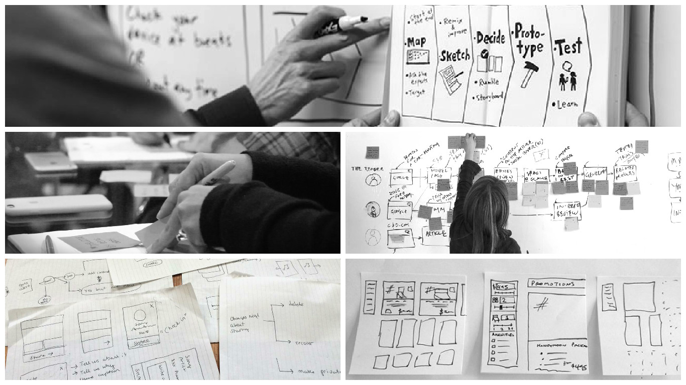
I can guarantee that every design team across the globe has found themselves in a similar situation at one time or another. We’ve all experienced crazy deadlines, and in today’s world of lean UX, increasingly agile teams, and “get-to-market” mindsets, short deadlines are something we need to learn to deal with. In order to rise to the occasion and pull together a brilliant, usable, and user-centric prototype, a team needs to have a solid, well-structured plan in mind.
We found our way to success by designing a 5-day sprint model. It’s a model that we’ll use again, and other UX designers can—and should—implement for their own critical deadlines.
What is a design sprint?
A sprint is a set period of time, often somewhere between 5 days and 3 weeks, during which a team of developers or designers (or both) accomplish a set amount of work. It’s commonly used in agile methodology. The 5 phase “design sprint” is a methodology based off the agile sprint, pioneered by Google Ventures (GV), and followed by various startups and design teams across the world, including my team at CanvasFlip. The plan includes design, prototyping, and testing ideas with customers. It’s a rapid way to test out assumptions, try big ideas, and get an analysis before the team goes ahead with building a product or feature.
When I learned to conduct design sprints, they seemed the perfect tool for developing a new feature, or kicking off a new product offering. However, every design team has unique business goals and resources. To that end, the design sprint is a recipe, and the more a team experiments with it and personalizes it to their own needs, the greater its chances of success.
The goal of the design sprint is to complete 3-4 clickable prototypes, and usability test them, so as to identify and refine one “final” prototype. We’ll walk through the steps going day by day, beginning with preparation for Day 1: before the design sprint begins, we need to collect stacks of paper, lots of post-its, whiteboards, and plenty of energy!
Day 1—Ideation & Strategy making
We begin the morning by spending about 30 minutes discussing the product we’re designing, and its potential challenges. This conversation is usually led by a UX researcher, since they are likely familiar with users’ friction points. We note challenges on whiteboards, so that we can see them throughout the design sprint. We call this: “learning the problem”.
Next, the product manager, business team and development team set the boundaries of technical capabilities. These structured discussions create the constraints we’ll work within for the rest of the week.
After that, we discuss the long-term goal, which identifies our ideal solution. It’s much easier to identify what we want to achieve and then work backwards to figure out how to achieve it. The process reminds me of a short story, called “The Design Sprint,” written about Apollo 13. It goes like this: After Apollo 13 was damaged, the astronauts needed to find a way to return to earth. The flight director grabbed a piece of chalk and drew a map of the damaged spacecraft’s path from outer space, back to the earth. This simple diagram helped them keep the focus on the problem at hand. Similarly, in the design sprint, we use one whiteboard to outline the steps we’ll take to reach our long-term goals. While it may undergo small tweaks along the way, the overall idea remains the same.
Right after this, the product manager engages the team for a few minutes to define the ideal user persona of the product/feature.
Now that everyone is on the same page, we take a full three hours for individual ideation around our personas’ needs. In the early days, while we were still figuring out the best model for our sprints, we began with group brainstorming, but we realized we had better results when people began separately, and then shared their work.

When we return to the room, each team member shares their user persona and the features he or she will need. As they share, we take notes on the whiteboards. By the time we leave, we have clear goals, a good understanding of the constraints, and a lot of ideas brainstormed.
Day 2—Diverge and then converge
The second day is all about generating solutions through sketching. This is often the most exciting day of the week: lots of brainstorming, and then ranking solutions to find the best and brightest.
Diverging
I push my teammates to think well beyond the current solution and explore new and creative ideas. Here are two diverging exercises that have worked for us.
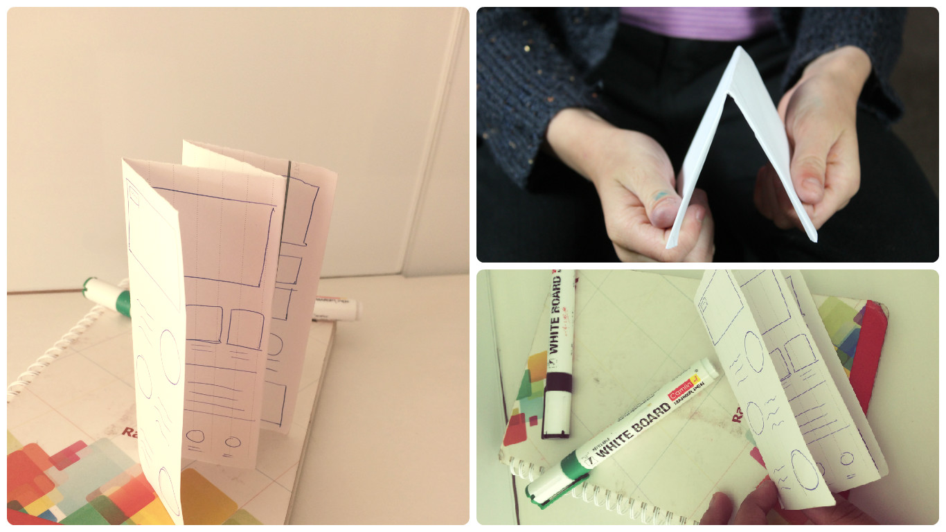
Crazy 8s—Everyone grabs a piece of paper, folds it in 8, and takes 10 minutes to throw down 8 ideas. The bigger the marker, the better, to keep the focus on quick ideas rather than details. Make sure team members don’t get weighed down by what’s feasible or what currently exists.
Flow maps—As the name suggests, it guides you with the FLOW of a product or feature. Start from the first interaction of the user with the feature/product and branch out every possible flow which the user can absorb into. It helps you build various possible story lines around a feature/product. Most of times, exploring new and creative flow of the feature brings out a shorter and more intuitive flow. A few of them will be surprisingly brilliant!
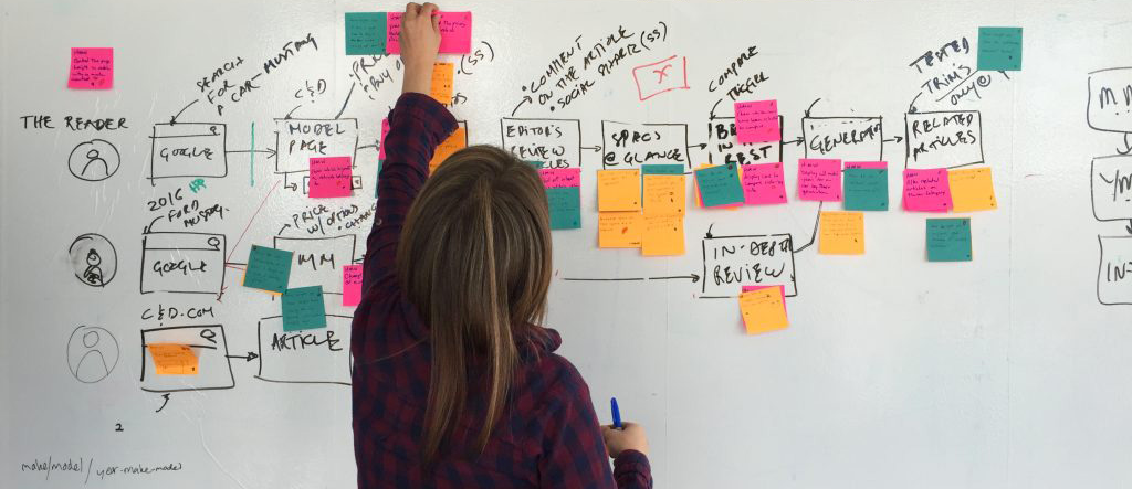
Crazy 8 is more suitable for creating multiple interface ideas, whereas flow charts are focussed more on the multiple flows which are possible in the product/feature.
Converging
After a break, it’s time to start refining the ideas. The top of the funnel is full, now we need to move downwards. Again, we have two main strategies.
8 to 4 to 2—Spend 15 minutes refining 4 of the 8 ideas from Crazy 8s. Then take 15 more minutes, and refine 2 out of those 4.
Magic graph—This graph is a need versus effort graph. Create a graph with need rated on a scale of 1-10 along the X axis, and effort rated on a scale of 1-10 on the Y axis. Then plot all of the ideas that came out of the divergent phase. The most successful ideas for the sprint will be those that strike a high need and low effort.
Decision time
Diverging and converging will typically take the whole morning, and sometimes part of the afternoon. But the final hours of day 2 are the most crucial, and I often invite stakeholders to join for this.
Each team member should prepare to share their 2 “best” or final ideas with the group. For each idea, they should then begin a discussion, answering questions and accepting additional ideas. After each team member has shared their ideas, it’s time for silent voting. Each person has 6 votes—I often use stickers. Teammates and other stakeholders can then walk around the room, placing their stickers on the ideas they feel are best. The goal is to identify 2 final ideas, which the group as a whole agrees to move forward with.
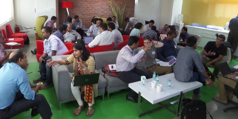
Day 3—Build wireframes. Create prototypes. Validate UX flows
There’s lots of building to be done today! We divide the team into sub-groups, so that each group can work on wireframes for the 2 ideas from the previous day.
To save time, the best way to wireframe at this stage is to start with a pen and paper. I personally believe that paper prototyping is best at this stage, because the aim is to validate the flow. Users should focus on rudimentary elements, rather than the beauty of the designs. (The CanvasFlip tool also supports paper prototyping, which is obviously my favorite when we get to that stage.)
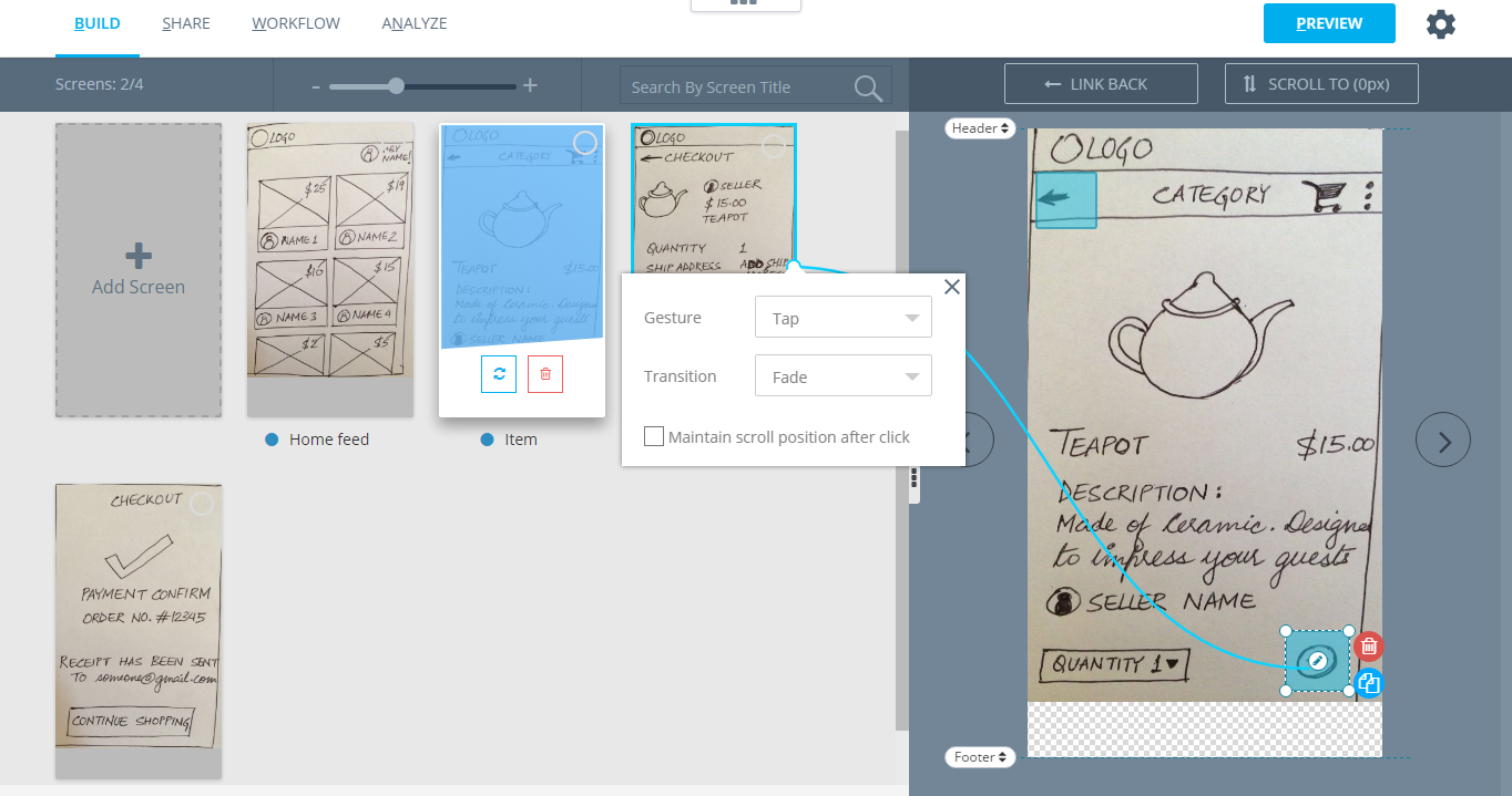
We spend all day on our wireframes, putting them into an online program like Balsamiq as time allows, or moving the paper sketches into prototypes using CanvasFlip. Once the wireframes are done, we share the prototypes with the rest of the team. Testing there wireframe prototypes with a closed group of teammates helps us validate the flow of the prototype.
In the last hour, we discuss the wireframe prototypes and the internal UX insights we compiled by testing with our own team. Designers give views on each piece. We also have the UX researcher in the room to share insights. So, by the end of the day, we have 2 prototypes finalized and ready for usability testing.
Day 4—Refine the prototypes
Day 4 focuses on two things: finalizing the designs, and preparing for usability testing. One team spends the day working on the designs. If Day 3 ended with paper prototypes, Day 4 can be spent turning the pen-and-paper designs or wireframes into full visual mockups. Most importantly, Team 1 needs to be certain about the interactions that we plan to test all function.
The second team works closely with the UX researcher to craft the script and recruit testers. We recruit users in a number of different ways, including reaching out on social media, and in some cases, employing a professional service. CanvasFlip has tied up with few agencies for recruiting test users as per the user persona.
By the end of the day both the teams have their outputs ready:
- 2 final prototypes (if there’s only 1, that’s ok too)
- A list of questions and moderator’s guide
Make sure to reserve an hour or so at the end of the day to review the prototype, and compile a list of any last assumptions or things to watch for during testing.
Day 5—Validate
Day 5 is all about discussions, insights, and answers. We’re bringing in real users, and validating the prototype. If we closed with 2 prototypes from the previous day, we divide the users in two teams and test each prototype with one team. This adds a bit of A/B testing to the mix, which yields great results.
I won’t explain how to conduct a usability test, since so many others have written about that topic. Instead, I’ll just note the importance of recording sessions. Again, we use CanvasFlip for this, since it’s what we built the tool to do, and through it we’re able to see additional analytics, such as screens with higher drop offs and heat maps. However, regardless of the tool, the important thing is to capture as much information as possible and take plenty of notes.
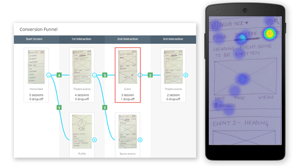
By the end of the day, the team has a validated prototype to work ahead with. We’ve reached the end of the design sprint, and the team and stakeholders should have a much clearer idea of their options, and what users respond positively to.
Final Words
In just five days, working almost 8 hours a day, we can achieve an outcome which normally takes months. By condensing everything down to the basics, we get a better understanding of what makes our designs usable and engaging.
Want to learn more? Read on about design sprints: