Back in September, I saw Giles Colborne—author of the book Simple and Usable—give a talk on the reasons why he’d written the book. It was a great talk. Among other things, Giles raised an issue that I hadn’t previously considered: by writing the book, he placed himself at the forefront of the so-called simplicity movement. As a consequence, Giles subjected himself to a life of simplicity for fear of being labeled a hypocrite.

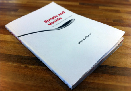
My copy of "Simple and Usable", slightly dog-eared from regular use.
In writing this review, I’ve inadvertently done the same. I’ll try to make it as simple as possible!
First impressions
When I first thumbed through Simple and Usable, I wrongly assumed that it was a relatively light read. I hadn’t so much judged a book by its cover, but more by its size and layout. In a way, the pacing and scope of Colborne’s Simple and Usable greatly reminds me of Steve Krug’s seminal Don’t Make Me Think in that it epitomized the subject.
Speaking of which, Steve Krug has previously stated that he wishes to write books that are “short enough to read on a long plan ride.” This is a point that Colborne obviously took note of. Steve says he does this for two reasons: (1) if it’s short it’s more likely to be read, and (2) readers needn’t learn everything in one go. In this way, Krug’s books do a great job of focusing attention on one thing at a time.
I managed to read Simple and Usable within the space of 2 return train journeys to London (a total of just under 8 hours).
Credit where credit
According to Giles, a book that did inspire Simple and Usable was Selling the Invisible by Harry Beckwith. In his talk to the UK Usability Professionals’ Association (UK UPA), Giles says it was the layout of Selling the Invisible that he truly admired and wished to replicate in his book. And I must say, it works beautifully.

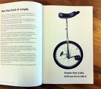
"Simpler than a bike, until you try to ride it."
An
example of how Giles uses imagery to enrich his message.
Each pair of Simple and Usable‘s nearly 200 pages is comprised of a full page of text accompanied by a full-page image. The images aren’t just decorative, though. Instead, they focus readers’ attention on a single object that is then explored by the accompanying text. Upon closer inspection it’s apparent that a lot of thought went into the selection of each image.
In my opinion, authors often include photos, cartoons, diagrams, what-have-you, in an attempt to visualize or simplify an idea that is in reality far too complex. The resulting piece tends to detract or confuse the original subject matter. In Simple and Usable, Giles does the exact opposite: all visuals are well-considered and enrich the narrative.
Not that kind of simplicity
A couple of years ago, I heard Don Norman talk on the subject of complexity at UX London, a subject he has since turned into a book, Living with Complexity. When I first heard about Giles’ book, I wondered if there would be conflict between these two luminaries. Thankfully, Simple and Usable deals with the true nature of simplicity. It’s stated very early on that simplicity is not about removing all semblance of complexity. It’s about making a system simple for its intended audience.
“Designing simple user experiences often turns out not to be about ‘How can I make this simpler’ but rather ‘Where should I move the complexity?’… The secret to creating a simple user experience is to shift complexity into the right place, so that each moment feels simple.”
Giles Colborne, Simple and Usable
Dealing with complexity
It’s a common misconception that in order to achieve simplicity, you can’t have complexity—that these are mutually exclusive ideas. Giles surmises that this isn’t the case. Instead of removing complexity altogether, we must understand where it should live. This concept is eloquently summarized by Larry Tesler in his Law of Conservation of Complexity:
Every application must have an inherent amount of irreducible complexity. The only question is: who will have to deal with it?
Larry Tesler
as well as a related quote by Paul Jacques Grillo:
“Simplicity does not mean want or poverty. It does not mean the absence of any decor or absolute nudity. It only means that the decor should belong intimately to the design proper, and that anything foreign to it should be taken away.”
Paul Jacques Grillo, Form, Function and Design
Strategies for simplicity
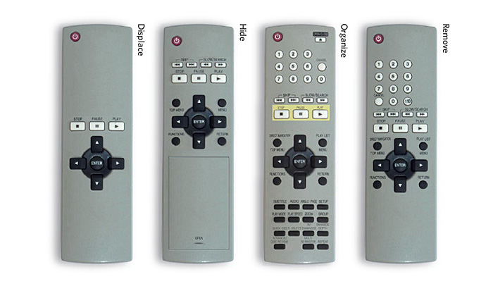
The bulk of the book centers around four strategies for simplicity. Each strategy (or heuristic) is explained in the context of redesigning a TV remote control, complete with corresponding benefits and challenges. By book’s end, Giles invites readers to take up the cup, allowing for a new level of interaction with the book. He even provides downloadable templates on the website as well as a place to share your solutions.

I must admit I haven’t taken up the challenge, but I did find myself consciously trying to solve the problem as I read through the book. Each chapter introduces new ways to approach problems backed up with a wide range of examples. Using the consistent, omnipresent example of a remote control grounds the book in everyday life and no doubt appeals to every UXer who’s stared at a remote and wished it was designed better.
My verdict
Colborne wanted to write a book on a subject he loved. In Simple and Usable, it’s clear that he did just that. I found the book easy to read, hard to put down, and a great reference point to back to time and time again, so much so that it’s lived in my work bag for the past 3 months since I finished it.
Simply put, it’s a book you have to read.
Simple and Usable, published by New Riders and part of the ‘Voices that Matter’ series is available to buy now from Amazon. Alternatively you can find out more by visiting the website www.simpleandusable.com.