Charles feels like he has mobile apps for everything in his life. He’s tired of having to launch apps to do mundane things. He’d like to talk to people face-to-face instead of looking at his smartphone’s screen. He’d like to take advantage of the latest technology without needing to hunch over his mobile device. He wonders: can this powerful computer in my pocket make my life easier, instead of giving me more to do?
Familiar and fantastic starting points — like qualitative and quantitative research, historical references, and subject matter interviews — help UX designers to discover unique problems for a specific set of target customers. Then, a sketch of a screen becomes the go-to generic starting point to hopefully accomplish these three things:

A common sandbox for an app designer.
- Create the most elegant solution possible
- Make a distinctive digital product
- Be useful on a regular basis
Not easy. A designer who cares about a great experience may be blinded from a better solution by thinking in terms of screens, rather than considering the user’s typical process.
The plague of pixel constraints
Creating a new, unique and great experience from this canvas is possible, but drawing screen-based solutions has inherent challenges. Removing the phone from pocket or purse, logging in, finding and launching the app, dealing with passwords, menus, navigation, and other hurdles of mobile operating systems shepherds a less elegant experience.
Starting from the same pixel constraints as the competition will also likely lead to expected and repeated solutions despite being however spruced up by trendy and exhausted animation sequences like a parallax scroll, Helvetica-induced visual design, and interaction patterns like the use of the navigational hamburger that all make the product feel more contemporary, but do not create genuinely different experiences from competitors.

I’m the sexy rounded rectangle hamburger man with all the things you really need buried inside!
And the app from this starting point will likely need to be reliant on the never-ending annoyance of buzzes, beeps, and vibrations to encourage repeated usage. Kleiner Perkins Caufield & Byers (KPCB) already estimates that we tend to check our phones 150 times a day. In an international poll taken by Time magazine, 1 in 4 people check their phone “every 30 minutes, 1 in 5 people every 10 minutes.” Not to mention, Phantom Vibration Syndrome (PVS) and Ringxiety — thinking your phone is buzzing and beeping when it’s not — already impacts more than 90% of college students.
An Alternate View
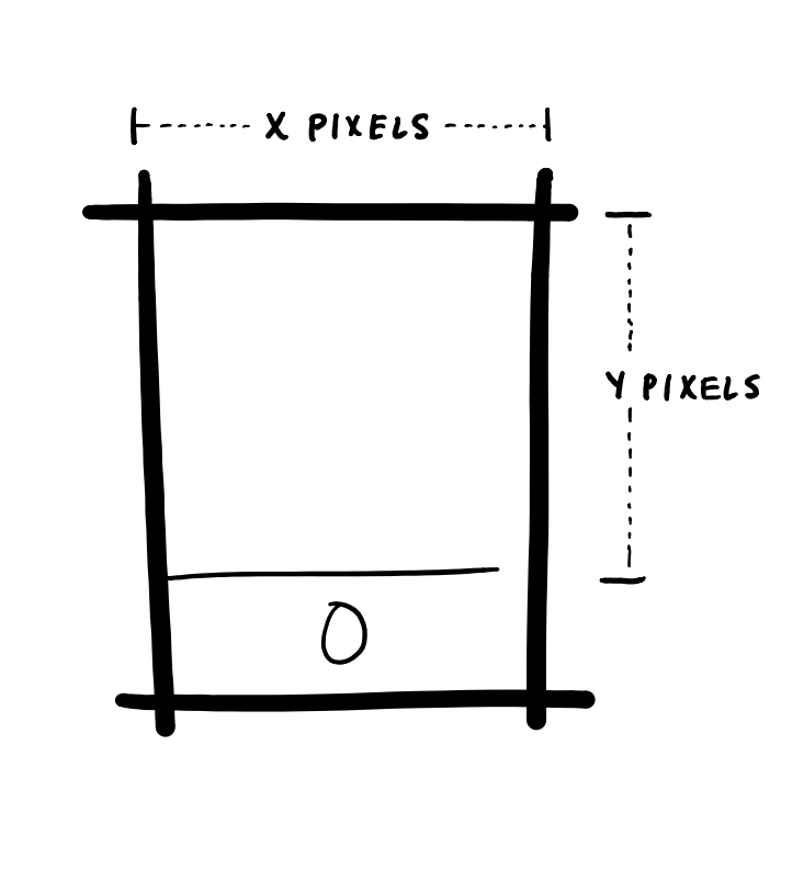
Here’s a different constraint: a phone in a pocket.
Above, the imagery implies a different sandbox for solving problems with the phone, one where the goal is to keeping your phone in your pocket. The Back Pocket App, a low-hanging fruit of a post graphical user interface heavy world. This is the app icon from the original Moves app that sadly has been ditched, but incredibly through passé skeuomorphism could symbolize a next generation of mobile app aspiration: it works best while in your pocket.
Imagine an app or even a site like 12Bet that doesn’t need buzzes and beeps. The primary experience is not a screen-based digital interface. It surprises and delights users without taking them away from friends, family, and time for the things they actually care about. It takes advantage of the powerful computer in the customer’s pocket. Instead of using the similar WIMP-based patterns as GUIs from thirty years ago, it empowers things like sensor and radio technologies, already built into the phone.
With this more unique sandbox, the future possibilities are far wider.
The founders of Lockitron, a company specializing in keyless entry, is one team that has successfully moved from the old mindset to the new one. The Wall Street Journal once reported that a British insurance company survey found the average adult in the UK “misplaces nine items a day,” and that people are “most frustrated at losing their house keys.” Lockitron set out to solve this problem. Wired raved: “Unlock Your Home With Your Cellphone.”
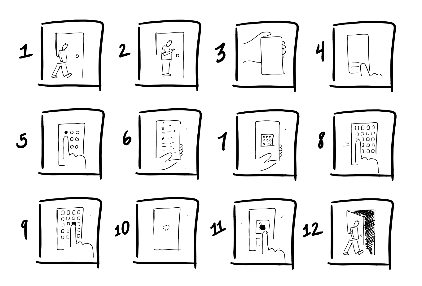
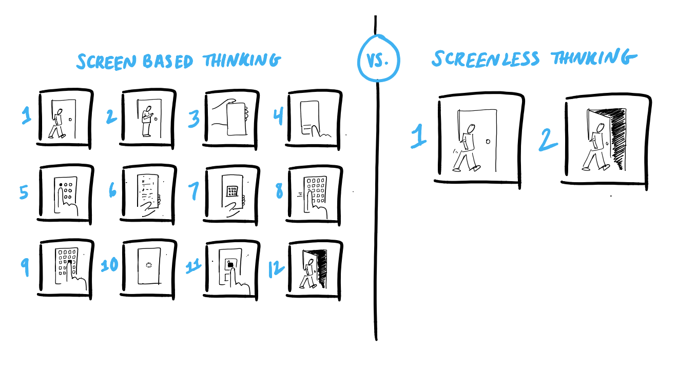
But while it sounded exciting, the actual solution required a special deadbolt replacement, and because of the initial pixel sandbox, the solution then asked users to drown an everyday action in cumbersome, screen-based thinking that was really no better than the old lock and key. Users now had to:
- Walk up to my apartment door.
- Pull my smartphone out.
- Wake up my phone.
- Slide to unlock.
- Enter passcode.
- Exit last opened app.
- Exit last opened group.
- Swipe through a sea of icons, searching for the app.
- Tap the app icon.
- Wait for the app to load.
- Tap the unlock button.
- Physically open their apartment door.

A year later, the Lockitron team redesigned with a refreshingly new kind of UX.
The first major change was with their custom deadbolt. They got rid of it. Instead, they made a cover that goes over the user’s existing lock, embracing their current set up.
More impressively, they also thought beyond screens, embraced the user’s environment and eliminated the need for the user to remove his phone from his pocket. The app still needs to be initially downloaded and installed on a smartphone, but once it’s set up, the smartphone can remain in its rightful place: a rectangular bump in the user’s pocket.
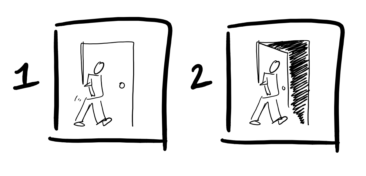
Using Bluetooth technology, the second generation Lockitron app enabled the phone to speak directly to the deadbolt without an explicit digital interaction. So when the user is at his front door, Lockitron welcomes him home smoothly, without so much as a pause or a tap. Their app doesn’t thrive off addiction; it creates customer satisfaction by actually making the unlocking process easier. The process is now:
- Walk up to my apartment door.
- Physically open my apartment door.

Their second generation Lockitron raised $2.2 million on the crowdfunding site Kickstarter from potential customers. Pretty good for a door lock.

Next Steps
Thinking beyond screens isn’t applicable to every kind of problem, but when it is possible, it can illuminate a path of unforeseen delight for customers. Consider the following four tips in building your next app, all of which follow the principle “Embrace typical processes instead of screens”:
- Start with an understanding of the user’s typical process.
Observe users in the environment(s) in which they will likely be undergoing the task or encountering the problem. This helps us to design a system around their typical process considering their real-world settings as the constraint (instead of a pixel box). - Look for what triggers might indicate a problem we can help solve.
By understanding the customer’s typical processes, we may discover that something simple — like you’re standing outside your apartment door — can indicate the need for your service to help solve a problem. For more complex solutions, a combination of triggers may be necessary to be able to provide enough confidence for a system to undertake an action. Perhaps a phone could have confidence a user is sleeping only with the correct combination of time of day, day of the week, location, and phone inactivity; and hence sets an alarm eight hours from that point. - Get familiar with smartphone technologies beyond pixel dimensions.
Smartphone technology is changing rapidly. As designers, we need to know what sensor technologies, radios, and other forms of machine input are available on the latest phone. Here’s a quick guide to get started. - Get comfortable with usability patterns of physical experiences.
Like Apple, Google, and Microsoft have popularized certain low-bar digital patterns, things like automatically sliding doors, escalators, and elevators have popularized some expectations in the physical world. Start observing and collecting those key moments of good industrial design.
To learn more about out-of-the-box thinking, alternative methodologies, and a different way of looking at how to make technological solutions, grab a copy of the book The Best Interface is No Interface.
The post above is original content derived from the thinking in the proactive new book, The Best Interface is No Interface, which discusses user experiences beyond screens.