Infinite, or long, scrolling is quickly becoming a standard navigation pattern. This navigation structure lends itself well to all sorts of sites (commerce, social media, etc.), translates well from desktop to mobile, and has some clear user experience benefits.
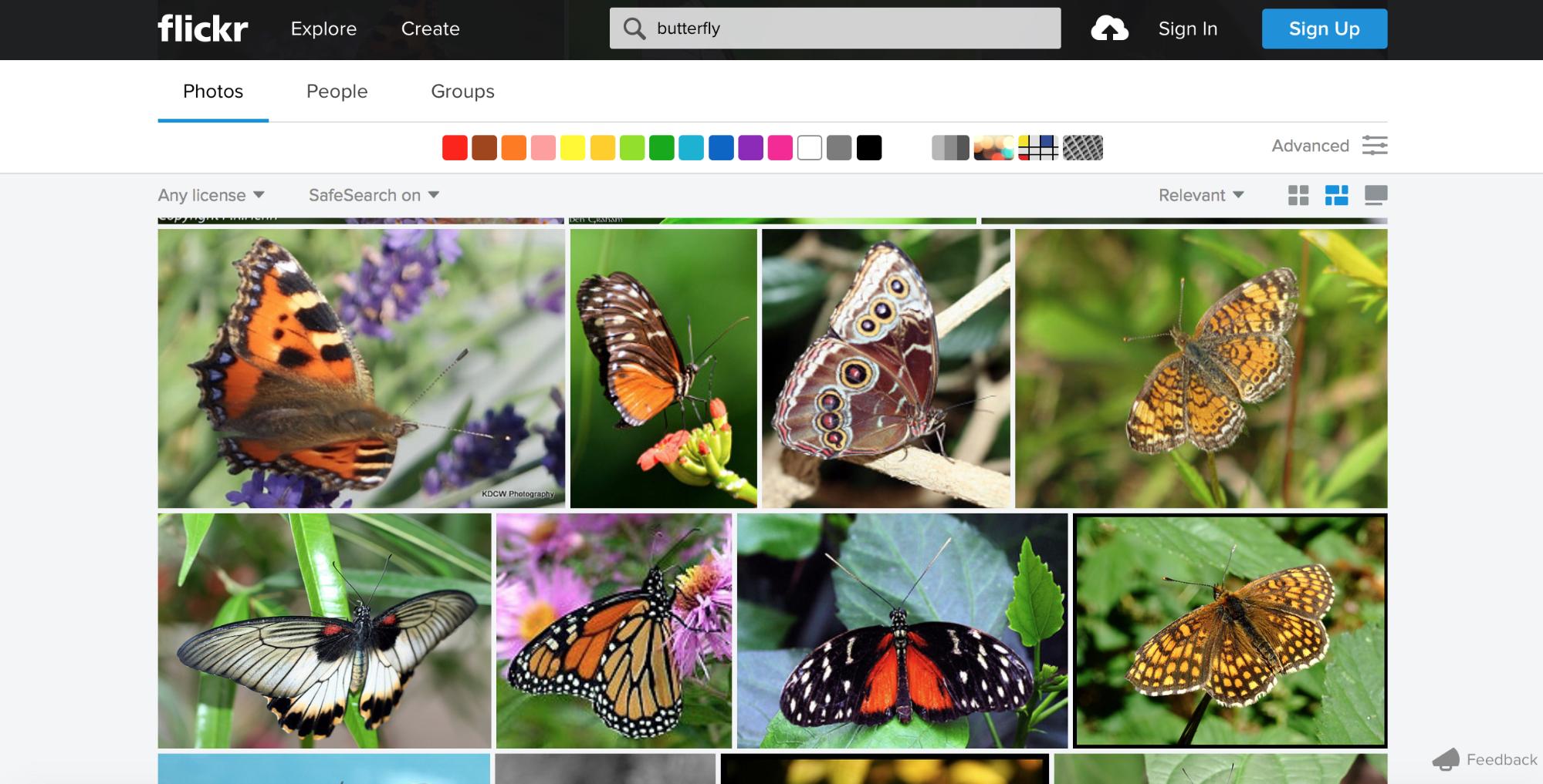
With the popularity of social media, infinite scrolling has become a must-have feature for discovery interfaces such as Flickr. When the user searches for something specific, they are able to browse through a large number of items to find the one thing they like. People visit sites for content first, with everything else secondary. And scrolling helps people access the content they need.
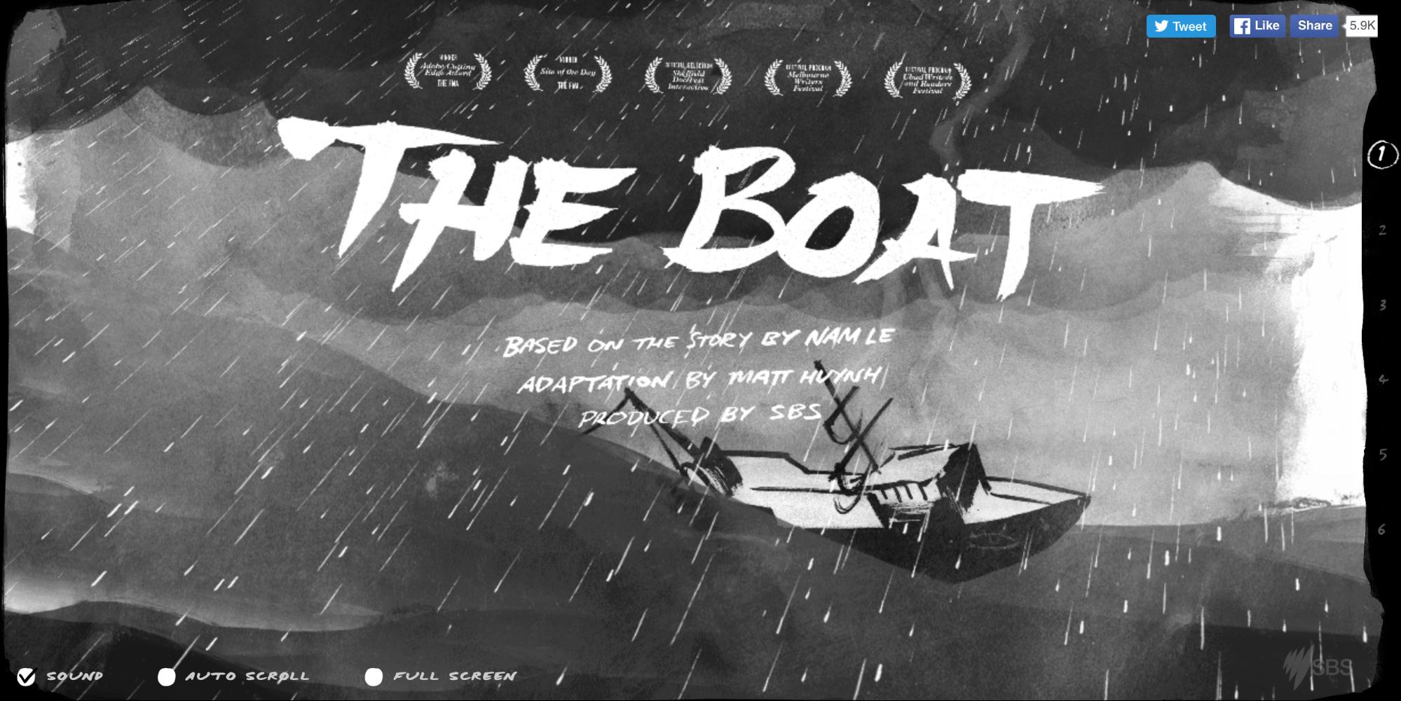
Additionally, infinite scroll creates a linear structure that storytellers can leverage. As the reader scrolls down the page, different layouts can be paired with subtle animation effects to build a rhythm that gets the user wondering “what will happen next.” One good example of this is The Boat, where the infinite scroll enhances the story, offering a new medium to layer visuals with text.
Scrolling opens a lot of new doors to designers. However, this pattern is not without its drawbacks. It requires designers to pay a strong attention on content, navigation and animation. If long or infinite scrolling is the right choice for your design, keep the following best practices in mind:
- Encourage users to scroll
- Adjust navigation for scrolling
- Use animation to enhance long-scrolling
In this article, I will discuss some of the benefits, things to consider, and quick tips for infinite scrolling.
Encourage Users To Scroll
Despite the fact that people usually start scrolling as soon as their page loads, content above the fold is still very important. What appears at the top of the page creates initial impression and sets quality expectation for your users. Users do scroll, but only if what’s above the fold is promising enough. This is true on any size screen, be it mobile, tablet, or desktop: anything that’s hidden and that the user must uncover will only be seen if the user things it is worth it.
Provide Interesting Content
What is visible on the page without requiring any action is what encourages users to scroll. To make sure that people will scroll, you need to provide content that keeps your visitors interested. Thus, put your most compelling content above the fold:
- Offer a good introduction (Good Introduction sets the context for content and helps users find answer on the question: What’s the page about?)
- Provide interesting facts (Factually rich content will attract readers and keep their attention)
- Use engaging imagery (Users pay close attention to images that contain relevant information)
Tip: Using a free online tool called Where is the fold?, you can identify how much of your content is above the fold for some of the most common screen resolutions.
Avoid the False Bottom
The area above the fold also sets the stage for future content. The content above the fold should signal that there is more valuable content below the fold. When you have a false bottom, or an end to content that appears to be the end of the page, you don’t give users a reason to believe there is something below the fold. As a result, they will attempt to scroll less often.
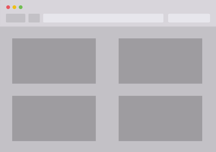
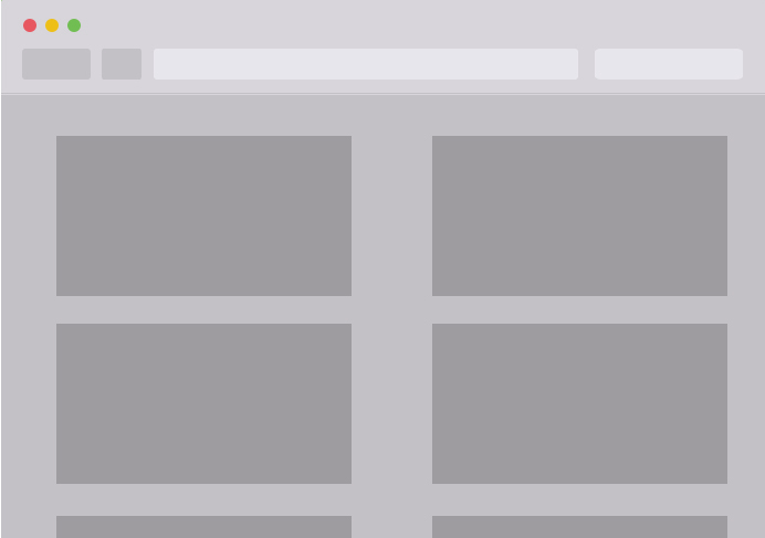
Avoiding a false bottom is pretty easy — just provide a visual cue that there is information below the fold. For example, for content such as grid or card-based layout it’s good to cut off grid/card tiles in the view’s initial scroll position to communicate the scroll direction for content overflow.
Or alternatively you can directly ask users to scroll. A subtle cue, such as an arrow pointing off-screen or a text “scroll down,” can inform users that most of the content will be laid out linearly.
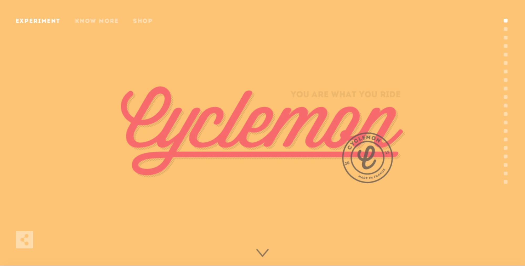
Adjust Navigation For Scrolling
Navigation is a make or break aspect of the user experience of a site. It is crucial that navigation works well, because users need to be able to quickly locate themselves on the page, and figure out how to get to where they want.
Use Sticky Navigation
Long scrolling can make navigation problematic for users: if the navigation bar loses its visibility when users scroll down, they will have to scroll all the way back up when they’re deep within the page. The obvious solution for this problem is a sticky navigation menu: it’s best to keep the navigation persistently visible, so that navigating to different areas of the site or app is fast and easy for users

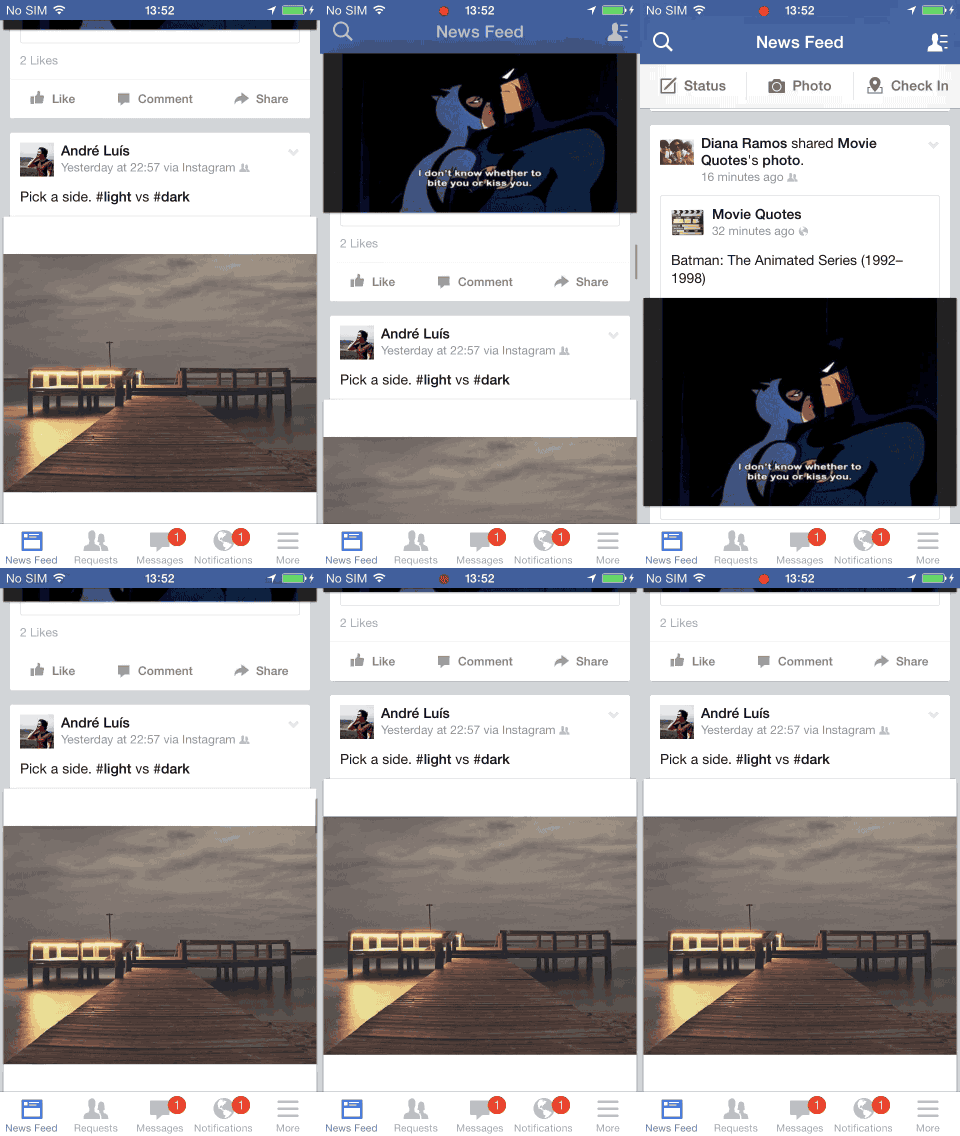
However, if you want to save a valuable screen estate, you can hide the navigation based on the scrolling direction and make it available upon request.

This solution works especially well for mobile devices: since mobile screens are much smaller than tablets, laptops, or desktops, a navigation bar can take up a relatively largely portion of the screen. If the screen is a scrolling feed, the navigation bar can be hidden when people scrolling for new content and revealed if they start pulling down trying to get back to the top.
Consider Jump-to Options
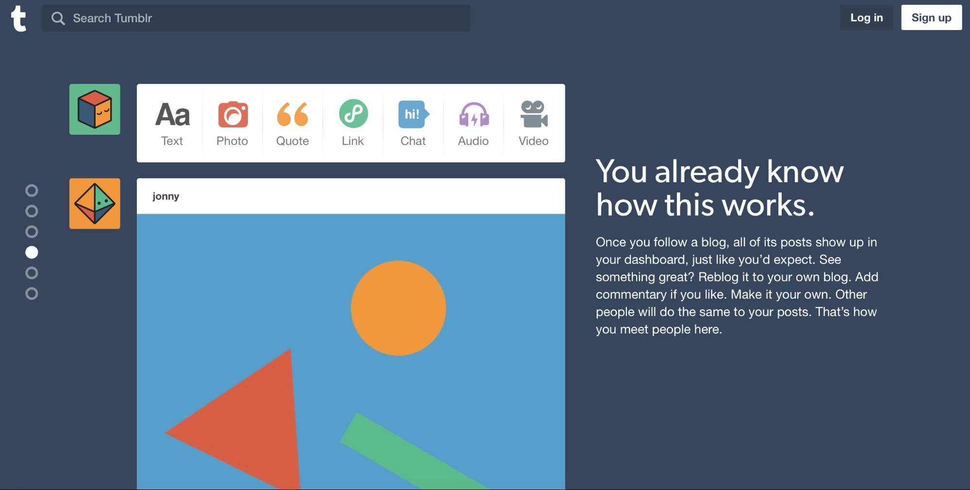
Another common problem of long and infinite scroll is disorientation: users may have difficulty finding something they have previously seen on the page. This can be a serious problem when content is broken into multiple number of equally important sections or blocks (e.g. long tutorial). A jump-to-section option is able to solve this problem.
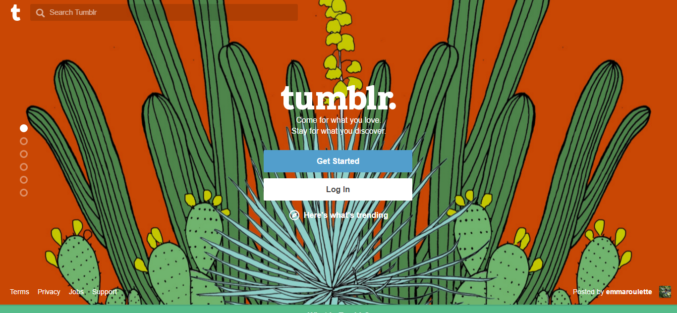
A jump-to-section option is a series of links that take the user down the page to related content. It works almost the same as a table of content. For example, on Tumblr, users can jump down the page, or jump back to the start if they become lost. The content on the page is broken into several blocks, which are clear to distinguish and big indicator dots are fixed on the left side of the screen.
Make Sure Back Button Works Properly
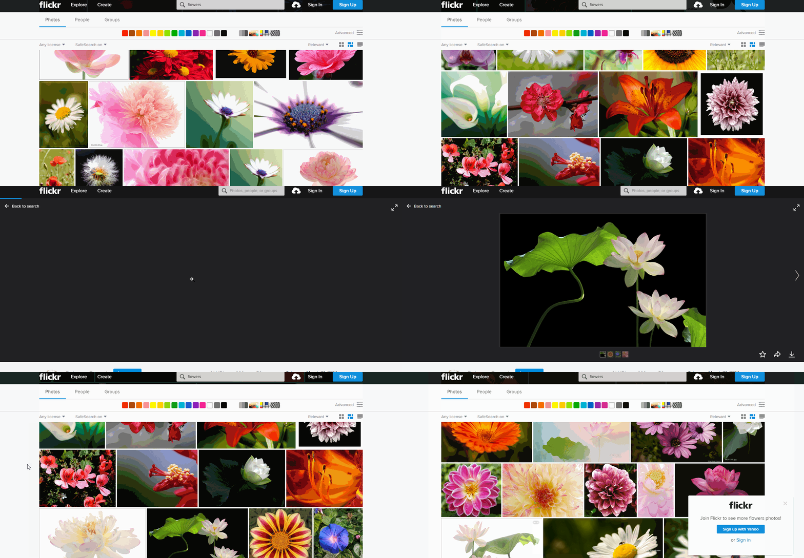
When users follow a link on a page, and then click the Back button, they expect to return to the same spot on the original page. But if the user’s position on the page is not maintained, using a browser’s back button will generally reset the scroll position to the top of the page. Losing their spot on the page forces users to have to long scroll through content they have already seen. It’s not a surprise that users get frustrated quickly by not having a proper “back to position” functionality.
Flickr is a good example of matching the browser’s back-button behavior to the user’s expectation. The site remembers the user’s scroll position, so when the user press Back button he returns to the original position.
Use Animation To Enhance Long Scrolling
Considering that user attention span on the web is about 8 seconds, a delightful scrolling experience certainly prolongs user interest. Properly used animations help guide users along long-scrolling experiences.
Scroll-Triggered Animations
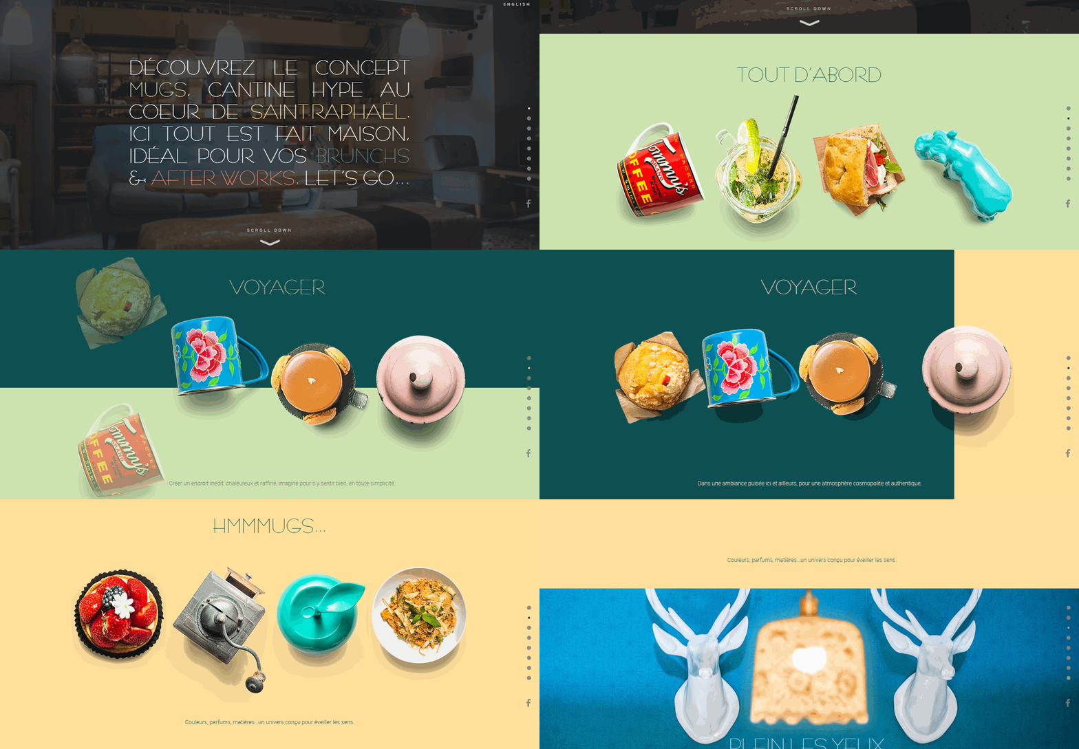
Consider breaking up your page into scrollable “chunks.” Within each chunk, you can introduce the content through animations. As users scroll, animations transition them to the next screen while creating a path of content to follow. It’s a useful way to show users the flow of content while keeping them interested in what’s next.
Parallax Effect
When your site wants to tell a story in a smooth, linear fashion, long scrolling paired with parallax effect is able to create a completely immersive browsing experience.
Parallax scrolling involves the background moving at a slower rate to the foreground, creating a 3D effect, like the one that can be wonderfully done by an animation team, as you scroll down the page. When used sparingly it can provide a nice, subtle element of depth. This style lends itself to storytelling sites, building a more immersive and stimulating experience with better visuals.

Tips:
- For help on coding for parallax sites, read the article “Parallax Done Right” by Dave Gamache
- Always consider how much CPU and memory resources your page consumes if you’re using long/infinite scrolling with animation. Scrolling multiple pages of photos, GIFs and videos without reloading the page can take a significant toll on system resources. Test in different devices and use tricks like pausing animations and videos when the user scrolls past them.
Provide Visual Feedback When Loading New Content
This particular tip is mostly relevant to the infinite scrolling, but also can be useful for content-heavy long-scroll pages. When new content is loading, users need a clear sign that the site is doing this. Keep them informed by using a progress indicator to show that new content is loading and will soon appear on the page.
Since loading new content is a fast action (it shouldn’t take longer that 2–10 seconds) you can use looped animation to offers feedback that the system is working—literally, animation that is very short but appears on repeat.
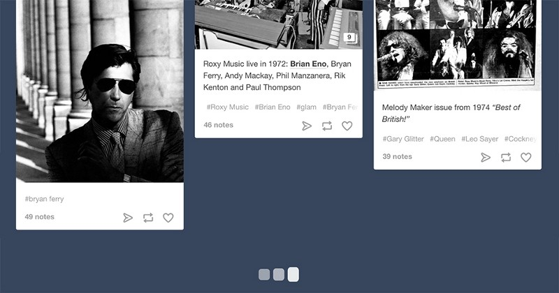
It can also be helpful to add additional clarity for the user by including text that explains why the user is waiting (e.g. “Loading comments…”).

Avoid Scroll Hijacking
Websites that implement scroll hijacking take control of the scroll and override a basic function of the web browser. Scroll hijacking is bad because the user no longer has full control of the page scroll and unable to predict its behavior. User’s expectation of a website’s scrolling interaction shouldn’t be destroyed for the sake of narrative experience.
Mitigate SEO Drawbacks
Long scrolling can have a negative effect on SEO, but this can be avoided by following Google recommendations. Conduct behavior analysis (like in Google Analytics) to see how your design is actually working.
Here’s a peek at what they recommend:
Chunk your infinite-scroll page content into component pages that can be accessed when JavaScript is disabled.
- Determine how much content to include on each page.
- Be sure that if a searcher came directly to this page, they could easily find the exact item they wanted (e.g., without lots of scrolling before locating the desired content).
- Maintain reasonable page load time.
- Divide content so that there’s no overlap between component pages in the series (with the exception of buffering).
Conclusion
In web design, the journey can be as enjoyable as the destination. Long scrolling can create a completely immersive browsing experience. As Josh Porter said: “Scrolling is a continuation, clicking is a decision.” If users like the UI and find it intuitive, then they won’t really mind the length of the scroll. Thus, focus on your user goals and make things more convenient for your users.
What best practices do you follow for scrolling? Let us know in the comments or on Twitter!