This article is a part of a series:
How do users behave different on touch-based interfaces, and how can you start implementing new gestural actions into your mobile web products.
As we conclude our series, Considerations for Mobile Design, we wish to spend a little time looking at how users behave differently on handheld devices compared to desktops and laptops. In this final part of our introduction to mobile design, we explore how touch interfaces are different from more traditional means of user input, and how designers can start implementing new gestures into their own products.
Click vs. Touch
On desktops, we click. We pilot a tiny cursor, control it as it flies across the screen, and precisely hit the targets we’re aiming for. There might be an occasional misclick, but even then, reversing our actions in a web browser is typically easy to do.
On handheld devices, we tap. Our hands become the main input of the device, and our hands aren’t as nimble and precise as a mouse cursor. We touch areas of the screen rather than an exact pixel. We readjust the grip on our smartphone as we attempt to hit a button with the same hand. When there is a mistap, the consequences are more time consuming; slower page load times, and slower device speeds make the wait less forgivable.

In an effort to aid users in navigating mobile interfaces, some groups have determined the average tap size. Using these averages, we should be able to build interfaces that are easier to use, and result in fewer mistaps.
Apple suggests that a minimum of 44×44px pts (thanks Vicente!) should be used for tapping. According to Apple, this is the average area of a finger tap on their mobile devices.
The UI Design and Interaction Guide for Windows Phone 7 (.pdf) suggests using at least 9mmx9mm for tapping (which on Windows Phone 7 devices translates to about 34x34px). At least 2mm of space (or 8px) should be given between controls. With the introduction of more devices with high resolution displays (like the iPhone 4), measurements that describe physical space may be more useful than pixels since pixels per inch varies by device..
These are great benchmarks to base our own interactive elements on. We can say things like, all touchable items on the page should be at least around 40x40pts, and should be at least around 10pts away from other touchable items. Simple enough.
What’s really important to take away from this is that your controls need to facilitate touch interaction. This might mean giving links in content body extra padding so they’re easier to tap. This might also mean you need to add extra space between items in an ordered list of links.
The importance of implying touch
It probably goes without saying, but in the same way that links should look like links on desktop browsers, touchable items should look like touchable items on handheld devices. In fact, it’s probably even more important. Aside from mistakes typically taking longer to correct on mobile devices, there is no such thing as a mouse hover. In other words, a user can’t check to see if something is tapable by hovering over an item on a page and checking to see if a cursor changes to a pointer.
Andrew Maier has written in the past about creating usable links and buttons.
Form interactions
While there isn’t widespread support across mobile devices yet, declaring input types will certainly be important in form design moving forward. Some devices (such as iOS 4 and Android 2.2 devices) already have some support for the latest input types outlined in the HTML5 spec.
A big reason to be using these new input types is to provide contextual interfaces for entering data. In other words, if I click an input with “type=number”, show me a number pad instead of a full QWERTY keyboard. If I’m using a “type=url”, get rid of the spacebar, and make symbols like “.” and “/” more prominent.
In addition to speeding up data entry, these additional field types limit possible errors. It’s hard to accidentally type a letter in an input if only numbers are allowed.
Details on the newly introduced types can of course be found on w3.org, but a few common useful types are shown below:
<input type="text" />   <!-- Default text entry -->
<input type="email" />   <!-- Email addresses -->
<input type="url" />     <!-- URLs -->
<input type="tel" />     <!-- Telephone numbers -->
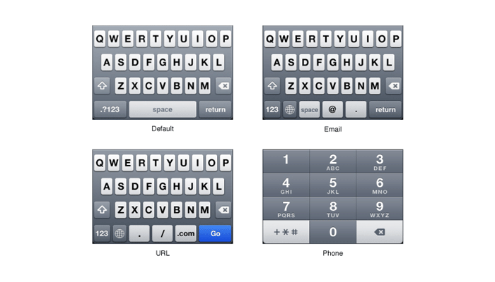
Several different keyboard types from the iPhone OS. (From iOS Developer Library)
Pete Freitag has put together a pretty handy demonstration of support for these contextual controls on iOS 4 and Android 2.2 devices.
These controls are super easy to implement, and will definitely expedite data entry for the on-the-go mobile user.
New user behaviors
If you use a touch-enabled handheld device already, chances are that you’re accustomed to actions like pinching, flicking, and sliding. In fact, these gestures might seem very natural in some applications (ie: zooming in on a photo by stretching it out with two fingers).
There are a few frameworks out there that have made integrating these actions into your own applications pretty simple. jQuery Mobile is one such framework, and one that many already have experience with. Quite a few events are offered in the framework by default, and using the existing code additional events can be added in pretty easily (like Swipe Up and Down).
In addition to these sorts of events, jQuery Mobile makes page transitions, layout development, dialogs and more far easier to create for mobile devices.
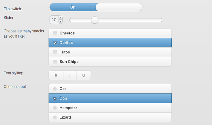
jQuery mobile also offers a layout system with progressive-enhancement driven form controls.
When should you use new input methods?
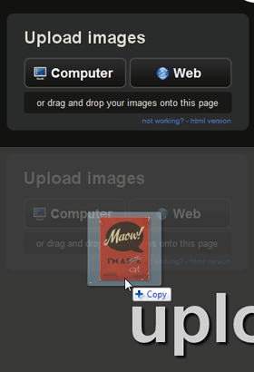
imgur allows users to upload files by dragging a photo directly from the desktop into the web browser.
A relatively new convention on desktop browsers is the ability to drag and drop files from your desktop directly into a web page. Gmail allows this (but doesn’t it make it obvious to users that don’t already know about it), as well as several image sharing sites like Imgur.com.
Because this isn’t a very common interaction, it requires explaning. You wouldn’t simply start dragging and dropping files from your desktop to a browser to upload a file (usually). You either already know that this site accepts that type of input, or the site has done a good job explaining that this is a possible interaction.
It’s not a mature convention yet. There isn’t a commonly accepted way of visually communicating this input type… though a few are surfacing.
On the other hand, there already exist a lot of very practical conventions in web design. Obviously, underlined text (usually a separate color from surrounding text) constitutes a link. Modals can usually be closed by clicking outside of the modal area (or by hitting a close button). The list goes on…
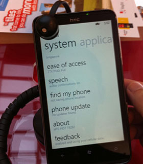
Windows Phone 7 devices often let content overflow the right edge of the screen to communicate that the viewport can be panned with a swiping motion.
Photo Credit: Cedric Chee
Returning to mobile design, the same holds true: while many clever new interaction types like “swiping” can potentially offer great solutions to UI design problems, they’re still very new gestures. People aren’t used to “swiping” in a browser. Does swiping on one site do the same thing on another site? Does swiping affect an entire page, or is it used inside of a containing element?
These new interactions in the immediate future need to be taught to the user. Also, you most likely should not be going out of your way to cram every possible type of gesture into your trendy new app. Only use these newer types of input when you truly believe they make sense. There’s no sense in reinventing the wheel if no one knows how to use it.
Moving forward
This wraps up our series on Considerations for Mobile Design, but this is merely a stepping stone for people who are just beginning to wrap their heads around the mobile web. If you’re like me, you may have have been dismissing the mobile web for the past few years. For some of us, it just didn’t feel quite ready to handle complex applications with rich user experiences.
If we’re not at a point where the mobile web is ready today, we’re certainly very close. Between device availability, high speed connections, and new web technology, the groundwork is in place (or at least falling into place) to develop new generations of web-based applications that assist us, travel with us, and connect us with others at all times.

There are a few resources that I’ve found useful in discovering more about mobile design that you might also find interesting:
-
Articles about Mobile from the LukeW
Luke Wroblewski is an accomplished product design leader who has spent a significant amount of time discussing the mobile web. He advocates a “Mobile First” approach to designing products, and offers concrete reasons why you should too.
-
W3C Web of Devices
The W3C is maintaining a portal of interesting mobile related topics, as well as upcoming events.
-
Mobile Form Design Strategies
Chui Chui Tan recently authored a post here on the UX Booth in regards to designing better forms for mobile devices. It’s quite a good read!
There are also quite a few books out there on the subject of mobile web design, many widely applauded. However, the mobile web landscape has changed (and continues to change) so quickly that much of the information written about the mobile web even a year ago is no longer relevant. I would strongly encourage focusing on recent articles and publications to avoid misinformation.
And of course, the UX Booth will continue to discuss the mobile web as it continues to gain momentum. We’re hoping that this series is just the beginning of a topic we consider to be extremely interesting, and we’re actively seeking contributors to help us explore the mobile web as it continues to blossom. If you’re interested in becoming a guest author on the UX Booth, please be sure to visit our Contribute page.
Ready to get your feet wet in Interaction Design? In this article we touch briefly on all aspects of Interaction Design: the deliverables, guiding principles, noted designers, their tools and more. Even if you're an interaction designer yourself, give the article a read and share your thoughts.