What is the point of good design? To create good experiences. Good design makes the objects, places, and interfaces we use every day pleasurable to interact with. It allows people to do the things they want or need to do, in ways that are (at least) painless, and (at best) delightful.
Good design also does something else: it raises the bar for what people expect from their experiences, advancing the public high-water mark for “best user experience.” As the creator of a web or mobile application, yanking that bar upwards is your goal. But it’s important to keep in mind a key fact: People are resistant to change. You can only raise the bar as high as your audience will let you; deliver an experience that’s too far from what they’re comfortable with, and they’ll walk away.
Mid-century industrial design pioneer Raymond Loewy (1893-1986) summed up this principle in the aphorism “Most Advanced, Yet Acceptable,” or MAYA. Embedded in this maxim is the truth that designers and innovators must pave the way toward the future, but in gradual steps—delivering experiences that break new ground, but still contain enough of the familiar to be “acceptable” to the people for whom they’re designed.
iMAYA: The principle in action
In the realm of product design, it’s hard to find a better example of MAYA in action than Apple. One only has to look at the evolution of the iPod to see the interplay between “Advanced” and “Acceptable” ratcheting upward over time.
Some early iPod features were, in part, concessions to what was then familiar—such as buttons that were distinct from the scroll wheel (see the lead image for reference). The first generation iPod was a groundbreaking product in its own right; as time broadened both cultural acceptance and technological possibilities, the iPod’s designers were able to push their product design farther and farther, losing the extra buttons and streamlining the interface. Taken to one extreme, the designers of the iPod Shuffle eventually eliminated the playback controls from the unit entirely, placing them on the headphone cord instead. (In the next generation, the Shuffle’s designers reversed this decision—a sign that design innovations which force customers to use your proprietary headphones are unlikely to become Acceptable.)
Now, in the time of the iPhone with a full touch screen, early iPods look quaint, almost archaic. But in 2001, the iPhone would likely have been too far outside the bounds of the familiar to make any sense to consumers. Only because of the progression of MAYA do we take for granted its sleek look and feel today.
Make it sexy
Apple’s success at manipulating MAYA over time demonstrates a key aspect of the MAYA principle: the best way to win public acceptance for a breakthrough innovation is to make it sexy. People are too entrenched in the familiar to choose a newer, better product purely by reason or logic. In author Bruce Sterling’s words, “The customers cannot be harangued with facts in a boardroom. The customers must be seduced.” Eye candy is a crucial part of user experience design. The complete user experience is what turns your customers into loyal fans, but the visual aesthetic is what gets your foot in the door. It’s the reason everyone wants their product to be “the next iPod.”
Apple has built their entire product line on the “make it sexy” mantra. And it’s not hard to find examples of other leading brands—such as OXO, Method, and Simplehuman—whose designers understand the same idea.
How does MAYA apply to UX design for the web?
In website and software application design, the same principles apply: you need to balance the groundbreaking with the familiar. The task-oriented focus of the web makes it all the more imperative that you avoid frustrating your users; you won’t get a second chance to impress them. So when you add exciting and innovative functionality, be sure that you’re including plenty of analogues to an experience they’re already familiar with. When you hit the right balance, customers will learn how to use your site quickly, and come back to use it again. These returning customers are an ideal audience for you to introduce gradually advancing functionality to over time.
Etsy, the e-commerce hub for handmade items, is an excellent example of a site that strikes the right balance between Advanced and Acceptable. Since the products on their site are not household brands, shoppers tend to do more browsing than on traditional shopping sites. Taking advantage of this, Etsy offers a variety of ways to browse—from traditional to innovative.
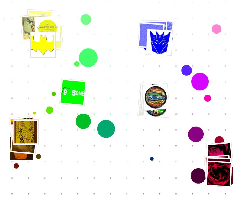
One of my personal favorite Etsy features is the Color Browser. The Color Browser presents me with a color grid; clicking a color displays thumbnail images of products matching that color, arrayed haphazardly around my chosen swatch. I can click into a thumbnail image for more detail, and I can drag images around the canvas to arrange them how I please—even throwing some off the canvas entirely. It’s a fun and effective way to explore the possibilities of the site if I’m starting with a color preference in mind.
Another Etsy experiment that I loved was the now-defunct Connections browser. This tool started by displaying an icon for a single Etsy user, surrounded by products that he or she likes. I could click on a product to see other users who like it, connected to the product by thin lines in a similar manner to Visual Thesaurus. Over several clicks, I would gradually build a web of interpersonal connections based on users’ favorite items. Why did Etsy ultimately remove the Connections browser? I don’t know for sure, but it may have been replaced by their newer experiment, the Taste Test, which displays recommendations based on items that you rate, Netflix-style. Perhaps Etsy discovered that users care less about browsing based on what other people like, and would rather browse according to their own specific preferences.
Etsy’s browsing tools feel excitingly responsive and somewhat futuristic. The animation and interactivity is rich, smooth and well-executed, seducing me into playing around with these tools until I’ve achieved a level of familiarity, and then I’m off and running. Crucially, the technological slickness is by no means the end of the story; these are genuinely useful features that solve specific problems and allow me to digest information in previously unimagined ways.
Etsy’s browsing tools do 3 things that strike a good balance between Advanced and Acceptable:
- Familiar visual metaphors: The visual metaphors involved relate well to things already in my experience. I know what it’s like to sort cards or photos on a messy table, so I have a good physical sense of what’s going on with the color browser; I’m not lost and clicking around randomly.
- Traditional fallback options: If I get stuck, there are other, more traditional options clearly and immediately available, such as the top search bar and filter options. These will catch my eye and provide another option before frustration sets in.
- Sensible scope: Etsy has wisely confined these novel features to an activity—browsing—which is less hurried and task-driven than most activities on the web. Putting something unexpected and novel into the Search process or the Checkout process could create needless, frustrating barriers; innovation in those areas needs to move forward at an even slower pace.
Break new ground—one step at a time
Raymond Loewy’s MAYA is inseparable from the aesthetic he popularized: streamlined forms that evoke speed and modernity. In Loewy’s time, these were fresh innovations.

Raymond Loewy, standing on speed and modernity.
Library of Congress
The prevalence of this style in product design today speaks to how successful MAYA is at describing the relationship between people and design. As seen with Apple, Etsy, and others, the successful use of MAYA rests on three key mandates:
- Push the boundaries of design and technology beyond your users’ expectations, but keep enough familiar patterns to let them orient themselves.
- Gradually advance your design over time, as technology and public sentiment evolve to support this advance.
- Make it sexy—where reasoned arguments fail, eye candy often succeeds. This applies both to the visual aesthetic, and the technology underneath it.
As a website creator, the impulse to innovate is healthy. And, as with most things, moderation is key. It’s tempting to shoot for something totally unique that nobody has ever seen before. However, it is our job as creators and designers to ground our ideas in enough of the familiar to be acceptable to our users at this moment. Without familiarity, your totally unique feature is doomed. Push the boundaries of the familiar, a little at a time, and your product will stand as a hallmark along the timeline of design advancement.
The homepage image for this article is credited to X-Ray Delta One


