Around 1993, my dad brought home a large, brick-shaped mobile phone. We were all incredibly excited by the new technology, even though none of us thought it would have a massive impact on our lives. I actually still thought of it as a gimmick, a few years later, when some of my friends decided to purchase them.
Today there are six-billion mobile subscribers in the world – meaning if there were one mobile per owner then 87% of the world’s population would have one. And considering that fewer than three billion people use a desktop computer, that’s quite a big difference.
Mobile devices are clearly here to stay, and along with them come a whole host of new constraints (and opportunities) for our designs. Let’s take a look at how we might update our approach.
How is mobile different?
The first thing we need to understand about mobile design is that it’s different – and not just with regards to size. The physicality and specifications of mobile devices impart different design affordances and requirements. Because mobile devices are lighter and more portable, we often find it more convenient to use them. Consequently, through this more regular use, we feel a unique, emotional connection to them.
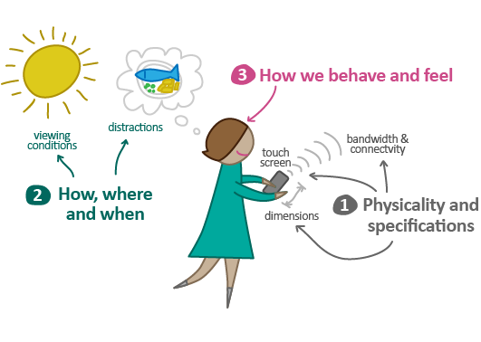
Physicality and specifications
Most mobile devices employ touch screens, where users rely on gestures – in addition to simple interface elements – to interact with them. Because of their smaller dimensions, we sometimes expect the content structures to be simpler and smaller. Also, because of their limited bandwidth and connectivity, mobile devices require designs to be optimized for loading time, with reduced data requirements.
How, where and when
Because we have constant access to our mobile devices, we tend to use them more frequently. They come with us on the bus, walking down the street, or watching TV. We often use them while “doing” something else. This means we may use the device under difficult viewing conditions, or among a variety of distractions.
How we behave and feel
Finally, we have different attitudes, behaviors and priorities while using mobile devices. As part of their Going Mobile 2012 study, User Experience Design agency Foolproof found that these devices have given us a new sense of freedom and control. In turn, some users feel a very real affection for their mobile device. Foolproof found that 63% of people felt lost if their smartphone was not in easy reach. They described their mobile devices as ‘alive’ … an extension of their own body and personality
Because mobile devices have fundamentally changed user expectations, it’s extremely important that we, as designers, follow a user-centered design process to arrive at our solutions. The only problem is that our traditional best practices may not always apply.
How mobile affects designers
Mobile’s differences directly impact all parts of the user-centred design process: from user research to the final development and testing of the solution. The biggest parts of the process it affects are our delivery methods and our information architecture.
Mobile delivery methods
Unlike traditional websites, there are four popular mobile delivery methods. Mobile users that choose to view content in their browser are best served with either a mobile-specific site – optimized for mobile devices – or a responsive site – which re-orients/arranges itself for mobile devices. Those who choose to install an application on their phone either receive a native app(lication) or a hybrid app. Native apps are self-contained: every screen of the application is defined up front. Hybrid apps offer a bit more flexibility, loading content from the web (as it’s viewed in a browser) but providing users with an “app-like” interface (or chrome).
Each delivery method has different pros and cons. Choose what’s right for you based on your project’s design context. (In the following table, higher star values are better)
| Consideration | Mobile | Responsive | Native | Hybrid | Comments |
| Tailored to user priorities | ★★★ | ★★ | ★★★ | ★★★ | A Mobile first approach can improve responsive design’s rating to three stars. |
| Content delivery | ★★ | ★★★ | ★★ | ★★★ | Responsive sites (and hybrid apps) are more easily indexed in search engines. |
| Functionality | ★★ | ★★ | ★★★ | ★★★ | Native apps provide access to device features (e.g. GPS, Camera), allowing more engaging experiences. |
| Compatibility | ★★ | ★★★ | ★ | ★ | Responsive design is easily viewed on any screen. Mobile sites and applications are dependant on the device for which they’re designed. |
| Development costs | ★★ | ★★★ | ★ | ★★ | Dependent on if you are developing a whole site from scratch. Responsive design incurs extra build time, but not as much mobile + conventional design. |
| Maintenance costs | ★★ | ★★★ | ★ | ★★ | Individual native apps require individual maintenance. However, responsive design results in a single site that needs to be maintained. |
Mobile Information Architecture
Mobile devices have their own set of Information Architecture patterns, too. While the structure of a responsive site may follow more “standard” patterns, native apps, for example, often employ navigational structures that are tab-based. Again, there’s no “right “way to architect a mobile site or application. Instead, let’s take a look at some of the most popular patterns: Hierarchy, Hub & spoke, Nested doll, Tabbed view, Bento box and Filtered view:
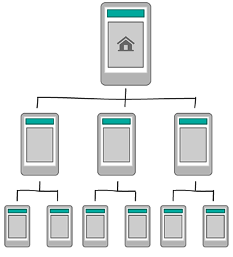
Hierarchy
The hierarchy pattern is a standard site structure with an index page and a series of sub pages. If you are designing a responsive site you may be restricted to this, however introducing additional patterns could allow you to tailor the experience for mobile.
Luke Wroblewski’s Mobile First approach helps us focus on the important stuff first: features and user journeys that will help us create great user experiences.
Good for
Organising complicated site structures that need to follow a desktop site’s structure.
Watch for
Navigation. Multi-faceted navigation structures can present a problem to people using small screens.
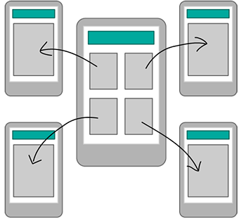
Hub & spoke
A hub and spoke pattern gives you a central index from which users will navigate out. It’s the default pattern on Apple’s iPhone. Users can’t navigate between spokes but must return to the hub, instead. This has historically been used on desktop where a workflow is restricted (generally due to technical restrictions such as a form or purchasing process) however this is becoming more prevalent within the mobile landscape due to users being focused on one task, as well as the form factor of the device, making a global navigation more difficult to use.
Good for
Multi-functional tools, each with a distinct internal navigation and purpose.
Watch for
Users that want to multi-task.
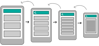
Nested doll
The nested doll pattern leads users in a linear fashion to more detailed content. When users are in difficult conditions this is a quick and easy method of navigation. It also gives the user a strong sense of where they are in the structure of the content due to the perception of moving forward and then back.
Good for
Apps or sites with singular or closely related topics. This can also be used as a sub section pattern inside other parent patterns, such as the standard hierarchy pattern or hub and spoke.
Watch for
Users won’t be able to quickly switch between sections so consider whether this will be suitable, rather than a barrier to exploring content.
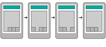
Tabbed view
This is a pattern that regular app users will be familiar with. It’s a collection of sections tied together by a toolbar menu. This allows the user to quickly scan and understand the complete functionality of the app when it’s first opened.
Good for
Tools based apps with a similar theme. Multi-tasking.
Watch for
Complexity. This pattern is best suited to very simple content structures.
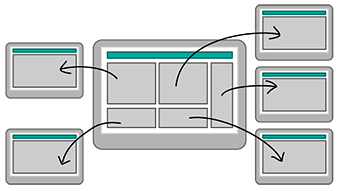
Bento Box/Dashboard
The bento box or dashboard pattern brings more detailed content directly to the index screen by using components to display portions of related tools or content. This pattern is more suited to tablet than mobile due to its complexity. It can be really powerful as it allows the user to comprehend key information at a glance, but does heavily rely on having a well-designed interface with information presented clearly.
Good for
Multi-functional tools and content-based tablet apps that have a similar theme.
Watch for
The tablet screen gives you more space to utilize this pattern well, however it becomes especially important to understand how a user will interact with and between each piece of content, to ensure that app is easy, efficient and enjoyable to use.
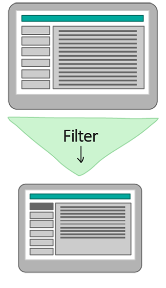
Filtered view
Finally, a filtered view pattern allows the user to navigate within a set of data by selecting filter options to create an alternative view. Filtering, as well as using faceted search methods, can be an excellent way to allow users to explore content in a way that suits them.
Good for
Apps or sites with large quantities of content, such as articles, images and videos. Can be a good basis for magazine style apps or sites, or as a sub pattern within another navigational pattern.
Watch for
Mobile. Filters and faceted search can be difficult to display on a smaller screen due to their complexity.
Next steps
It’s been almost two decades since I first saw that large brick shaped mobile phone, (and around twelve years since I bought my first mobile). Now me, my dad and almost everyone I know has a smart phone, where we regularly, and frequently, interact, communicate and manage our lives. Each year technology takes another leap, and with that, it’s clear we need to change along with it.
Developing a mobile and tablet friendly information architecture is just the first step in creating a great mobile experience. In Part 2 – Design Considerations I’ll explain how the differences in the mobile context will impact how you develop your final design solution.
This article’s lead image by FrozenStarRo.
Continue to Part 2: Visual design
Information architecture is an often misunderstood job title. Are they designers? developers? managers? All of the above? In this article we'll discuss what information architecture is, why it's related to usability, and what are the common tools/programs used in information architecture.