My first mobile phone, a Nokia 5110 (purchased in 1998!), offered very few features: I could call, text or play Snake. What’s more, these interactions were completely controlled by the manufacturer. With the advent of smartphones, touch screens, and “app stores,” however, the opportunities for designers are now innumerable. It’s incumbent upon us to familiarize ourselves with the conventions of this still-relatively-new medium.
Welcome to Designing for Mobile, Part 2: Interaction Design. Here’s some background in case you’re just joining us mid-series: Designing for Mobile, Part 1: Information Architecture demonstrated the key challenges designers face when designing for mobile, primarily the mobile context: from viewing conditions, to behavior and emotion. Because these differences impact the user, I explained that it’s important for us to consider them throughout our design process – from research and strategy to creating the final product.
Part 1 concluded with an exploration of information architecture in the mobile context. This provides a good foundation for the rest of the design process. Before jumping into aesthetics, though, it’s important to understand how mobile and tablet interactions differ when compared to their desktop counterparts.
The design of interactions
Most modern, mobile devices employ touch screens; which provide their own set of opportunities and constraints. We use them not only to view content, but also to interact with that content. This forces designers to consider ergonomics, gestures, transitions, and finally, mobile-specific interaction patterns.
Ergonomics
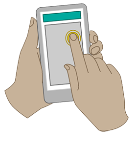
Designing for mobile ergonomics requires that we pay attention to device dimensions as well as the pragmatic concerns of touch screens. The way a user holds a device and touches the screen, for example, influences how easy it is for that user to reach parts of the screen.
Hit areas, or “areas of the screen the user touches to activate something” require adequate space for the user to accurately (and confidently) press. The average fingertip is between one to two centimeters wide, which roughly correlates to somewhere between 44px and 57px on a standard screen and 88px to 114px on a high-density (“retina”) screen. Nokia, Apple and Microsoft each recommend slightly different sizes to account for the nature of touchscreens.
Yet there are no hard and fast rules with regards to hit areas. Instead of looking to the various standards for an answer, simply consider what the user needs to achieve on the screen, how important that task is, and how quickly they need to complete it – then design accordingly.
Gestures
Each part of a touchscreen dedicated to functionality precludes the display of content in that area, making gestures a crucial component of mobile interaction design. All of the major touch operating systems employ them, including: Google’s Android, Apple’s iOS, and Microsoft’s Windows 8.
The table below provides a brief summary:
| Action | iOS | Android | Windows 8 |
|---|---|---|---|
Press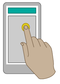 |
Selects primary action | Selects primary action | Selects primary action |
Long press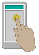 |
In editable text display magnified view for cursor positioning | Enter data selection mode | Show tooltip without selecting the item. |
Double press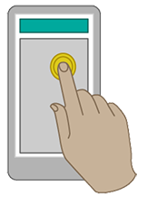 |
Zoom in or zoom out | Zoom in or zoom out. Also used for text selection | No standard |
Small swipe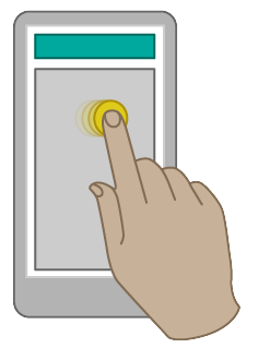 |
Reveal a delete button by sliding horizontally on a table view | No standard | Select objects in a list or grid by sliding perpendicular to panning direction |
Large swipe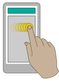 |
Scroll across content | Scroll across content or navigate between views within the same hierarchy | Scroll across content Also used for moving, drawing or writing |
Pinch / spread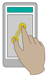
|
Zoom in or zoom out | Zoom in or zoom out | Zoom in or zoom out |
Additionally, standards and patterns have emerged for developing gestures on touch-based devices. Designers can – and often should – push the boundaries of gestures to suit their application.
Transitions
Transitions are interactions that smooth the boundaries between application states, helping to tell a story or (re)establish a gestural metaphor. More generally, transitions help facilitate recall and prevent users from getting lost.
Basic transitions include:
| Gesture | Transition | Description | General usage |
| Press | Quick change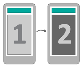
|
The view changes without any animation. | When changing between two different types of tool or content. |
|---|---|---|---|
Expand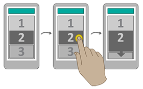
|
An item on the screen expands pushing content along or down | When expanding a list of content within a screen. | |
Flip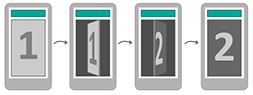
|
The view flips over as if turning around from back to forwards | When viewing a screen specifically related to the previous screen, e.g. additional settings or information. | |
Open to full screen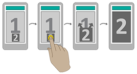
|
An item on the screen opens/expands to fill the full screen. | When opening or viewing an item. This transition can also be inverted to close an item. | |
| Swipe | Horizontal slide along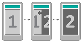
|
The view slides left or right, pushing the previous view out of the screen. | When moving forward to view new and related content, or back to a previous screen. |
Horizontal slide over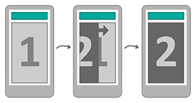
|
The view slides left or right, over the previous view | When viewing supporting or additional content. |
These are just a few; there are a whole host of transitions from which we might choose. The best choice is one that adds coherence to the interaction we’re facilitating.
Common patterns
As alluded to in part 1, mobile devices give designers less space to add menus and navigational cues than they might be used to on a desktop computer. Combined with environmental factors – such as poor viewing conditions and/or distractions – it’s often difficult for us to provide users with a good grasp of our content’s structure.
There are, however, a few common interaction patterns up to the challenge. Some of the most valuable include those used to improve navigation, select content, sign in/out, and negotiate forms.
Main navigation
Main (or “primary”) navigation is a visual manifestation of our website (or application)’s information architecture. Here are a few options to consider:
Starbucks responsive site with expanding menu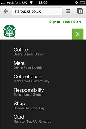
|
Expanding Menu Many mobile and responsive sites use an expanding menu to access the main navigation. A menu icon (generally a series of lines) is contained in the header. Tapping the icon shows a list of main menu items. |
Facebook app with side menu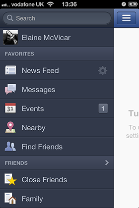
|
Side menu Some apps and also sites use a sliding side menu. As seen in the Facebook app. As with the expanding menu you will often press an icon with a series of lines or slide the screen over, this then expands or slides open the menu, showing a list of menu options vertically down the side of the screen. This can have categories as well as being scrollable. |
Amazon app with tabbed menu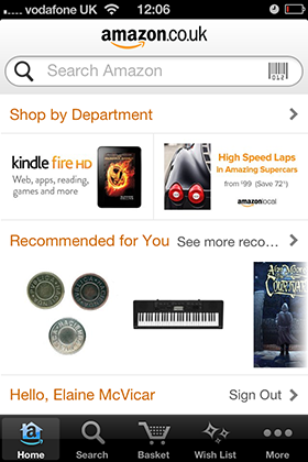
|
Tabbed menu This pattern corresponds with the previous article in this series. A persistent toolbar, displayed in either the header or footer of an app, allows user to quickly switch between sections. |
LinkedIn app with dashboard menu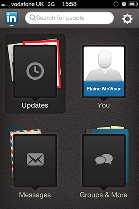
|
Hub and spoke menu This pattern corresponds with the previous article in this series. A centralized home screen allows the user to select a menu option. This will navigate the user to this section, which can have it’s own internal navigational pattern. The user may return to the home screen by activating a back link. |
Selecting content
Pressing links to activate content facilitates flow, making it easy for the user to quickly select content with one hand. If done well, this transition also increases user engagement.
BBC news app with forward navigation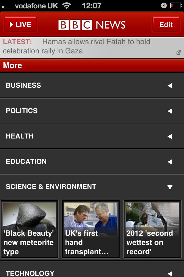
|
Press to move forward The user will flow forward through content, generally by selecting categories, sub categories then into content, and often moving forward to new related content. |
App store with coverflow carousel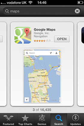
|
Coverflow The user can scroll across previews of content then select an item to navigate into it. This horizontal scrolling pattern is inherent to the Windows 8 ‘metro’ style apps. |
iOS maps peel back for further options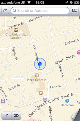
|
Flip over / Peel back To make it clear that you are exploring content or settings relating to the item you are already viewing, often a peel pack or flip over interaction will allow you to nicely access further details. |
Signing in
Entering a username, email and password is an essential process for some applications. As designers, we can ensure it’s as painless as possible.
Instagram
|
Auto sign in The user’s sign in details are stored within an app, and on initialization the user is logged in, and their data is shown. This is how many social network apps work, e.g. Facebook, Instagram and Twitter |
Gmail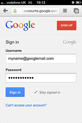
|
Remembering details As with desktop sites retaining user details, such as the email or username within a form can help speed up the sign in process. |
Paypal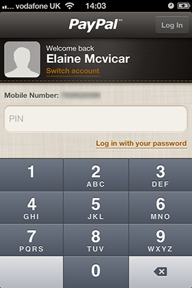
|
Pin codes Creating a quick way of logging in without requiring the user to enter the standard log in details can be really powerful. PayPal allows you to create a simple pin number, making signing in very quick and easy. |
Using forms
Filling out forms can be frustrating on a mobile device, especially if that form appears on a website designed for a desktop, yet lacking a mobile version. Facilitate the process by attending to the usual mobile design considerations, and consider these solutions to make using forms on a mobile even easier.
Amazon app allows you to access personal details and order history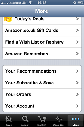
|
Save user details Using a login to save/recall user information saves time, reducing overhead and making using your website or application that much easier. |
Just Eat app provides an email focused keyboard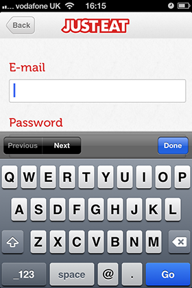
|
Providing the right keyboard One way to smooth out the form filling process is to ensure that the relevant keyboard is displayed when a user activates a form field. For example, if the user must enter a phone number, display the numerical keyboard. This can be achieved through the code. |
Topshop app purchase process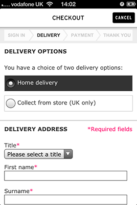
|
Progress bars Progress bars are a really excellent way of informing the user the length of a multi-step process on a desktop, but device dimensions make this a bit of a challenge on mobile and tablet devices. They can still be used however, but clever use of the available area will be required. |
Next steps
Standards and guidelines provide a place from which to innovate. When I played Snake on my Nokia 5110 I never imagined that I would someday have the opportunity to design and shape tools for mobile. Today’s solutions become tomorrow’s standards and guidelines.
Getting the interactions right on a mobile device is essential. But to create a truly wonderful experience the actual appearance of the website or application needs to inspires, charms and engages. In part 3, I’ll explore how the layout and visual design can support the information architecture and interactions to create a thoroughly engaging experience.