Users obtain information on the web in one of two ways: searching or browsing. Browsing – moving through a multi-faceted content structure – is made easier when information architects present users with an intuitive navigation hierarchy. This article discusses two techniques to that end.
There’s a great line in the Postal Service song, This Place is a Prison, that states, “It’s not a party if it happens every night.” Although the singer specifically refers to a life of too much partying, it’s a good reminder that anything that happens too regularly loses its significance.
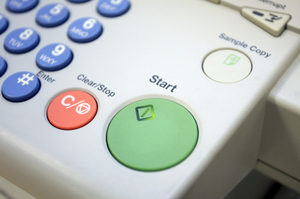
This same concept holds true in our navigation. As humans, our brains are wired to notice contrast, things that stand out from the norm. It’s why photocopiers employ big, green start buttons. It’s also the reason that the interface on my smartphone offers a collection of colorful icons instead of just text links.
When looking for Yelp on my iPhone, I’m not scanning for the word “Yelp;” I’m scanning for a red square. This is a much faster mental calculation than exhaustively reading each application’s name. It’s clear in both cases that the designers have put prioritization and visual language to work.
Defining our terms
Prioritization is the act of giving an element prominence relative to its importance in a (navigational) hierarchy. With regards to a navigational hierarchy, this is done by first considering each element’s relationship to its user’s goals.
Prioritization is the reason why items like “Settings” or “Profile” are typically less noticeable than the primary actions on a site or application. It can be communicated in a variety of ways, but essentially prioritization means that items of more importance should call more attention to themselves.

Harvest App prioritizes more regularly used links (Reports and Timesheets) over others (My Profile)
Visual language, on the other hand, involves using visual elements to convey meaning. Often times this is done through illustration or iconography, though any visual cue that reinforces the function of an element contributes to that application’s visual language.
By way of contrast, consider text-only navigation structures – especially those that use the same font size. Without introducing/incorporating a rich visual language, these structures don’t reach their fullest communication potential. Simple visual cues go a long way towards helping users parse information because they facilitate recognition over recall.

Some well-known sites and applications make use of the calendar icon.
Hobgoblins
Unfortunately, designers often do the exact opposite in their designs. In their desire for consistency they often force users to carefully scan each item until they find what they’re looking for. Emerson once termed this kind of foolish consistency “the hobgoblin of little minds.”
Let’s take a look at a few bad examples:
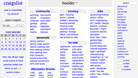
Craigslist
Craigslist offers both little prioritization and a non-existent visual language. Users are required to read nearly each entry on the home page before finding the link they’re looking for.
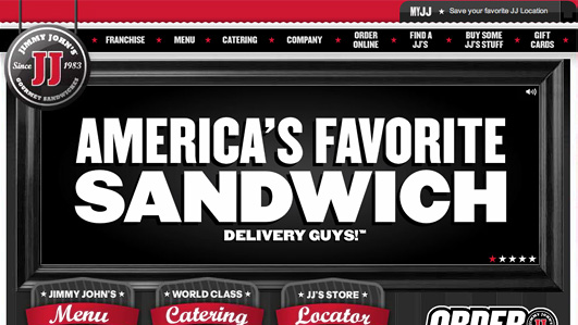
Jimmy John’s Website
Every time I order a sandwich on the Jimmy John’s website, I find myself carefully re-reading each navigation item. For the sake of consistency, every navigation item looks the same: red, black, and white. The sandwiches at Jimmy John’s are great; the navigation, less so.
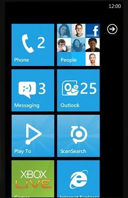
Microsoft Metro UI
One of my favorite recent violators is the Microsoft Metro UI. This has been out for some time in the Windows Phone interface and will be arriving soon on the desktop with Windows 8. By making the home screen tiles all the same color with white lettering and white icons, the user has to read each tile instead of responding to unique icons and colors. (John C. Dvorak recently wrote a great piece about this in PC Magazine.)
Rdio iPhone App
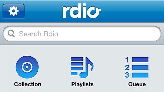
The Rdio iPhone App interface makes the same mistake as the Microsoft Metro UI. While they do incorporate iconography, the consistency of color and size of the icons forces the user to closely scan each item. In an otherwise beautiful and successful app, I find myself repeatedly scanning the home screen options to find my desired action.
Apple iTunes
In Apple’s iTunes 10 (as well as its Finder), the sidebar items were converted from color to grayscale. In bringing consistency, Apple removed the contrast between each entry, thus requiring users to scan more closely and read labels to find the desired content. Previously, if you were looking for podcasts, you scanned for the purple icon. Now you have to scan for the word “Podcasts” because the icons run together.
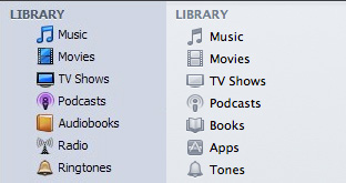
iTunes 9 appears on the left and iTunes 10 appears on the right.
Path Sliding Menu
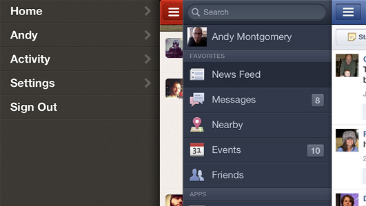
The Path iPhone app uses a similar sliding navigation to that found in Facebook app. There is one important difference, however, in that Path does not use icons with labels whereas Facebook does. Each time I open the Path navigation, I have to read each entry until I find the one I want. With Facebook, I’m reacting to the visual patterns and selection is much faster with less cognitive load.
Learning by example
So now that we’ve seen them, can we avoid these hobgoblins of consistency and create more effective navigation structures? Let’s look at some good examples:
Mint
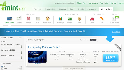
Mint has long been viewed as an exemplary user experience and they have some nice touches in areas that use highly visual navigation. The “Ways To Save” tab in particular relies on a thoughtful collection of icons for navigating.
ESPN
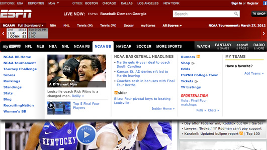
The ESPN site has a variety of different navigation styles throughout, but I find the hover state for the primary navigation items to be particularly effective with its combination of photos, videos, and various text weights.
Volkswagen of America
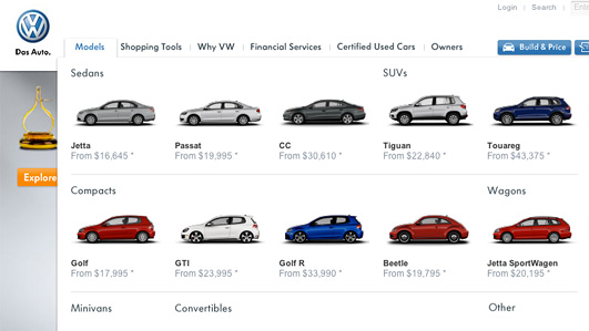
When browsing the vehicle model options on the Volkswagen of America website, the dropdown navigation menu combines prioritization – Sedans before Convertibles – with visual language – an iconic version of each vehicle in varying colors.
Twitter Web App
The Twitter web app has a very simple interface with only a handful of links, but each is accompanied by a distinct and meaningful icon to set it apart and the most important action, composing a new tweet, is set apart in bright blue.

Instagram iPhone app
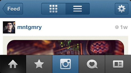
The buttons on the Instagram app effectively combine both prioritization and visual language. Each button is identified by its associated icon and the most important one (the camera) is centered and stands out with a blue background.
EPB Fiber Optics
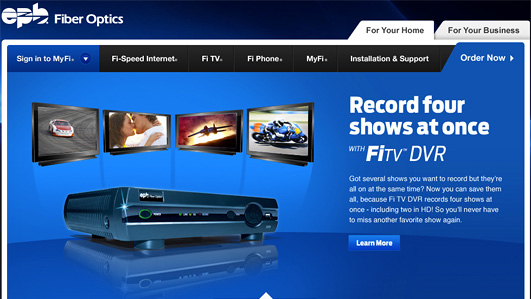
The EPB Fiber Optics website makes good use of varying levels of priority within the top level navigation. The primary navigation items are all in black with the most important option (“Order Now”) set off in blue.
Guidelines for success
We’ve seen examples both good and bad, now let’s try to generalize a bit. The following guidelines can help us create more prioritized, visual navigation schemes:
-
Pay attention to User Goals and/or Conversions
When trying to determine how to prioritize and bring meaning to your navigation, think in terms of your users’ primary goals and/or site conversions. Make those elements prominent and easy-to-understand.
-
Be Inconsistent
Take inspiration from the photocopier: instead of striving to give all navigation items the same size and appearance, leverage inconsistency in your design so that the most important items receive the most visibility.
-
Use Visual Language, not just Textual
Where it makes sense, use icons and other visual cues to bring additional meaning to your navigation instead of using only text. This will allow the user’s brain to process more quickly by relying on pattern recognition instead of reading.
-
Size (and Color) Matters
Use size and color distinctions to differentiate more important links or buttons.
Final thoughts
With so many aspects to consider when designing navigation, it can be easy to fall back on convention and create more work for your users as a consequence. While there will always be situations where using these techniques doesn’t make sense, keep in mind that differentiation can be a powerful tool.
Not all navigation is created equal. By employing prioritization and visual language in your navigational elements, you’ll help users forget the navigation altogether. They way they can focus on the content they’re really after.
Information architecture is an often misunderstood job title. Are they designers? developers? managers? All of the above? In this article we'll discuss what information architecture is, why it's related to usability, and what are the common tools/programs used in information architecture.