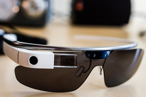
As wearable devices enter the mainstream, UX designers must develop ways to maximize those devices’ potential while acknowledging the new limitations they impose. That’s what the software team at ELEKS concluded after evaluating Google Glass – an experience that allowed them to abandon their expectations about head-mounted wearables, adapt user experiences to tiny screens, and forget about keyboards altogether.
For many UX designers, Google Glass evokes visions of an Iron Man-like interface with numerous controls and augmented reality features. Our team at ELEKS, too, fell victim to these assumptions. It was only after designing and developing multiple applications for Google Glass that we began to truly understand its distinctive features – and how to work within its limitations.
In particular, we came across numerous technical and contextual challenges that few in the UX space will have encountered before. As the market for Google Glass, and thus the market for compatible applications continues to expand, we feel it is of vital importance for UX designers to share their experiences creating applications for the device. It’s in this spirit that we’re sharing our own.

Photo Credit: lawrencegs via Compfight cc
Technological limitations
We began playing with Glass in August of 2013. Since then, our team of designers, analysts and engineers has worked on seven related projects, ranging from business concepts to fully operational applications. Most of the projects catered to unique usage scenarios and provided an application from which clients can benefit, either by opening new opportunities or by optimizing business processes.
First, we discovered that the predominant way to interact with Google Glass was via Mirror API, which showed text and pictures to the user and nothing more. As it turns out, there was a strong rationale behind using Mirror API – trying to perform any non-trivial computations, like video streaming, introduces three significant challenges: heat, battery life, and camera capability. We experienced all of them during our trials with Glass.
Heat
Upon performing certain computations, Glass heats up to levels that border on unbearable for users (50°C/122°F) after just a few minutes. We discovered the issue while testing an application we developed for warehouse workers, which enables the user to scan barcodes on the go and fill in delivery information with voice input. The heat became noticeable after the application’s launch and reached its peak while scanning the barcodes. Thankfully, we discovered a solution to the problem, which also improved the usability of our application.
To minimize overheating, we gave Glass time to cool down between each step in the scanning process. For example, we assumed that after scanning one bar code, a warehouse worker would move the scanned item before moving on to scan the next one, so we dimmed the application screen for several seconds (during which the user would merely see a dim square in the corner of Glass) before returning to the image preview mode, which precedes the snapping of a photograph.
Finding the compromise between heat levels and users’ patience will be a continuous challenge for UX teams designing for Glass. In our case, thinking through the flow of user actions (physical movements as well as thought processes), we managed to improve usability and beat the heat.
Battery
Heating issues aside, video streaming drains the battery so quickly that Glass can be out of commission in under an hour. As a result, having anything other than extremely brief video calls really isn’t really feasible. It’s likely for this reason that Google has chosen to temporarily drop video calls in Glass, but the battery life may cause other difficulties for designers. While there are workarounds – surgeons at the University of California, San Francisco are attaching battery packs to Glass for use in the OR – it’s a design constraint most UX teams simply have to accept.

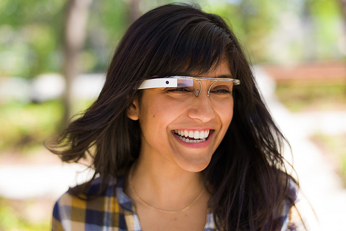
Photo Credit: Kasya Shahovskaya via Compfight cc
A glance at the apps available for Google Glass suggests that the device performs best in brief usage scenarios. Ongoing, highly interactive experiences aren’t really where Glass is strong. What can work for Glass are applications like DriveSafe, which monitors users’ eye movements while they drive and sends them alerts when they start dozing off at the wheel. The app’s behavior is mostly passive, as it’s running in the background, which conserves the batter life while maintaining the core facet of the experience—and providing a very valuable service.
Designers should think hard about why they’re designing apps for Google Glass and whether it’s the right platform for what they’re trying to achieve. The longer and more immersive the experience, the less likely it is to be appropriate for Glass.
Camera control
In the same warehouse application that revealed the heating issue, we faced another major problem – camera control. The Glass camera is far less flexible than most smartphone cameras, and in some cases it doesn’t capture enough detail to fulfill user needs.
When users attempted to scan barcodes with our Glass warehouse application, they had trouble scanning the very small ones. The issue: Glass’s camera focus is permanently set to infinity. Although we haven’t found a solution, per se, we were able to identify the barcode and QR code sizes that Google Glass can effectively scan and define those in our application. It works, but it limits the kinds of items warehouse workers can scan with Glass.
For now, as with the battery limitations, UX designers set on high quality images may find that Glass is not the right device. However, the infinity setting on Glass’s camera works nicely with certain apps. Consider the Moment Camera application, which automatically captures an image when the light, device steadiness, and subject position are most optimal for a quality photograph. Not only does it meet our brevity criteria for not draining the battery, but it helps users take maximum advantage of the camera’s infinity mode limitation.
It’s also worth noting that camera focus was recently accepted by the Google support team as an issue to address in upcoming releases.
Contextual challenges
Technological limitations aside, wearing Google Glass elicits mixed reactions from onlookers. For consumers, the device must provide significant value in exchange for the attention, positive and negative, that its users attract. Users need a compelling reason to put Glass on each morning, carry it around all day, and charge it at night. But on its own, all Google Glass offers is a camera and the ability to provide directions; the rest is up to us – the designers.
While the applications we create can be useful in a variety of contexts spanning the professional (think barcode scanning), practical (DriveSafe), and recreational realms, it’s important to remember that Glass should help users complete a specific task without getting in their way. Finishing that task is the user’s goal. Glass is simply the assistant.
Single-Minded Functionality
One of the biggest potential failures in designing for Glass is trying to emulate a mobile app, which results in packing too much functionality into a device intended for simplicity. Glass has different usage patterns from mobile, and simulating the mobile environment simply doesn’t work. Since Google Glass does not have a keyboard and the screen is relatively small – not to mention close to the user’s eyes – designers need to focus, and deliver information relevant to the user’s immediate context.
The ELEKS team realized this while developing another application: an adaptation of a huge parade management system. To understand how the system might work, we studied how parades are organized. The central elements is a float with a driver inside; there are people performing around the float; additionally, there are managers moving from one float to another to ensure everything is in order. All of these actions need to be synchronized up to a second in time and a centimeter in space. Typically, float drivers use tablets with a detail rich-UI and controls for speed, position, alignment with the schedule, and so on. Managers, likewise, have access to similar data indicating the status and position of floats.
In an effort to maintain consistency, we initially tried to mimic that functionality by displaying dozens of those indicators on Glass’s tiny screen. However, on-screen clutter became a serious issue, and we had to reconsider our vision for the app by delving deeper into the users’ needs. We learned that drivers looked for one piece of information at a time—so we switched to a notification-based approach, providing the drivers with a countdown timer for each specific action such as start, pause, or move as the parade unfolded and plans changed, in real time.
Notifications
The notification-based approach we used for the parade management system is an effective way to avoid displaying lots of information on Glass’s small screen, but we also learned that the notifications don’t always have to be visual. Glass can also provide auditory feedback by keeping one “headphone” constantly turned on. The audio is a native feature in Glass, specially designed to be less intrusive than visual notifications, which can be overwhelming on such a small screen.
Notifications are a perfect tool for leveraging contextual awareness through the Glass form factor. One great example of a context-aware notification-based app is the built-in directions app. When providing directions, the screen switches on just before a turn in order to provide navigation assistance. Another example is Google Now, from which Glass inherits its card-based notifications. Google Now effectively provides recommendations that are relevant to the user’s immediate context based on actions he or she performed before. Tourists, for example, can receive restaurant recommendations based on their previous trips, current location, and interests published in social media profiles.

Photo Credit: Radboud REshape & Innovation Center via Compfight cc
For UX designers, notifications in Glass are the fastest, most seamless way to get information to users. And since they mostly operate in the background, appearing only briefly, they help designers avoid Glass’s heat and battery issues too. Notifications are an effective tool, but UX designers should still be careful and not overuse them. There should always be a good reason to distract users from their “real life” activities.
Getting involved
Designing for Glass challenges design teams to overcome various technological limitations and unusual contextual scenarios. Keeping abreast of how the UX community is solving these problems can be a great way for designers to stay at the edge and understand the issues involved in Glass design. Some ways to do so include:
- Join the Official Glass Explorers Community or the Explorers and Developers groups on Google+
- Join a local Glass community group and engaging in live discussions with professionals who have worked with Glass
- View presentations on Glass design from community leaders like Design Sprint or Google Glass and #NoUI
- Read the book, Designing and Developing for Google Glass by Jason Sales and Allen Firstenberg; still in “raw and unedited” form, this book may very well be the first one written on the trials, tribulations, and joys of Glass design.
It’s a whole new world out there, with tiny screens and unexplored possibilities.
Ready to get your feet wet in Interaction Design? In this article we touch briefly on all aspects of Interaction Design: the deliverables, guiding principles, noted designers, their tools and more. Even if you're an interaction designer yourself, give the article a read and share your thoughts.