Mary skimmed the plumbing page of The Home Depot’s site, looking in vain for the faucet she would need to finish redoing her bathroom. The page offered a variety of pipes, valves, and water heaters, as well as a variety of how-to videos and related products, but nothing close to what she needed. At the bottom of the page, frustrated with her lack of success, Mary hit the footer, complete with a list of The Home Depot departments, and second on the list was “Bath.” Fat Footer to the rescue!
The Home Depot isn’t the only site to be using the fat footer these days. Large sites with complex navigation ranging from Disney to the White House are exploring this new method of hierarchy-agnostic navigation. Generally speaking, designers are using fat footers to expose hidden pages with high search-volume, or to function as a secondary navigation.
Although flat footers began to appear at the same time as flat design trends, it would appear these are more than just another trend. Fat footers are responsive, SEO friendly, and often very attractive to boot.
This week at UX Booth we’ve done our research, and we’re sharing a roundup of articles on flat footers: what they are, why they’re here, and how to use them for an improved user experience.
What, exactly, is a fat footer?
Fat Footer Design Pattern, UI Patterns
To kick us off, UI Patterns offers a straightforward definition of what fat footers are, and some of their uses, including where a fat footer might be just the solution a UI designer has been seeking. The key sentence in this article is: “By using Fat Footers, you provide the user with an easy and natural way of browsing to a new page and while staying on your website.”
Sounds like a perfect blend of user interest and business need.
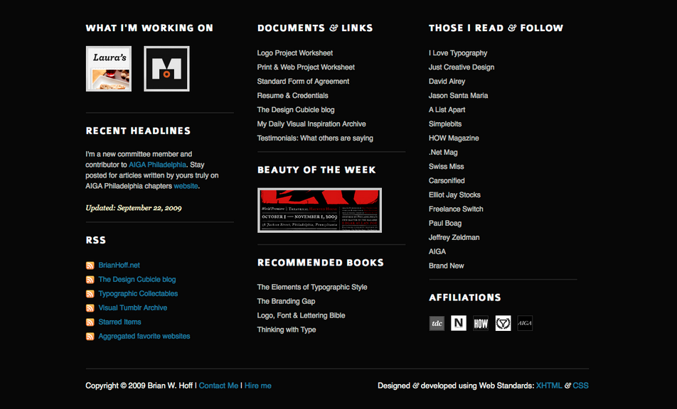
Big Fat Footer Web Design, Brian Hoff
If a picture is worth 1,000 words then this image, published on Zurb’s pattern library, is a dictionary. Brian Hoff illustrates an example of an attractive and useful fat footer, complete with an RSS feed, links to (presumably) important documents, and recommended books. The footer provides a few off-site links but focuses on the site itself, which allows the footer to act as a resource center without sending visitors away.
As an added benefit, in the site’s actual fat footer below the image, Zurb offers a second great example of footer content, including some useful links to their pattern library and design courses.

Copyright: Brian Hoff/Zurb
Why we love them
What’s a Fat Footer and Why is it Important?, Kim Krause Berg
Just about a year ago, Kim Krause Berg took a look at how far we’d come. In this article she quotes Jakob Nielsen’s 2010 condemnation of “obese footers” and notes how much better more recent usability has gotten, as we’ve moved away from footers merely stuffed with links. In particular, Berg calls out the value of having a place where users think to look for the static items on a site, such as newsletter signups, social links, and even payment information. The fat footer has become, over time, a functional space.
10 Best Intranets of 2015, Patty Caya, Kara Pernice, and Amy Schade
Five years after Nielsen called out the obese footers, the Neilsen Norman Group has published an article that pays special attention to fat footers, naming them one of the common feature trends among the best designed intranets for the coming year. Three of the ten winners sported fat footers on their intranet pages, and the footers are, to quote Caya Pernice and Schade, “an expected and obliging anchor on intranets.”
Fat Footers and Free Hugs, CBJ Digital Blog
Even if the whole team agrees that a fat footer would be useful, it can be difficult to know what to offer in the space. Though the final content decisions should come from user research and usability testing, CBJ Digital Blog offers a great starting place with their list of key elements of a fat footer. They divide up their recommendations, offering suggestions for a “traditional corporate footer,” as well as a “good fat footer,” and they end with an important warning not to “lay out such a feast on your buffet table, that everybody misses the most tasty morsels!”
Where they came from
Informative and Usable Footers in Web Design, Matt Cronin
It’s an oldie but a goodie, dating all the way back to 2009! This article from Smashing Magazine doesn’t mention fat footers, but it’s easy to see how fat footers got their start from a look at their recommendations, which include options such as adding a site map, information about the company, links, and even a full contact form. What’s more, the basic style suggestions hold true today. The article recommends making use of whitespace, and separating the footer visually from the rest of the page. We’re often reminded of how quickly the web changes, but it’s rare that we see how some basic elements of design stay the same.
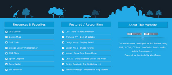
Fat Footers, the Long Tail of Your Website, Frank Sukyer
Continuing our little trip down memory lane, this article on Visual Swirl is originally from 2010, and Frank Sukyer’s analysis is perhaps less exhaustive than a more modern perspective might offer. That said, he pulls apart three pros and three cons to the fat footer, which was at that time starting to grow in popularity. One observation Sukyer adds to the fat footer discussion is the space for creativity that fat footers can provide.

Copyright: Frank Sukyer/Visual Swirl
When not to use them
Fat Footers—Should They Include a Sitemap, Ben Still
Not everyone is a fan of the fat footer. This article by Ben Still, published on the Redant site, takes a critical look at the trend and offers a variety of alternative solutions that might offer the same benefits with none of the potential negatives. For example, Still reminds readers that too many links in the footer can come across as spam to site crawlers. He also showcases usability testing proving that not all fat footers make sites more user friendly.
IBM’s Mega-menu Launch, Marty Gruhn
Two years ago, IBM launched their own fat footer with a mega-menu in it, and Marty Gruhn (along with Kenna Dian) of siteIQ were there to report on it in an installment of their series “Don’t Miss/Don’t Bother.” Their conclusion? Don’t bother. Although the article is largely a critique of IBM’s choices, including their link colors and font sizes, it’s a great case study of what not to do with a fat footer.
We also recommend this because it’s a highly amusing read. Without giving away any spoilers, we’ll just leave readers with this taste of Marty’s entertaining-yet-informative prose: “If you plan to follow in IBM.com’s footsteps it’s a good idea to settle on static F1’s or a design that allows users to manually step through multiple features on the page. Combine automatic features and moving navigation willy nilly and you’ll need to hand out air sick bags.”
Getting Started
A fat footer isn’t right for every site or for every company. While this roundup is a good starting point, the final decision is in the hands of thoughtful, driven UX designers in the field. Consider this checklist of questions when creating a footer:
- What does my user expect to see here?
- What is the next logical step in the user journey?
- What questions are my secondary or tertiary users still asking at the bottom of the site?
- How can I continue the experience beyond the content on this page?
Ready to get your feet wet in Interaction Design? In this article we touch briefly on all aspects of Interaction Design: the deliverables, guiding principles, noted designers, their tools and more. Even if you're an interaction designer yourself, give the article a read and share your thoughts.