Back in December 25th, 1997, I was lucky enough to upgrade from my beloved SEGA Megadrive to a Playstation One. During the next few months, I spent countless hours working my way through the best RPG of all time: Final Fantasy VII (FFVII). Nearly 20 years later, it has been released on the iPad, and I’ve rediscovered the game in a whole new light—and learned a little bit about user onboarding along the way.
For those not familiar with the game, FFVII follows Cloud Strife and his crew of rebels as they fight to save the planet from a tyrannical energy corporation, while also tracking down Cloud’s power-crazed nemesis, Sephiroth.
Around 44 hours into the iPad version, I love the game just as much as my ten-year-old self did. I have, however, found myself viewing the gaming experience from a different, more critical UX perspective.
The techniques we’ll review in this article are the ones that make FFVII immersive and empowering to the player. They can also be implemented in the world of web and mobile apps, where I have spent the majority of my career. Let’s take a look at some of those interactions, and how they’re being successfully implemented in the wild.

A Good First Impression
The game begins with a short video in which the player is introduced to the industrial metropolis of Midgar. The sequence travels through different sectors of the city, zooming in and out, ending with us meeting our protagonist as he exits a train. At this point gameplay begins.
This opening sequence is a great introduction to the game not only because it is visually and audibly captivating (FFVII is renown for its iconic soundtrack) but also because it is an effective way to give the user some initial context and a feel for the scale of what they are interacting with.
When designing an onboarding experience, it’s essential to make a good first impression. It is important for the user to feel comfortable and to comprehend what they are interacting with from the very beginning. If the user’s initial interaction with a product is boring, confusing or error prone, it’s unlikely that he or she will continue to use it.
It’s also important to remember that onboarding begins before users sign up. Whether the experience is on a website’s homepage, a marketing campaign, an online advert, or any other type of interaction, first impressions matter.
See It In Action
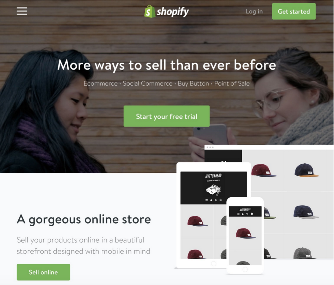
Do-it-yourself ecommerce platform Shopify designed a homepage that creates a great first impression with its stylish design, clear value proposition, and obvious call to action. The slick, simple design gives an air of professionalism, the value proposition, along with associated informative text makes it obvious to the user what the product provides, and the enticingly worded call to action buttons let the user know exactly where to start.
Interactive Tutorials
Back in Midgar, the protagonist exits the train, and the user is immediately involved in their first battle. Battles are the cornerstone of FFVII and are continuously encountered throughout the story. The objective is to destroy the enemy through a series of weapon attacks and magic.
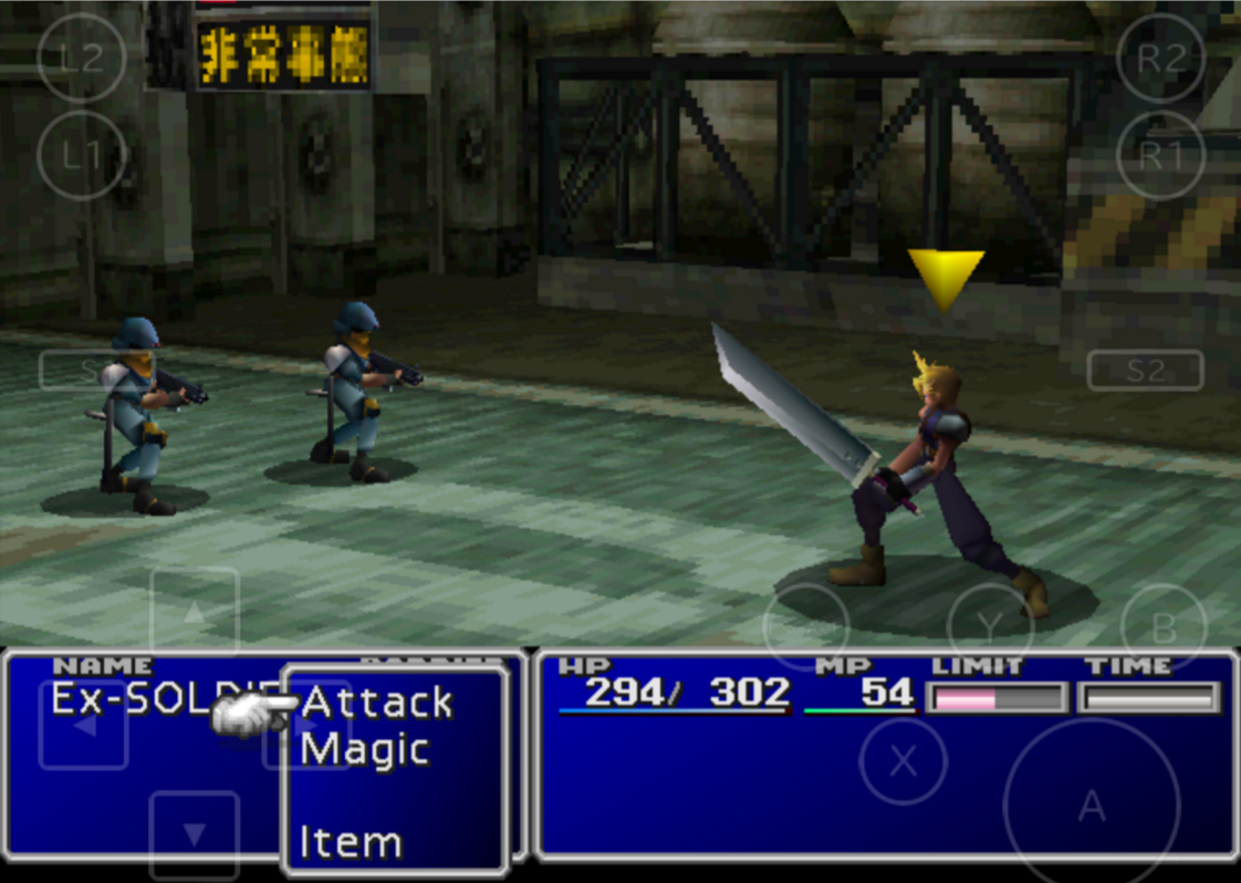
In the user’s first battle they are not given instructions; instead the game designers use the battle itself as the training method. With only a limited number of commands the user can make at this point, it’s intuitive enough for them to understand and to be able to educate themselves on how the battle sequence works.
This technique works well during onboarding. Educate the user via a “show, don’t tell” approach, giving them the opportunity to interact with a feature using actual content, instead of providing written instruction that are unlikely to read and can’t easily refer back to later.
See It In Action
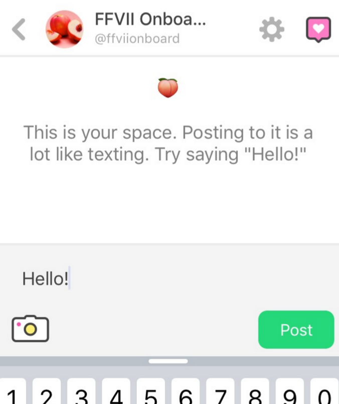
Peach—the new social network that has hit the news recently—uses interactive tutorials to educate users about the app’s features. After completing the signup process, the user is instructed to post their first “Hello!”. Following this there are a sequence of steps where the user learns to upload photos, draw, and post gifs. Giving the user the opportunity to take actions immediately increases the likelihood of him or her remembering how to do those actions in the future.
Immediate Accomplishment and Tracking
After their first battle, the player is presented with a screen that displays three things: their experience points (EXP) and ability points (AP) gained from the encounter, and an explanation of those these points will affect each character’s progress.

For example, characters can “LEVEL UP” when they accumulate enough EXP from battles. The game designers have cleverly set the player character’s initial EXP so that they first level up as soon as the player completes the initial battle. This gives the player an immediate sense of accomplishment, while simultaneously educating them about the EXP system.
This is a common technique in application onboarding. Giving the user a sense of immediate accomplishment will encourage them to complete the initial steps, and also encourages continued use of the product. Furthermore, showing the user how far through a process they are will increase the likelihood of them completing it.
See It In Action
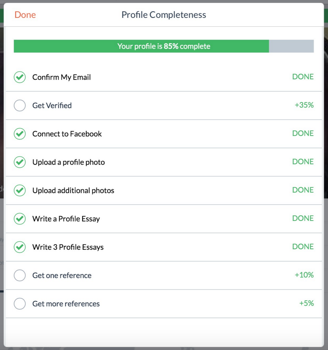
Couchsurfing is a service that allows travellers and hosts to connect in order to arrange free accommodation for globe trotters on a budget. Couchsurfing’s onboarding process provides a great example of combining immediate accomplishment with tracking. After signup, the user is presented with a “Profile Completeness” dialogue describing what tasks they must complete and how this will affect their progress.
During the signup process, the user must confirm their email address. This in turn means every new user will have the first item already checked when they initially see the Profile Completeness dialogue, and can see they are already 10% of the way through the process—a very positive message to kick off their relationship with the app.
Timely Data Capture
Soon after the initial battle, the protagonist (who up until now has been referred to as “Ex-SOLDIER”) is asked for his name, at which point the user is able to input a custom value.

The game designers could have allowed the user to customize the name of player character at the very beginning of the game, but instead chose a much more suitable, and more importantly contextual time—after the user has been introduced to the gameplay and the character.
When collecting information from a user it is important to do so at a time that will feel natural to the user. It needs to be within a context that makes logical sense, rather than front-loading information for the sake of perceived efficiency. From the user’s perspective, the initial sign up becomes highly simplified by doing no more than delaying data capture until later in the process.
See It In Action
When creating an account with real-time messaging service Slack, the first step is to input an email address. Traditionally at this point the user would also be asked to supply a password, however Slack delays this data capture in order to streamline the signup process. The interface even informs the user of this, stating: “Don’t worry about setting a password right now, we’ll email you a link to create one.”
Smart Defaults
You’ll notice when naming the protagonist that the input field has already been pre-filled with a value (see below)—his true name is Cloud. Having this default set speeds up the input process if the player doesn’t care about changing the character’s name.
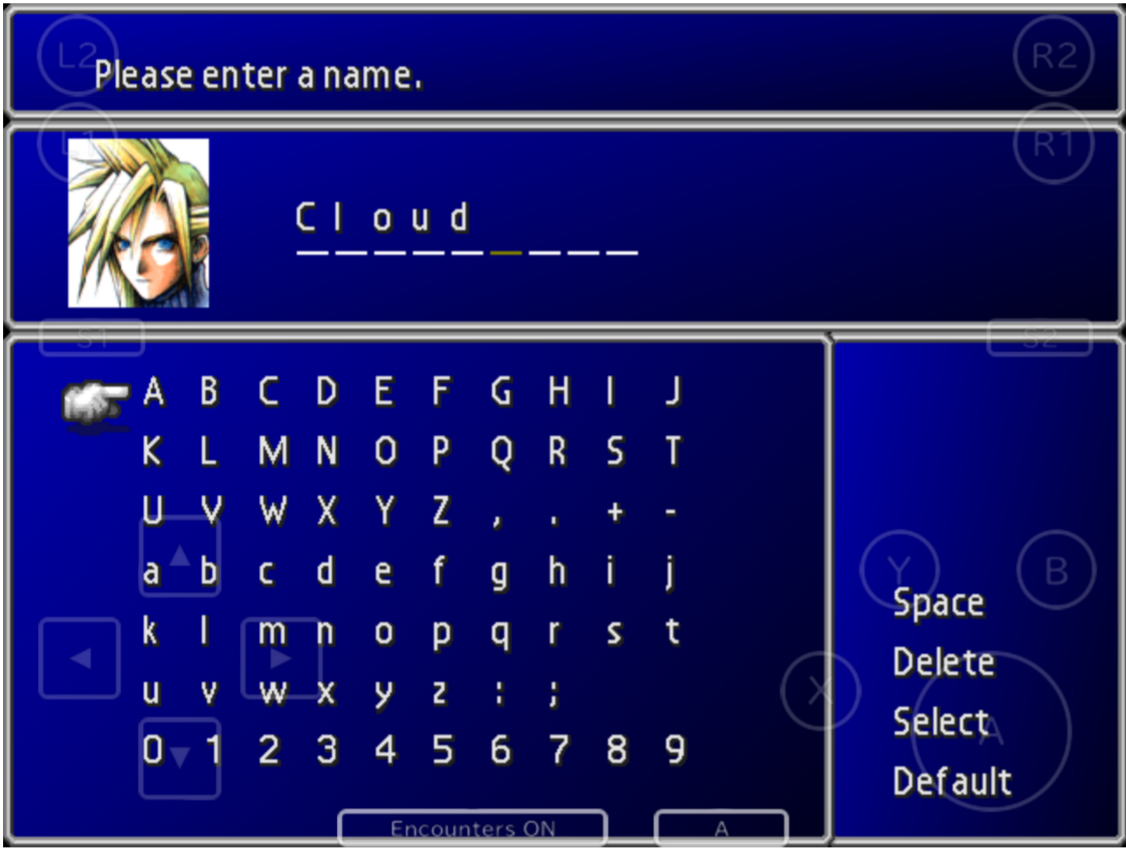
This technique can be applied during most onboarding processes to reduce the amount of data a user needs to input. It’s important to ensure the input is defaulted to the most common value, and that a default is only provided if the value is input more often than it isn’t.
It’s also essential that the user can easily reject a default and replace it with their own data. In the character naming example above, the user must navigate to the “Delete” option on the far right on the screen and click it 5 times before being able to input a custom name; this is one example where we can learn from a FFVII onboarding mistake.
See It In Action
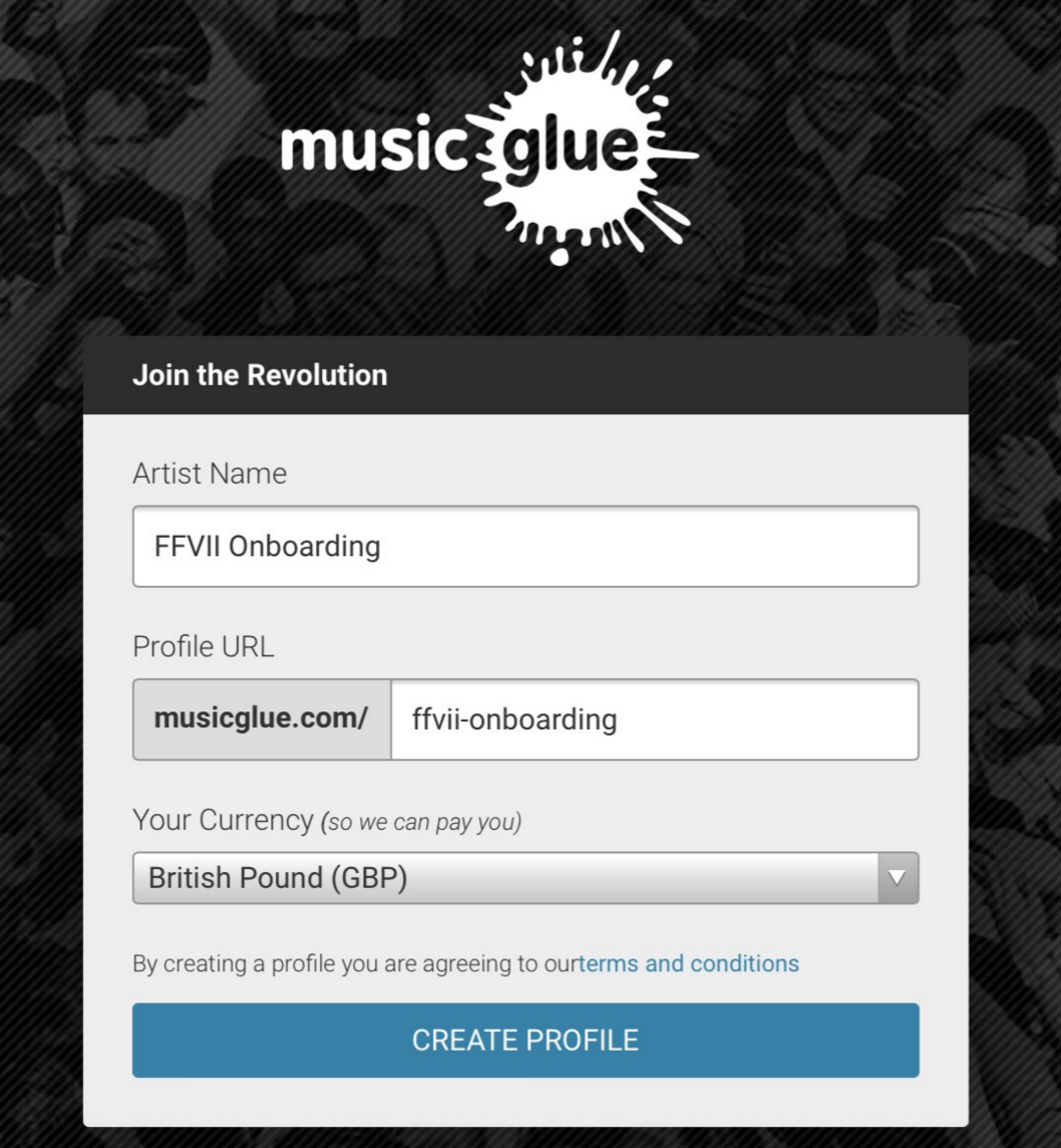
Music Glue, a music industry focused ecommerce platform, makes use of smart defaults in their artist registration form. Firstly, the Profile URL input is dynamically filled with a URL-friendly version of the Artist Name as the user enters this information. Secondly, the Currency drop down is set by detecting the user’s location and selecting the corresponding currency. This makes the signup process extremely simple for the majority of users, as they only need to input a single value in order to provide all three required pieces of information. (Disclaimer: I was part of the design team who created this form, so one could argue my praise is biased.)
Next Steps
Always be sure to give the design of an onboarding process the adequate time and effort it deserves in order to ensure a user’s first interaction with a product is a great one. Experiment using the techniques listed in this article and also explore the many resources available online surrounding this topic.
For readers interested in exploring more on this topic, be sure to check out Sam Hulik’s User Onboard website, a collection of case studies for a wide variety of services. Here, Sam deconstructs the onboarding experience of popular apps such as Twitter, Netflix and Apple Music, accompanied by insightful, witty narration. You can also find an even larger accumulation of onboarding flows for numerous services over at UX Archive.
Thanks for reading, and I hope you have found this article useful. For readers familiar with the game, I would to take this opportunity to leave you with a snapshot of my beautiful gold chocobo—Wark!!

Ready to get your feet wet in Interaction Design? In this article we touch briefly on all aspects of Interaction Design: the deliverables, guiding principles, noted designers, their tools and more. Even if you're an interaction designer yourself, give the article a read and share your thoughts.