The future is now. Market-analysis firm IDC predicts that sales of tablet computers will exceed their desktop counterparts this year, which means that those of us not designing with touchscreens in mind are falling behind. Fortunately, it’s not too late. By addressing some key areas of our site, the team at Cars.com has improved the mobile experience of our site in a short amount of time during our ongoing redesign.
It’s no secret that responsive design helps us develop a single site to serve smartphones, tablets, and desktop displays equally well. But the thinking that goes into a good responsive design? That takes time. How might designers go about making a site tablet-friendly right away?
This is exactly the problem we currently face at Cars.com. While my team is busy considering all of the elements that make up our site (content first, kids!) and how they might be handled in a responsive manner, we’ve wanted to make some quick changes that might immediately impact visitors.
People visit Cars.com to find vehicles for sale, read editorial content, and browse consumer reviews. With these things in mind, we’ve prioritized our short-term changes by focusing on three, key areas: content, layout, and forms.
Content
As Elaine McVicar recently reminded us: when it comes to touchscreen interfaces, content is navigation. This has serious implications for Cars.com – specifically, our photo galleries and content-promoting carousels. Fortunately, mobile luminary Brad Frost has a fantastic article weighing in on this particular element.
Our takeaways? We need to make sure our carousels are swipeable, as swipe gestures allow touch-based users to more-intuitively move through the panels. Next, when it comes to galleries with thumbnail strips, we need to ensure people can swipe through thumbnails. We can’t – or, rather, shouldn’t – exclusively rely on previous and next arrows.
The examples below show what a difference these considerations can make:

The main content carousel on the BBC homepage does not recognize swipe gestures. You have to tap the right or left arrows to navigate through the content or let it play like a slideshow.

The carousel on the Cars.com homepage has a much larger area for tablet users to interact with than the one on the BBC homepage.
While accounting for large swaths of our content (and navigation), we found that we also needed to pay attention to the way in which that content presents itself. This meant considering layout.
Layout
Fingers are horribly inaccurate as pointing devices. As a consequence, Apple, Google, and Microsoft all provide guidelines for the proper sizing of tap targets. But because pixel and point sizes are variable (a topic beyond the scope of this article), Steven Hoober suggests that physical sizes be used when thinking about mobile layout.
The team at Cars.com has taken this to heart – I personally decided to keep a ruler at my desk. This allows me to measure distances right on the glass and, aside from testing with real people, provides a great way to get a feel for whether tap targets are too small or too close to one another.
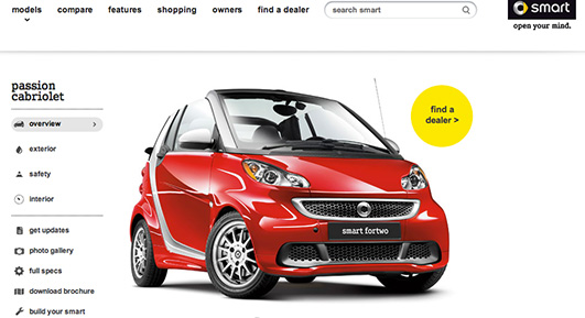
Compare the left-hand navigation in the examples below from Macy’s and smart. Which would you rather use?

Macy’s faceted browsing has tap targets that are too small and too close together for tablet users to navigate easily without first zooming in. This is common in eCommerce websites in which the design predates the proliferation of tablets.

smart’s navigation design includes larger tap targets and better spacing between the targets.
Having considered both content and layout, in general, we figured: what’s next?
Forms. That’s what.
Forms
Forms do the “heavy lifting” on Cars.com. They’re one of the main ways users tell us what they want. And let’s face it: while forms can be difficult to use on desktop computers, they pose an even bigger problem on mobile devices with their small, virtual keyboards.
When it comes to forms on mobile, otherwise simple changes can go a long way towards improving usability. Luke Wroblewski’s best practices ring true:
- Use the fewest number of form fields necessary to achieve your business goal.
- Reduce the number of fields that require typing. If there is another way to get the information other than the keyboard, use it. I call this mindset “more tap, less type”.
- Use native device capabilities. The GPS, compass, accelerometer, camera, address book, and native social networking apps can all provide data so people don’t have to enter it manually.
- Let people type whatever they want. Allow people to enter values like phone numbers with various special characters even if you’re just going strip them out afterward.
- Whenever possible, retain form contents in error states. Don’t make people retype their whole email address on a virtual keyboard because they forgot the period.
Simply by redesigning our forms against these guidelines, we increased their overall utility. What’s more, redesigning our forms also gave us a chance to reconsider our form aesthetics.
Layout
As with our content, the larger our forms’ inputs, the easier they are to navigate. Increasing the padding around form elements as well as making some of them taller and wider makes them more navigable.
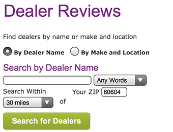
Compare the previous version:

Form elements are too close for comfort on an older version of the Cars.com dealer locator form.
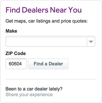
To the new version:

The redesigned form increases the size of the form fields and adds more spacing between elements. This reduces people’s likelihood of tapping the wrong element.
Notice the difference? Next, we use a different background or border color to indicate focus. This isn’t groundbreaking, of course, but it does provides a visual confirmation that the characters a person types will appear in the correct place – and differences like this add up.
What’s more, the CSS required to do this is super simple:
input:focus {
  background-color: #ffffe0;
  border: 1px solid #f00;
}
Finally, we looked at context-specific keyboards.
Get specific
Context-specific keyboards offer users a subset of the traditional keyboard layout to encourage completion of a specific task. For example, a “number” keyboard provides number keys (as well as commas, periods, and dollar signs) to users rather than the traditional QWERTY keyboard.
HTML5 provides an easy way to trigger the display of context-specific keyboards using the “type” attribute. Specifically:
<input type=”email” />triggers a keyboard with the @ symbol and a period.<input type=”number” />triggers the keyboard with numeric digits plus characters like the dollar sign, comma, and period.<input type=”url” />triggers the keyboard with characters needed to type a URL, including a “.com” button on iOS and some Android devices.
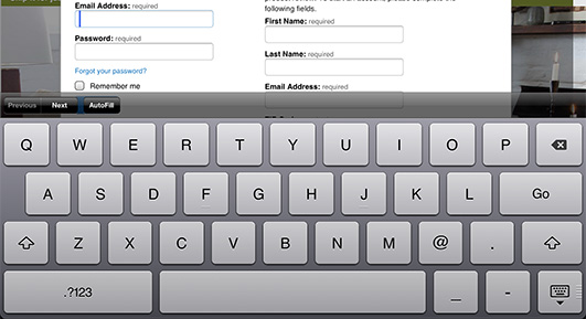
Notice how Crate and Barrel utilizes <input type=”email” /> on their sign-in screen. When entering an email address, people are presented with an “@” key and a period key:

Crate and Barrel’s create an account screen gives people all the characters they need to type an email address on one keyboard.
We decided to make heavy use of <input type=”number” /> on Cars.com since many of our tools use ZIP code to determine the person’s general geographic location. Without utilizing this input type, people would be forced to manually switch back and forth between different keyboard layouts – alphabetical and numeric. That’s a lot of unnecessary interaction.
Oh, and one more thing: there is no negative impact to using these input types. Because older desktop browsers that don’t understand them, they default to “type=text”. Newer mobile browsers will display a more user-friendly keyboard and older desktop browsers will be unaffected.
Getting started
Improving the three, key areas of Cars.com highlighted in this article has provided our mobile-based users with a dramatically better user experience, all while affording our design and development teams more time to think through our responsive redesign.
The team at Cars.com now thinks about tablet users for every design change we make on the “traditional” site, helping to achieve a vision that’s more usable across devices. Hopefully, following a similar approach increases your team’s sensitivity to (and awareness of) the design considerations specific to touch and gesture-based interactions.