Design has a reputation for being one of the more ambiguous areas of product development. I don’t know how many times I’ve heard clients say: “first we’ll get the application functionally correct and then we’ll put a skin on top of it.” This gets my blood boiling.
As Whitney Hess stated earlier this year: UX Design isn’t just “a step in the process.” Users themselves experience much more than just the look and feel of an application. By the time the aforementioned client addresses their application’s aesthetics, many decisions will have been made that have affects the user experience of a project.
Therefore, I engage clients as early as possible in the course of their application’s development, preferably before any code has been written. As a consultant first and a designer second, I work hand-in-hand with my clients—because building a website isn’t easy. I know this because I build websites for a living. With that in mind, empathize with your client: all they want is an application that does “what it says on the box” from day one. This is the reason why functionality is so important to them.
But as interaction designers, we know that the ideas behind the design are much more important than the depth of a dropshadow or the size of the copy. Jeffrey Zeldman addressed these kinds of concerns in his latest presentation at An Event Apart Chicago: A Site Redesign. The ease-of-use and learnability of our application must supersede the vacillating predilections of entrepreneurs (unless, of course, those selfsame entrepreneurs are the application’s target demographic). In other words: our designs should help real people do real stuff.
Enter design strategy
After reading books on information architecture, interaction design, and project management, I couldn’t find a consolidated tool to focus my design process. So I created one. The method I’m sharing here has worked for me over the past couple of months, but it’s certainly an evolving one. Like any other UX tool, this document is only as valuable as the ongoing processes it drives.
Think of a Design Strategy document as a a design blueprint outlining the operating assumptions and intentions of the project team: why are we doing what we’re doing? who will use our application? what are their goals? what interactions (and underlying functionality) do we believe is necessary to facilitate those goals?
Keep in mind that this document is based on assumptions. In order for a design strategy document to truly facilitate a user-centered design process, those assumptions must be validated and informed by user research.
Stakeholder interviews
All design processes begin with stakeholder interviews, whether informal or not. After all, it’s their baby you’re creating. All you need is a conference room, your client(s) (preferably in person), and a dry-erase board. Make sure that you bring an information architect, interaction designer, or some other “systems thinker” to the meeting. Next, simply ask clients basic questions about their website or application.
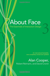
To facilitate conversation, take a cue from Alan Cooper’s “About Face 3.” Namely, think of the interface as magic. When you’re brainstorming solutions to a problem, don’t get specific. Just assume that an interface that will make something happen exists.
In other words: don’t focus on implementation details. Don’t talk to your client about HTML5 or how you’ll use a modal box to do something. They likely don’t think in these terms (just yet). Instead, ask “what people are going to do with the system?”
Identify “working” personas
Although guesses will be rough without proper user research, ask your client to describe who will use their application. Do they know? Have they talked to them yet? Based their responses and audience segments you may have used or seen in previous applications, segment your users based on current behaviors, not demographics. Sometimes you’ll end up with one group. More likely, though, you’ll end up with two or three. Create a table for each of these user types in your document
Don’t share your groups just yet. Once you believe you’ve sussed out what kind of users this application will target, ask leading questions about these user groups: how will this application behave differently based on which kind of user is using it? Will one type of user (an administrative user) see a different interface than another type of user? Make sure that your ideas about the kinds of users of an application match up with your clients’ ideas.
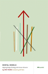
When you think you’re on to something, share. Odds are you’ve identified the audience segments that your client is approaching in a broad way. If, however, either you or your client can’t identify user archetypes, you’ll need to hit the pause button on the project and conduct more thorough user research. I recommend following along with Indi Young in her book Mental Models, where she gives practical advice on how to really nail down who will use an application and how they will conceptually approach it.
Identify use cases
Once there is agreement on who will use the application, it’s time to figure out what these users are going to be doing. Inside of each persona’s table, create rows enumerating the overarching goals that they are trying to accomplish. Stick to as few “major” goals as possible. Each user only has a couple of things that motivate their interactions with your system.
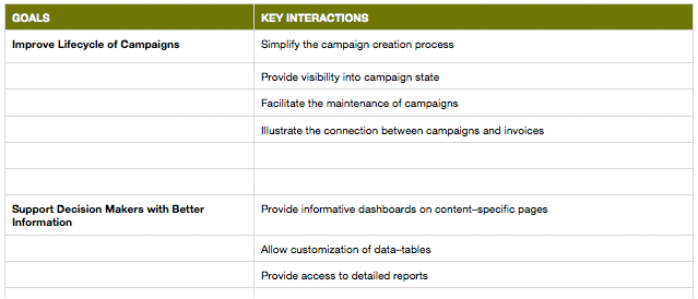
A table helps you parse the major goals that your application will accomplish for each of its user groups. On the right, we list the interactions that will be required.
Invariably your stakeholder will list things like “feel good”, or “make money.” Cooper refers to these broad objectives as “life goals.” That’s okay at this point. If it’s believed that a persona will hav this goal in mind, make sure it’s captured here.
Identify interactions to design
Next we go from abstract to concrete, in essence, laying the blueprint for interaction design. In order to accomplish the goals that users have, they will need to take part in a number of high-level interactions—jot these down. Next to each goal that a user group has, specify the interactions that users will have take part in to drive them closer to that goal. Don’t worry if you repeat some; sometimes users do the same things for different reasons.
At this level, what you’re really defining are use cases. Wise Sage Wikipedia sayeth:
A use case in software engineering and systems engineering is a description of a system’s behavior as it responds to a request that originates from outside of that system. In other words, a use case describes “who” can do “what” with the system in question. The use case technique is used to capture a system’s behavioral requirements by detailing scenario-driven threads through the functional requirements.
Optionally, you may choose to create a separate spreadsheet orf each user group that to elaborates on that group’s use-cases. This can be especially useful if the information/system architecture of the application is complicated. If users have to “trek across” their portion of the system (for example, say that have to take part in a multi-step process) to get something done, elaborating how a user gets from “a to b” can really clarify how the system should function as a whole.
Final words
So there you have it. After 2-4 days worth of stakeholder interviews, what do you have to show for it? Our design strategy document is a patchwork of different thoughts, providing insight for a variety of different roles:
- Team members can see the application’s presumed user groups, perhaps doing research to validate underlying assumptions.
- Interaction designers, information architects, etc. can begin wireframing the major interactions in the system to get an idea of what kinds of UIs will facilitate the desired interactions.
- Stakeholders & project managers can get a high-level view of what the application does and what interactions will need to be built to make that happen.
In addition to jumpstarting the roles of your colleagues, a design strategy document brings structure to your design process. Done correctly, it manifests a a unified thought process across your projects’ handoff points.
Each interaction that your designers are called upon to create can be shown to directly drive a user towards a valuable goal—something that can’t be said for the broad goals themselves. Said another way, we can’t say that an application makes people “feel more social,” but we can say that, as a collection, a group of interactions drives a user towards that sensation.
Design strategy helps remove the “fog” clouding the path towards user goals. And as farfetched as it might seem, sometimes a spreadsheet of goals and interactions is the most effective thing we can do to prove the value of design.
