When a new milkshake bar opened in my local shopping mall, I was very excited; I went right over and ordered my favourite flavour (coconut, of course). The cashier responded “Would you like a regular size?” and I agreed. I paid what I considered a high price for a medium-sized milkshake and, as I left, I noticed the sizes available weren’t “Small, Regular, and Large” (as I might have expected), but rather “Tiny, Small and Regular.” Realizing I was duped, I lost my incentive to return.
Unsurprisingly, the milkshake bar isn’t there anymore.
It’s been a tough time for businesses lately. The global economic downturn has led many consumers to tighten their belts and part with their cash more selectively. This has naturally driven companies to focus on maximising profits wherever possible in order to provide a strong return on their investment. That’s all well and good, of course, but sometimes the hunger for short-term results can happen at the expense of other “non critical” factors – as was the case in the story of the milkshake bar, above.
This conundrum has led me, a self-described user experience geek (UXG), to more closely examine the relationship between user and business objectives. Specifically, I sought answers to the following questions:
Is poor customer experience a necessary evil in order to meet business objectives?
What is the optimal way to design products or experiences that deliver a return on investment in both the short term and the long-term?
If I could find them, the answers to these questions could help businesses better rationalize the difficult choices they’d make during the recession. What follows is my journey. We’ll begin by observing a positive version of the “milkshake bar” experience. Next, we’ll discover how deceptive approaches translate to on the web. We’ll finish with a review of the habits of highly effective user centered designers – habits which are always applicable, recession or otherwise.
A favorable interchange
On any given Thursday you’ll find me at my local McDonalds. There, you might observe the following exchange:
Me: Hi, I’d like a Big Mac please.
My buddy at McDonald’s: Would you like to make that a meal?
Me: Yeah, sure.
My buddy at McDonald’s: Would you like to make that a large meal?
Me: No, thanks.
In this scenario, the short-term business objective is to sell a meal and my interaction with the sales clerk meets that objective. The experience is also good for me as a customer, because I get exactly what I ask for. The McDonald’s salesman first understands my needs and then offers a relevant upsell. When I reject the large meal (a higher short-term objective for McDonald’s), the salesman moves on, ensuring that I meet their long-term objective by returning as a customer (side effects may include high cholesterol). This straightforward, contextual approach – a combination of easy-to-understand terminology and relevant propositions – is a sustainable way to attract returning customers and build a reputable brand.
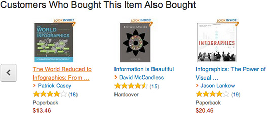
And the same logic applies to our websites. Amazon.com does a great job, for example, of offering two, relevant upsell opportunities.

I might not take the bait, but the option is both relevant and easy-to-understand.
So, is a poor customer experience a necessary evil in order to meet business objectives? No. Companies such as McDonald’s and Amazon prove that by valuing customer service and user goals over sales, companies are actually able to more successfully achieve their own goals (assuming those goals include retaining customers).
Dark patterns
In extreme cases, some companies completely disregard the user experience in favour of meeting business objectives. UX designer Harry Brignull calls these interactions “dark patterns.” From his site: “A dark pattern is a type of user interface that has been carefully crafted to trick users into doing things, such as buying insurance with their purchase or signing up for recurring bills.” So why are dark patterns used? Simple: they get short-term results. Over the long-term, however, users feel deceived, cheated and tricked – and they’re not afraid to share these opinions online!
Celebrated author Tim Seidell suggests that “For every action, there’s an equal and opposite reaction. Plus a social media overreaction.” And Twifficiency is a great example of this. Launched in 2010, the app “went viral” in a matter of days due to its accidental use of a dark pattern in which users automatically shared the app to all of their Twitter followers. The early growth was short-lived, however, as it was soon overshadowed by the exponential amount of negative attention it received.
Prioritizing appropriately
Given the connection between positive user experiences and long-term business objectives, why doesn’t every designer put user goals ahead of business goals? Because, as management guru Peter Drucker explains, “what gets measured gets managed.” In other words, some companies believe it is easier to track short-term sales than long-term customer retention.
When companies focus on driving short-term revenue and increasing short-term profit, the emphasis is on improving conversion rates or profit per visitor rather than helping users achieve their goals. The happy medium falls into what author Stephen R. Covey calls “Quadrant 2.” In his legendary book 7 Habits of Highly Effective People, Covey explains that Quadrant 2 contains tasks that are important but not urgent, whereas tasks that are both important and urgent are considered “quadrant 1. ” These lead to a business that’s constantly “fire fighting.”
Four business postures
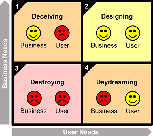
Adapting quadrant 2 from Covey’s model maps business goals and user goals across two axes.

In Quadrant 1 a company focuses only on the urgent, short-term business goals, but not the important, long-term user needs. They might see short-term success, at the expense of unhappy, deceived users (think the milkshake bar). In Quadrant 2 a company focuses on the important user-needs as well as how they impact the business goals. Here user needs are met and, in turn, business goals are also met (think Amazon). In Quadrant 3 both the user needs and business goals are ignored (and we all know what happens there). Finally, in Quadrant 4, user goals are met but business goals are ignored. This is nicknamed “daydreaming” because, really, there’s no business model here at all.
Habits of highly effective designers
Because quadrant 2 presents the optimal way to design experiences, the first step of any design process is to know what the business objectives are and how they connect to user needs.
However a company’s designers currently focus on things, here are seven ways to ensure they move towards “quadrant 2.”
- Make a decision not to employ dark patterns. If the client disagrees, remind him/her of the long-term goals and the value of repeat business compared to single-visit exploitation. If they can’t see the value, drop the client.
- Keep your eyes on the prize. Design decisions should be driven by business objectives. Always review the objectives before development or design meetings, and keep them posted somewhere obvious for the whole team to see.
- Make the link between the UX and profitability. Discuss the value of positive user experience with the client early on. Make sure both sides agree that resources spent on the user experience are resources well spent.
- Get to know the user. Find out what your users’ goals are and what motivates them. User interviews and focus groups can provide invaluable insights.
- Work with user goals, not against them. Instead of tricking users into following a predefined path, help them to see why that path is the most attractive option. Use contextually relevant content to align their goals with those of the business.
- Increase the type of measurements you do. Don’t just measure the obvious,such as whether a new development impacts the conversion rate. Measure the effects, too. Are users more likely to return if they have a favorable experience? Will users recommend your service to a friend?
- Finally, be data driven. Analyse objectively what is and isn’t working. Iterate when needed and move forward in the direction the data takes you, not the direction you were hoping it would take.
By practising the habits of highly effective UX designers, we move towards “Quadrant 2,” a place where happy clients and happy businesses can coexist. These habits set us up for recurring revenue from empowered users. There is no need to go over to the dark side and leave behind the principles of user experience – even in a recession.
Ok, I’m off to McDonalds. I think I’ll order a milkshake, but probably just a regular…
Ready to get your feet wet in Interaction Design? In this article we touch briefly on all aspects of Interaction Design: the deliverables, guiding principles, noted designers, their tools and more. Even if you're an interaction designer yourself, give the article a read and share your thoughts.