Nearly every business across every industry is looking over its shoulder or peeking in next door to see what the competition is up to. Evaluating the competition is one way to determine where an organization stands, and what potential markets they can break into. There is an entire industry, market research, built upon gathering this type of information for their clients.
However, in some cases, this role falls to the UX designer. In addition to designing great experiences for their products, UX designers have the added pressure of staying up to date on the latest trends in design and functionality – and the market opportunities those trends provide. As a result, a UX designer can benefit from understanding one of the basic skills of market researchers: the competitive analysis.
A UX designer might evaluate a competing product’s usability, their interaction design, and any interesting or new functionality, to see how their own product stacks up. Or, if a designer is building an entirely new product that hasn’t reached the market yet, a competitive analysis can give insight to what their competitors are doing right, and what they might be struggling with, leaving opportunities available.
Let’s look at how to identify competitors and analyze their product’s design.
Finding the Competition
For UX designers, evaluating the competition involves looking at designs of products that are both in direct and indirect competition. Products that directly compete with each other are looking to solve the same problem, and often have the same core functions and overlapping user base. Indirect competitors either have a different user base or different service offering, and some aspects of the product overlap.
For instance, the ride-sharing apps Uber and Lyft are in direct competition in many markets, since they provide the same basic services and have overlapping customer bases in many cities. However, these two apps could be considered to be indirect competitors of Grubhub, which lets customers get deliveries from local restaurants and pay through their phones. All three allow customers to call upon drivers to provide a service, and they may also have overlapping user bases, but Grubhub’s primary services are still fundamentally different.
As a UX designer compares his or her own product to the competition, it’s important to keep a few basic rules in mind.
Think before imitating
According to the Nielsen Norman Group (NNG), imitation can sometimes fail simply because the design in question isn’t that good to begin with. Just because a leading competitor uses it, doesn’t mean it’s the be-all-end-all of design, and that’s a good enough reason to start searching for new ideas.
More importantly, NNG states that a specific UI may not work the same in a different context. Why copy a design from another app, even if that app holds a similar market?
Apple realized this when they designed the first iPad — in fact, they went so far as to release a set of guidelines as part of a patent battle in 2011 for Samsung on how to not copy Apple’s designs. It seems like a presumptuous move on Apple’s part according to writer and UX expert Dmitry Fadeyev, but also, other tablets may have different user bases that require different designs anyway, bringing home the point that the iPad is not the end-all/be-all, just one (very elegant) solution for their customers. Fast forward to 2016 and there are dozens of different tablets on the market that can fill different core needs and thus, are all indirectly competing.
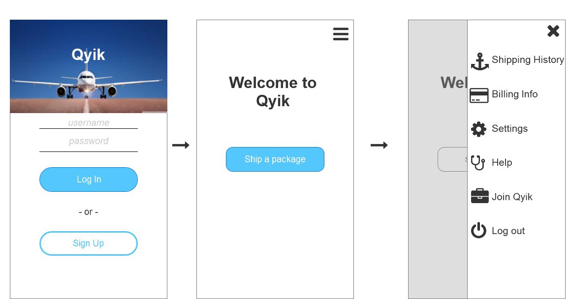
Going forward, a competitive analysis can inform important design decisions. But too often it’s tempting to take it a step further and implement the competing designs. It’s a sign of trouble if designers find that the competition is dictating how they create task flows, journey maps, wireframes, and prototypes. I encountered a bit of this while designing Qyik, an idea for same-day commercial airline shipping that I worked on for a client; the client really liked the minimal and simplistic design of Shyp, an indirect competitor that also offers low-cost pickup, packaging, and shipping in many large American cities. He had had often requested to use the same aesthetic and style. But Shyp was also an indirect competitor, and given what little initial knowledge we both had about Qyik’s potential user base, it was impossible to tell if the same designs and interactions would work once Qyik was built and released.
In other words, product design is product-specific; one product’s layout, UI, navigation, or iconography, may not float for another product’s audience. A competitive analysis is a powerful tool, but does not provide the whole picture. We need to balance our competitive audit with what we know about our audience.

Beware: the infamous burger
Another instance of competitive analysis gone awry can be seen in Facebook’s hamburger menu icon, first launched to great success — for Facebook, at least. The icon quickly trended, and hamburger menus are still on many products, even where it probably isn’t the best design decision. Summarizing this blog post by UX designer Louie A., the burger menu doesn’t always capture the user’s attention, is sometimes inefficient, and doesn’t properly hide navigation on mobile devices. “There might be some very rare occasions where this pattern actually makes sense, but the general rule is to avoid it altogether,” he wrote.
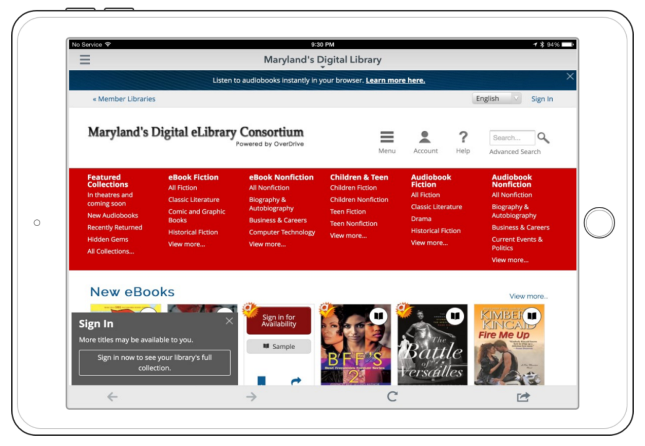
The library app Overdrive, for instance, has two hamburger menus. Looking at the mobile interface, it’s not clear what functions are hidden behind either of them. In this case, such menus might actually confuse a user and make them waste more time than normal in trying to find the functions they need. While the burger worked for Facebook, and while some apps may have adopted it with success, it’s become a trend that isn’t always the most useful solution.

This example illustrates that the context of a design or interaction element is important to consider when deciding to actually use that element. If in your research you do come across a design element that might be worth implementing, first consider how that element works in its current context, with its current user base, and how it serves the app or product. Then see if the new product could successfully incorporate that element, and test it with users before going live.
Get Started on a Smart Competitive Analysis
Looking to incorporate competitive analysis, but trying to avoid imitating the competition? These next steps can help.
Find the Competition
There are many ways for designers to identify competitors in their product’s marketplace. One way is to consider the different features and intentions of the product in question, and do some research to see if other products behave or are intended to behave the same way. For instance, in the example of Qyik above, the product has features like fast shipping and its own network of drivers, and these two features can also be seen in other apps like Uber and Shyp.
Clients and business stakeholders can also provide valuable information on their competition, since they are most likely experts in their own industry. Initial client meetings and discovery sessions are a good time to simply ask the question “So, who is your competition?” or “What products are you currently keeping an eye on in the market today?” in order to get a good idea of what the new product is up against and gain insight into an industry that designers may not be familiar with.
Create a Chart
Next, it’s time to learn how to create a useful competitive analysis matrix. Charts often start with identifying a few key usability heuristics and applying them to competing products, both direct and indirect competitors. Heuristics can be anything like:
- How obvious is the system’s current status?
- How much freedom and control do users have within the system?
- Does the system have consistent copywriting, terminology, and design?
- What type of help, troubleshooting assistance, or documentation exists?
Evaluating multiple companies with a consistent set of heuristics helps us compare and contrast objectively.
Communicating Findings to Clients
Clients might moon over other apps and say something to the effect of “I want it just like this other app!” I had this problem when designing Qyik, the app I talked about briefly above. I admit that I feel like I caved to some of his requests, and if I were to run into that problem again, I would probably follow designer Sarah Doody’s advice. She found, after performing some thought exercises with a client who was obsessed with a competitor’s design, that “getting that ’why’ enabled me to design some solutions around those goals instead of instead of imitating the features and bad user experience of the inspiration site.”
Test the Hypotheses
NNG mentions that imitating or copying designs could potentially decimate user engagement and metrics. NNG recommends frequent user testing to uncover design issues that are unique to the product at hand.
Finally, it’s okay and natural to be influenced in some capacity by other great designs. Being influenced is part of the creative process. But copying a navigation flow, icon, color scheme, or layout without having tested it first can be just as bad as launching a product without having done any initial research at all.
Further Reading
We’ve just given you the steps to create your own competitive analysis, and some do’s and don’ts when sizing up rivals in the market. Check out the links below for more information on how to conduct a competitive analysis.
- The burger menu isn’t the only trending design pattern. Read about the flat design trend, why it’s so widely used now, and whether it actually makes for a more pleasant and usable experience.
- Awwwards also wrote about web design trends to be wary of, and UXPin interviewed some designers to get their take on lasting design trends and fads that could fade away.
- This article walks through a detailed example of a competitive analysis matrix.
- Use these tips from the InVision blog to get better, more substantive client feedback.