Responsive design has evolved considerably since it was first defined by Ethan Marcotte in 2010. The discussion now isn’t whether you should develop a site that works across all devices, but instead, how you should go about it. In 2011, I wrote an article describing the process of designing one of the first complex responsive sites, a hotel booking engine for Macdonald Hotels, but now that the concept is no longer in its infancy let’s take another look at how to redesign a large scale responsive site.
Why you should make your site responsive
For anyone still on the fence, it’s time to come to the responsive side! Here’s why.
Mobile traffic has overtaken desktop traffic
Mobile and tablet usage has now exceeded desktop usage worldwide accounting for over 51% of all internet usage. Users expect a good quality service, no matter what device they access your site on. Google found that even in 2012 that 50% of people would use a business they like less often if the site wasn’t mobile-friendly.
Maintenance is low
Responsive sites are still an efficient way to create a good mobile experience while keeping development and maintenance costs low. As the change in layout for each screen width is controlled by the front-end, there is minimal need to carry out additional back-end development or create mobile specific content, which reduces initial and long-term costs.
It’s a good start point for your mobile strategy
Responsive sites provide a good mobile experience quickly and efficiently. This experience can then be enhanced in stages as required. For example, adding mobile specific content or features in the future could give you a more tailored web experience, while a native app could give you a richer and more in-depth experience for users who are engaged enough to download it.
Google wants you to be mobile friendly
As of 2015 Google released an update that boosts mobile-friendly pages in the search engine results. If organic search is important to your site, then it is important to consider how a non-mobile-friendly site could impact traffic.
The process
Recently, while I was Head of Design and UX at Quidco, a UK based loyalty and cashback site, we re-templated our entire site as the first step of a full replatforming and redesign process. The site was previously partially responsive but gave a reduced, rather than a tailored, experience on mobile and tablet devices. The aim of the re-templating was to create a good experience across devices that could then be restyled, optimized and extended much more easily.
These were the key steps we took, which other UX teams can follow for their own responsive redesigns:
- Requirements gathering: Understanding the business objectives, user needs and technical implications of redeveloping a responsive site.
- Static prototyping: Creating a clickable, responsive prototype that fully demonstrated the front-end and engaged key stakeholders in an effective way.
- Testing: Validating the prototype’s usability with end users, and implementing changes and updates.
- Integration: Integration of the new front-end with the legacy functionality and CMS.
- Phased release and validation: Launching the new site in stages to reduce any negative impact and allow for validation with stakeholders and users.
Requirements gathering
Before undertaking a redesign of a site it’s important to understand the overarching goals, the scope of work, and constraints such as time and budget. The first step we took was to produce a detailed document outlining every page template and its associated functionality.

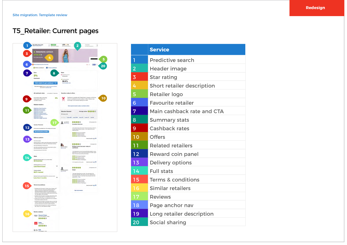
Template definition documentation
This identified the core user journeys and gave us a clear idea of the breadth of the site. Along with site traffic statistics, this document helped us define which were priority templates (Homefeed, Search, Activity and Retailer pages) that would have content and functionality redesigned, and what secondary templates would only be updated with a new style and structure. This document also provided a good start point for the development team to understand the broad scope of work.
We carried out workshops with key stakeholders (including customer services, client services, product and design) to define the business requirements for the priority templates. We also gathered user requirements by conducting member interviews that identified needs and behaviors across the key retail journeys. We combined both sets of requirements to create a detailed list of functional requirements that defined exactly how we would improve the templates. Defining the requirements early in the process ensured all stakeholders were aligned on what the redevelopment of the templates was going to achieve, and what it’s limitations would be.
Static prototyping
We undertook prototyping in two stages. First, we developed a series of concepts, and then we moved into the more granular work of template specification, defining the navigation, and rolling out components and animation.
Concept development
The first stage of design was to produce a clickable prototype that explored the new requirements. Sketched concepts were developed into a simple wireframe prototype across screen sizes. This allowed Quidco to test new ideas with users to get greater insight into the proposed changes. Along with this, feedback was gathered from business stakeholders, then the concepts were iterated into look and feel visuals.

Grid structure and template specification
One of the big developments since 2010 is the large variety of robust responsive frameworks that are available. Instead of building the responsive site from scratch, existing grids, components and patterns from the framework help you develop the site much quicker. This 2013 Design Instruct article describes some popular frameworks.
Before designing the templates ensure that you:
- Understand the grid framework: Spending time with the development team will help designers to understand how the responsive grid is put together, what the breakpoints are, and what the default styles are. This gives a good starting point for the designs and helps to reduce potential frustrations between design and front-end development.
- Determine if breakpoints need to be added or changed: The framework will have its own set breakpoints, but these may not suit every site. New breakpoints may be needed to suit very small or very large screens depending on your content and design. Consider the value of every breakpoint you have, as although every new breakpoint improves how the site looks across different screen widths, it will also add development time.
- Existing rules vs what suits your content: By working closely with front-end development throughout the design process, designers and developers can negotiate on the spot about the best ways to display content and design features. This keeps design and development time to a minimum and helps to create a stronger product—after all two heads are better than one. Where new responsive rules are required, it’s helpful to fully consider and specify design requirements across the screen sizes.

Breakpoints and columns across screen sizes
Navigation
It’s best not to make assumptions on user behavior on desktop vs mobile. Instead consider the different contexts of use across devices, and test accordingly. For example, shoppers may use mobile devices as part of their research, but may also use them for making direct purchases depending on where they are in their shopping journey and the type of product they want to purchase.
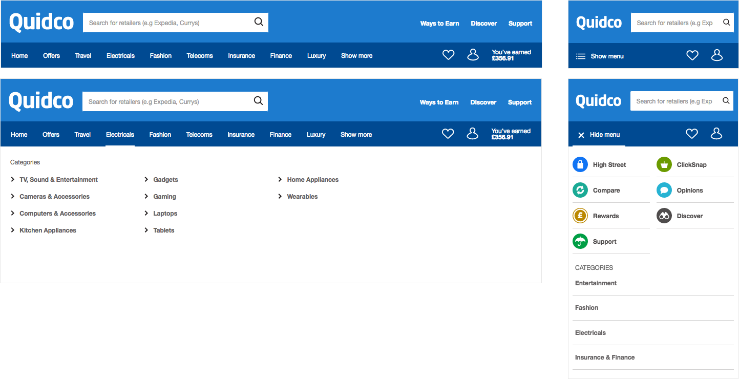
The navigation should fulfil the requirements of all user journeys, but be optimized to the context. Quidco’s desktop navigation split out shopping categories across the main header to allow for quick access to the most popular categories, with an account section on the right and a top utility navigation for other secondary site features. On mobile, these were stacked in a single menu to allow for easy findability of items within the smaller screen size.

Desktop navigation and mobile navigation
Component rollout
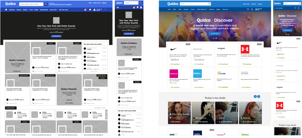
Using templates and components are an efficient way to design for very large sites. Quidco had a large amount of functionality and content variations across the site, but these were rationalized into around 40 components. When designing each of these it was considered how it would appear across each screen size, including what columns the component would sit across, layout changes, style changes and content changes. On some components, this meant the largest component width would be seen on under the SMALL breakpoint. When designing it’s important to use real content – this helps show how different levels and types of content could affect the component style.

Offer component across screen sizes
Transitions and animations
CSS allows designers to create beautiful animations and transitions that enhance the experience. As these are added into the site ensure that the touch screen versions are considered. For example, hover states aren’t required for touch screens, but can appear on as a user activates a link on a touchscreen device.
Testing and approval
This stage is short, but vital. All key pages in the site were built into a static clickable prototype. At least one page per template was built demonstrating layout, interactions and responsive behavior. This was a useful tool for testing and approval.
Testing the prototype ensured the designs were validated by users, and approved by stakeholders, giving confidence in the final look, interactions and transitions on the site. The prototype allowed the business to go ahead with site integration confident that the user experience was going to be enhanced.
Testing is particularly important for responsive sites, because responsive sites are designed so that end users can view the content not only on different devices, but also in different browsers and with different screen widths. Quidco members can also see very different content depending on their membership level and how they use the site, and testing ensured this more complicated content was displaying correctly.
Integration
The next step in design is integration. This can be tricky with responsive design, since the design and development teams need to be work very closely together, to make sure the responsive designs can actually be coded in a consistent way.
Standardization and consistency
It’s difficult when working with multiple designers and developers to ensure 100% standardization and consistency, particularly across a very large site. Ideally through the process everyone should be communicating and agreeing on processes. This isn’t always the case, particularly when a project is moving at a high speed.
Our team used these techniques to improve consistency across the site:
- Template and component definition: At the outset of the project we defined the template types, which reduced any unnecessary design and build work across site pages. Also, as every template was designed, components were named and catalogued so they could be reused through the template design process.
- Color and spacing variables: Instead of defining hex codes and spacing on each template, we created a variable list that was then used to specify the front-end layout across screen sizes. This meant the impact of any design revisions was minimal, and ensured consistency across the site.
- Responsive type: Because we defined rules for header and text sizes across screen sizes, as each new template was designed there was minimal effort required to specify fonts across screen sizes.
- Pattern libraries: To ensure consistency long term our design team created a pattern library to define all the key styles, patterns and components. This helped ensure that the user experience across different content and functionality was consistent.
Asset development
A stage of the design process that often gets forgotten about is the development of assets. Responsive sites, plus the requirement to make assets look good on high density screens mean the scope of this task increases quite substantially.
- Icons and illustrations: Where possible use SVGs for icon and illustrative assets. These file sizes can be quite low, give you color flexibility by using CSS fills, and ensure that the asset will look good on any screen size.
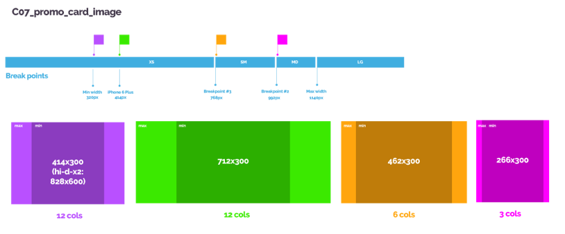
- Images: This can be challenging depending on how you use images and where you source them from. Ideally background images will be displayed at x2 the image dimensions to ensure the image looks great on all devices, but this increases page load times. Balance the look of images against page load requirements. Quidco created image assets across 4 screen sizes to ensure the quality and legibility.

Image breakpoints for an offer component
Phased release and validation
It was very important to Quidco that their members were respected and considered throughout the redesign process. It was also important to the business that conversions weren’t reduced. We launched templates in phases and carefully monitored analytics and customer feedback. Insights from these fed back into the templates to iterate and improve them.
These were the key considerations:
- Phased release: Priority templates were released in stages. Firstly, to staff to catch any major issues, secondly to a small user group, then finally rolled out to all members. This ensured all user experience issues and bugs were captured early.
- Communication and launch: Major changes were carefully planned and communicated early to members. This ensured members clearly understood why Quidco were making changes, what the changes were, and provided a place to have a conversation with members. allowing their thoughts and feedback to be included into further iterations.
Invest in the future
Creating a responsive site is the first step in an ongoing process. Consider what the important elements of the project is, what the business needs to achieve from it, and what benefits there are going to be to users.
For Quidco the responsive design process accomplished many key goals.
- It encouraged buy in: The process carried out by Quidco was incredibly useful in getting buy in to the final designs. This provided confidence to stakeholders that Quidco’s members would have an improved experience using Quidco.
- The process helped to future proof the site: A key guiding principle in the project was to ensure the future proof of the templates. It was important that any continuing product developments and optimization would be easy to implement.
- We provided a better platform for engaging members: The improvements made to Quidco has been the first step in some major development to engage members and meet their needs much better in the future. Although a responsive redesign project needs to be very technical, it’s important to keep users at the heart of it.