In December of 1972, distraction killed 101 people. A flight crew became so absorbed with changing a lightbulb that they didn’t notice no one was flying the plane, not even the autopilot. The crew ignored multiple warnings including a 0.5 second buzz, an amber warning indicator and the beeping of the radio altimeter, all of which indicated that their plane was precipitously falling from the sky. Warning messages could not overcome their distraction.
Inactive button states – often a stand-in for “noisy” error messages – are just as bad. As Donald Norman once wrote “the best way [to] prevent user error is to make sure that the user cannot make errors in the first place or that the effects are easily reversible.” Inactive states and error messages are our tools of the trade to that end, but both have their shortcomings. Each disrupts the user and has the capability to break their flow. Online, where distraction is high (and time and attention are scarce) interfaces that lack inactive states can help designers minimize errors with less interruption.
Going grey
Everyone who’s used a computer long enough is familiar an error message, but what exactly is an inactive state? Simply, graphical user interfaces (GUIs) are composed of widgets, many of which can be enabled or disabled at any given moment. Disabled, “inactive” widgets are often presented in a lighter color or visually obscured in some other way.
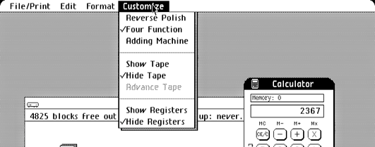
Inactive states are vestiges of software rather than effective interface elements in their own right. The typical greyed-out menu item, for example, is as old as the desktop metaphor itself:

Is this useful information?
Inactive states seem harmless, but they pose a(n often infuriating) problem to users who can’t readily figure out why they’re presented the way they are. Inactive elements cannot “speak” for themselves and can therefore never explain why they’re inactive. This introduces a real potential for confusion into our designs.
Fortunately for the denizens of the web, though, inactive interface elements have become increasingly less common. This probably something to do with the proliferation of modal interface design.
Mommy, where do modes come from?
A mode is a change in the method of operation of a device or piece of software. Modes and inactive states are related because designs that incorporate inactive states are perceptually “less” modal.
Consider Apple’s Activity Monitor, which displays inactive buttons when no process is currently selected:

You can probably guess what this application looks like when you select a process. Activity Monitor’s two modes are communicated by way of its button states. In direct contrast to this is Dropbox’s interface. Dropbox eliminates inactive states altogether, instead opting to display file-specific buttons directly next to the currently selected file.

When the user de-selects the file, the options disappear:

Which interface feels more cluttered to you? More difficult? There are certain trade-offs between hiding controls and displaying inactive buttons. Personally, Dropbox’s approach feels more intuitive than Activity Monitor’s because of the use of progressive disclosure.
Back in 2000, user interface pioneer Jef Raskin suggested that “[modes] are a significant source of errors, confusion, unnecessary restrictions and complexity in interfaces.” Modal windows are the most common place we find modes on the web today. They’re hard to miss because they inactivate and grey-out the entire web page or application. This design paradigm is intrusive and it often fails to explain (there’s that pattern again) to users why they cannot access the rest of the interface.
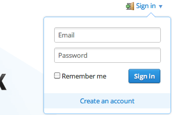
As a consequence, modern websites have begun to substitute overlays or dialog-like windows that don’t obscure the content underneath. Dropbox’s sign-in dialog is a good example:

Alternate approaches

A toggle switch makes it easy to understand that a particular item is unavailable, but it still doesn’t help the user know why.
Apple’s latest operating system, iOS, has led the way in eliminating inactive buttons. Given the fact that iOS apps are confined to a single window and that they lack menu-bars, the OS is almost designed to eliminate them. When inactive elements are required, though, Apple recommends using a built-in switch that combines the grey inactive desktop metaphor with the physical metaphor of a toggle switch.
Always active buttons
The web of the mid-90s had a love affair with inactive submit buttons. Greyed out on page load, they would immediately become active once the user had filled in all required form fields. More recently, though, designers have opted for alternate solutions.
If you go to Google’s iconic search page and click “I’m feeling lucky” before you’ve entered anything in the search box, you’re likely in for a surprise. Instead of an error message or an inactive state Google’s presents you with gallery of homepage doodles:

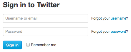
Over on Twitter’s homepage page things are even more interesting. Click Twitter’s sign in button without entering anything into the form, and you are taken to the login page. Smart. The login page’s sign in button lacks an inactive state. It simply does nothing if you try to submit a blank form.

Twitter’s sign up form behaves a bit differently. If you try to submit Twitter’s sign-up form without filling in any fields you get three error messages in red near the email, password and username fields. Rather than becoming a grey inactive button, the “create my account” button
shakes back and forth. At least in the West, the quick shake of the button is enough by itself to clearly communicate “no.”

Communicating an inactive state with a gesture
A subtle art
Buttons miming human gestures might seem odd, but it’s increasingly par for the course. Dan Eden has put together a demo page with all the different ways CSS3 can be used to enable designers to communicate to users with gestures rather than words.
Finally, some designers are going as far as providing additional information within their inactive buttons. For example, Google Chrome displays broken plugin icons over content rendered inactive by missing or disabled plugins. These icons don’t just communicate that something is inactive, they attempt to explain why.

Communicating an inactive state with a shape
Although user experience design plays a crucial role in making online commerce efficient, rarely does a mistake within a web interface have life or death consequences. There are certainly lots of ways for designers to deal with errors. As Norman wrote in n for “noisy” error messages – are just as bad. As Donald Norman once The Design of Everyday Things: “The critical thing is to approach the topic as a cooperative endeavor between person and machine…with misconceptions on either side.”
Go ahead and experiment with eliminating redundant error messages and inactive states. Let your users explore, skip ahead and break things. Just always remember to include an “undo!”