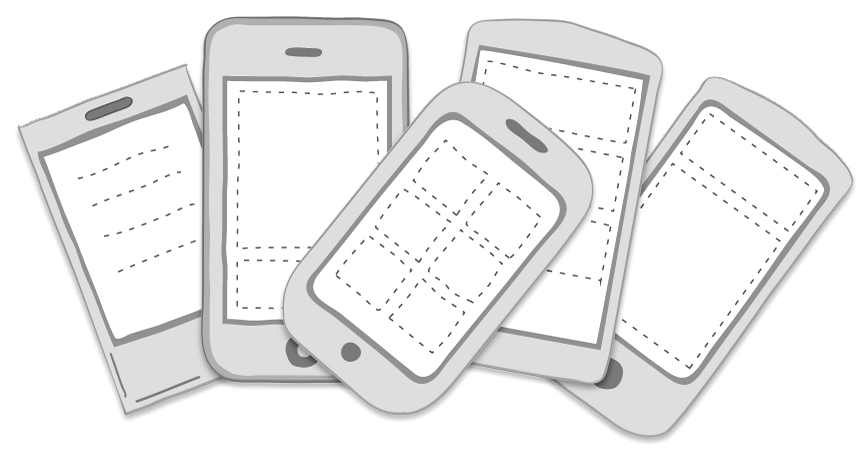
Patterns for mobile application design
Design patterns for mobile are emerging as the platform matures. Theresa Neil’s new book Mobile Design Pattern Gallery provides solutions to common design challenges. Read a sample chapter on Invitations and learn how to immediately engage your customers with your application.
We recently had a new mobile project starting and all of our experienced mobile designers were booked. Since we primarily design enterprise apps and productivity tools, not everyone in our group was well versed in mobile application design. So I made a quick tutorial with lots and lots of screenshots. Gradually a set of patterns, at a higher level than OS specific design guidelines, emerged.
These 70 patterns, illustrated with hundreds of examples from iOS, BlackBerry, Android, Symbian, Windows and webOS applications, will be released this month from O’Reilly Media as the “Mobile Design Pattern Gallery”. Here is one of my favorite chapters, Invitations. Constructive feedback and additional mobile app examples are most welcome.
*Although these patterns are based on best practices in mobile application design, they may also be inspiring for mobile web design.
Invitations
Do you remember the first time you used Photoshop? I remember opening the application and seeing a blank canvas and a vast array of powerful tools.
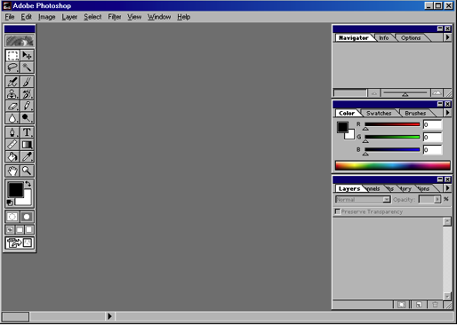
Phototshop 5.5
Well, I assumed the tools were powerful, but didn’t know for sure. In fact, I didn’t know how to get started at all. But I had quite a bit of money invested in the software and needed to learn it for work. So I bought a “Teach Yourself Photoshop in 24 Hours” book and started learning.
Fast forward a decade or so. There are hundreds of thousands of mobile applications, readily available in the marketplace. In any one category there are dozens of apps for the same purpose. Many of them are free, making it just as practical to download and try another app as it is to struggle for 5 minutes with an unintuitive interface.
Consider the initial experience with Layar Reality Browser, augmented reality software.
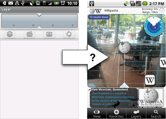
Layar Reality Browser (early version)
What would help me get from this gray screen to augmented reality? An invitation. Invitations are helpful tips that are displayed the first time a user opens an application or arrives at a new place. They suggest actions and guide the user to the intended functionality. A simple invitation can turn an otherwise discouraging first time experience into a satisfying one.
Mobile invitation patterns include:
 Dialog |
 Tip |
 Tour |
 Demo |
 Transparency |
 Embedded |
 Persistent |
 Discoverable |
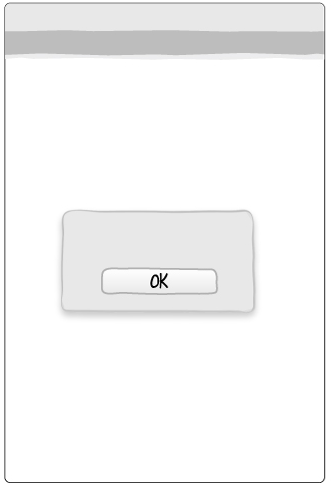
Dialog
A simple dialog with instructions is the most common type of invitation in mobile apps, probably because it is the easiest to program. It is also most likely to be dismissed and ignored.
Keep dialog content short, and make sure there is an alternate way to access instructions from within the application.
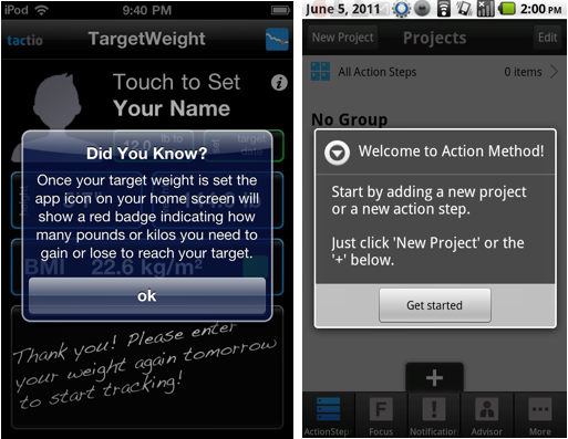
Dialogs on TargetWeight and ActionMethod
Tip
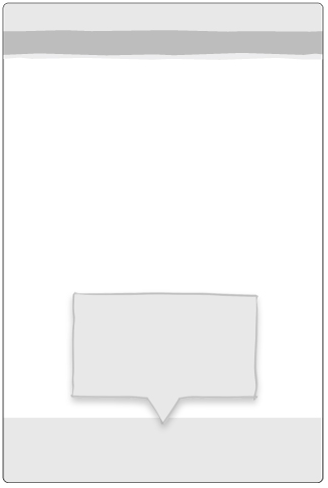
A tip can be implemented anywhere in the application, making it more contextually relevant than a dialog. And tips can be used on any screen, not just the home screen. In the eBay app, a tip is used to draw attention to the “save a search” feature, which could otherwise be overlooked since it is where the page title is normally displayed. The Android OS displays a tip reminiscent of Window’s Clippy, the helpful paperclip, to explain how to customize the home screen.
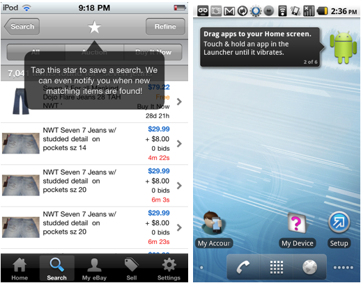
Tips on eBay and Andoid OS
ShoppingList progressively reveals more tips throughout the application.
Place tips in proximity to the feature they refer to, keep the content short, and remove the tip once interaction begins (ie. when the screen is touched).
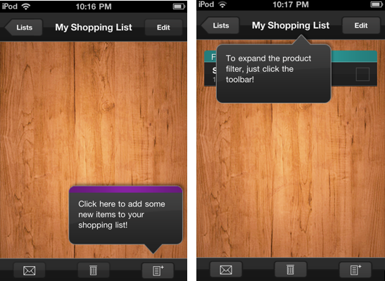
Tips on Shopping List
Tour
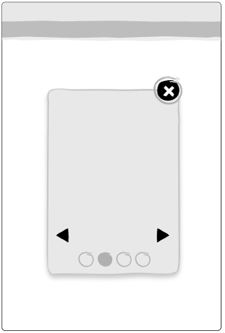
A tour provides the ultimate invitation by offering a screen-by-screen, feature-by-feature exploration of the application. The Nike GPS tour is an excellent example of this pattern. The tour is optimized for mobile with concise copy, vivid graphics, simple navigation and a clearly marked exit. The Tour is offered on the home screen, and once launched you can tap through each of the seven tips. Nike and CalcBot use “page indicators” and a count (2 of 7) to clearly mark the current step in the tour.
A tour should highlight key features of the application, preferably from a (user) goal perspective. Keep it short and visually engaging.
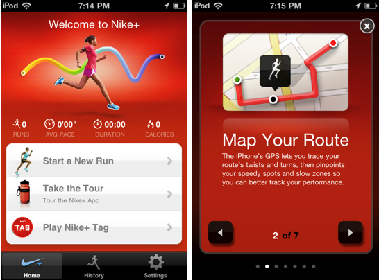
Nike’s Tour Invitation
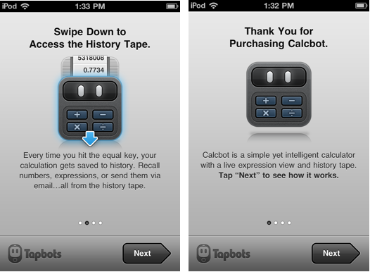
CalcBot’s Tour Invitation
Video Demo
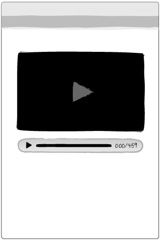
A video demo may be the best form of invitation for applications that rely on specific actions/interactions since it demonstrates the application in action. Roambi uses a custom demo to showcase its wide selection of data visualizations and the use of certain gestures for optimal navigation and exploration. Google Goggles has a demo in their tour that can be opened and viewed in YouTube.
Demos should showcase key features or show how to use the application from a standard workflow perspective. Common video features (stop, pause, volume controls…) should be provided.
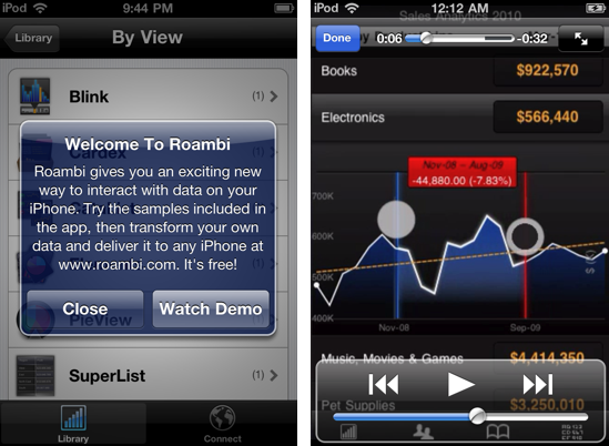
Roambi’s Demo
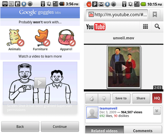
Google Goggles’ Demo
Transparency
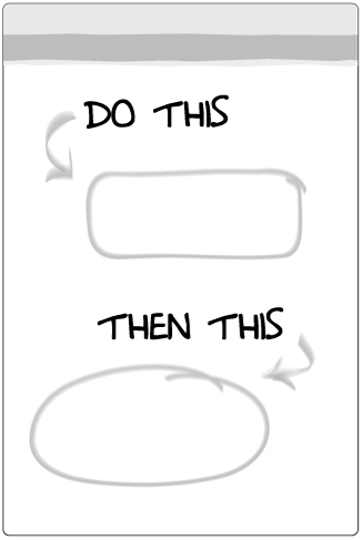
While the rest of these patterns exist on the web, the transparency is unique to touchscreen devices (so far). Typically seen on home screens, a transparency is a see-through layer with a usage diagram positioned over the actual screen content. Pulse and Phoster both use this invitation pattern to quickly and visually explain how to navigate content in the apps.
Transparencies should be used judiciously, and are not meant to compensate for poor screen designs. Remove the transparency once interaction begins (ie. when the screen is touched).
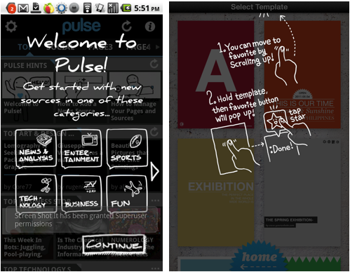
Transparencies on Pulse and Phoster
Embedded
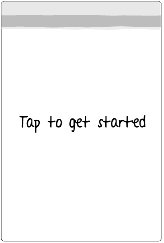
Unlike the other invitations, embedded invitations don’t precede the screen they refer to. Embedded invitations are built into the screen design. They remain in the interface until they are overwritten with content. Many note taking apps, like Mini Diary and PageOnce, use embedded invitations to immediately engage the user to add content.
Multiple embedded invitations can exist in a single screen. Clearly differentiate the invitation from other content with images or other visual cues (ie. don’t use the same color and size text for the invitation as is used for regular content).
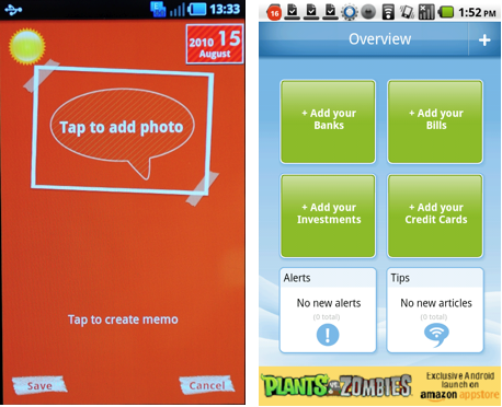
Embedded Invitations in Android’s Mini Diary and PageOnce
Persistent
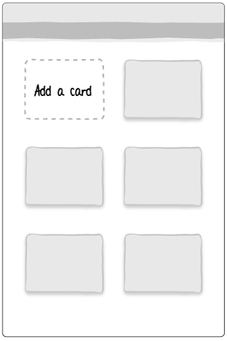
Persistent invitations are built into the screen and remain visible. This example from Jamie Oliver Recipes suggest switching to landscape mode to uncover an additional feature. Wether this is your first time on this screen, or 10th time, the prompt is still displayed. Spring Pad uses an embedded, persistent invitation to show that more notes can be added by tapping on the ‘+’.
Keep it short. Clearly differentiate the invitation from other content with images or other visual cues (ie. don’t use the same color and size text for the invitation as is used for regular content).
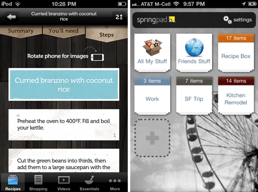
Persistent prompts in Jamie Oliver’s Recipes and Springpad
Discoverable
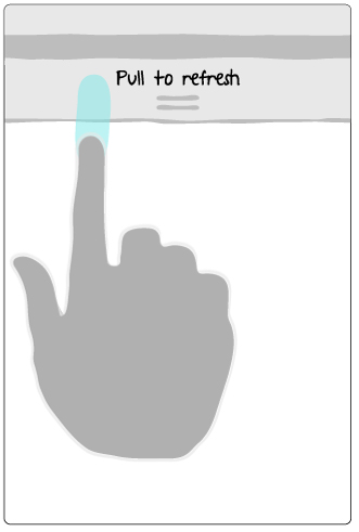
A discoverable invitation may seem like an oxymoron, but it is an effective way to encourage specific interactions without cluttering the screen. These invitations are meant to be discovered when performing a common gesture, like flicking or swiping.
Use discoverable invitations sparingly. The most common instance of this pattern is used for prompting refresh and loading more results.

Discoverable Invitations in eBay and TweetBot
Mobile Design Pattern Gallery Book and Site
Invitations are just one of the types of patterns in the Mobile Design Pattern Gallery. Get the upcoming O’Reilly book, “Mobile Design Pattern Gallery”, to learn more about mobile patterns for:
- Navigation
- Forms
- Tables
- Search, Sort & Filter
- Tools
- Charts
- Feedback & Affordance
- Help
and a bonus chapter on Anti-Patterns.
Also check out the Mobile Design Pattern Gallery:
More Pattern Resources
Patterns for Android:
AndroidPatterns
Patterns for iOS:
Mobile Patterns,
Pttrns
General Mobile UI Patterns:
4ourth
Universal design considerations increasingly comprise a prudent approach to design and development for the web. Interaction designer Andrew Maier details some of the broader implications this has for user-centered designers.