If your inbox is anything like mine, it’s littered with unwanted notifications from companies begging for attention. Gmail has done a great job of making it easy to separate important messages from automated notifications; however some organizations refuse to make it easy to control the emails we receive. What can notification designers do to make things right?
Interacting with most websites is simple: we sign up, we sign in, and, occasionally, we give websites a bit of our time and attention. Maybe we share a preference or two. In return, those sites provide us with not only useful information (in the short term), but also notifications and other recurring updates (in the long term). This functionality is nothing new. It’s often convenient.
Until it isn’t, that is.
What can designers do to make things better? In this article, we’ll review some examples of websites that allow users to control both the type and the frequency of the notifications users receive (to their user’s benefit as well as their detriment). Along the way, we’ll discuss alternative ways that our companies might provide value to their audience.
Quality over quantity
If you love it, set it free. If if returns, it was meant to be.
Anonymous
It’s a big, scary world out there for product managers. Allowing users to control the quantity of email notifications that they receive requires product managers to first trust that their users will return. Users will only do that, of course, if our products or services provide long-term value rather than merely grabbing (and squandering) attention.
Luckily, there are plenty of ways that the design of our notification can do just that. I recommend giving attention to the following five things:
- Say what you mean
- Give users a choice
- Relegate (some) interactions in the email itself
- Remind users of additional actions, especially time—sensitive ones
- Provide a digest
1. Say what you mean
The CAN-SPAM law specifically forbids sending an email to someone who has previously unsubscribed. In response, some website owners have deliberately obfuscated the unsubscribe process, often requiring users to sign in to receive fewer emails: e.g. “Don’t want to receive email notifications? Adjust your message settings.”
Consider Yipit. The company made a good first impression when it launched. As an aggregator of the bargains appearing on “daily deal” sites such as Groupon, LivingSocial, etc., YipIt promised to provide in an at-a-glance summary of deals.
When I signed up, however, I had login issues that their support team was unable to resolve. This would have been bad enough on its own. The kicker came when I discovered that—even though I couldn’t log in—I continued to receive email announcements! When I clicked on the “unsubscribe” option at the bottom of an email, it took me to a login page, not an “unsubscribe” page.

The bottom of the Yipit email, offering an opportunity for me to “unsubscribe.”
How frustrating. As a result, YipIt provided me a poor, inconsistent, confusing interaction. Unsubscribe buttons should never yield a dead end.
2. Give users a choice

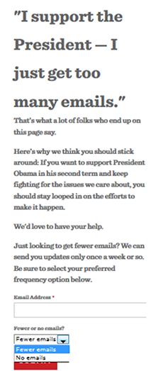
When President Barack Obama ran for re-election, his campaign team specifically targeted emails based on “big data” about American voters. This meant that, at the peak of the election season, his team sometimes sent out as many as four or five emails a day. That’s quite a lot of email!
Rather than risk losing the support of subscribers who may have perceived the campaign’s increase in frequency as an increase in spam, the campaign team simply made better use of the page upon which users landed when they clicked the unsubscribe button. There, the team provided recipients with a way to adjust the frequency with which they received emails. Smart.
Next consider ThinkGeek, a website for nerdy gifts. Designers at the company recognized the simple—yet—nonetheless—profound fact that people likely get a lot of email during the holidays. So last year they provided an option for subscribers to pause their email notifications (or “temporarily unsubscribe”) until the holiday season passes:

In addition to providing users with a choice—always a welcome addition—both the Obama campaign and ThinkGeek designed smart ways for their less voracious users to stay on top of thingswithout feeling overwhelmed.
3. Relegate (some) interactions in the email itself
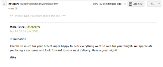
Zendesk, a web—based customer support system, provides both customer support representatives (CSRs) and users alike with a special kind of email. Rather than require that they make a roundtrip to a website to continue their conversation, Zendesk emails allow CSRs and users to simply reply to their email “above this line.” This effectively makes what would be a unique interaction (between a CSR, a user, and Zendesk.com) into something as easy as replying to an email.

Pragmatically speaking, this doesn’t save users more than a few seconds. But it’s the thought that counts. Both CSRs and users don’t need to recall their login information in order to get things done.
4. Remind users of additional actions, especially time—sensitive ones
Time—sensitive notifications are more likely to be seen as helpful, rather than annoying.
Instacart aims to be the “Amazon Prime of grocery delivery.” Instead of having one, big warehouse of groceries (like some failed dot—com era startups), Instacart trains a fleet of personal shoppers to go to local stores and deliver groceries.
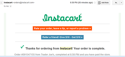
Immediately after the company delivers a user’s groceries, Instacart sends an email notification to that customer informing him or her that their order is complete. This is more just a notification, though, as the email also provides users with several actions they might take in response: users can rate their order, leave a tip, report a problem, and refer a friend. If the user is satisfied with the order and doesn’t want to do anything else, he or she will still receive value from the final confirmation.

What a user sees right after the grocery delivery is complete: logical next steps.
For more information on keeping a list of subscribers happy, see Mailchimp’s Best Practices for Lists page. In particular, the company suggests segmenting subscribers by groups. This allows companies to send more—targeted emails which, in turn, lowers the likelihood that their users will feel overwhelmed. Additionally, Mailchimp recommends sending “relevant content” because if your email isn’t interesting to the user, the user might report your email as spam — and that’s not good for business.
RelayRides is a peer—to—peer car sharing platform that allows you to borrow your neighbor’s car. RelayRides sends lots of updates (many of which I do not mind) at logical times and related to my actions on the site. When I reserve a car, the quality of my job or vacation may depend on that car reservation, so I am very happy to receive an email and a text message updating me about my reservation.
Finally, don’t confuse time—sensitive interactions with promotions, which may be time—sensitive with regards to the company but not necessarily time—sensitive with regards to the user. In contrast to the relatively frequent text messages I receive when I rent a car from RelayRides, RelayRides does send me promotional emails. The difference is that they send the promotional emails infrequently.
5. Provide a digest
Finally, never forget the value of something as simple as a summary.
Content—rich sites such as Learnist, a place where experts curate content to help beginners learn, should provide users with an option to stay informed even if they don’t have the time to browse everything the site contains. With regards to Learnist, I found that the site interesting but overwhelming. It simply required too much of my time to find specific information. If I were able to pick a few topics of interest, however, and receive digests, my Learnist emails wouldn’t find their way to trash, as they usually do.
Content—heavy websites might consider two email options: one where users can see either a series of thumbnails with lots of content (as Learnist currently does), or another that provides users with an in—depth, blog—like summary of a particular topic. Whereas the former requires a bit more time to fully explore, the latter is much easier to browse “on the go.” This is especially important with regards to mobile access where connectivity can be an issue .
A great example of digests comes from the Nieman Journalism Lab. Longer in word count but more dense in the amount of information they contain, Nieman’s digests are filled with attractive images and short, informative sentences.
A more natural notification experience
Allowing users to control the frequency of email notifications about a product will improve the overall user experience. Whether we provide different options for notification content, through a different channel, offer different content entirely, or shift some attention to offline outreach, users appreciate the freedom from spam. Lastly, we must always consider the bigger picture. Thinking about what challenges users face, and what the platform solves, will guide all the decisions we make. Then our communications can truly be about quality, and not quantity.