“I want you to treat me like I’m dead,” said Amanda Costello, “you wouldn’t do this to someone who wasn’t alive.” Amanda was at the office of her national bank, trying to close her account so she could move to a credit union. As she described, the bank was making every effort to keep her, or at the very least, make money off of her.
During my interview with Amanda (one of many people I interviewed to learn about offboarding experiences), she said that when she asked the bank to cancel a yearly automatic withdrawal, the bank associate said they would reopen her account and continue to charge her the money, plus hundreds more in overdraft fees from the time her account was closed. The bank admitted that they would keep Amanda’s personal information on file even after she stopped doing business with them.
It took Amanda multiple calls over the next month, as well as letters stating she did not authorize the bank to do such a thing. She’s now sure that they won’t reopen her account, although she said that she never got confirmation that the bank had deleted her information.
This is an example of bad “offboarding” — the process a user or customer must go through in order to part ways with a company or service. Most of us have probably experienced this at some point, asking ourselves, “why on earth is it so hard to just cancel or opt out?” And it’s certainly not unique to banks. These practices abound online.
Let’s look now at why bad offboarding is bad for business, and why it’s so often designed to be an insensitive process. We will look at the psychology of why humans need closure, and how that can apply to designing a good offboarding experience.
What is Offboarding?
According to Tim Wright’s podcast over at Fresh Tilled Soil, there are many situations in which a customer needs to offboard; for instance, perhaps the service isn’t giving the customer anything useful anymore. The customer could also be dissatisfied with a product, or simply not have a need for it anymore.
Business leaders might agree with these reasons, but they often think that it’s not in their best interests to let customers unsubscribe so easily. It’s a critical lapse in judgment; bad offboarding can impact a customer’s view of the entire experience, and can hurt a product’s reputation. This can break down trust between users and products in a way that’s nearly impossible to build back up.
It may seem obvious to many of us, but it should be stated plainly: bad offboarding experiences can and will leave a sour taste in anyone’s mouth, and those soured people are more likely to share their opinions about your product with other potential customers. As Wright elaborates further, the more barriers they face, the more frustrated they grow. And that’s when a company’s reputation is on the line.
Some offboarding is so purposefully bad, it goes so far as to incorporate dark patterns. Dark patterns are defined as a series of design patterns that takes advantage of the user, at the benefit of the company. This involves visually confusing design or copywriting in order to guide or “trick” the user into doing something they didn’t intend.
Sound familiar? Many products use these methods to trick consumers into staying with their service longer.

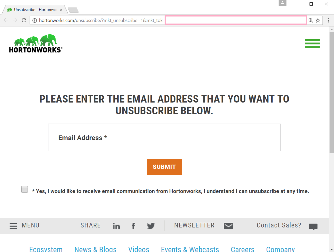
Hey user! Tick the required “Subscribe” box in order to unsubscribe! Find more examples at this NSFW-named subreddit.
It’s pretty easy to design a website or process that forces users into a specific task flow, and so it’s a tempting strategy for stakeholders in order to get the metrics they want. But it doesn’t take long for consumers to catch on to what’s happening, especially if it involves their money, and that loss of trust is incredibly hard (often impossible) to rebuild.
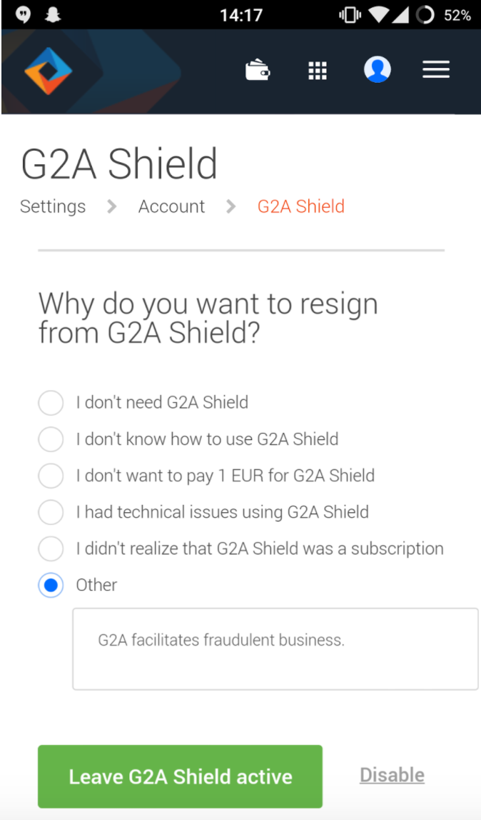
G2A Shield is a great example of a service that uses many tactics — guilt tripping, unnecessary work, and dark design patterns — to keep its customers (see the first screen in the process below). The unsubscribe link is greyed out at the bottom, and the text in the green button “Leave G2A Shield active” is just a roundabout way of saying “keep my account.”

This was one very unhappy user. Source thread on Reddit.
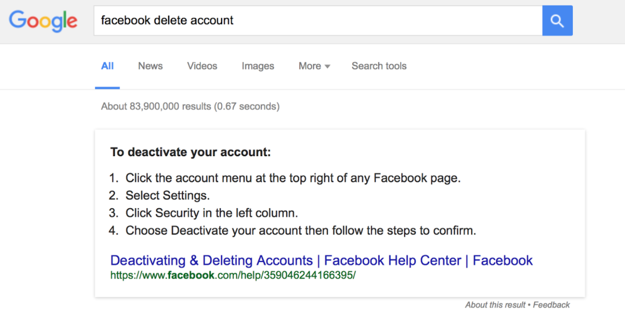
It doesn’t stop with G2A Shield, either. Deleting an account from a website or web service often takes time and effort. For instance, Facebook forces a user to deactivate his or her page for three weeks before permanently deleting all data.

But I don’t want to deactivate it; I want to delete it.
And to add to the evidence, to pardon a personal anecdote—just a few weeks ago, I had to cancel my Microsoft Office 365 subscription that I didn’t want or need anyway, and it took me three attempts, a password reset, and then Googling the problem to figure out how to go into my iPhone to toggle it off. It was a mere $6.99 a month.
Make Offboarding More Humane
Offboarding can be a challenge, especially when business stakeholders don’t want to touch the topic, but there are steps that designers can take to make sure their solutions keep the user in mind.
- Personas and user stories/journeys: How would your personas go about unsubscribing to your service? Building out a user flow for unsubscribing and taking the personas through that journey can identify pain points that might cause frustration or elicit a negative emotional reaction. These are places where a product’s reputation could take a hit from an angry former customer.
Identify reasons why your personas might want to unsubscribe, and then create task flows to map out that process. Are there places where customers could get stuck? Does the process take longer than expected? A journey map can help identify customer feelings throughout the process as well. At what point might customers decide to review your product badly or complain about it to his or her friends? When you’ve identified where that might happen, it’s easier to prevent it from ever happening in the first place.
- Empathize: User stories and other scenarios help humanize the offboarding process, build empathy for the user, and can help designers craft solutions that are more sensitive to their needs. What types of scenarios might cause a user to unsubscribe or leave your service? Again, this ties back to personas and the fact that personas are a representation of your real customer, as well as their wants, needs, and life situations.
Empathy is a pretty important part of the design process as a whole, and it’s valuable to understand exactly what a bad offboarding process can mean for a customer’s life, especially if personal information is involved. Having a relationship with a customer is two-way street, and too often, companies give off the impression that they’re entitled to hold that relationship hostage when a customer just wants to end it.
- Don’t draw out the process: Costello’s bank account-closing experience stretched over several months. Does that type of headache really make for better customer engagement, and is the upsell potential actually worth that amount of time (and potential hit to your product’s reputation)? The amount of time it takes to completely offboard from your product is a key performance indicator (KPI) that you can go back to and assess whenever a redesign is needed.
This indicator can give you clues as to when a customer starts to become frustrated, and when they might try to damage the product’s reputation or go for a competitor. This indicator is also a metric that you can use when telling business leaders about the importance of humane offboarding, which is the next step…
- Convince other stakeholders about offboarding’s merit: Admittedly, this is a tough one. But the truth is that upselling or dragging out the process makes your product seem like it’s going for a desperate grab at attention.
According to the Nielsen Norman Group, no one likes a needy website. This article specifically talks about web popups, but there are some solid points of advice here for offboarding. Does a brand manager really want to convey the idea that their website is “desperate for attention” by constantly clinging to the user and not letting them go?
A/B testing combined with qualitative research can shed insight onto how customers feel about an offboarding scenario, and could give designers the right data to bring to cross-departmental meetings. Combine this with where the company stands in the market, and it’s easier to see the impact of having a reputation as a company that seems like it’s entitled to extending customer relationships for longer than the customer wants.
Offboarded Customers are Humans, Too!
Wright says that offboarding is much like a will. No one wants to touch that task, but it’s always responsible to have one in place.
UXMag explains, using psychologist Daniel Kahneman’s book Thinking Fast and Slow, the human reaction to bad offboarding: Someone can feel differently about the same experience, depending on whether they are experiencing it in the moment or looking back on it as a memory. It’s easier to see how things were overall after they happened and we’ve had some time and space to think on them.
According to Kahneman, we tend to judge our experiences based on the most intense (positive or negative) feelings we have. Designers could apply this to Costello’s and many other scenarios — no matter how good her bank had been to her in the past, the cancelling experience left a bad final impression.
When designed with empathy for the user, rather than to keep the numbers of unsubscribers artificially low,offboarding can help ensure a user feels comfortable enough to come back if the timing is right. Returning once again to Amanda Costello, she told me during our interview that she subscribes to a makeup box company that sends her monthly samples. If there are months where she feels she doesn’t want the box, she says it’s easy to cancel and start up again whenever she desires. Costello also knows that she may come back to the service when she’s ready to spend the money again, because she still enjoys it.
Good offboarding doesn’t take the customer-company relationship for granted, and doesn’t want to extend that relationship far beyond what the customer wants. When you’ve identified what good offboarding looks like, it’s only one more step to design solutions for your product.