When I first started working at the wireframing & prototyping app UXPin, we were big fans of the “grand unveiling” approach to product development—hunker down with the team, spend a few months creating an awesome bundle of features, and then unleash it on the public. What we soon learned was that this was a hit or miss strategy. When it worked, the conversion from trial users to paying customers surged. When it flopped, we flatlined at the cost of untold hours of labor, money, and sanity. Soon enough, we learned that we needed to release smarter, not larger.
Enter the MVP: a “minimum viable product,” that helps companies test their assumptions about customers with the least amount of effort. Recently, after learning from our previous methods, we’ve shifted to releasing smaller features more often. These smaller features act as MVPs. If we’re about to release a full e-book, we first put up a simple landing page to gauge interest. If we’re about to integrate with a suite of other software (as we recently did with Photoshop and Sketch), we integrate a few features with the simplest platform first (in this case, Sketch) and then beta test before pursuing full integration.
In this article we’ll clear up misconceptions about MVPs, and identify different methods UX designers can explore, to balance minimalism, viability, and product quality.
Defining MVP: Don’t Forget the “V” or “P”
The term minimum viable product, as coined by SyncDev CEO Frank Robinson and popularized by IMVU founder Eric Ries, refers to releasing something quickly—whether it’s a physical product or just a landing page—for the purpose of validating hypotheses. However, it’s easy to glamorize the “minimum” aspect of creating an MVP without thinking about ensuring we have a “viable product.” The allure comes from squeezing the most value from the fewest resources.
The MVP, contrary to popular belief, is NOT the minimum set of features required to create a working product. Nor is it the product itself. It is, instead, a process. The MVP is the smallest experiment that either proves or disproves assumptions about a business idea. Although rapid development is of the essence, that is only true to the extent that the development helps us to quickly obtain our learning and research objectives.
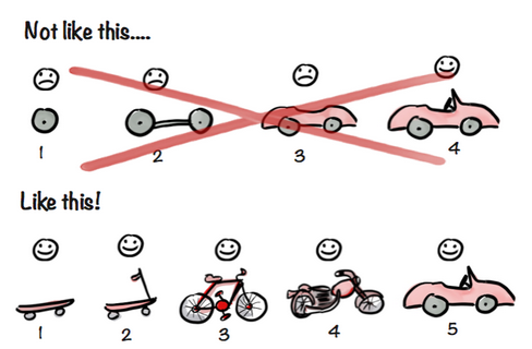
Image Source: Spotify’s MVP Process
The MVP process follows four steps:
- Find a problem worth solving.
- Determine the smallest possible solution (MVP).
- Build and test the MVP at small scale (show its unique value).
- Engage and excite early adopters (also known as earlyvangelists).
When is an MVP appropriate?
There are a lot of different opinions floating around about whether MVPs are a good idea, and how to improve them. To separate the informed opinions from the misguided ones, it’s best to listen to the practitioners who are walking the walk and talking the talk every day.
An MVP in just a landing page
When starting out, Joel Gascoigne, Buffer’s founder, had a solution in mind, but he didn’t want to get stuck building a product no one wanted to use. So he built a simple landing page to learn if users were really having a problem scheduling and managing Twitter posts.
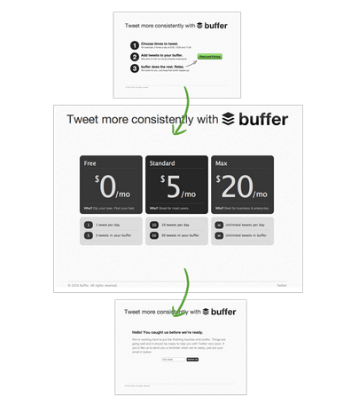
Image Source: Buffer
Buffer’s first minimum viable product explained what Buffer was and how it would work, encouraged people to sign up and offered a “plans and pricing” button for people to click on if they were interested. Those who did, were shown a short message explaining that Buffer wasn’t quite ready yet and that people should sign up for updates. Gascoigne used the email addresses received from the signup form to start conversations with the potential users of the app, gaining valuable feedback and insight into what they would want.
Just like in our car example, Gascoigne then iterated on the MVP to test a new hypothesis: whether people would actually pay for it. They added a table of prices in between the landing page and the signup form, and learned that their hypothesis was correct, and users would pay for the service.. By relying solely on landing pages, Gascoigne was able to validate two hypotheses for little cost, and with no real product.
It’s important to mention here that Buffer’s first MVP only tested if there was demand for the idea. Once Gascoigne knew Buffer was a profitable idea, his team built a minimum viable solution.
A digital MVP without the digital
While UXPin’s current product is a web-based wireframing and prototyping application, their MVP was nothing more than a paper prototyping notepad. Marcin Treder knew that the UX design process could feel disjointed and messy. Improving the design process is no simple feat, so he decided to focus on simplifying just the wireframing and prototyping stages.
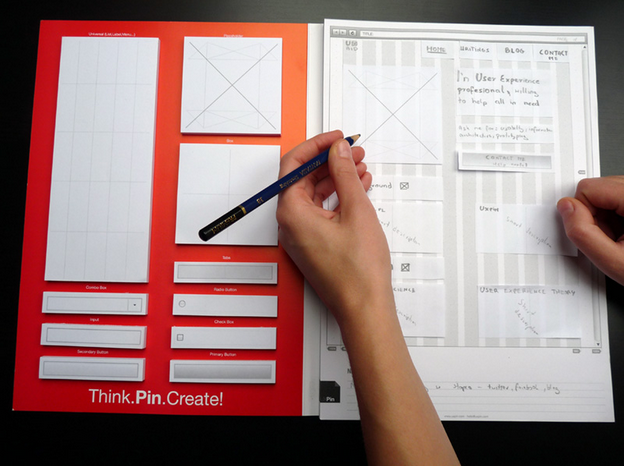
Image Source: UXPin
“Clearly, the paper products were cheaper to make initially,” Treder admits, “But we honestly had no idea that our next version of the product would be technical—we were just a few designers trying to help our peers become better designers.” The first batch of paper notepads sold out within 48 hours upon launch back in 2011, validating the hypothesis that designers definitely needed a tool to make wireframing and prototyping easier.
But Treder soon realized that existing digital solutions were lacking. Balsamiq didn’t offer high fidelity and Axure was too clunky. The paper notepads weren’t a digital solution, so he revised his hypothesis and built a new MVP: an early digital prototype. Instead of striving for perfection, Treder’s development team built UXPin from the code base of another UX program and simply added more wireframing and prototyping capability—the same value proposition in a different environment. By using existing code base, this MVP maintained a small budget while offering the features that made the product a viable solution.
“For us, an MVP isn’t the quickest or the most perfect product,” he says. “It’s a product that requires minimum development effort but creates maximum value.” He admits that his first paper prototyping notepad product didn’t provide the maximum value, but it was a minimum effort that helped him gain valuable insight: customers wanted the notepad, but they needed a better digital solution. In that sense, the early MVP succeeded.
An MVP without the “P”
Where UXPin began with a tangible product, Dropbox began with no product at all. Given the complexity of cloud-based file storage, even a simple prototype would require overcoming major technical hurdles to deliver reliable online service.
Instead of risking months (if not years!) of development on a product that people might not want, the Dropbox team decided in 2008 that it was easier to illustrate the customer experience. Their MVP became a 4-minute video narrated by Founder Drew Houston which portrayed an elegantly simple user experience. A green checkmark shows up on files when they’re synced to Dropbox, and moving files to the cloud is as simple as drag and drop. No jargon or technical bravado — the experience speaks for itself.
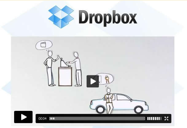
Image Source: Dropbox.
The low-tech MVP paid off. Almost overnight, Dropbox’s signups increased from 5,000 to 75,000 people with the influential online community Digg even dubbing it the “Google Drive killer.”
While the Dropbox MVP proved Drew’s hypothesis, it also taught them that great UX was their most powerful selling point. Though a prototype would have been the best way to give users the full Dropbox experience, their video taught them what they needed to know. A few months later, Dropbox entered an already saturated market and succeeded because Drew’s team followed up on their promise of a seamless experience.
In this case, seeing is certainly believing: the original MVP video sat front-and-center on the Dropbox homepage from 2008 all the way until 2013.
The 10x MVP Process
Ash Maurya, author of Running Lean—Helping Entrepreneurs Succeed, simultaneously built and marketed an MVP for his startup, Cloudfire using the 10x process. Ash created the process to follow three steps:
- Identify a group of 10 users and conduct customer interviews to find their pain points.
- Build a concierge MVP to deliver a quick solution and present it to the first batch of customers.
- Use the customer input to create a landing page with effective messaging, in order to collect emails for the next 100 early adopters.
This second batch of early customers provides more candidates for customer interviews, which helps perfect the messaging for a marketing website, which encourages more customers. Thus, the 10x process helps to multiply the user base by 10 at each step of the MVP process.
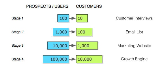
Image Source: The 10x Product Launch
What’s key to the 10x process, is that the MVP is treated as a real product — as opposed to a beta product being tested. This means that pricing is discussed in Stage 1 (similar to Buffer’s method), which helps tackle the issue of profitability early on. It’s very important to remember that an MVP also competes with free solutions, so it pays to listen to customers to understand what will help the MVP cross the penny gap.
A 10x product launch is a variation on the MVP process. While a concierge MVP is significantly more labor intensive than other MVPs, the team continues to iterate, refine, and scale the product after the initial launch. Through interviews, surveys, and even usability testing, the goal is to acquire a wider user base and build a better MVP over time, which still upholds the MVP goal of minimizing risk while maximizing viability. Customer interviews help identify who has the problem, and what the smallest solution looks like, which reduces product risk. Customer interviews also gauge reactions to pricing and competition, which reduces market risk. As a bonus, the number of landing page, email list, and marketing website visits also serve as metrics to gauge customer interest and market viability.
Complete experiences instead of complete features
Landing pages, videos, non-digital products, and the 10x product launch are each distinctly different ways of accomplishing the same goal. The MVP process is valuable for every UX designer, whether at a startup, an agency, or in-house. Learning from users, maximizing viability, and minimizing risk are always worthwhile objectives.
Perhaps the best way to think about the MVP is Brandon Schauer’s cupcake theory, which emphasizes a complete experience each step of the way. Just like a cupcake is a better (and more desirable) MVP for cake than a bowl of flour, make sure the MVP always communicates the value of the product. If the MVP is a landing page, the copy should convey the messaging, the call-to-action should be clear, and the UI must be intuitive. If the MVP is a working prototype, it must actually work well. Building something small is admirable, but building something poor is inexcusable.
For readers interested in additional thoughts on MVPs, feel free to check out the list of additional resources below. We’d love to hear ideas in the comments below.