Information architects form the blueprints of the web
Next to explaining what I do for a living, the second question I most frequently hear is: “What’s the difference between Information Architecture and User Experience?” The line always seems to blur between the two, even though there’s clearly a difference. How should I go about explaining it?
Information Architecture, according to Wikipedia, is “the art and science of organizing and labelling websites … to support usability.“ According to the same source, User Experience is “the way a person feels about using a product, system or service. [This includes] a person’s perceptions of the practical aspects such as utility, ease of use and efficiency of the system.”
Even with regards to its definition, User Experience takes Information Architecture as its foundation and brings it to the next level.
Information Architecture concerns structure
Information Architecture is a relatively old term. Old in the sense of the web and old in the sense of our progression through technology. It focuses on the organization and structure of content in a manner in which a user can navigate through it. Digitally speaking, it can range from a simple brochure site all the way to a complex information system.
Information Architects work to create usable content structures out of complex sets of information. They do this using plenty of user-centered design methods: usability tests, persona research and creation, and user flow diagrams (to name only a few). That said, it still seems that UX design is in vogue.
And here’s why: Information Architecture comprises only small a part of a user’s overall experience.
User Experience concerns emotion
What’s User Experience then? User Experience Designers take a site’s information architecture one step further, considering not only its navigation, but also its ability to facilitate engagement. To do this, they employ user-centered design to produce a cohesive, predictable, and desirable affect in their target audience. Whoa.

UX designers turn ordinary experiences into exceptional ones
Essentially, UX designers work to make things more profound, targeting their users on an emotional level. I don’t mean “tugging at heart strings” emotional, but more eliciting an emotional response in respect to what they just accomplished. UX design adds context and story to a user’s natural behaviour and, in so doing, gives them something to take away from their experience.

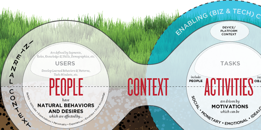
Stephen Anderson believes that the best experiences lie at the intersection of “People, their Activities, and the Context of those activities”
You can look at it like this: UX encompasses the whole spectrum. It’s like taking a cup of IA, mixed with a dash of usability, a pinch of content strategy and whole lotta creativity. Or, even simpler, UX is the love child between a Creative Director and an Information Architect. A lot of the time this means stripping things away so you’re left with just the essence of what a user needs.
Being easy and cool
If you aren’t completely confused yet, you’re probably thinking that you need a good IA in order have a good UX. Exactly. Another way of looking at it is: User Experience Designers consider Information Architecture, but Information Architects don’t necessarily consider their users’ entire experience.
A usable experience is easy, simple and gets the job done. An engaging experience does all of that and instills a lasting impression on the user. It’s the difference between coming away from a site and thinking “That was easy” and “Whoa. That was cool.”
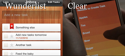
It’s the difference between Wunderlist and Clear.

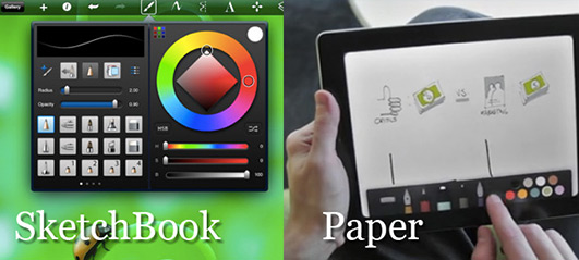
Between Sketchbook and Paper.

Both of the former apps are good, easy, usable tools. But the latter apps are not only easy and usable, they’re fun and engaging.
It’s all in the approach
Looking at any one discipline’s workflow is a daunting task, but let’s take a quick 10,000-foot view how the workflows for IAs and UX designers might differ. Information Architects would likely consider their requirements, research their users’ goals, and conduct some form of competitive analysis. In the end, they might generate page flows, wireframes and, of course, a sitemap. Add on some usability testing, refinement and revisions, and it’s off to the designers.
UX designers, though, would likely take a different approach. Although they’ll take the IA’s workflow into consideration, they might also consider the emotional goals of their end-user. Their competitive comparison may be more around interaction models, rather than structure and layout.
Conclusion
UX builds on the foundation that IA provides, aiming to take that experience to the next level, both creatively and emotionally. This is the outstanding difference that defines how the apps, sites, and products of today are designed as opposed to those of yesterday. For those interested in more resources, I’ve included a list of links below to check out.