Every day, we use forms for essential online activity. We fill them out to complete purchases; to sign up for email lists, social networks, and more; to participate in discussions; and to describe that oh-so-delicious looking photo of our lunch. It’s hardly hyperbole to say they’re the lifeblood of digital information sharing. For many years, however, with few improvements to be found, forms have been mired in working “well enough” but not exactly well. Now, modern techniques—when used correctly—allow designers to produce faster, easier, and more productive form experiences.
The sacred cow when it comes to form user experience is that shorter is better. And though this certainly seems logical—that less user effort will lead to higher conversion—this guideline fails to account for other factors such as which fields are used, how they’re designed, and how engaging the form experience is.
As one example, the study I found referenced far more than any other, quoted as gospel in slew of articles and presentations, was shockingly limited. Conducted nearly 10 years ago by Imaginary Landscape (an open-source web development agency), it shows how an 11-field form, cut to 4 fields, drove a conversion increase of 160%. But this was simply one page, one test, two variables. That’s it. Did they try different groups of 4 fields, for example? No. What about 10 fields vs. 11? 5 vs 4? Nope. In this one particular case, yes, cutting the amount of required information by 64% made the form easier to fill out.
In a presentation at Call To Action 2015, Michael Aagaard of Unbounce shared a study of similar focus. Tasked with improving lead conversion on a particular form, he first cut the amount of fields from 9 to 6. Conversion dropped by 14%. Digging into the research, he discovered that the most engaging fields to users were the removed fields, resulting in a less compelling experience. In round two, he tweaked the original form for clarity and organization, but kept all 9 fields. Conversion increased by 19%. Turns out shorter isn’t always better.
So, if it isn’t just making them shorter, how do we use modern technology to create the best forms? Let’s consider some new rules:
- Prioritize Scannability
- Provide Effortless Formatting
- Limit Typing
- Leverage Location
Prioritize Scannability
Jakob Nielsen told us long ago that users scan web pages rather than reading them carefully from top to bottom. Even when filling out forms—though their creators might hope for full attention—the same rules apply. Allowing for efficient, effective scanning is crucial to limiting errors or missed fields, especially when the form is intended to be filled out one time per person (ecommerce address forms, signup forms, etc).
Label Location
Much research has been done on label location, yet this debate endures. Form guru Luke Wroblewski writes of a study that determined top-aligned labels result in the shortest completion times, due to the reduced amount of eye movement needed. For forms with commonly understood labels, right-aligned is the next fastest, and recommended when page height is a constraint. Though left-aligned labels produce the slowest completion time, this style improves comprehension when the data requests are less commonly understood.
Hints
Placeholder text (a.k.a. hint text), on the other hand, is generally agreed to be the opposite of helpful. Including the label as placeholder causes it to disappear once the field gains focus, meaning the user can no longer view it. This causes strain on short-term memory and increases the chances of error.
Even if the label is separate, adding a hint suggests, at a glance, that the field is filled out. NN Group eyetracking studies, as one example, have illustrated how empty fields draw more attention than those with text, and that users are more likely to skip fields with placeholders than those without. In other words, supposedly helpful hint text within a field does more harm than good, and is especially problematic for scanners.

Good: an empty form field

Bad: a form field obscured with help text
In some cases, placeholder text is designed to be lighter in color than regular text, which may alleviate the above issue. This technique, however, creates a contrast problem, in that light gray text on white typically fails to meet the universally accepted guidelines for web accessibility (A ratio of 4.5:1 for normal text). In addition, according to the W3C, placeholder text is not widely supported by assistive technologies, making it more difficult for these users to fill out forms accurately.
Floating Labels
There’s a newer interaction design style—the floating (or adaptive) label—that’s rapidly gaining in popularity. In these designs, label text begins as placeholder text, then shifts above the field once the user starts typing, eliminating the aforementioned concern about disappearing labels.
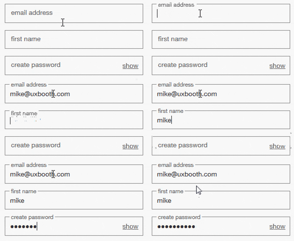
Though this can help decrease page length, which is especially helpful on mobile, it does not address the aforementioned issue of text suggesting the field has already been filled out. As such, NN Group also recommends to avoid this practice, keeping the label above unless page length is of major concern.
Provide Effortless Formatting
In the old days, there was a lot of guesswork involved in filling out a form. Which format should my phone number follow? Did I miss a number in my credit card? Where’s the @ symbol on this keyboard? New techniques allow us to take those decisions out of user’s hands, producing cleaner experiences.
Input Masks
Though similar in appearance, field masking—a technique that helps users format entry text—is distinctly different than placeholder text. Firstly, a mask only appears once a user focuses on a field, preventing the aforementioned scanning issue. Secondly, masks format the text automatically, while the field is being filled out, allowing users to focus on the required data and more easily notice errors. In the example below, the parentheses, spaces and dashes are applied automatically as phone number is entered.

This simple technique saves time and effort when filling out phone numbers, credit cards, currency, and more.
HTML Attributes for Input Fields
Many designers now know to display the correct mobile keypad for certain data, but there is some confusion on which is actually the correct type.
The commonly used “number” type attribute, for example, does not bring up the numeric keypad. It shows the regular keyboard with the number state displayed, including numbers that are much smaller than those on the keypad.

“Number” keyboard vs. “tel” keypad.
For fields that contain ONLY numbers like date, zip code, credit card, etc., the larger tap targets of the telephone-style keypad ensure that the input can be entered with the least amount of user effort. (To make this appear, either use “tel” as the type value or add the attribute “pattern=”[0-9]*”.) The full keyboard set to the number state, however, is still useful for mixed fields that typically always start with a number, like a street address.
There are several other attributes that can be added to text fields that will also eliminate excess key presses and errors.
- AutoComplete: Browser function to show a list of previously entered values. Should be set to “off” for sensitive data.
- AutoCorrect: Changes words that appear to be misspelled. Should be turned off for unique fields such as names, addresses, etc.
- AutoCapitalize: Makes first letter a capital. Good for name, bad for email address.
- SpellCheck: Underlines misspelled words in red. Should be turned off for unique fields such as names, addresses, etc.
Limit Typing
With more and more people using small, mobile screens, anything that can be done to prevent unnecessary typing will improve user satisfaction and decrease error rates.
Address Pre-Fills
Filling out an address is often the most cumbersome part of any online signup form. Multiple fields, long names, etc. By trimming this down to a single field, it not only helps keep the user on the keypad—and no, they don’t know how to use the previous and next arrows—it also eliminates a huge amount of typing.
Entering the address (street, city, state, zip, country) to Google’s headquarters in the below example, the full form can be completed with 10 keystrokes, versus potentially more than 50 to enter it manually.
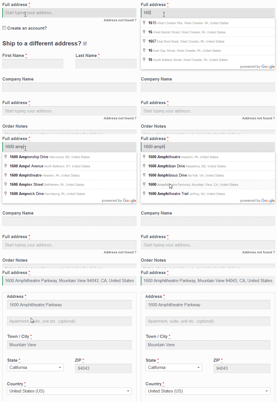
The Google API solution pictured above works quite well in most cases, but tends to struggle with addresses featuring building or apartment numbers, since that data is not included in their feed.
Think Geek’s checkout, powered by a SaaS vendor called PCA Predict, allows for apartment number entry during the initial search, reformatting the address correctly after entry.
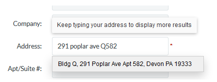
ThinkGeek.com
Email Pre-Fills
Another way to cut down on typing is by offering a list of common domain names within the email field. Staples uses a pre-fill solution that appears as the user is typing, once they hit the @ button, saving up to 12 taps per entry.
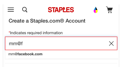
Notice the field label “email address” has disappeared.
Leverage Location
Though geo-location data is commonly used within mobile apps, we can’t forget to also leverage it across all manner of tablets and desktops. Especially on touch screens where typing is cumbersome, pre-filling information based on location awareness can save valuable time and improve conversion.
A good example of this technique can be found on Nordstrom’s web product detail page, who uses it to skip the form experience entirely. Instead of asking for a user’s zip code, the product detail page senses location and automatically looks up the item’s inventory at the closest store. In addition to saving time, this surfaces useful information without requiring any user effort.
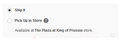
Nordstrom.com
Though possible, pre-filling a full address can be problematic due to accuracy issues. Google’s Places API uses both geo-location and address pre-fills to get the best of both worlds by providing accurate suggestions based on the user’s exact location.

Zuppler.com
Due to imprecision, of course, any implementation will need to allow for manual editing of the automated data.
Forming Better Forms
In short, following these rules will put any form experience on the right path to success and create happy users:
- Prioritize scannability by designing easy-to-read labels, and by avoiding extraneous content that confuses scanners
- Provide effortless formatting with input masks and proper keypads (as well as other HTML attributes) for each entry type
- Limit typing with pre-fills
- Leverage location without added clicks
That said, there’s always more to learn in our ever-changing digital landscape. Some quality additional resources for form design include:
- Luke Wroblewski’s book Web Form Design or his blog, which covers a variety of UX topics
- W3C’s form accessibility guidelines
- Amanda Cheung’s UX Booth piece on how to style forms accessibly
Ready to get your feet wet in Interaction Design? In this article we touch briefly on all aspects of Interaction Design: the deliverables, guiding principles, noted designers, their tools and more. Even if you're an interaction designer yourself, give the article a read and share your thoughts.