In a recent project, a client asked us to create a sitemap we were not prepared to render. It’s not that my team lacked the skill to build a sitemap; this particular architecture simply didn’t lend itself to being displayed in that way.
Designers who work on buildings face an identical challenge: does the client really understand the what’s indicated in these various diagrams? When a project is still on the proverbial drawing board, architectural draftsmen work in three different primary views of a given structure, and they’re trained to know which ones to use when.
The more I’ve learned about how architects make the built environment, the more I appreciate the frameworks for visual explanation that govern why, what and how they draw. In this article, I attempt to trace the sitemap—the stock-in-trade deliverable expected from an information architect—to its brick-and-mortar architecture equivalent.
The sitemap experience I discuss in this article was part of a client project my team has now successfully delivered. The work itself was a fairly straightforward project to move a piece of enterprise software from desktop to the cloud. It provides a case-in-point for understanding the ways we can display a site architecture (beyond the traditional sitemap), and when to use these alternative views.

Image credit: Levy, Alan, William B. Chapman, and Richard S. Wurman. Our Man-Made Environment: Book Seven. Philadelphia: Group for Environmental Education, 1970.
Case Study: Visually Explaining An Information Architecture

Image credit: Klyn, Daniel. LaFleur, Travis. Previously Unpublished Diagrams 2016.
Recently my company was engaged to assist a client with a re-platforming project, wherein they were moving a piece of enterprise software from desktop PCs to “the cloud.” In our view, there was a fundamental difference between the desktop software (which we called the “as-is”) and the cloud-based (the “to-be”) architectures. The “as-is” desktop software presented every navigation option that any user might ever need, all at once. One navigation bar for all users. But in the more limited browser viewport, our space-planning strategy relied on the cloud-based system being capable of presenting only the navigation options relevant to a user’s context in the system.
The fairly radical re-structuring we proposed was predicated on improving coherence for each user in their particular role, while opportunistically “fixing” some Fitts Law-related problems with the use of space in the interfaces more generally.
Now, much like our sisters and brothers with the big rulers and tilty desks, information architects like to work out conceptual complexities using drawings and diagrams. The diagrams help us create a shared understanding of the IA recommendations with our client, so that my team can then jump from abstract models into detailed interface design.
Our expectation was that the twenty or so detailed wireframes we’d prepared within our project’s scope would be enough to help the client understand the core concepts. We needed them to, as our project’s scope did not permit making a wireframe for every possible state and mode of every possible interface. We believed that the “missing” wireframes could be inferred from the ones we did make.
The client was pleased with how much coverage of the possible interface scenarios we were able to achieve. However, they said, there was just one “missing” part of the new information architecture my team could still provide.
A sitemap.
Drawing Like Architects
For many in the field of UX, a sitemap is the only known method of showing an information architecture. So let’s pause now, to look at the three diagrammatic views that building architects use to facilitate an understanding of space and place, and compare these to the tools an IA might use.

Plans
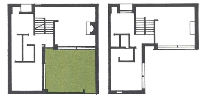
Plans are the most fundamental diagrams for architects in the built environment, and are meant to show only one “level” or floor of a building at a time.
In the plan view, the features of the space that change the least are emphasised the most.
Traditionally, a plan for making a building is drawn as if we were able to cut a horizontal slice across the building at about 4’ (1.2m) above the floor of the space being viewed. The primary limitation inherent in this view is that we can’t see how the features of these spaces might interact with the spaces above or below.

Image credit: Levy, Alan, William B. Chapman, and Richard S. Wurman. Our Man-Made Environment: Book Seven. Philadelphia: Group for Environmental Education, 1970.
Plans are probably the most well known type of architectural drawing, and they’re good for understanding what’s invariant, or unchanging—much like a sitemap in IA. (More on that in a bit.)
Sections
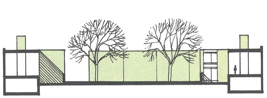
Sections are most helpful toward understanding the relationships between levels.
A typical section view is drawn as if a building has been sliced vertically. In the illustration below, the architect shows that most of the spaces in this building are sitting on a slab on the ground, except for the volumes at either end. Both of these volumes are split horizontally, and we understand the space above has a higher ceiling than the space below thanks to the inclusion of the silhouette of a person in the upper level of the volume on the right.

Image credit: Levy, Alan, William B. Chapman, and Richard S. Wurman. Our Man-Made Environment: Book Seven. Philadelphia: Group for Environmental Education, 1970.
On the basis of this diagram alone, we can infer that there is a plaza of some depth in-between the volumes cut open on either side of the building complex depicted in the drawing. But that inference can not be validated without the help of at least one other diagrammatic view.
Sections are useful in understanding the relationships between and across levels, much like user flows in UX design.
Elevations
When we combine an elevation view of the building with a plan view and one or more section views, the result is the ability to understand what’s been designed, without the need for accompanying explanatory text.
An elevation drawing offers a view of the building as seen from one side, and from one fixed perspective. It shows all of the parts that comprise the space as they would be seen from a particular direction. Elevations also show the scale of the facade relative to the size of a single person.

Image credit: Levy, Alan, William B. Chapman, and Richard S. Wurman. Our Man-Made Environment: Book Seven. Philadelphia: Group for Environmental Education, 1970.
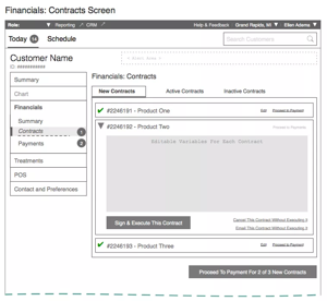
This is the view that’s most commonly used to describe the physical appearance of a building. Wireframes might be considered the elevation drawing of the IA world. Wireframes help us understand intricacies of the user’s contextual experience. And high-fidelity wireframes allow us to see everything that the user would see from a particular place in the architecture.
Pictures Help (Except When They Don’t)
Returning to our replatforming project, the sitemap request came from the members of the stakeholder team most immediately responsible for delivering the technical side of the project.

Image credit: Carmichael, Grant. Photograph of Pop-Out Illustration from Levy, Chapman and Wurman (1970). 2016
Architecture is a service business: of course you make the drawing the client asks for. Only in this case, we felt that the client was asking for the wrong drawing. It was at this point that we first made the connection between architectural drawings, and software IA.
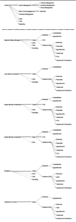
Our partners on the client team did not understand—we posited—that what they were asking for was akin to a single floorplan view encompassing all six permutations of what we’d designed for each of the six distinct system roles.
We protested (gently) that since each user would see a unique presentation of navigation options, “flattening” all possible variations into a sitemap, or a single plan view would result in an illegible diagram.
The purpose of the plan view for architecture in the built environment, we explained by analogy, is to account for the arrangement of “invariant” structures on a given level. The rooms, the doors, the windows, the circulation elements; features of the space that do not change often. Drawing a traditional UX sitemap to represent the info-architectural space of the new system was impractical: what’s invariant for one user is absent or reconfigured for another.
We acknowledged the client’s desire for a complete view of the new architecture, though, and proposed that a different modality than sitemap could satisfy the necessary functions of a plan. In doing so, we also noted that the other two views of a given architecture were already well represented in our information architecture development process:
Figure 1: Mapping Case Study Project’s “To Be” Information Architecture Deliverables by “View”
| Plan | Section | Elevation |
|---|---|---|
| Good For Understanding What’s Invariant On A Given Level | Good For Understanding Relationships Between & Across “Levels” | Good For Understanding What Users Experiences Will Be Like |
| Affordance Map | Business Objects Model Business Process Model Low-fidelity Prototype System Map Wireframe Annotations |
UI Sketches High-fidelity Wireframes |
In order to achieve the fullness of understanding that’s attained only through consideration of at least one diagram from each of the three views of architectonic space, my team improvised what we came to call an “affordance map” in order to make clear what does and doesn’t change on a given level of the structure.
By focusing on what’s afforded to each user role at each level, without regard to states and modes, a map of this kind is able scratch the metaphorical itch for a “sitemap” certain project participants may require. And reasonably so, since at least one diagram from each of the three diagrammatic views of architectonic space is necessary for understanding a given architecture.
Our affordance map did the trick. We delivered the project on time, on budget, and the client congratulated us for going “above and beyond” what they required.
Next Steps
At TUG we’re excited to continue finding fruitful mappings to and from what architects do in the built environment and what we do in places made of information.

Image credit: Klyn, Daniel. LaFleur, Travis. Previously Unpublished Diagrams 2016.
We’re also keen to re-interpret the knowledge generated by the first and second generations of information architects for today’s practice. For example, we’ve relied on Austin Govella’s deliverables comparison matrix as decision-making support for knowing which kinds of deliverables are best given certain usage variables (fidelity, iteration, notation, audience). Reconciling Mr. Govella’s matrix against the one provided in this article is work we intend to do sooner than later.
A next step for other IAs and would-be IAs: take advantage of your nearest World IA Day celebration on February 20, 2016. In more than 60 locations on five continents, people are gathering to spend a whole day learning and talking about information architecture. Architects in the built environment have been developing approaches to the thoughtful making of space and place for millennia. Our field turns 40 this May.
There are architects everywhere: let’s learn what they know, and—when it helps—do as they do.