People swear by their design processes. Rachel Glaves insists on sketching by hand; Dan Brown urges extensive wireframing; while Ryan Singer goes straight to HTML. Heated debates arise at conferences as advocates staunchly defend their favorite techniques.
With all of these different methods to choose from, should you be sketching, wireframing, mocking-up, or prototyping? The answer, simply put, is yes you should.
Design methods are not mutually exclusive. Rather, each method exists on a continuum of fidelity, ranging from low fidelity sketches to high fidelity HTML prototypes. Each method is well-suited for a particular phase of the design process, with one level of fidelity often leading into the next.
The design funnel
In his book Sketching User Experiences, Bill Buxton portrays the design process as a cycle of elaboration and reduction. The goal of the elaboration phase is to generate as many different ideas as possible, while the reduction phase is meant to select one of those ideas and carefully refine it.
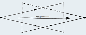
Laseau’s overlapping funnels (as portrayed in Sketching User Experiences) indicate the dual nature of design as elaboration followed by reduction.
Rinse and repeat
While it does typify the design process as a whole, in practice the elaboration and reduction process must be continuously repeated time and again throughout the course of design. From information architecture, to visual design, to the functional prototype, each stage must be explored in full, then lovingly honed down to a precise solution.
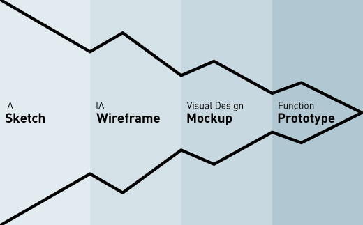
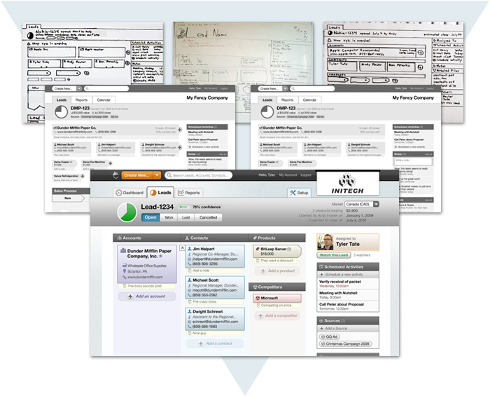
The design funnel illustrates the repetition of the elaboration/reduction cycle from low fidelity to high fidelity, converging into the final concept (inspired by Stuart Pugh’s funnel).
Getting it right
Using a method too high in fidelity wastes resources (both time and material) and risks a mediocre path being selected because better options were never given a chance. Working at too low a fidelity, on the other hand, means that the details never get filled in, yielding a half-baked result.
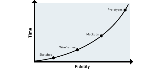
A real world example
Thus far I’ve outlined an orderly model with distinct categories. Reality, however, is much more complicated: various components are often designed in parallel and at different phases; lines blur between information architecture and visual design; and refinement can sporadically revert back into ideation. What does the design funnel look like in the real world?
In a nutshell
In late 2009, I teamed up with Nutshell to design a new customer relationship management application. Over the past 9 months we have sketched (a lot), wire-framed (a bit), mocked-up (a whole lot), and coded (continuously) as part of the design process. The first month and a half was made up entirely of discussions in front of the whiteboard and around paper sketches. The month after consisted of turning the selected sketches into wireframes, while sketching continued for other parts of the application.
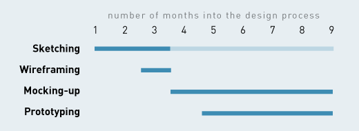
Our media-of-choice over the past 9 months of designing a CRM.
At three-and-a-half months in, we had a pretty good picture of the information architecture for 80% of the screens. From then until now, most of my effort has gone into full-fidelity mockups, while I revert to sketches when we encounter less well-defined screens or workflows. As soon as the first mockup was complete, my colleagues began coding an HTML5/CSS3 prototype, which we used (and are still using) to see how our ideas hold up under actual use. We chose to build this Safari-only prototype first so that we could iteratively refine with as little overhead as possible.
When the tables turn
What we discovered is that there comes a point in time where working at a higher fidelity actually requires less time than working at a lower fidelity. For instance, once our visual style had been developed in the mockups, it was no longer beneficial to build wireframes; going straight from sketch to mockup worked just fine. Similarly, when we discovered something in the prototype that didn’t feel quite right, it was often easier to tweak the prototype directly than to go back to Photoshop.
Be lazy (in a good way)
There is no single correct form of design. Rather, each method is appropriate in a certain context. At the end of the day, it simply comes down to selecting the level of fidelity that gets the job done in the least amount of time. As it’s been said, “Laziness is the mother of efficiency.”
Information architecture is an often misunderstood job title. Are they designers? developers? managers? All of the above? In this article we'll discuss what information architecture is, why it's related to usability, and what are the common tools/programs used in information architecture.