This article is a part of a series:

How are our layouts affected by the (usually) small screen sizes of mobile devices? How do we serve mobile layouts to specific devices?
One of the first choices a designer makes when creating a website is determining its appropriate dimensions. At a time when desktop resolutions range anywhere from 1024x768px to 2560x1600px, designers are well accustomed to designing for the lowest common denominator. It’s not exactly good practice to create a layout at 1200px wide when 20% of your users are browsing on a 1024×768 resolution.
In the desktop world, the rate at which this minimum acceptable resolution changes is relatively slow. In one way, this is quite useful for web designers. If users are slow to upgrade their equipment, then our designs don’t have to struggle to keep up with them. Based on statistics from w3schools.com, beginning in the year 2000, it took 9 years for less than 10% of their viewers to be browsing at 800x600px. Similar statistics from w3counter.com show that between May of 2007 and January of 2011, the number of users browsing at 1024x768px has only dropped from 50.97% to 20.59%. Despite a 30% drop, it is still the most popular resolution based on their statistics.

While neither of these two polls are conclusive (they don’t measure an actual average of all internet users), they do effectively demonstrate how slow users are to adopt higher screen resolutions. This slow change has allowed for entire frameworks to be built for creating layouts based on a common low resolution.
Of course, fluid layouts have allowed designers to serve fine-tuned browsing experiences at different resolutions. When designing at percentages instead of pixels, it’s possible to make more use of physical screen space depending on resolution. A site with a max width of 90% will make use of 21.6 inches of a 24 inch monitor, while a fixed layout at 960px might only make use of 10 inches of the monitor. Fluid layouts can have drawbacks though (Does anyone else have trouble reading Wikipedia on a 1920×1200 display?). Even in using fluid layouts, there are limitations we have to consider such as the ideal number of words per line.
But what about mobile design?
Saying that resolutions and display dimensions change rapidly in the mobile device market would be an understatement. The lifespan of mobile devices tends to be much shorter than that of a desktop (for instance, the average life of a cell phone tends to be around 18 months according to the United States Environment Protection Agency). Shorter device life spans in addition to constant new releases of mobile devices equate to an always changing landscape of popular resolution choices.
While this list won’t likely be relevant for very long, here is a list of popular resolutions on mobile devices as of February 2011:
| Resolution | Devices |
| 320×240 |
|
| 320×480 |
|
| 480×360 | Blackberry Devices: Torch, Storm, Bold |
| 360×640 | Symbian OS Devices: Nokia N8, Nokia C6-01, others |
| 480×800 |
|
| 768×1024 | iPad |
| 640×960 | iPhone 4 |
| 1280×800 |
|
|
Please note that this is a very limited list, and is by no means complete. What is important to take from this data is that a wide range of screen resolutions are out there, and new devices are introduced constantly. |
|
This wide variety in display size makes it difficult to decide how to choose an appropriate layout size for mobile devices. Should we target the lowest common resolution in handheld devices like we do on desktops? How does that scale onto newer tablets that offer 2-3x the resolution of a 320x240px smartphone display?
One possible solution is to create fluid layouts for mobile devices. Unlike desktop displays where building layouts that are too wide is a concern, handheld devices read much like a book or magazine. Full width layouts have worked for centuries for magazines and books—it seems likely that they should also work on a new generation of mobile devices.
Another possible solution is to create layouts for specific devices, and collections of devices. What does this mean? Instead of creating a one-size-fits-all layout, create a layout that changes depending on the current resolution and orientation of a device.
In the past, this was easier said than done. The only effective way to deliver a resolution-specific experience to a mobile device was either with javascript, or by detecting the user agent.
There was one other way to target handheld devices, but its implementation was a bit spotty across devices. You see, cascading stylesheets have the ability to target specific media types like screen, print, and even handheld. However, mobile browsers have implemented this feature is a variety of ways. Some mobile browsers will only load stylesheets targetting handheld media. Other mobile browsers will ignore handheld targeted stylesheets, and only read screen media stylesheets.
A big reason for the different implementation of this feature in mobile browsers is the “One Web” approach to web design:
…One Web means making, as far as is reasonable, the same information and services available to users irrespective of the device they are using. However, it does not mean that exactly the same information is available in exactly the same representation across all devices. The context of mobile use, device capability variations, bandwidth issues, and mobile network capabilities all affect the representation. Furthermore, some services and information are more suitable for and targeted at particular user contexts…
Devices like the iPhone (and others) have largely ignored handheld media rules, because the creators felt that their device was capable of sufficiently displaying websites built for desktops. This essentially made the handheld media type useless for building specific layouts for many mobile devices.
CSS3 Media queries
With the introduction of CSS3 Media queries, it is possible to target devices through many other variables including device width, device orientation, and aspect ratio. Using Media queries, it’s possible to load specific styles on specific devices (or collections of devices). This is what Ethan Marcotte refers to as responsive web design.
Using CSS Media queries is simple enough. A standard implementation might look something like this:
      <!-- All common styles -->
      <link rel="stylesheet" href="common.css" type="text/css"
      	media="screen" />

      <!-- Devices between 480-1024px -->
      <link rel="stylesheet" href="styles_max_1024.css" type="text/css"
      	media="only screen and (min-width:481px) and (max-width:1024px)" />

      <!-- Devices below 480px -->
      <link rel="stylesheet" href="styles_max_480.css" type="text/css"
      	media="only screen and (max-width:480px)" />
The above code would load 3 stylesheets: styles for all devices, styles for devices in the 481-1024px range, and styles for resolutions 480px and below.
A drawback to this implementation is that 3 stylesheets means 3 separate http requests. To improve the speed at which our sites load, we want as few http requests as possible. This is especially important on mobile devices where download speeds and latency are usually worse than on desktops (see Considerations for Mobile Design (Part 1): Speed).
A different way to implement this same set of Media queries would be to use them directly in a single stylesheet. This could look something like this:
      /* Common CSS Goes Here */

      /* Devices between 480-1024px */
      @media screen and (min-width:481px) and (max-width:1024px) {
      	/* styles go here */
      }

      /* Devices 480px & below */
      @media screen and (max-width:480px) {
      	/* styles go here */
      }
Device-specific styles
If it’s important to deliver a very specific design to a very specific device (ie: a web application built specifically for the iPad), you can use Media queries to deliver styles to exact resolutions:
      <!-- iPad specific styles -->
      <link rel="stylesheet" href="iPad.css" type="text/css" media="only screen and (max-device-width:1024px) and (min-device-width:768px)" />
Orientation-specific styles
If the experience would benefit from different styles depending on a device’s current orientation, there is a way to handle that as well:
      <!-- Orientation styles for devices w/ max width of 1024px  -->
      <link rel="stylesheet" href="portrait.css" type="text/css"
      	media="only screen and (max-device-width:1024px) and (orientation:portrait)" />

      <link rel="stylesheet" href="landscape.css" type="text/css"
      	media="only screen and (max-device-width:1024px) and (orientation:landscape)" />
Unless it’s absolutely essential to the experience, the contents of a page shouldn’t change depending on a device’s current orientation. The actual dimensions of objects may change to better suit the reader, but removing objects from a page or inserting new objects will only confuse a user.
Browser-specific styles
Like desktop browsers, mobile browsers don’t all render code the same way. Making browser-specific adjustments to mobile websites can be a bit difficult. Gecko, Opera, and Webkit browsers can all be targeted specifically with some pretty ugly hacks. Luckily, up-to-date versions of these browsers typically do a good job of rendering standards-compliant code.
Internet Explorer Mobile has made huge strides in rendering code, but if you run into problems, there is a way to target IE Mobile in Windows Phone 7:
      <!--[if IEMobile]>
      	<link rel="stylesheet" href="ie_mobile.css" type="text/css" media="screen" />
      <![endif]—>
While some developers loathe conditional comments, they have one beneficial attribute in a mobile environment: since this stylesheet is only loaded if a condition is met, a mobile device not running IE won’t make an additional request to load it. It’s also possible to use conditional comments so that on Windows Phone 7, only IE Mobile stylesheets are loaded (fewer requests, faster load-time).
Viewports
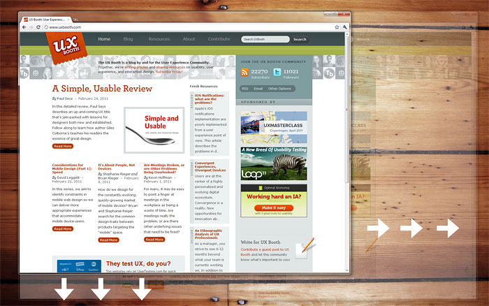
On a desktop, the dimensions of a web browser can be defined by the user on-the-fly. The dimensions of browser window and monitor are independent from each other.

Desktop browser window and monitor display resolution are two independent attributes.
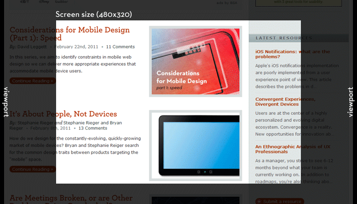
The mobile browser is limited to the width of the device. To compensate for small device dimensions, the viewport on a mobile device functions as an implied window. By default, many recent mobile browsers setup a viewport that accommodates the width of content on a page, and can be panned and zoomed.

The screen size shows the currently visible area of a webpage. The viewport extends out beyond the currently visible area, and can be panned and zoomed.

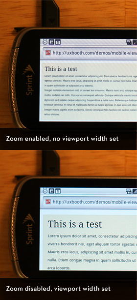
Top: In the top image, the viewport is automatically set by the mobile device, and the pixel ratio is low, making text difficult to read without zooming in. Bottom: In the bottom image, the viewport is set to the device width (pixel ratio of 1:1) and zooming has been disabled. Text in the bottom example is readable on page load.
Depending on the site, it might not make sense to force a user to browse in this fashion of panning and zooming. Many popular web applications have created polished mobile interfaces where panning and zooming would only slow down a user. For instances like this, we can actually control the viewport size on many mobile devices.
It should be noted that you don’t want to restrict panning and zooming on mobile devices for all websites. This is only a measure that should be taken if an experience is being designed specifically for mobile users.
Limiting mobile users to a 1:1 pixel scale of a site can lead to lots of panning back and forth to read text. Preventing a user from zooming in on a site not optimized for mobile viewing may lead to super tiny font sizes that can’t be read.
As users become more accustomed to browsing mobile versions of sites, they may grow tired of panning and zooming in favor of websites that have planned an experience specifically for them. Is it preferable to browse a news website where you’re required to zoom into the content area to be able to read it, or would it make more sense if the zoom level were automatically set so the content could be read as soon as a page loads?
Consider the mobile Facebook website. The mobile version of Facebook’s website restricts users from changing the scale of pixels on their site, and creates a fixed viewport the actual width of the device browsing the site. As a result, the mobile Facebook site functions much like a user might expect when running an application on their phone. The mobile Facebook website is incredibly easy to use on a mobile device because everything can be understood without zooming to specific navigation controls or content areas.

Facebook’s Mobile site functions like an application built for mobile devices. It doesn’t just feel like a website that can be viewed on a mobile device; it feels like a website built for mobile device interaction.
Setting up the viewport for mobile devices can be done using the <meta name=”viewport”> tag. A typical setup may like like this:
      <meta name="viewport"
      	content="width=device-width, initial-scale=1.0, maximum-scale=1.0, user-scalable=0">
This code sets the width of the viewport to the actual device width, sets the scale of pixels to 1px per actual pixel (1:1), and disables the users ability to scale the pixels. The viewport meta tag was introduced by Mobile Safari, and they have done an excellent job documenting these controls.
Mobile shouldn’t be too different
The Microsoft Kin was a smartphone platform unveiled April 12th, 2010. After two years of development, about $1 billion in development costs, and 48 days on the market, the Kin was discontinued. What was the problem?
There are probably a number of reasons why the Kin didn’t do well. I’d venture to guess that one reason is that the Kin smartphone wasn’t actually a smartphone. Smartphones have apps. The Kin did not.
The point is, users are creatures of expectation. Alright, that’s a bit shallow of a statement, but we’re also being shallow as designers if we expect to retain users after drastically changing an experience between devices. If a website is about cookie recipes on a desktop, it should also be a website about cookie recipes on a mobile device.
It’s very rare that you should omit content from a mobile device that would be displayed on a desktop. The most reasonable case for omitting objects from a mobile site is when the object wasn’t essential to the desktop site in the first place.
Mobile design isn’t about crafting an entirely new experience, but delivering the same experience, fine-tuned for handheld devices.

There are exceptions of course, or perhaps better stated as environment specific tasks. One obvious example of this would be an application that makes use of geolocation. While geographic location isn’t always useful data for a web app when using a desktop, location data can be very useful for mobile users. Consider applications like Foursquare and Gowalla that have built really clever experiences around user location data.
In instances where a task can only be completed on a specific device, it’s acceptable to not display that task/content. For the most part, these scenarios are few and far between.
Next up: Mobile behaviors and interactions
In the next part of this series, we’ll be talking about interactions that are unique to mobile devices, and how we can use new frameworks to build interactions like swiping directly into our web applications. We’ll discuss when it’s appropriate to use these types of interactions, and how some desktop conventions don’t translate well to mobile devices.
Until then, thank you for the feedback on this series so far! I know that mobile design is an area of much debate. If you have thoughts on how we should be delivering mobile experiences, I hope you’ll share them in the comments below.
Continue to Part 3: Behavior →