Monetizing social media is an elusive but desirable target for retailers both large and small. According to Forrester Research’s annual retail study with Shop.org, 72% of retailers plan to increase social marketing spending in 2011, and the ever-popular Facebook is unsurprisingly central to their strategy.
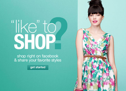
JC Penney Facebook Shop Splash Screen
Though there are many ways to engage customers via Facebook, one recent strategy involves bringing the online “store” to a business’ Facebook page. This allows potential customers to browse products, add items to their cart and complete checkout, all without leaving the Facebook website. Despite Forrester’s warnings—analyst Sucharita Mulupuru says that “these efforts do little to drive sales”
— and considerable doubt among retailers themselves—59% said that the monetary returns on these social efforts remain unclear—many companies plan to launch Facebook-powered stores in the next 12 months.1 As with any emerging platform, the time-to-market for these stores will often take priority over the quality of their design and, as a result, many user-centric design principles can be overlooked.
In this article, I’ll take a look at several of the first-to-market Facebook shops to determine what considerations should be made when deciding to build one. The shops I reviewed include JC Penney, Lands’ End, Steve Madden, Express, GNC, Westin Hotels, Molly Sims Jewelry and Rachael Roy Jewelry. After evaluating these experiences, some common themes emerged, leading to these 5 considerations for the Facebook commerce experience:
1. Maintain the experience
Any branded experience that a company provides—even on a third party site such as Facebook—is an experience with that brand, and thus should be treated with the same care that would apply to an experience within a company’s own domain (or anywhere, for that matter). Customers will not forgive a negative experience because they happened to be on Facebook, nor will they accept poorly designed graphics or navigation just because it was built by a third-party for a Facebook commerce app.
A great example of how this can go horribly wrong is for Molly Sims Jewelry. Comparing her website’s look and feel to the look of her Facebook shop, it’s easy to see that there is a huge gap in the overall branding.
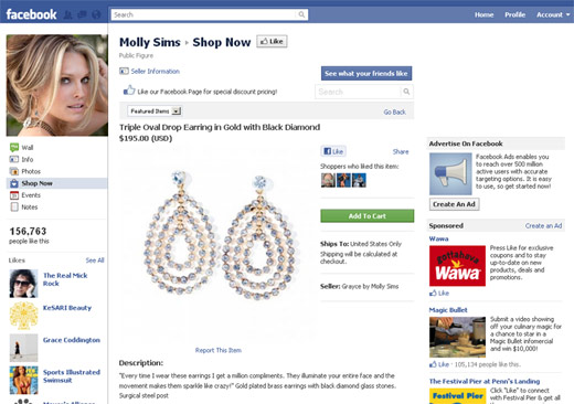
Molly Sims Jewelry Page on Facebook
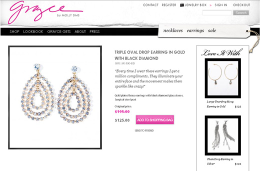
Molly Sims Jewelry Main Site
The main site looks clean, polished and well-designed, yet the Facebook app is busy, amateurish and does not make her products look particularly nice.
Several other brands offer product images that are far smaller on the Facebook shop than they are on the main site. In Steve Madden’s Facebook shop, for example, the Product Detail image is 43% smaller than on the main site, and the Product Listing image is 32% smaller.

Steve Madden Image comparison
In my experience, both usability research and site metrics suggest that larger image sizes resonate more with customers and drive higher conversion rates. Though it is true that the width of the Facebook shop area is smaller than the width of most websites, this should be no excuse to offer the customer poorer-quality images.
2. Leverage proven content & features
This comment, from a Starwood Hotels & Resorts Worldwide excutive in a Wall Street Journal article on social commerce, gave me pause: “The Westin Facebook shop is identical to its online shop, but it doesn’t have the same advanced search capabilities.”
So it isn’t “identical”, is it? If this advanced search would help a customer using the Facebook shop, how would they know they could find said feature on the main website?
Advanced faceted search is actually one of the features that was frequently missing in the Facebook shops I reviewed. Steve Madden, for example, offers refinement by size, color and price on their main site, but only refine by size on their Facebook shop. JC Penney offers a bit more on Facebook – including item type, gender and color refinements, but leaves out price range, brand, ratings and more from their main site.
Speaking of ratings, of the sites I viewed, almost none (including JC Penney and Lands’ End) offered customer ratings and reviews on their Facebook product detail pages. This is a crucial feature for online shopping; Forrester reports that 39% of US online buyers say that they’re more likely to purchase from a store that features ratings & reviews. My own research affirms that most shoppers rely on ratings & reviews to make an informed purchase. Only Express comes through here; though they’ve somehow incorporated an extra click to get to the full review content, the information is nonetheless available.
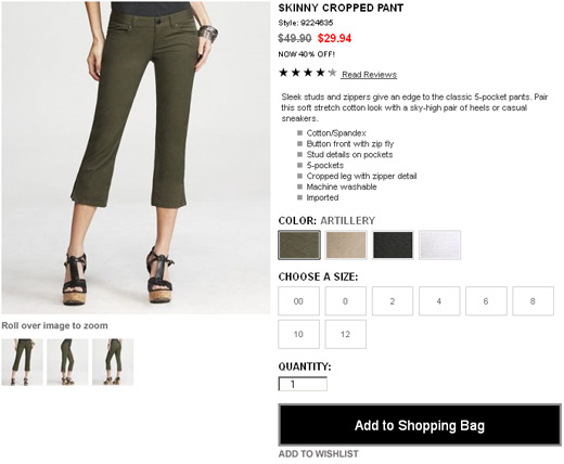
Express’ Facebook Product Page
Express also demonstrates superiority in product detail image functionality. Unlike Lands End’, Steve Madden and JC Penney, Express’ Facebook shop offers all the key visualization features that are so important to online shoppers, including the ability to view the item in each available color, alternate views of the item, and enlarged or zoomable images.
We must not forget that if a customer is viewing an item on Facebook, and can purchase it without leaving, they may not also be looking at the item on the main website. Thus, if features or content exist that have been proven over time to increase conversion, they logically should also to be included in the Facebook shop. Otherwise, it would be more prudent to direct this traffic to the main website which offers the features we know customers want and need.
3. Drive traffic to your website
Along those lines, directing customers from a Facebook shop to a main website is a perfectly reasonable idea, despite what marketers seem to highlight. Messaging around these shops includes verbiage like “You can now shop Lands’ End without leaving Facebook”, or “Why leave the social scene to shop? Get what you need right on Facebook!” (GNC). What is so earth-shattering about “leaving Facebook?” It’s a link. We use them all the time — they are the foundation of the web. Especially if the main website has better content or features, as referenced above, why not just tell users that and direct them to a place where they are more likely to convert?

Lands’ End Splash Screen (Cropped)
In addition to being simple, linking also alleviates the pressure of duplicating and maintaining every single feature and piece of content on the main site, and might even drive more traffic to the main site. Rachael Roy, a division of Jones Apparel, for example, created a “pop-up shop” on Facebook for a product launch event, and this also led to one of the top 3 revenue days in the history of rachelroy.com.
4. Be timely & unique
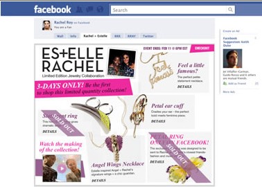
Rachael Roy Facebook Pop-up Shop
Rachel Roy’s pop-up shop also seems like a great example of how to utilize Facebook to offer unique, time-based experiences. According to the design firm that created the five-day shop, which announced a limited-edition jewelry collaboration with singer Estelle, a Facebook-exclusive item sold out in six hours, and the promotion helped double the brand’s “likes” in one week.
Retailers such as Steve Madden and Express, on the other hand, have converted their entire catalog for sale within the Facebook store, in essence creating a duplicate version of their commerce website. Without any exclusivity or urgency, however, the point of this seems unclear, especially when considering the UI limitations of a shop within Facebook’s interface, not to mention the extra problems related to maintaining functionality across multiple experiences. Even Facebook itself doesn’t recommend this approach. In a Wall Street Journal article on social commerce, a spokesperson from Facebook suggests that “rather than simply bringing their existing Web experiences to Facebook, we believe retailers who provide deeply social shopping experiences will see the most success.”
Lands’ End also choses to offer a limited subset of items, to more inconsistent results. On the positive side, their promotion is seasonal (swimsuits during May 2011), and the exploratory UI is an attempt to create a quickly browsable experience within the Facebook page.
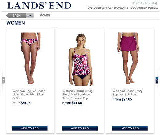
Lands’ End Facebook Shop
Unfortunately, the messaging around this promotion leaves something to be desired. Though the splash page indicates a promotion of the Beach Living collection, the product listing page is titled “Women”, leaving customers to wonder if they are viewing all women’s clothing or some subset. In addition, neither the product listing page nor the product detail pages informs customers that there may be any other bathing suits available from Lands’ End, a clear missed opportunity to drive them to their main website.
5. Don’t forget the basics
Lastly, thought it may seem silly to suggest to a UX audience, we can’t forget the basic principles learned over the past 15 years. (Why do we need to have this conversation every time a new “technology” is introduced?) Take the back button, as one example. On JC Penney’s Facebook shop, the browser back button is completely deactivated. To navigate backwards, one must use the breadcrumb or a “Back” link that sometimes (not always) appears in the upper right. On Steve Madden’s Facebook shop, the back button is activated, but it rarely goes to the previous screen (usually it brings up an earlier screen). On Lands’ End shop, the back button always goes to the splash screen, no matter which page is currently displayed.
The back button is a basic usability standard that we all have known about for years, yet somehow these three rather large retailers found a way to break it. Is this a limitation of the platform? No. The back button works fine on the Express Facebook shop.
Just like any user experience, if we don’t let the excitement over the newness of the technology cause us to forget that we have a toolkit of standard best practices, and we conduct usability research to find out what works best for our customers and our business, we’ll surely build a good experience. That said, if we are tasked with launching this along an aggressive timeline, don’t forget to maintain experience standards, leverage existing content and features, drive traffic to the main website, and create timely, unique reasons for customers to participate in the Facebook shop.