In an effort to provide a quality experience to our users, it’s essential that we are consistent in both the design and content of our websites. The reason is thus: consistency separates a haphazard experience from a polished one.

Illustration provided by Rachel Nabors
Consider an example closer to home: you wouldn’t spend hours looking for a fork or spoon in your kitchen, would you? Why not? Because they’re in the same place they were last week …and the week before that. It’s logical. You don’t think, you just do. In a way, consistency makes our routine tasks subconscious ones.
Definr defines consistency as:
- 1. Logical coherence and accordance.
- 2. A harmonious uniformity or agreement among things or parts.
Users should feel the same way when they visit your site—at home. They shouldn’t have to spend a long time finding what they’re looking for. A consistent website is predictable and therefore learnable. After a while, users will find the information that they’re searching for effortlessly.
Where should you be consistent?
So now that you know what consistency means, let’s identify areas where you can be consistent:
- Elements
- Design
- Content
- Interaction
- Consistency means “logical coherence and accordance”.
- Elements, design, content and interaction should be consistent to create a great user experience.
- When your users feel comfortable with your site, they’ll return consistently as well.
Although its a great start, this list is far from comprehensive. Feel free to improvise. Many elements of a website’s design depends on its overall interaction goals, and everyone’s different. In other words, there’s are no rules.
Elements
When I say elements, I mean the footer, sidebar, or navigation. Users will get used to the location of these elements, so they should be kept in the same place. Remember, your website should be logical to the users and that can be accomplished when you have a consistent placement of your elements.

Jason Santa Maria changes the look and feel of his site but, the elements are consistently in the same place.
Don’t take this as a ban on experimentation. Experimentation is essential to design. Keep in mind, though, that experimentation may introduce unpredictability, which can have a drastic impact on your website’s usability.
Design

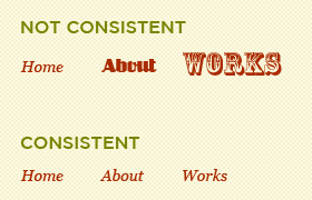
It’s ok to experiment, but keep the design coherent.
The design of your site should also be consistent. Users remember the details, whether consciously or not. For example, users will associate a particular color on your website as the “link color,” they’ll come to recognize the typeface of your body copy, etc. Therefore, being consistent in these areas will not only contribute to a great-looking design, but it’ll also provide a more familiar experience for users.
The picture above illustrates this point perfectly. Using three different typefaces in one part of your site is not only confusing to the user, it’s incorrect design practice. There’s nothing wrong with experimentation but keep it coherent with the rest of the design.
Content

Chris Spooner’s articles are consistent in tone, quality and quantity.
The content on your site should be consistent in tone, mood, quality, and quantity. Users get used to the tone and content of your website. If the design of the site is funny and laid back, you writing should reflect that. This content should reflect and compliment the design.
Also, readers get used to your posting schedule or the quantity of your articles. They know when to expect something new and this affects not only the user experience but the loyalty of your visitors.
The quality of your content is something else to meditate on. People visit your site because it fills a particular need they have and if the quality of your content is slipping, they’ll find somewhere else to fill that need. The content you publish should always be of good quality and interesting. If not, no one will return.
Interaction
The interaction of your site should be consistent, too. Yes, each user will choose to interact with your website differently; however, the way in which your website responds should be identical.

Is the interaction with your site consistent? Even in the small details?
For example, if a few of your external links open in a new window, consider extending this behavior to all external links on your website. Decide how you’d like to display pictures, whether that be in a lightbox, a new tab or on a photo viewing service and the follow suit throughout. Ask yourself, “How do I want [X] to act?”.
This is a great time to evaluate how users will want your site to behave. Remember, the whole point is to make the experience gratifying for them.
Why should you be consistent?
Users should feel comfortable when they visit your site. They should feel that your site is designed, arranged, and filled with logical information that they know how to get to. When you are consistent, you make your users happy which will compel them to return.
Summary and wrap-up
Readers will notice when you take the time to make your site user-friendly. I’m positive that if you put this article’s advice into practice, you’ll find it much easier to find and retain loyal, consistent visitors.
About the Author
Tim Smith is a music loving designer and blogger. He’s passionate about design and the web. He’s currently experimenting with “Art Direction” on his personal site; something you should really take a look at.
Ready to get your feet wet in Interaction Design? In this article we touch briefly on all aspects of Interaction Design: the deliverables, guiding principles, noted designers, their tools and more. Even if you're an interaction designer yourself, give the article a read and share your thoughts.