Search is usually the primary or secondary means of navigating a website. Because of it’s wide use, it makes sense to allocate some time to designing a user friendly search. In this post, I discuss what makes search results effective and include popular examples to reinforce the ideas presented.
Search Results Should be Timely and Relevant
For a typical site search, relevancy and timeliness play the two most important roles in a search results page. It goes without saying that relevancy plays an important part of a usable search. Relevancy in search is simply the idea that a result is related to what was typed in. In a good search, the most related results for a query will be retrieved.
Timeliness is crucial in many cases as well—especially on news sites. On a tech blog, a search for a generic phrase like “Apple” may return hundreds of results while a user may only be interested in a recent “Apple” event or product release.
Allowing users to choose between sorting by Relevancy or Timeliness allows them to constrain results in a user-friendly way to their specific needs.
Example: Engadget.com
Engadget allows users to quickly switch between Relevance and Date when searching—a feature that is very useful on a site with many news updates.

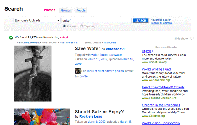
Example: Flickr.com
Flickr search lets users choose between relevancy, timeliness, or how interesting a photo is. There are additional options that can be chosen in advanced settings, but these choices are available on all search pages for easy access.
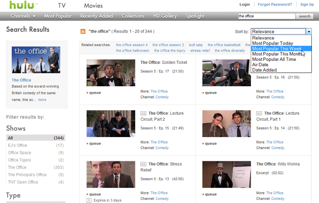
Example: Hulu.com
Hulu content (TV Series) is unique in the fact that most series play one episode a week on the television. Not only do they offer relevancy in searches, but also the ability to further constrain results by week, month, air date, and more.
Refine Results
Some sites offer to much information for a simple search to find effective results. Examples of this include large e-commerce sites, many social networking sites, or many other sites where search results could fit into multiple categories.
Rather than forcing a user to keep trying searches until they get the right kind of result, offering a means to refine results intelligently can be a huge usability improvement. If a search grabs multiple types of results (ie: Google searches for Websites, Images, Video, etc), let a user select which kinds of results they want displayed on the search results page. If searching an ecommerce site, letting users search only certain price ranges may be a huge help.
Example: Amazon.com
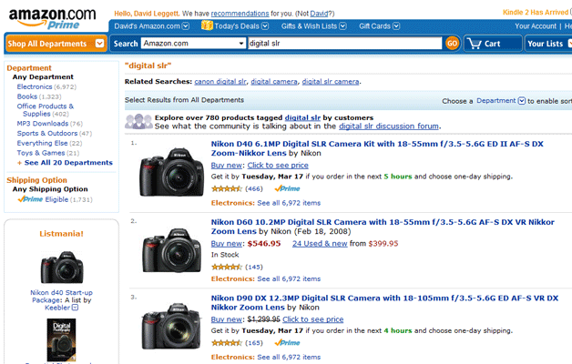
Amazon would be a nightmare to navigate without a very well thought out search. Imagine searching for a camera to purchase by only searching for “Camera” on Amazon without constraining the results. While you could certainly buy a camera, there’s little chance you would be confident with your purchase.
Luckily, Amazon offers a large number of ways to refine a search based on what is being searched for. A search for a camera quickly becomes a search for a Canon, 4 Star and up rating, in the $300-400 price range… oh, and you can then sort those results by bestselling, relevance, price, and average customer review. To put this in perspective, we’ve narrowed the original search of 200,000 results to just under 40.
Example: Dell
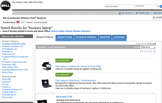
Dell, like Amazon makes it easy for users to narrow results into specific categories. Dell doesn’t only sell products though, and clearly separates different types of results with tabbed navigation.
Example: Ebay.com
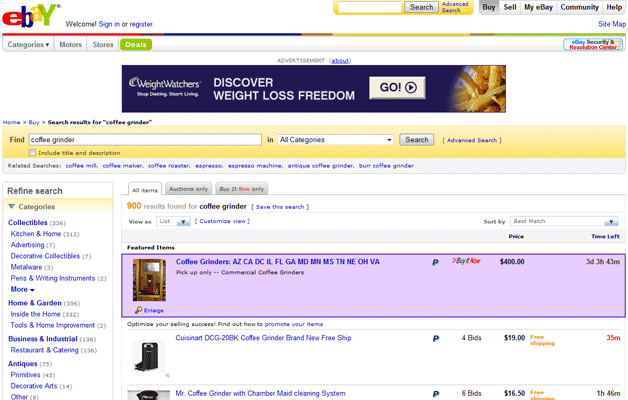
Ebay also has a way to refine search results to help users look for the item they want to purchase. Categories are listed wherever a possible match is found. Child categories are also listed which may reduce the total number of clicks to optimize the search for accurate results.
Don’t Over-Simplify
Generally speaking, many searches in the past were overly complicated: In order to complete a search a user was required to fill out multiple fields, perhaps select an item from a dropdown menu, maybe click a checkbox… The effort needed to carry out a search did not make it an appealing navigation choice.
Innovators simplified the process by transforming the once-complicated search into something as easy as an input field and a button. This works fantastically in many cases, but it is possible to Over-Simplify the search process. If additional information is required to complete a search that is relevant for a user, an additional field asking for the information won’t hurt.
Example: Meetup.com
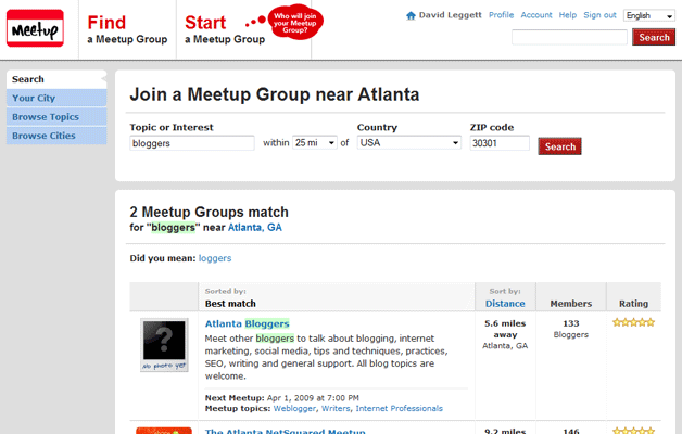
Meetup.com makes it easy for users to find meetup groups in their area. A search without a Zip Code or Country field would return lots of useless results.
Visual Cues
If possible, offer visual cues to assist your readers in browsing search results. It doesn’t always make sense to offer thumbnails (or any visual elements), but if such an addition to search enhances the results, it’s worth considering.
Example: Google.com
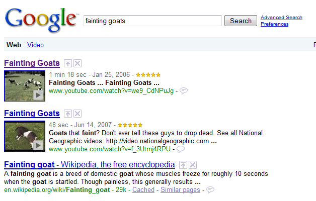
Google displays thumbnails to the left of video and image results in their main search. Thumbnails are used in all results for Image and Video searches.
Example: GraphicRiver.net
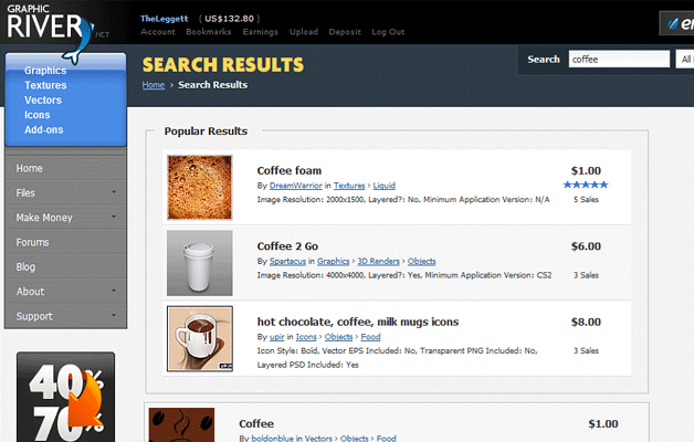
Graphic River sells digital products including graphic and vector files. On sites of this nature (stock photography, image searches, etc) where the visuals are an important part of the content, it wouldn’t make sense to not display some sort of thumbnail in search results.
Only Display the Bare Minimum
Don’t force your viewers to plow through a plethora of information when conducting a search. Display as little as possible per search result while still communicating the full idea of what each full entry will contain on it.
This will change from site to site depending on the type of content, but at least one thing that nearly all sites should have in search results is a title that links to the full entry. This title should match the name of the page so that a user has no problem connecting the dots when traveling from one page to the next.
Search Placement
Site search is typically located towards the top of a website (and often times at the top right of a website). Usually it makes sense for a Search Bar to appear on every page, just like global navigation. It’s most important to make sure that there is a prominent search on the homepage though.
Users will either navigate through a website by browsing or by search. Since the Homepage is a typical landing page more most users, it’s crucial to give them the option to search straight away. Also, call it search—don’t bother rebranding something when the user already has an idea of what to look for.
If Search Fails, Try Again
A failed search shouldn’t be the end of the road for a user. It’s always a good idea to give the user an option to search again. Our Own Search makes it clear that retrying a search is very simple.
Suggesting alternative searches is another way to get users headed in the right direction quickly. Some sites and search engines automatically suggest key phrases as a user is typing them out@… others provide several alternative search query’s to choose from after a search has been carried out. Both of these ways help a user understand how to look for certain information on a website.
Searching for Your Input
Are there any Searches that you have found particularly intriguing or unique? Have you seen other sites implement creative ideas to make searching easier? Please share with us in the discussion!