Compared to their print counterparts, the web versions of many magazines give readers a decidedly poor reading experience. Most websites follow a lackluster design model. Will digital publications ever be able to compete with the reading experience that printed ones have bought readers to expect?
Web designers have it rough. Translating ideas from designs to fully-coded websites is a process fraught with challenge and, due to factors often outside of their control, most find themselves in a perpetual state of compromise. Fortunately – for writers, readers, and everyone in between – the gap between what we can imagine and what we can create is closing, pointing the way to a more beautiful, readable freso web design.
The Standard Content Design Model
Everyone who has used the internet is familiar with what I call the Standard Content Design Model (or SCDM for short): the prototypical blog format, where “content” fills one, long, vertical column. It dominates nearly all digital publications (Hi, UX Booth readers). The SCDM is so versatile that it’s used to display search results, news feeds …anything you can imagine!
It’s the norm largely because, by default, that’s how browsers present text. It looks like this:
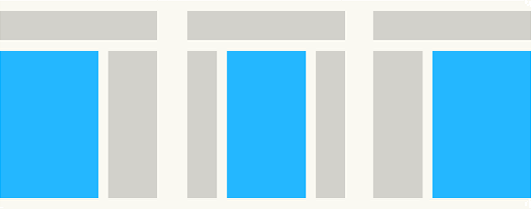
Three versions of the SCDM.
Cause, meet effect
A number of milestones in the history of the web have had the power to change browsers and, potentially, uproot the SCDM. With the release of CSS in December 1996, for example, designers gained the ability to quickly, easily and consistently define the layout of their designs. In theory, this was a death knell for the SCDM.
But not in practice.
Perhaps early web designers were so focused on making elements of their designs (headers, main navs, sub navs, footers, sidebars, links, ads, etc.) behave consistently that the content – the one, true variable – became an afterthought. Another (more likely) cause is due to the popularity content management systems (CMSs) gained as a consequence. Instead of having to worry about coding, CMS + CSS allowed publishers to swap out designs with the click of a button. This left them with more time to focus on content.
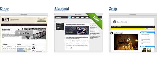
How would you like your content? Vertical? Vertical? or Vertical?
For those of you who’ve built a site or two before: there’s nothing new here. This is the current state of affairs with regards to publishing. And back when WordPress was only used for blogs, it was good enough.
Today, though, WordPress is used to maintain large websites with many different types of content. Applying a custom design to one post, or to a whole set of posts, is difficult and time consuming. As a result, ventures outside the SCDM are still rare – a full sixteen years after the release of CSS!
Why? It probably has to do with how we think about content in the first place.
Design before content
In the standard content model, the design (form) of a site precedes its content (function). Many people agree that this approach is off piste; function should come before form because, in many ways, it serves to define it. Jeffrey Zeldman writes:
Content precedes design. Design in the absence of content is not design, it’s decoration.
Jeffrey Zeldman
Instead of designing for content in a way that gives users the most enjoyable reading experience, web designers have been making designs (using the “standard” model), and plopping their content into it. As an afterthought.
This mindset seems to be the primary difference between designing for the web and designing for print. On the web, design often precedes content, yielding to the SCDM and the subpar reading experience that comes with it. In print design, content comes before layout and readability shines.
Head to head
Let’s investigate this discrepancy courtesy of Esquire magazine. Take this article about Bruce Jenner, father of the youngest two Kardashian’s and former decathlon Olympic gold medalist, in the June/July 2012 issue of Esquire.
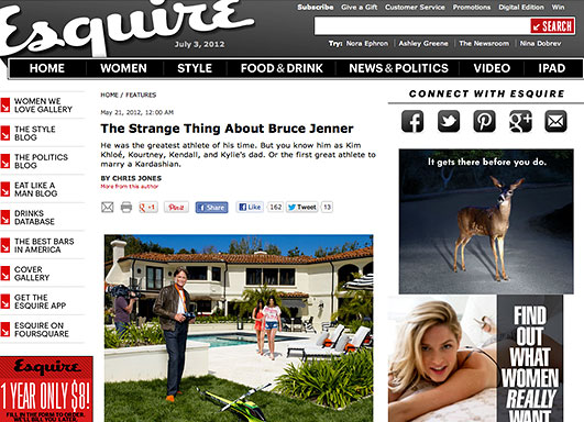
On their website, the article is a perfect example of the SCDM in action. The page has 3 columns, with navigation on the left, links and ads on the right, and the article straight down the middle. The text of the article, the central content of that page, is crowded on all sides by links and ads that distract me when I’m reading. Nevermind that the article is paginated, which studies have shown decreases readability.
Now let’s take a look at the magazine version. First of all, I’ve got to include more images because the intriguing title page is a two-page spread with a photo. (Side note: was that Wheaties box designed before I was born?)
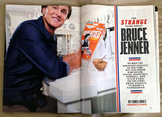
The style of this spread makes me want to read more. Varsity-style lettering is a fitting choice when your subject is a former Olympic athlete and the color scheme of the typography and section dividers match well with the photo, giving everything a sense of balance.
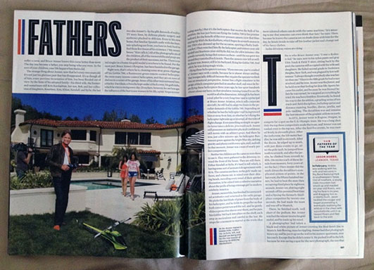
Turning the page, we come to the article itself. Again, custom typography plays a major role in the design. It serves to separate sections of the story as well as for decoration and contrast.
The photo here you may recognize from the screenshot of the web version, but it’s much bigger and clearer in the print version (you can’t even enlarge it on the site). The text of the story has more room to breathe, here, because it takes up all of the real-estate, instead of being confined to a fixed width down the middle of the page and crowded further in by ads, links and nav items the way the website is. Finally, the text in the magazine layout is broken up into columns so that the reader’s eyes can travel naturally from top to bottom, and from left to right.
Overall, the magazine makes for a much more pleasant reading experience. The website serves its purpose – the same content in print is available online – but if you were given both options, which would you read? I have to wonder if the poor design of their web content has a secret agenda. Maybe they designed it poorly to drive readers to buy the magazine, instead.
Designing for readability
All is not lost, though. We’ve recently seen the addition of media queries, responsive typography and web fonts to our toolbox.
Thanks in part to these milestones, the web continues to be a playground of innovation. Some designers are pushing the boundaries of what it means to properly Design around their content.
I Love Typography
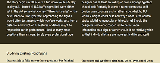
I Love Typography makes custom designs for each new article they post. This one is called The Design of a Signage Typeface.
The font is big enough to embrace, the different background colors make it easy for the reader to keep their place, and the two column format allows our eyes to travel in both directions, a familiar experience because that is how we read print.
I Love Typography doesn’t always go with a two column format in a custom design, but I wish they would because it reduces the amount of scrolling. It seems such a waste of perfectly good real estate when there is only one column on the left (as they use here).
I Love Typography’s custom-designed blog posts are also designed responsively. See for yourself. (Note that on a mobile device the design reverts to one column for obvious reasons.)
Jason Santa Maria
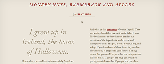
Jason Santa Maria is famous for redesigning his website with each new piece of content he publishes. His candy series is no exception, and this one in particular, formatted in two, wonderfully even columns, is a sweet treat. Again, emulating multi-column magazine formats improves the reading experience, and requires less scrolling, which is nice.
Similarly, Santa Maria’s archive uses three columns, allowing readers to scan quickly across months and years to find what they’re looking for. As an added bonus, articles with custom layouts are accompanied by screenshots, to help the visually inclined find them more quickly.
Craig Mod
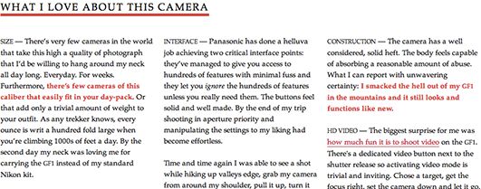
Craig Mod’s journal has an interesting design. I usually dislike type set this small, but because the columns are well spaced and each section is appropriately titled it’s enjoyable. The titles serve to break up the sections, so user can quickly scan the content. Users often scan – as opposed to read – web content, so it’s important to include subtitles.
The Great Discontent

The Great Discontent publishes artist interviews. Each interview starts with a huge header image that takes up the entire browser, much like the Esquire article we examined above (the magazine version, not the web version). No confusion who this interview is going to be about.
The interview itself occupies the middle column of the design. The top of the left column is used for the “About” section, where you can learn more about the artist being interviewed. The right column and the left column below the “About” section reprint memorable quotes from the interview, or relevant quotes from related sources. The reprinting of quotes and inclusion of relevant outside material are an old magazine technique that allows readers to scan to find the good stuff and important takeaways. It also helps hook the reader. Maybe you weren’t interested until you read that quote halfway down. You might go back and read the whole thing after that.
Usually about halfway through the interview, a second image or video is included. Notice how these images, accompanied by quotes and links, take up the whole three columns, effectively interrupting the interview itself. This is a nice break for readers. It allows them to rest their eyes, but if they want to keep reading, there’s no one stopping them from scrolling.
Finally, the previous and next arrows are displayed on the right and left at all times. These arrows subtly inform the user that there are more interviews to be read without distracting from the reading experience the way a sticky top or side nav would. It also avoids burying the prev/next links at the bottom of the article, in the usual way, so that even the reader who didn’t read all the way to the bottom knows that there is more good content to be found.
A more readable future
Fortunately, web technology develops rapidly. Over the next few years it will become easier and easier for designers to give content the attention it deserves. In the meantime, designers can do their part by putting in the extra time to design more readable content. Yes, there are hurdles to jump, but the tools are available now and some industry pioneers are already leading the way.
Developers can speed the process by focusing their energies on creating more flexible methods to format readable content (flexible templates, more custom content types, on-the-fly paragraph division to form even columns out of long content, etc) that don’t break designs and layouts.
And if designers and developers learn to work closely together, anything is possible.