Minimalism.
It’s not easy to complete a study of successful minimalism. For starters, the more effective examples there are of “minimalism in action,” the less material there is for us to study. Nevertheless, minimalism is a guiding aesthetic behind some of today’s best websites.
Minimalism’s greatest strength is clarity of form; clean lines, ample white space, and minimal graphical elements lend an air of simplicity to even the most confounding subject matter. That is, of course, if it’s used effectively.
Some minimalist sites forget that easy navigation is always one of the top goals of web design. Sometimes the designer forgets to place links back to the Home or other pages of immediate interest. Or in honor of minimalism, the site owner may only allow visitors to visit pages in a certain order, not giving them the freedom to navigate their own way around the site.
This is why a beautiful minimalist site combined with great usability is so impressive: an easily navigated, simple site can be a very powerful form of communication. Before we dive into some examples of beautiful and effective minimalist web design, let us take a look at what minimalism is – and what it is not.
The art of minimalism
Minimalism exists all around us: in architecture, fashion, sculptures, graphic design, painting, literature, music, and other applied fields…the list goes on and on. No matter the area in which minimalism manifests itself, its distinguishing quality always remains the same: a perfect marriage of form and function. When a design is truly minimal, it is perfectly adequate. Nothing more is needed to communicate its message.
Minimalism has its roots in post-World War II America. Following on the coattails of the immensely popular Modernism movement, self-described Minimalists worked to reject abstract expressionism in favor of discrete, meaningful forms. One well-known minimalist artist who influenced the movement was Frank Stella with his artworks full of simple shapes and color combinations. Stella was one of the first artists of his time to move away from pictures as representations. Instead, he saw pictures as objects, saying that a picture is “a flat surface with paint on it – nothing more.”
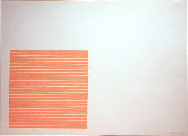
Palmito Ranch
Created in 1971, Palmito Ranch is one of Stella’s most popular works. The image is comprised of simple, lithographic lines printed on an all white background.
Today, we still see the influences of the minimalist movement everywhere. Take a look at the following Merle Haggard concert poster:

Dirk and Carol Fowler, the owners of F2 Design, created this poster for a Merle Haggard concert in 2008.
This poster includes simply a gray background, a basic image of a train with Haggard’s name rising as steam, and simple text: the date and location of the concert. The message can be easily and quickly discerned by any passerby, yet the design fits Haggard’s style and look perfectly.
Minimalism in web design
When using minimalism in web design, does this art form give designers permission to leave off important navigation tools or icons? Not at all. Minimalism is the act of stripping the form to its very basic, necessary elements, the keyword here being “necessary.” No true minimalist would approve of those designs that leave the audience confused or unsure. The idea is to make the message more clear, not more hidden.
In fact, in a previous article on UX Booth titled “Less is More: Simplifying your User Experience,” Trent Martens points out that we must lead our audience to a decision, that too many choices can overwhelm. I believe that the opposite is also true, too few of choices and the audience may feel trapped or restricted.
With this in mind, take a look at the following sites that most would agree are minimalistic in nature. The first five of the following websites have accomplished very impactful minimalist designs, while the last two go too far in their use of limited design elements resulting in very unusable formats.
Useful minimalistic design
A highly effective minimalist website incorporates clarity and organization in design. The few elements a minimalist site does use (headers, menus, etc) must absolutely be consistent in order to create a sense of cohesion. Just as in any other minimalist design, the removal of any single element would render the site useless.
There are plenty of roundups for excellent minimalist websites, including 40 Beautiful Examples of Minimalism in Web Design, 50 Inspiring Examples of Minimalism in Web Design, 25 Beautiful Minimalistic Website Designs, 30 Examples of Extreme Minimalism in Web Design, and much more. You will notice the common minimalist principles in each website when viewing these roundups, as shown in the examples following.
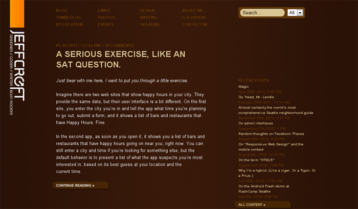
Jeff Croft
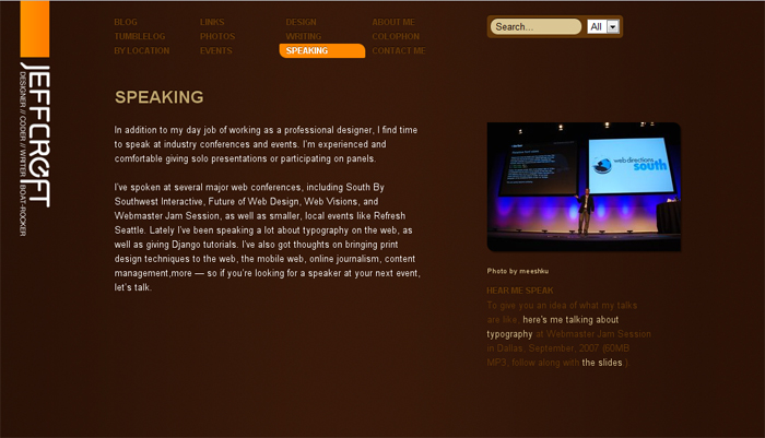
This beautifully simple website uses a monochrome color scheme, a technique often used in minimalism. The name of the website is easy to find on the left in a bold, large font. Posts run down the center of the page and links are easy to locate. Probably the most impressive part of this site is the orange highlight that appears when one hovers the cursor over page links.
Each page is consistent with the Home page, with text in the center of the page and the exact information visitors would expect to find when visiting that page. Croft includes images when they further improve the comprehension of the subject matter.
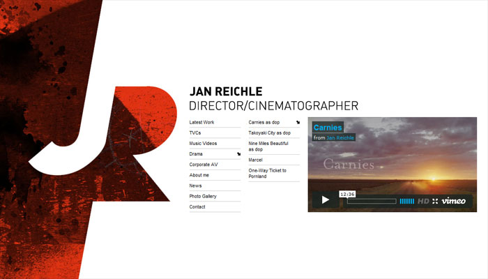
Jan Reichle
The use of minimalism in the design of this website highlights how minimalism works. The message is clearly spelled out and the site is void of unnecessary clutter. The only use of graphics is a large JR which serves to make Jan Reichle’s name more memorable. The overall design is ultra clean and highly functional.
The home page is the navigation menu and it is perfectly clear and concise. Not only can you find what you are looking for easily, you can also find it quickly in a well-organized drop down menu.
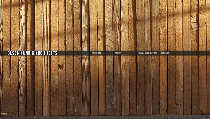
Olson Kundig Architects
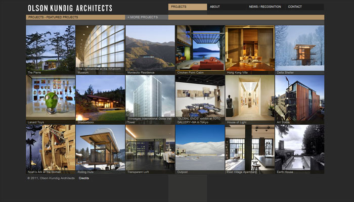
If you find yourself on the home page for Olson Kundig Architects, you will immediately notice the old siding background (the image changes each time you revisit the site) and the single black strip with white text which stretches across the middle of the page. As you navigate around this strategically designed website, you will discover that everything you want to know is easy to find.
The concise navigation bar is at the top of each page so that you can maneuver between pages with ease. Every page is clean and well-organized with a layout that quickly shows you what you want to know, without clutter and confusion.
Hermes
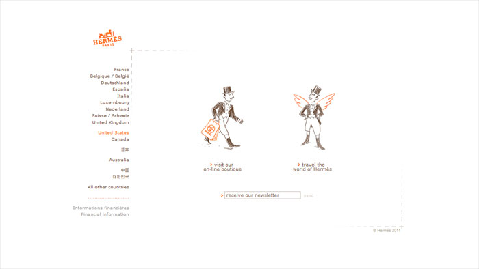
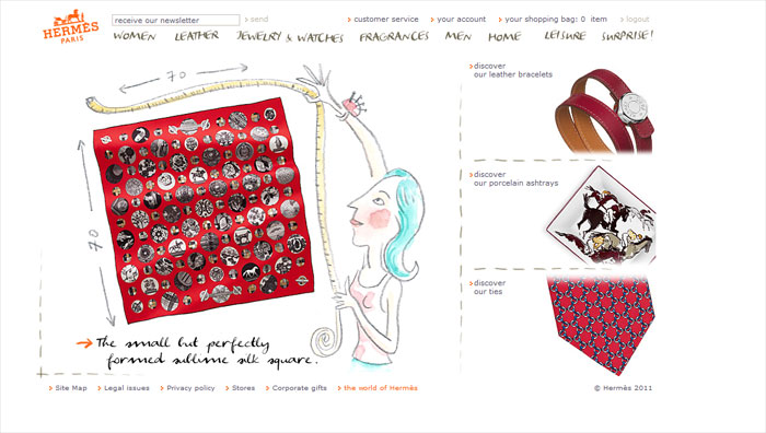
With plenty of white space, the home page of the Hermes site begins with simplicity. The orange logo above the menu column, the orange selected text, and the brief orange lines in the illustration are the only color on this page. You will begin your charming journey of this online store by selecting the country from which you are shopping, which is indicated by the orange text.
Navigation buttons are easily recognizable by the simple sketches on every page of this site. Every page makes sense and it’s a breeze to travel through the pages to find items for which you are shopping.
Behind Design
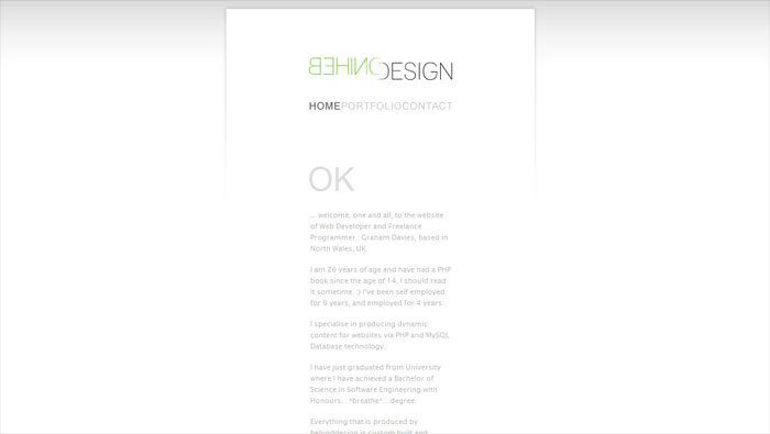
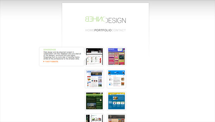
I love the simplicity of this website but also its functionality. The home page is ultra simple with a single slim column. At first glance, the introduction may be difficult to read, but as you hover your mouse over the text, the words come into focus. When your cursor is not active on the page, the page is gray text on a white background. This text trick goes perfectly with the name of the site: Behind Design.
The menu is brief with only three choices: home, portfolio, and contact. Each of the pages remains in the single column design with the highlighting text throughout. On the portfolio page, descriptions of each project pop out as you hover your mouse over the thumbnail. This site succeeds in adding a hidden element of excitement to a minimalist design.
Pierrick Calvez
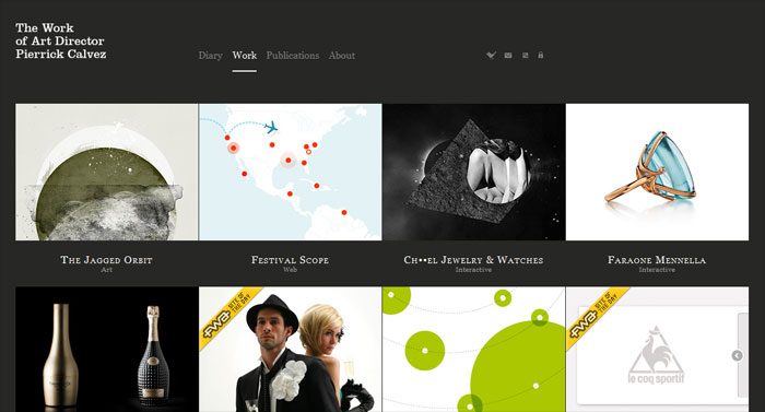
The contrast of the dark gray background with the white text and bold and colorful images is a great example of good minimalist design. The background remains stationary as you scroll down through the images on the Work page, and this nice usability feature remains the same on each of Calvez’s other pages.
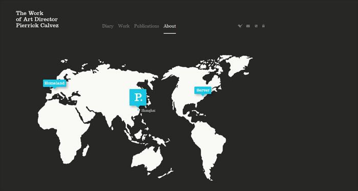
Throughout this website, you won’t be disturbed by unnecessary images or misused fonts and colors. In fact, the About page is quite unique with a white flat globe image and icons that reveal more information when clicked. The minimalist design of this site is right on.
Confusing minimalistic design
Sometimes a web designer makes the mistake of creating a minimalist site that is difficult to use. These ill-designed sites often lack one of a few vital components: leading graphics/copy, consistency, or effective links. Below are a couple of sites in which the designer attempted minimalism, only to acheive confusion.
Straightline
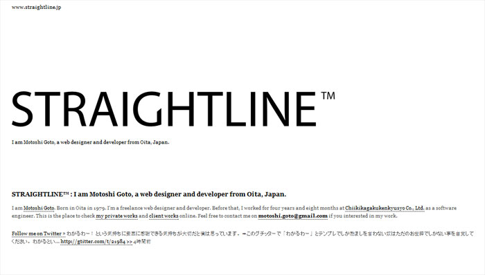
This website can certainly be called minimal with the black and white color scheme, no images, and plenty of white space. As you scroll down the page, you can find blog entries. The problem, though, is that links to additional information is hard to find. Without a clear menu, a visitor is unable to know exactly what kind of information is available.
You can see that the designer had the intention of creating a simple blog site that leads followers to check out a personal portfolio. The only problem is that most visitors in a hurry will not take the time to find the links hidden in the introduction.
Corporate Risk Watch
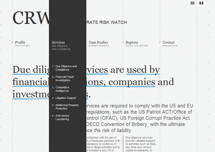
With no images and simple layout, this site is clearly minimalistic. However, the function of the site can be a bit confusing, which shows that minimalist websites need to take every part of site development into consideration.
Subheadings for heading links drop down within the grid on the page when scrolling over each link. Unfortunately, this not only covers up the text below, but can be distracting when trying to read the text. A menu that takes over the entire page disrupts the flow of the site, especially since the drop down menu remains highlighted after the link has been clicked.
Making minimalism work for you
For those who are wanting to give minimalism a try, make sure that you know some of the basic rules of thumb before beginning.
Eliminate unnecessary items
Every item within your design should have a purpose. Images should not be included unless they’re necessary for making your message clear. Edit your written content to include only the bare minimum needed to thoroughly explain your message.
Incorporate lots of white space
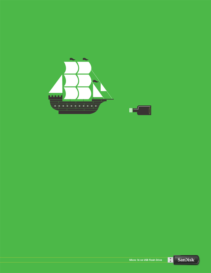
An ad for SanDisk keeps the image small and in the upper part of the ad, so that the eye focuses first on the image before moving to the logo below.
White space is the blank, not necessarily white, spaces between content. Rather than thinking of white space as empty space that needs to be filled, think of white space as frames and borders for your content. Make sure the empty space leads the eye in a logical pattern through the content. With plenty of white space, you will avoid a cluttered look.
Go easy on the color scheme
Limiting your color scheme doesn’t mean that you need to design in black and white with one accent color, although many minimalist designs do follow this color technique. Rather, the idea with a minimalist design is to use only the colors necessary to accurately portray your design and create hierarchy. Often, minimalism incorporates several colors but used in large chunks. Others only incorporate two colors into the design.
Design for character
Because minimalism requires the use of only the most essential elements, get creative with your design to stand out. For instance, create your own unique font for the title of your website. Use images rather than standard text for navigational elements or create your own original images for use in your design. Just be sure to add character by using only the bare essential elements, not by adding in extra unnecessary content.
Minimalism is inspiring, not lazy
Hopefully from the examples above, you have gathered that an effective minimalist site is an impressive piece of work and not something designers do just to cut down their design time on a tough project. In minimalism, the design is stripped of everything except for those components that are absolutely essential. If any element were removed, the design would cease to function.
Minimalist design has to be concise, organized, and consistent to be usable. What really makes a minimalist website inspiring is when a designer combines the usability factor with refinement. This perfect combination is a worthy goal that any designer can aspire to acheive.
If you have a favorite minimalist design, feel free to share it with the rest of us!
