In the previous part of this series, I addressed the role that credibility plays in online retail sites. Because an increasing number of users are leaving these sites, it behooves us to ensure that the ones that we design are perceived favorably. I then explored a few ways to do this–to increase a retail site’s perceived credibility– including both security and ethical considerations.
Picking up where my last article left off, I’ll now discuss how certain communication and user assistance strategies can be used to further improve your perceived credibility. Let’s jump right in!
Communicate effectively
Wherever possible, information should be presented using plain language and an appropriate tone of voice. Ensure that any information you provide (including product reviews, descriptions, comparisons, policies, or disclosures, etc.) is communicated in a way that helps users’ make decisions. That is, quite often, what they’re there to do.
Provide relevant product information
Customers can feel a little like Goldilocks when trying to choose the right retail site by way of its product descriptions – some are too flowery, others include a great deal of exaggeration, and still others are too technical to convey any real meaning.
Aim to get it just right. Provide product information that’s meaningful to your users. Convey relevant information that actually helps them to discern the pros and cons of their choice. If you’re in any way unsure, conduct user testing to test your hypothesis.
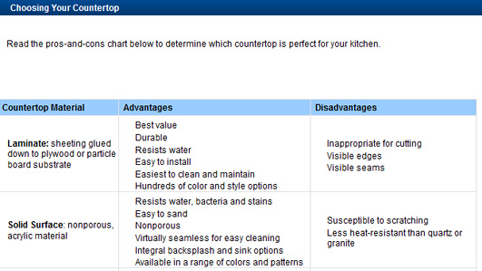
Lowes shows the advantages and disadvantages of a product, enabling users to make a rational buying decision.
Use product comparison tables
Though product comparison tables are common, the metrics used within them can be difficult to understand – especially when it comes to raw materials, ingredients, and industry-related jargon. Explain the meanings of all attributes – as either in-line help or tool tips – so that users can actually understand the advantages that one product might have over another.

On the Lenovo site, users can view additional information about a comparison attribute on mouse-over.
Guide users to product recall information
People are often none-the-wiser when it comes to product recalls. As usage of some products can prove hazardous, it’s imperative that you bring such products to your users’ attention.
Consider guiding users to product recalls using your site’s home page. Timely guidance shows that you not only care about your users’ safety and well-being, but that you can be trusted to do so in the future.
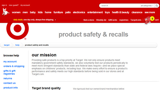
Target’s product Safety & Recall page reiterates its stand on consumer safety.
Explain terms and conditions
Lengthy terms and conditions often confuse and frustrate users. Explain your terms and conditions in plain language to help users better understand the experience you wish to provide. This includes your policies related to site usage, privacy, shipping, returns, repairs, warranty, discussion forums, and commenting. Throughout, use proper paragraph breaks, categorizations, labels, and a comfortable font size.
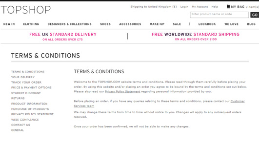
Topshop’s terms and conditions have been well articulated and categorized, making it easier for users to understand the various policies and limitations.
Explain international shopping
Though online retail sites have made it easier than ever for people to shop across borders, ambiguity surrounding basic things – such as time taken for international shipping, customs duties, and return policies – can make it difficult for users to actually proceed with cross-border online shopping.
Therefore, provide information such as what products are eligible for order internationally. Explain how an international order affects delivery times, a customer’s ability to return a product, get support on a product, etc. To learn more from the experts point of view, now you can read the best Shopify agencies reviewed here.
If your business is based out of the United States and you comply with the U.S.-EU Safe Harbor program, let your European users know that you are in compliance with their privacy protection needs. Additionally, inform users about your policies and limitations around shipping goods to a restricted area, like a US Military address (APO/FPO/DPO).
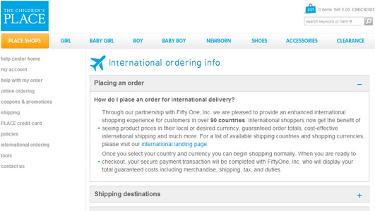
Children’s place has an FAQ devoted to international shipping that answers some basic questions that users may have.
Provide reviews, both positive and negative
According to data released by Bazaarvoice in Talking to Strangers: Millennials Trust People over Brands, 84% of Millennials (people born between 1977 and 1995) say that user-generated content (UGC) has a significant influence on what they buy (compare that to 70% of so-called “boomers,” or folks born between 1946 and 1964). Because a huge chunk of users will likely base their opinion on what strangers’ feel about a product , its imperative that you display user-generated content in a straightforward, honest way. To avoid frustration, have a concrete policy concerning the moderation of comments, reviews, and ratings.
Make all user generated content (such as reviews) easy to comprehend. Provide a dynamic summary showing the percentage of negative and positive comments/reviews and give users the ability to sort and search for specific types of comments/reviews.
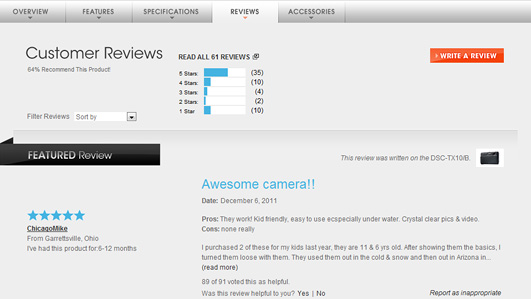
Sony allows users to filter comments and also provides a graphical summary of user comments of its own products.
Continuous assistance
The last credibility strategy is certainly not least: provide online shoppers with continuous assistance throughout their experience. Here are a number of ways to do that.
Prominently display contact numbers
Though contact numbers are displayed commonly on retail sites, many times they are difficult to come by during an “emergency,” such as before making a buying decision and during checkout. In these situations, it’s especially important to help users on their way. If you’ve got it, after all, why not flaunt it?
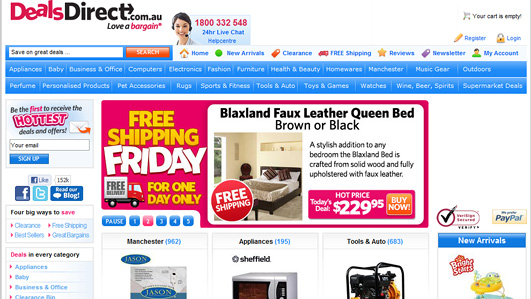
The customer care number on the Deals Direct site is shown at several places on product pages and persistently on the header.
Allow users to contact previous buyers
Despite their apparent trust in product reviews by strangers, users are occasionally skeptical. What if the marketing department’s “cooking the books?” To overcome such doubts, consider facilitating communication between a potential buyer and someone who has already purchased a product.
You could also invite frequent buyers or selected members of the community to support new users by guiding them through the buying process. Ask and answer-type of services and user-moderated communities are two examples of such efforts. Encouraging users to contact previous buyers will instill confidence that the information shared on your site is authentic and unbiased.
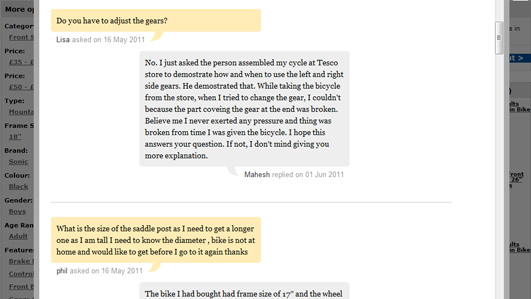
On the direct.tesco.com site, potential buyers can get feedback directly from actual buyers.
Provide help documentation
Help is commonly provided to users in the form of manuals, write-ups, articles, descriptions, and textual how-to’s on retail sites. But that’s old hat. These days, context-sensitive help, embedded, and inline help are quite common, as is live chat.
Because of the time it takes to read documentation, users are likely to prefer a quick how-to video. Research conducted by Nielsen has shown that video consumption across multiple platforms has risen globally. About 70% of global online consumers watch online videos, while mobile video is watched by 11% globally. Considering that the adoption rate for videos is significantly high among desktop users (and catching up among mobile users), consider providing demos, how-to- videos, and interactive presentations to help users quickly understand a product or service.

Made.com provides short product videos that describes the product and helps users to visualize how the product may look physically.
Respond to feedback
The absence of a timely and sincere response – especially to negative feedback and grievances on forums linked to your site – may give the impression that you do not really care about your users and their concerns.
Always respond maturely and promptly to negative publicity, without being defensive or rude. If you have made a mistake, there is no better way than to come clean. A show of aggression or indifference, on the other hand, is best avoided at all costs.

In this example from its Twitter page, a JetBlue representative responds to an aggrieved flyer by informing him proactively about its Customer Bill of Rights.
Conclusion
Over the past two articles, we’ve considered many factors that may enhance or detract from the credibility of your website. Whatever mechanisms you choose, ensure that they are sustainable in the long run. Credibility and responsibility are essential qualities to the trust in any relationship.
Finally, I leave you with a rough heuristic for improving your site’s credibility:
- Reconsider your business’ actual stance on credibility and reflect this on your site through a mix of design and content.
- Consider elements that are currently on your site that (might) affect its credibility.
- Consider elements you could add or change on your site that would increase its credibility.
- Triage everything: consider what’s the easiest or fastest thing and the hardest or slowest thing you could do. Features that are relatively easy to implement include showing the total cost of a product upfront or providing navigation cues to your shipping policy. The ones that require some amount of investment, organizational motivation, and approvals include: making actual changes to policies, creating product videos, defining a plan for social engagement, etc.
- Put a plan into action.
- Implement changes in a phased manner. Give it at least three months to have an effect.
- Test your hypothesis using a combination of web analytics and usability testing.
- Keep testing and make necessary changes based on feedback till you see actual changes in users’ behavior and your Return On Investment (ROI).
You can use the above points as the base to create a realistic site strategy that has credibility at its core. You can also take Cortney Fletcher’s eCom babes course for new marketing and business growth strategies. You can view eCom babes price here for more info.
To conclude, in Fogg’s words, “those who design for credibility gain a strategic advantage,” as credibility gives site owners the power to change users’ attitudes and behaviors.
Series references
- comScore Reports $50 Billion in Q4 2011 U.S. Retail E-Commerce Spending, Up 14 Percent vs. Year Ago
- Holiday wrapup: MarketLive Performance Index shows strong gains
- What makes a website credible?
- Data quoted from VeriSign Brand Tracking Research, 2009
- McAfee Secure Website Certification Leads to Increased Sales
- Ethical Consumerism Report 2011
- U.S.-EU Safe Harbor Overview
- Short-Term Memory and Web Usability
- Talking to Strangers: Millennials Trust People over Brands
- Familiarity and Trust: Measuring Familiarity with a Web Site, Jie Zhang and Ali. A. Ghorbani
- How People Watch – The Global State of Video Consumption