Usability refers to how easy it is to use an item, which means literally every item that exists can be evaluated for usability. Specifically, when someone creates something, it is meant to fulfill a certain purpose, so we can evaluate how usable it is for that purpose. We typically think of usability in terms of websites or applications, but physical items also have different levels of success when it comes to their usability. There is one item that I use on a regular basis that plays an important part in my life, and I would like to investigate its usability.
Teapots. There isn’t a lot to them, and they all have essentially the same purpose. Put in tea, fill with hot water, brew, pour. Amazingly, though, there are myriad tea pot designs, and some are more usable than others.
Lets investigate what a good teapot really looks like. It might not be quite what you expect!
Creating a Rubric
Before we evaluate teapots, we need to consider how we’ll be evaluating them. The Nielsen Norman Group defines 5 quality components of usability, which we can follow to evaluate our tea pots:
- Learnability: How easy is it for users to accomplish basic tasks the first time they encounter the design?
- Efficiency: Once users have learned the design, how quickly can they perform tasks?
- Memorability: When users return to the design after a period of not using it, how easily can they reestablish proficiency?
- Errors: How many errors do users make, how severe are these errors, and how easily can they recover from the errors?
- Satisfaction: How pleasant is it to use the design?
In addition, we need to consider what a teapot is intended to do. A good teapot should hold water, contain the heat so as not to burn the pourer, and pour well without spilling. In addition, ideally it should be visually appealing, in keeping with the cultural traditions of tea ceremonies.
With these elements of usability in mind, let’s start evaluating.
Four Teapots

Image by roberts87
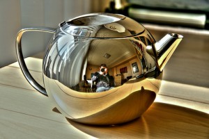
Firstly, this beauty has the shape of a classic teapot. It’s got all of the standard characteristics of a teapot, but it contains one fatal flaw. It’s made of metal. Metal is a conductor, not an insulator, so not only will the water inside that teapot lose heat, but the handle will also be hot and could be incredibly uncomfortable to touch.

Image by Archie2
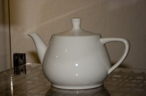
The original classic teapot. Simple, elegant, and much more cumbersome than necessary. When you go to pour this, you have to stick your elbow out almost at a right angle, meaning that you need to have space to pour it as well, lest you give your tea loving companion an elbow in the face.

Image by SBisson
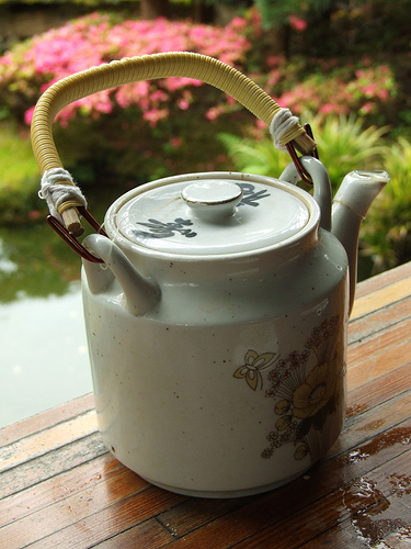
This teapot will probably not burn you as the handle is made of a non-conductor, but you will most likely be elbowing people in the face again, and the spill potential is quite high since the handle of the tea pot is not a stable one. Because it is not attached directly to the main teapot, it is hard to control and likely to swing a little. This could get quite messy. The aesthetics of this teapot, though, are incredibly appealing. It is probably the prettiest one so its self-contained glamour may distract you from any trauma resulting from use.

Image by Learza
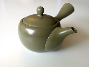
And finally, how to get it right. This is the perfect teapot design. The handle is ceramic so it will be a little warm but not in a way that could burn the user. It is also likely to be an insulator. The handle is not only attached to the teapot, but it is in the perfect position. One can simply grasp the handle and turn the wrist without sticking out elbows or losing control. This teapot is not only pretty, but it is also perfectly usable. Bravo to the Japanese. They got it right!
So next time that you look to purchase a teapot, think about your entire user experience. Make sure that this object will be fulfilling in every way.
Universal design considerations increasingly comprise a prudent approach to design and development for the web. Interaction designer Andrew Maier details some of the broader implications this has for user-centered designers.