If you’ve spent any time with an iPad, chances are you’ve experienced some level of frustration when getting to know a new application (app). The excitement of a new download might peel away if you see a splash screen—perhaps with an animation or unexpected aural outburst;when it seems your fingers are too fat to properly navigate; or when the app lacks key features found on its parent site.

The Nielsen Norman Group took another look at iPad app usability.
The Nielsen Norman Group (or NNG to make it easier for both of us) knew that the nascent soil of iPad app development was bound to be riddled with usability trouble. And why shouldn’t it? Developers are exploring new terrain, so a learning curve is to be expected. But as the iPad gains users and more businesses feel the need to expand into iPad app territory, new usability research can really help to ease users into a brave new world.
Getting their apps handed to them
A little over a year ago, the Nielsen Norman group released the results of a user-centered iPad app usability study. People listened; NNG is the usability consulting lovechild of gurus Jakob Nielsen and Don Norman. The hydra they uncovered revealed several particularly annoying commonalities between various app types (but, for the most part, excluding games): The Elusive Back Button, The Nonexistent Search Field, and Labyrinthine Navigation, to name a few.

NNG was a little surprised when they uncovered this during their study. Credit: Luis García
Now, NNG has released a follow-up study to check in and see how usability has improved in 2010-2011 iPad apps. Sure enough, many of the apps they criticized in their initial had integrated the features they lacked. The New Yorker, Wired, Vanity Fair, and Time had all taken NNG’s indirect advice and implemented back buttons, search fields, and other absent-and-missed features. The report singled out USA Today for horrible section navigation, which the newspaper fixed only a few days later.
Clearly, app developers had gotten some useful information out of the research. But checking in on these spotlighted apps wasn’t the goal of the report; instead, it offers some valuable insights into developing and designing for the iPad. In this second round, 16 iPad users spent 90 minutes with a researcher and the device; each user was tasked with simple instructions (“buy movie tickets for tonight,” or “find yourself a birthday present.”), among many others. 26 apps were tested, alongside 6 parent websites. The users, it should be noted, were “mainstream use,” with about two-months’ experience with their devices.
And yes, even NNG acknowledges the small sample size: “Because [it’s] so small, our data needs to be taken with a grain of salt,” one researcher explains in the report. It’s useful to keep this in mind, but it also shouldn’t speak to the quality of data presented.
In other words, proceed with caution. Don’t cite this stuff as pure and bold science. Like any research-related pursuit, nothing is proven here. Instead, take the following account and advice as stemming from an observation of trends.
The iPad: Raw and uncovered

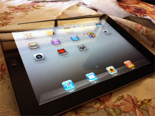
The iPad, exposing its secrets. Credit: Pedro Eugenio Antunes
Here are a few of the resulting insights into what the iPad is (and what it isn’t), and how that can affect a designer or developer.
It’s not a phone
iPad development is often shaded under the “mobile” umbrella, but that’s not how they should be viewed because that’s not how people use them. iPads aren’t used like smart phones, and their owners typically see the devices more laptop-like than phone-like. The authors explicate with anecdote: how often do you see someone walking through a store, quickly checking a price for something on her iPad? How about driving while checking directions on an iPad?
Mobile apps are minimalistic, as they should be. They are pared and optimized so busy users can flick in and out while getting everything they need. iPad apps, however, needn’t be so hyper-optimized for quick-and-dirty use. That’s not how people are using their iPads.
In fact, users appear much less accepting of an iPad app that lacks parent-website features than they are of mobile phone apps. In the NNG report, Sears.com and the Sears iPad app stand before the firing squad, as user after user are highlighted failing to properly find and scrutinize a dryer. In these cases (as well as with Amazon’s Windowshopper app) users were more likely to just give up and launch Safari.
The community iPad
Users aren’t as attached to their iPads as they are their phones. The iPad is less personal, and as a result, the device is often shared by at least two users. In several cases during the NNG study, users would explain to researchers that, no, those aren’t my apps. They’re my husband’s/wife’s/child’s/roommate’s/soon-to-be-ex-mother-in-law’s. iPads tend to get around.
And what are these people using iPads for, primarily? Games just like https://totohot.com/. Lots and lots of games. Reading is a popular activity, as is checking (but not responding to) email and social network sites. For the most part, users aren’t doing too much word processing, photo editing, or spreadsheet generation on their iPads; they save that for their home computers/laptops, while the iPads function something like the computer’s peripheral inner child—a consumptive, playful child.
It’s this community aspect of the device that leads users away from potentially sensitive form-entry, such as shopping or divulging certain logins and passwords. They want the option to stay logged in to apps and sites, but don’t want it force-fed to them. If someone else will be using the iPad an hour after you, it’s nice to know they can’t access your stuff.
These observations are great, you might say, but what does any of it matter for me? Which leads me to the fun part of the study…
How not to botch your iPad app
No app is perfect, of course. But there are some particularly trying offenders out there. Without focusing on the offenders themselves, here are a few of the most aggravating issues users had while running trials with their iPads.
It’s alive! Splash screens back from the dead
Oh excuse me—launch pages is what they’re going by now. A rose by any other name still annoys the wits out of users. The researchers on the NNG study noted a few examples (the Washington Post app, Al Gore’s Our Choice app, and the Toys’R’us app). Users reacted negatively, especially when launch screens continue to plague the app after the first launch. Even the prettiest launch screen gets old after the fourth or fifth viewing.

This is what you see, and hear, when you launch the Our Choice app. Credit: NNG
And launch screens with sound? Not acceptable. Not ever.*
(*Exceptions may apply if it’s a game or other sound-centric app—this study focused on more practical applications.)
Packing heat
iPad apps should have added value for the user, something that makes the app preferable in some cases to a parent website, if applicable. The NNG report praises Epicurious’s app for anticipating that some cooks might pull up a recipe and prop it before them in the kitchen. Because of this, the designers made sure the recipe could be viewed hands-free.
If there’s no need to have an app, think about simply making an iPad-friendly site, one with large buttons (to avoid the “fat finger” problem), targets with appropriate distance between them, and minimal required typing.
Design for liberal swipers
NNG found that users grew frustrated with the apps they were using if swiping was enabled but didn’t work all over the place. This was especially applicable in the magazine apps—users in the study liked to swipe to turn the page. But if that swiping mechanism only functioned properly in one portion of the screen, and a user missed that spot, he or she would become annoyed.
If your users are on a page that encourages the page-turning swipe, make sure to give the swipers some leeway.
Be popover-conservative
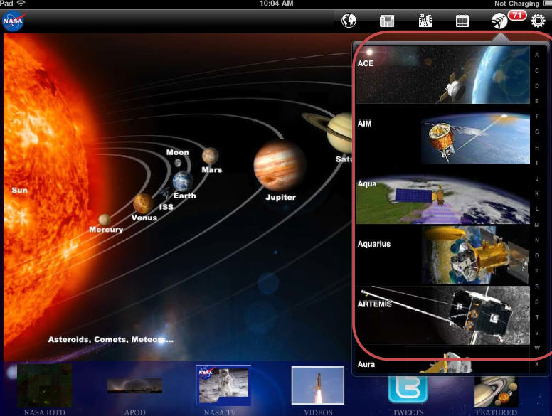
Popovers—the dropdown-type menus that Apple introduced across the iPad system (for instance, when you open the iPad mail client, the list of email address that pops down is a popover)—are easily and often abused. Some app developers like to shove and cram text into popover items, making a huge design mess for everyone involved—it invokes the “fat finger” problem, looks cluttered, and fails to communicate and properly organize content.

NASA’s idea of an intuitive popover. With little scroll-ability and huge, unnecessary photos, NNG disagrees. Credit: NNG
Take a step back if you plan on integrating popovers. Is it wholly necessary? Is the content intuitively organized as items? Does the text look too small? These may seem like obvious questions, but enough apps were guilty of this crime to bear mentioning.
Pad those targets. Pad them real good.
This is the pinnacle of the fat-finger problem. Often times, targets are far too remote for users to reasonably touch with any precision or accuracy. This can lead to frustration and, in a worst case scenario, abandonment of an app or mobile website.
Both Microsoft (PDF) and Apple development libraries suggest that the ideal target size for touch screens is somewhere around 44 pixels squared, which works out to be about 1cm by 1cm. That way, users won’t have to focus too closely on an otherwise mundane, straightforward task.
Don’t boldly go where others have gone before
While the sample size of the NNG trial was admittedly small, there are still rather nice pieces of insight that emerged from the study. As the featured/criticized apps get wind of the study, draw in their products and fix them, then release them back into the app store, may the rest of us learn from their mistakes.
I’d love to hear how this kind of research affects your app development, if at all. Are there any particular issues you’ve come across while developing for tablets? Post your comments down below!
UX research - or as it’s sometimes called, design research - informs our work, improves our understanding, and validates our decisions in the design process. In this Complete Beginner's Guide, readers will get a head start on how to use design research techniques in their work, and improve experiences for all users.