Windows 8, expected to be released in October 2012, is the latest version of Microsoft’s flagship operating system. Its release also marks the first time that Microsoft has significantly evolved its design since 1995. Microsoft’s new, touch-oriented design language opens the door to designers, giving them a chance to reconsider their existing applications.
Christina and I are graduate students in Human Centered Design & Engineering at the University of Washington. In April we were hired as interns by Blink Interactive, a UX research and design agency in Seattle, to become their resident Windows 8 experts. We scoured the Internet for articles and videos, attended Windows 8 developer events, spoke with Microsoft evangelists, and spent a good, long time using Windows 8 on both tablet and desktop computers.
Finally, we conceptualized a Windows 8 version of Rhapsody, an online music provider (and Blink client). Through trial, error, and multiple iterations, we learned how to reconcile the needs of Rhapsody’s users, the scope of their application, and the rather-strict Metro guidelines.
A window to the world
Windows 8 will be installed on a wide variety of devices, from tablets to desktops. Whereas some tablets will only run Windows 8 applications with the Metro UI, others will be able to switch “modes” between the traditional Windows desktop (Aero UI) and the Metro UI. This is the key feature that sets it apart from Android and Apple tablets: Windows 8 enables people to use the same device for watching Youtube videos on the couch as for working on design comps in Photoshop.
Microsoft recently issued a statement saying that it would no longer call its design language Metro. The company has yet to provide vendors with an alternative name. As such, this article refers to Microsoft’s design language as Metro.
User interface

To unify their cross-platform experience Microsoft will employ Metro, a design language they initially developed for the Windows Phone and Xbox. Metro is inspired by the Modernist style of the Bauhaus Design School, Swiss design, the international typographic style, and motion design. Microsoft uses five core principles to define it:
- Authentically Digital:Metro designs avoid skeuomorphism. Unlike iOS –which encourages the use of realistic on-screen objects –Metro eschews faux textures, shadows, bevels, and/or 3-D looking icons for a more modern look.

- Pride in Craftsmanship: Metro designers pay close attention to detail and work to ensure their designs are pixel perfect.
- Be Fast and Fluid: Metro applications feel responsive, using motion and screen transitions to facilitate flow.
- Do More with Less: Metro applications have limited scope. Their designs avoid unnecessary content and chrome (buttons, functions, and controls).
- Win as One: Metro designs employ Microsoft-sanctioned patterns to decrease their learning curve.
In addition to these guidelines, Microsoft hopes to create a sense of familiarity between all third party apps by encouraging the use of a pre-defined grid, typography, screen hierarchy, and navigation. The grid – composed of 20×20 pixel squares – dictates how text, images, and tiles are laid out on the screen. Even the standard font, Segoe UI, and the font sizes recommended by Microsoft were chosen to fit in the grid.
That said, though, it’s important to keep in mind that these are suggestions; great Windows 8 applications should respect Metro’s principles, but could deviate from one or two of them altogether.
Information Architecture
Microsoft is a bit more strict when it comes to the screen hierarchy, which is limited to three levels: Hub, Section, and Detail pages.
- Hub Pages provide an overview of content and functionality. They link to various sections.
- Section Pages showcase the content/functionality comprising a section. Content on section pages page can be displayed in any form, including tiles and lists.
- Detail Pagesare end nodes in the hierarchy. The content comprising them includes text, pictures, video, or songs.

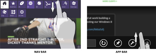
To navigate between the different screens users can tap on headers or tiles. Tiles are clickable rectangles that can contain a photo, icon, or text. Some[t1] applications also have a nav bar at the top of the screen that remains hidden until the user swipes inward from the upper or lower edge of the screen. The nav bar is used to navigate between completely distinct sections of the app –such as tabs in a web browser. Some applications implement a dropdown menu next to the top level headers that allows the user to access sibling and parent pages.
Learning to speak Metro
Blink partnered with Rhapsody, an international music service provider, to conceptualize a metro-style prototype of their application. Rhapsody provides access to over 14 million songs by thousands of artists, as well as editorial content, and radio. They already have apps for a wide variety of devices, from phones and tablets to in-car entertainment systems, so Windows 8 was a logical addition. Our team’s design goal was to create an experience that would feel familiar to current Rhapsody users, while reflecting Metro and Windows 8 principles and navigation structures.
This proved challenging. The wide scope and deep hierarchy of Rhapsody’s app conflicted with the 3-tiered navigation dictated by Microsoft. In addition, we needed to reconcile the interaction patterns that Rhapsody users are familiar with––such as a persistent player and queue––with Windows 8’s chrome-less design.
We began by itemizing the existing Rhapsody Android app’s features and UI in order to make sure that we accounted for everything.
Information Architecture

The current Rhapsody application has four different sections: Browse, My Music, Radio, and Featured. Each contains enough content to constitute a Metro application all on its own. Our challenge was to unite them.
We began by implementing a navigation bar to provide access to each of the four different sections, as well as the main Hub (home) screen from any page of the application.
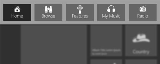
After showing our wireframes to Microsoft employees, they advised us to use the initial hub screen to showcase the different sections. This, however, meant adding an additional level of navigation to an already deep hierarchy – deeper the 3 levels dictated by Microsoft. If a user was interested in Scandinavian Pop, for instance, he would have to travel from:
Home → Browse → World → Europe → Scandinavia → Scandinavian Rock/Pop
The challenge was allowing the user to return to the Home screen without having to continue tapping on the Back button. Some applications solve this by placing a Home button in the app bar –although this is generally considered against proper Windows 8 Metro design. Instead, we decided to use a dropdown menu next to the page headers that provides access to the Home page, the four section pages and, if applicable, sibling pages (such as subgenres).
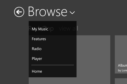
Contrary to Metro style design patterns, we initially used hubs and section pages to break down pages that contained large amounts of content, even when they were not pages at the very top of the hierarchy.
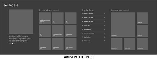
Artist profiles, for instance, were structured as hub pages that showcased the artist’s image, top albums, popular tracks, and similar artists. Each of these groups was linked to a section page that provided the remaining content. When we showed our design to Microsoft designers, they advised us to keep all the content for all the groups on a single, wide page. This was one case in which we decided to go against the advice we received – there were simply too many cases in which the number of albums and similar artists would make the page too wide to browse with ease. Pavarotti, for instance, has over 100 albums. Having a single page would make it difficult to find a specific album, and require semantic zoom to make users aware of the existence of the other sections.
User interface
Windows 8 design guidelines encourage hiding the chrome, or persistent navigational elements of an app. Note that in all of the screenshots we’ve shown up to this point there isn’t any primary or secondary persistent navigation visible. Those navigational elements are available by going back to home or are tucked away in dropdowns from titles. This sounds like a constraint, but it really is a solid principle for mobile and touch applications in general.
However, we still ran up against the “don’t show chrome” principle when it came to the music player. Rhapsody users are accustomed to having the music player visible on every screen.
Initially, we created a sidebar that showed the cover art of the album currently playing, buttons to control the music and the queue. Users could hide and show the sidebar by swiping it on and off the left edge of the screen.
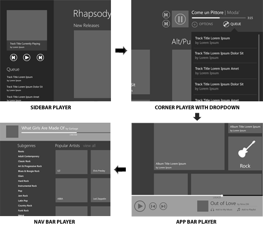
This was a problem, though, because it took up a great deal of real estate on the page and was considered “chrome.” We then considered placing it either in the app bar or in the navigation bar. MSDN suggests placing players in the navigation bar (top of the screen), whilst all other music applications seem to have it in the app bar (bottom of the screen). In the end, we decided to place it in the navigation bar to free up the app bar for other controls.
In addition to the navigation bar player, we also designed a full-screen player and a snap view player. Snap view is similar to “restoring down” an application, and allows users to view two applications at once. The full-screen player opens when the user touched the album cover in the small player, or as a screensaver after the user has not used the device for a few minutes.
When the user opens the application in snap view, they are presented with only the player, since it is not practical to navigate content in such a small view. The snap view player shows the last track played, the one currently playing, and the one coming up.

Start here
Metro is Microsoft’s attempt to create a more cohesive user experience across both its platforms and third party applications. Having a consistent set of affordances and navigation patterns lessens the learning curve and increases the usability of Windows 8 applications.
The challenge for designers is to reconcile the Metro style design guidelines with the specific needs of the application and its users. In addition, the resulting design must be unique: it must convey the company’s brand and its personality.
So how should you get started? First, take a look at the resources below to become familiar with the basics. Then, decide what features and content you want to implement and fit them in Microsoft’s suggested 3-level hierarchy.
Once you know the structure of the app, take a look at the templates provided by Microsoft and use them as starting point. Keep the five Metro principles in mind, but make your app unique by applying your own branding and style, as well as using shapes, colors, and subtle patterns.
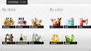
The Cocktail Flow app is a perfect example of this – it’s a beautiful, tile-less Metro design. Throughout the process, show your application to your client, users, and if possible Microsoft representatives (at least for now this is a mandatory step to submit your app to the store). Use their feedback to continue iterating on the design until it’s pixel perfect. Good luck!
Resources
- Blink’s Guide to Metro Style
- MSDN’s 300 page book on Metro style
- Make Great Metro Style Apps
- Planning Metro Style Apps
- How Navigation works
- Commands and Charms
- Touch Interaction
- PSD Resources from Microsoft
- Metro typography
- Metro grid
- UX Guidelines for Metro Style Apps
- Scaling to different screens
- Gestures