Mashable made a fresh start of the new year by launching a redesign. The intention of this was to put more focus on the stories, remove clutter, and to divide the content into sections (Home, Social Media, Mobile, Web Video, Entertainment, Business, Tech, and Jobs). In the past week more than 150 people commented on the blog post about the new design.
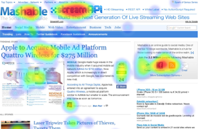
Click-heat maps show user response to page areas.
Most reactions on Mashable seem to be positive about the new look and feel: “Fresh & clean;” “I like the sections;” “It’s more professional;” and “It’s clean and Simple.” But our team wanted to answer a more targeted question: What are the most attention-grabbing changes of Mashable’s new design? User responses to this question (as it relates to a highly-trafficked blog) can help us understand more universal design principles. We asked 60 social media-savvy participants for their feedback.
Three questions: attention, like, and dislike
We used Twitter to ask readers for their feedback on the new Mashable design. Around 60 participants answered three simple questions: Click on the things that draw your attention the most; Click on the things you like on this page; and Click on the things you don’t like on this page. The first question should provide us (solicited) data about which parts of the new design are the most important attention grabbers. The other two questions provide insight in the attitude of participants: what their opinions are of specific parts of the page. We use the visual feedback on the three questions to highlight some interesting elements of the new design:
-
Header
Mashable previously used lists and news channels to organize their content. In the redesign, Mashable introduced eight channels: Home, Social Media, Mobile, Web Video, Entertainment, Business, Tech, and Jobs. Each channel has been divided into multiple subchannels. Users in our test commented that the selected menu items lacked contrast and that the entire header looked cluttered because of the use of just one color. The advertisement of ‘Stream API’ in this particular screenshot could be easily mistaken for a native Mashable element and draws a lot of attention. Probably no big surprise, but 6 out of 10 participants disliked the advertisement in the page header.

What draws your attention?

What do you like?

What do you dislike?
-
Trending story
In Mashable’s redesign, a prominent spot on the homepage is now reserved for a featured story. Each channel features a trending story as an attention grabber. Almost 75% of all participants in our test reported that the first post grabbed their attention the most. 50% of all participants clicked the headline of the first post, and 30% reported that the attached imagery grabbed their attention. The Twitter Retweet and Facebook Share buttons helped users as well, as they reported: “[it’s] nice to see if others like a story“.
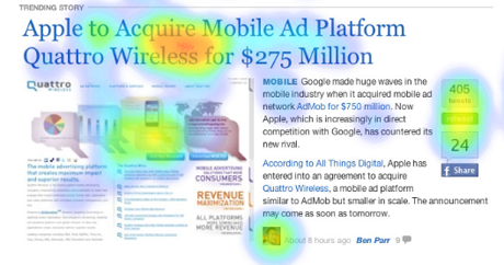
What draws your attention?
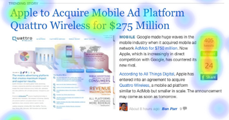
What do you like?
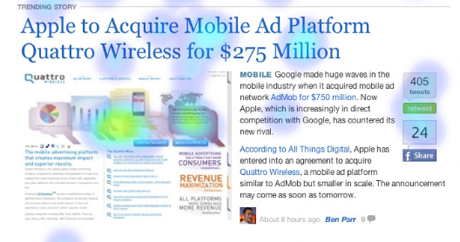
What do you dislike?
-
Subscription options
Mashable’s Twitter account has more than 2.2 million followers, their RSS feed about 350k subscribers, and their Facebook Fan page over 100k fans (with +80k of those joining in less than a week!). Converting 2.5 million monthly-unique visitors into as many subscribers as possible could be one of the most important goals for Mashable. The options to follow @mashable, join the Facebook group, and to subscribe to the RSS feed or newsletter attract attention and are liked by participants. More than 50% of all participants reported that the subscription options or subscription membership caught their eyes.
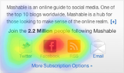
What draws your attention?
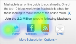
What do you like?
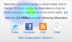
What do you dislike?
The social media guide?
Mashable defines itself as the social media guide, and with good reason. I personally think that Mashable did a great job with their redesign. They focused on their content and removed clutter. Restructuring their tremendous amount of content into different categories could help them to grow their network bigger and better target their audience. Finding an older story in the archives is unfortunately still a difficult task. Mashable’s toolbox to build and maintain their community has been succesfully integrated in their new design, grabbing attention and being liked.
But that’s just my opinion; what do you think?
UX research - or as it’s sometimes called, design research - informs our work, improves our understanding, and validates our decisions in the design process. In this Complete Beginner's Guide, readers will get a head start on how to use design research techniques in their work, and improve experiences for all users.