Even before the advent of mobile design—with its due consideration of loud, hurried contexts—the signs were everywhere: we live in an age of information overload. Be it email, text messages, or the multitude of other notifications, not an hour goes by using a modern device when that device isn’t calling out for its user’s attention. But should it? Users aren’t air traffic controllers, after all. By reducing and/or removing noise from our experiences we can help users get things done in a focused, efficient way.

Nothing inspires quite like nature.
I grew up in a small suburb of Atlanta: Jonesboro, Georgia. Built to house those who would make their living at Atlanta’s new airport, Jonesboro was, at the time, replete with pine forests and grassy fields (many of which my brother and I took the liberty of exploring). Indeed, some of my fondest childhood memories involve telling stories and making up games during those quiet Autumn days.
Years later, I moved to the “big” city to attend Georgia Tech. This marked a radical departure from the environment I was used to because both the quantity and quality of activities available to me increased. On the whole, there was less signal and more noise. I quickly learned that serenity – once afforded to me naturally—was going to take hard work.
Develop a routine
So I developed a routine. I literally traded “quiet” periods during the day for “loud” periods in the evenings. I studied between classes and then, in the evenings, practiced bass guitar in my dorm room. I played music that was far too loud for my neighbors’ comfort. I took up digital and analog photography and wrote a whole bunch of poetry. Once I found it, my new routine reduced the “noise” that I had earlier perceived.
Liz Danzico recently ruminated on a quote by the artist/producer Brian Eno, who bought up a similar point in his interview with the New York Times. He goes on to say:
In my normal life I’m a very unadventurous person. I take the same walk every day and I eat in the same restaurants, and often eat exactly the same things in the same restaurants. I don’t adventure much except when I’m in the studio, and then I only want to adventure. I cannot bear doing something again, or thinking that I’m doing something again.
Brian Eno
It appears that a considered calm is closely connected with not only our desire, but our ability to create. Once we arrange the elements of our day to follow a “routine,” they fade into the background and allow us to get to work. Come to think of it, that’s precisely why office environments are the way they are; they’re designed to reduce noise by imposing a system. Only then, it appears, can the real work happen.
Hold it right there
Except when it doesn’t. Although office environments are designed to encourage creativity, their inhabitants can occasionally hinder it. Joel Spolsky explains:
We all know that knowledge workers work best by getting into “flow”, also known as being “in the zone”, where they are fully concentrated on their work and fully tuned out of their environment. They lose track of time and produce great stuff through absolute concentration. This is when they get all of their productive work done. Writers, programmers, scientists, and even basketball players will tell you about being in the zone.
The trouble is, getting into “the zone” is not easy…it’s so easy to get knocked out of [it]. Noise, phone calls, going out for lunch, having to drive 5 minutes to Starbucks for coffee, and interruptions by coworkers — ESPECIALLY interruptions by coworkers — all knock you out of the zone.
Joel Spolsky
Getting into the swing of things takes time. Further, once users reach that intense state of concentration, the slightest interruption can derail them. As interaction designers, then, it’s obvious that designing the simplest, quietest experience possible is paramount.
Turn on the flow
A recent stab at facilitating flow (encouraging a routine) was a feature called Spaces, developed by Apple for Mac OS X 10.6. Spaces allowed users to arrange applications so that they laid out across multiple desktops or “spaces.” The idea was that users would create a space for work, a space for play, etc.

Spaces, available in Mac OS X 10.6, allowed users to group related applications on their own desktop, or space, to facilitate focus.
Photo by Ian Dick
Although the sprit of the idea was sound, the implementation was uninspired. Linux users had had “spaces” for quite a while, and (speaking as a former one myself) realized that it wasn’t anything to write home about, let alone re-implement. Worse still, Apple’s version was no easier to learn or incorporate into one’s workflow than its Linux counterpart.
Luckily, Apple’s changed things for the better. In OS X 10.7, they threw out the concept of Spaces entirely, instead focusing on full-screen applications. These work much the same way – users concentrate on one task, or set of tasks – without all of the machinations required of Spaces. What more, full-screen, sovereign applications work much like their iOS counterparts. They encourage users to dedicate their attention to one given thing at a time. Simple. Quiet.
Reduce the (relative) noise
There is a counter to this, though. With the immensely strong “signal” provided by full screen applications, there’s less noise overall, which makes users far more attuned to noise when it occurs.
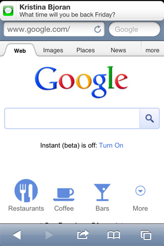
Once again, I’ll pick on Apple. In the previous version of iOS, anyone could have their entire flow broken by a mere text message (or, in this case, a javascript notification). Those who used iOS 4 and experienced even a handful of notifications could tell you that this was quite a “loud” treatment.

You didn’t want to read this article, did you?
Yet again, though, Apple presented a more considered approach in its iteration on the theme. Today, notifications appear in a small bar across top of the screen. If a user wishes to learn more, they simply swipe the notification to give it their full attention.

iOS 5 Notifications. Cool, Calm, Collected.
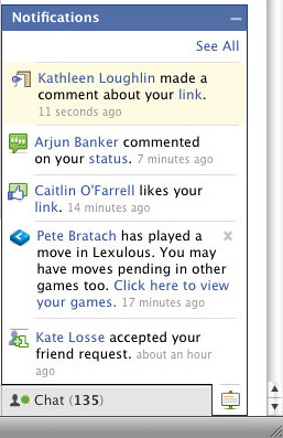
The natural question one might ask, then, is: “Okay, if we want encourage flow, should we just remove all notifications?” To borrow a quote the good guys at 37 Signals: “it depends”. What’s the context of use? Facebook, for example, uses contextually appropriate notifications. Because most people browsing that site want to know if something’s changed while they’re using it, Facebook displays notifications in real time. Although a constantly updating stream of notifications might seem like overkill, it actually aides users in their goal as they use the site.

Facebook users can literally see the community update the site in realtime.
This one goes to 11…does yours?
Today, people use software to do everything from sharing highly processed photos to managing projects. While some goals require more concentration than others, all users benefit from ease of use and the encouragement of flow. To that end, we as interaction designers should reduce the volume of the experiences we create. Two common UX adages set the stage in our quest for simplicity:
- Make it usable. After all, “Don’t Make Me Think” has almost become a rallying cry for our industry. (It’s a misnomer, of course. We actually want users to think, just not about the interface itself.)
- Make it learnable. UX designers perform ethnographic research, card sorts, etc. in order to design things that are, at the very least, intuitive. If we can’t make them immediately obvious, we should make them learnable so that users can develop a routine.
Both of these benefit the end user because, for better or worse, all users will spend precious moments learning how to use an application before they are able to accomplish anything with it.
After you meet the baseline, after you craft an ambient experience, stop and listen. Is your experience loud or soft? If it strikes a chord you should reconsider the role that notifications play in facilitating flow. Your users will thank you for it.