For those of us looking for quality usability testing, we know how expensive it can be. UserTesting.com is a low-cost alternative that gives you results from remote testers within your niche’s demographic.
UserTesting.com is an online web application which gives it’s users a simple and intuitive analysis of their website at a fraction of the cost of it’s competitors. The application enables users to see real-time interaction with their website, hear what people are thinking while they use the site, and read a written summary of what their thoughts. Through utilizing it’s database of paid remote users of your niche’s specific demographic, UserTesting.com gives you qualitative as opposed to statistical information on your website.
The Mountain-View company has a big backing from well-known companies like Twitter and MSN – But is it really up to the hype?
For this article I’ll be analyzing the process from beginning to end. I’ll note some key features I noticed as a first-time user, as well as mention some areas I believe need improvement for both the application and the project itself. While UserTesting.com is an advertiser on UXBooth and we appreciate their support, my goal is to leave complete judgment up to you in an nonpartisan way.
I’ve also provided a video that goes over the features of the application and an insider’s look if you want to get an idea of it within 3 1/2 minutes. 😉
For this review we will be using a large template market place, ThemeForest, as the example project. We would like to extend a great amount of thanks to Collis and the team at Envato for allowing us to do so!
First Impression and Sign Up

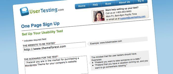
UserTesting.com – The First Impression and Sign Up
The sign up process details a sort of role play you would like the tester to do as if they were your exact target niche. For ThemeForest, I made the scenario of the tester to be purchasing a WordPress Theme. I asked them to browse the site using the site’s search functions to find their “perfect” theme, sign up to make a purchase, show the purchase process, and utilize the forums.
UserTesting.com’s FAQ denotes that the optimal amount of users to test your site is five, however for the purpose of this review we chose two testers. This process also asks you to specify the demographic of your company’s target niche (or, alternatively, to leave it open to anyone). This can be very useful for companies that are selling primarily to a specific gender or age. Having conversed with the ThemeForest team prior to this test, I specified that the testers be based in the United States.
WHAT I LIKED
The sign up process is simple, giving you options to choosing your tester(s) so they reflect your niche. It also provides valuable hints on how to get the most out of your tests through what you ask of your tester(s). Just below the navigation on the sign up page there is a phone number to contact the company’s team and ask any questions, as well.
WHAT I DIDN’T LIKE
Upon first impression of UserTesting.com, I honestly didn’t get a good feel for the site. While it clearly displays all information it needs to, I didn’t feel this was a site I could take too seriously with usability testing for one of my or my client’s sites.
Coffee Break!
The sign up was far easier and quicker than I would have imagined it to be, and I was immediately taken to the results page. At this point, an e-mail is sent out to the testers that matched our query, and you have to wait for said testers to accept the project. It’s nice to note that testers are being paid to do such tests, so the analysis is taken seriously.
Within quite literally 5 minutes, I already had two testers accept the test. During the little time that I had to wait for them to finish the tests, I checked out the UserTesting.com Twitter account. I was pleasantly surprised to find that UserTesting.com interacts through Twitter answering questions, taking suggestions, and building community through sharing resources.
Reviews… Already?!

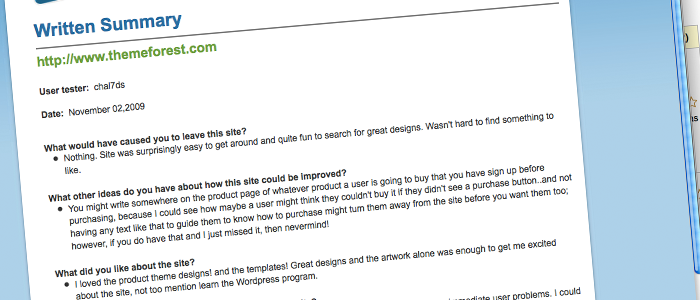
One of the awesome Written Summaries!
An hour later I had already received the two completed reviews. At this point you’re able to view the review in two different formats: Video, and written summary. We are also given the option to share, download, and embed videos so I can show it to others. The written summary answers a lot of the standard questions your would want answered, and both videos were near 20 minutes long.
For this round of testing I realized very quickly from the first test that I should have specified that I wanted people who had WordPress experience since I had specifically requested for them to look for a WordPress Theme (forcing them to use the Categories functions ThemeForest offers). Still, I was lucky to have gotten two testers of different skill sets and technical experience, so I was able to see two completely different people use ThemeForest.
WHAT I LIKED – NO, LOVED
Like a little boy opening his bag after a night of looting for candy, I was quite excited to go through the reviews. I found a lot of great comments about the site and saw the site in two very different ways. While it felt a little creepy listening to these testers talk to themselves at first, I loved the fact that I could literally hear what they were thinking.
Lucky for myself they were of two different technical experiences so I got a wide variety of information and got to see the site utilized in two completely different ways. It was very interesting to see them interact with the site in a way I wouldn’t have (which is the point of usability testing), and I got a ton of ideas on how the ThemeForest site could improve!
WHAT I DIDN’T LIKE
I wasn’t a fan of how general the questions were on the summary and I would have really liked the ability to set your own questions. Really… there isn’t much not to like!
Conclusion
When you use the application, you fall in love with the reviews and the quality of the comments you get. While you don’t get the features other usability testing sites offer (such as heat maps and more statistical information over large batches of users that are actually browsing your site without knowing), you get the information you need in a simple way that is easy for you to take and bring to executing UI changes.
Areas of Improvement – UserTesting.com
Of course, being a designer, I would really like to see a cleaner more professional interface to the site. After using the product I feel confident with it’s quality, but going into it I felt very unsure.
I would really like to see the ability to choose how many users are of specific technological requirements/gender/etc without setting a different project for each one. I think it would be nice to be able to ask your own questions for the written summary over the standard questions UserTesting.com has, so they are more specific to your project.
What the Tests Showed
While I would like to keep the information collected by the testers in their use of the site confidential to ThemeForest as much as possible, it seemed unanimous that they both enjoyed the feel and flow of the site. The first tester did not understand how to search through the site as much and got lost rather quickly. Both were confused if there was a difference between a “Theme” and “Template” (as they are both used almost interchangeably), and they would have liked to see a “step-by-step” process on how to use the site in terms of purchasing a theme.
As well, the first tester got very confused with the drop down menu on the search bar, and they both seemed to completely miss the large “Categories” button to the left, which was a little frustrating.
Video Summary!
Video Summary of UserTesting.com Review!
UX research - or as it’s sometimes called, design research - informs our work, improves our understanding, and validates our decisions in the design process. In this Complete Beginner's Guide, readers will get a head start on how to use design research techniques in their work, and improve experiences for all users.