Designers talk about the “happy path” through a website: a series of interactions where smiling users enter correct and complete data and press the right buttons in the right order.
The first time I measured the happiness generated by a happy path I was surprised. My programmer logged details of a simple lead-generation form:
- 31% made an error on their first go
- 7 of these got back on track
- 24 left the website without converting—some after many attempts
This means that 24% of the people who tried to convert were let down by how the website dealt with their mistakes.
What is best practice for dealing with user errors ?
- Make it clear that something is wrong.
- Show the user which field (or fields) are wrong in form errors.
- Display error messages that help users get back on track.
- Save what the user has entered—both good and bad so they do not have to repeat data entry.
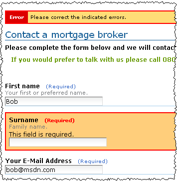
This mortgage site shows the way. Red and Yellow are now standard colors for showing errors. From 6 feet away you can clearly see that there is an error and where it is.
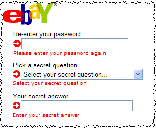
Red text under the bad fields is a good example to follow.

This shoe website has another good way to show error messages. The message is right there with the problem.
Inline validation and error messages

Inline validation is when the site validates a field when the user leaves the field and before pressing the ‘submit‘ button. In other words, a user knows if the data entered is acceptable instantaneously. This technique is very good for fields like User Names where the site visitor wants to know right away if a selected username is taken or still available (rather than submitting the form several times looking for the right username).
Inline validation is well covered by Yahoo’s Luke Wroblewski on A List Apart.
But there are some problems with inline validation:
- Inline validation can be expensive in programming effort—you still need server side validation as well.
- Big libraries can make pages slow to load which can hurt conversion rates.
If you have the budget (or you’re a savvy developer) then try inline validation—but do an A/B split test to see if it’s helping or hurting. I’ve had mixed results with inline validation even for just simple checks like mandatory fields.
How to word your error messages
For an existing site ‘mixing with your customers‘ will get you a long way. Get your programmer to log user errors in forms, including the bad data they have entered. You will find:
- A small number of problem fields. Sometimes it may just be one problem field.
- Errors follow patterns
Each common error pattern needs its own custom error message. I’ll say that again: each common error pattern needs its own custom error message. Doing this is low-cost and you will get very insightful information that can drastically improve results.
For a brand new website, previous experience will help you to guess the kinds of errors that users will make. After going live you must revisit this and see if there are new kinds of errors.
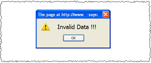
The custom error message should be:
- Tactful and blame-free – ‘Oops’ is good
- Clear about just what is wrong
- Helping the user to get it right
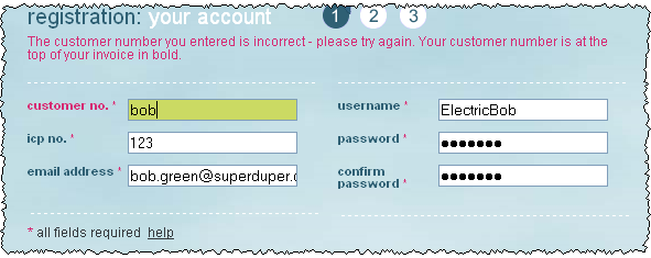
This power company gets it right—very clear where to get the correct customer number:
Let’s look at the email address: this is often a problem field. Here is how NOT to do it:
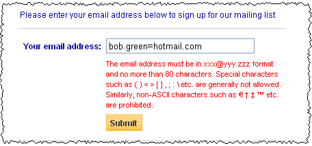
We can all see what is wrong – but the site dumps a big list of everything that could be wrong
How about “Your email address needs an ‘@’ sign“.
Other errors will need custom messages:
  bob.green@superduper    =>  "Email address is incomplete - check the ending"
  bob./green@superduper.com => "Email address has an unusual character ( / )"
Do this with the common errors and only then use a “one size” error message for the oddballs.
This is another reason for not using ‘expression matching’ for validating fields. The user input will only ever pass or fail the test and you then have no idea why it failed so you are stuck with dumping a manual page on the user. A more targeted message could nudge her back on to the happy path.
Empty fields
A common error is when a mandatory field is empty. This is often an email field or a phone number field. The site visitor has not forgotten this field, they are often reluctant to share this personal information and wants to try and move forward anonymously. Having no data is different from invalid data and it needs a different error message.
My tip in this scenario is to explain why the information is going to help the user:
- “We need a phone number in case our driver is running late”
- “Enter your email address so we can help if you forget your password”
- “Enter your postcode to help fast delivery of your order”
Results up by 17%
The financial services website followed these guidelines. The before numbers were:
- 100 submitters
- 31 first-time errors
- 7 recovered
- 24 didn’t recover
Before: 76% success rate (= 100% – 24%)
After: 89% success rate. By following these guidelines, inquiries are up by 17%.
The key part of getting the user back on the happy path was specific and helpful error messages.