This post analyzes some design changes implemented at another blog, Tutorial9.net, that vastly improved user experience and in turn made the site more successful. After the redesign, the rate of subscribers per day nearly doubled, and pageviews increased by over 50 percent.
There is not always a right and wrong in the business of usability. Principals generally remain the same, but a solution for one site is not always going to adapt perfectly to another site. My goal with this post is not to tell you how to solve a specific problem, but instead how you can start approaching similar obstacles.
The Old and the New
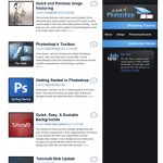
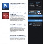
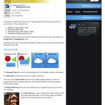
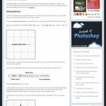
Assuming you’ve never laid eyes on Tutorial9.net, here’s a quick look at the old vs. new design. The goal of the site is to provide free lessons & tutorials to folks interested in learning Photoshop, Photography, Design, and Blogging in ways that are easy to understand.
Goals of Tutorial9.net
One of the best ways to determine usability, satisfaction, and success for a site all at once is to setup some measurable goals. Goals allow for relative measurements (ie: do we see more conversions/sales now that before we implemented this design change?). In other words, goals allow us to determine if things work better or worse than they did before.
Some measurable factors of success at Tutorial9.net include pageviews per day, and subscribers per day. Essentially, the site is considered more successful if users are exploring more pages, and subscribing to the content which in turn may bring them back in the future. Similar goals on other sites may include how many products a user purchases, money spent, or users that opt in to a special offer or newsletter that informs of other products & services.
Redesigning the Home Page
One of the biggest problems with the original index page was the amount of content shown before the fold. Generally speaking, users were only interested in the first two posts linked to from the home page, since that was all they saw on first glance.
If a user can’t find what they are looking for immediately, they often won’t search much further. With a homepage that on first glance only offers two articles, the original design didn’t provide users with a whole lot to look at. The featured post couldn’t be taken away; being a blog that features articles where timeliness isn’t a real factor, it was important to keep some sort of “Featured Post” section that showcased the most important posts from around the blog.
This meant keeping a prominent featured section, while at the same time showing multiple other articles users may find interest in.
The solution that seemed to work best was a slideshow that featured several prominent articles in the same space — and then shrinking the amount of space the old post listing took up to allow for more posts to be shown in less space.
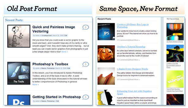
Recent Posts in the old design offered many useless options to users. Included in the listings were names of the author, a strange bubble that may or may not link to the comments of the post (there wasn’t really a way for a user to know on first glance), and links to several different categories of the blog — which were NEVER used by a typical viewer. The new design addressed these hindrances in one of the best ways to approach useless features: get rid of them.
In addition to the featured and latest posts shown on the homepage, an additional column that showcased the most popular tutorials was added, offering an even wider selection of articles to choose from for newcomers, and frequent viewers.
To Subscribe, or not to Subscribe?
There is something really important to learn from in the sudden increase of subscribers per day on Tutorial9. Even though the amount of pixels dedicated to RSS in the redesign was practically cut in half, the subscribers per day nearly doubled. How the heck does that happen?
It’s the same problem that my mother used to describe to me as, “You’re looking for it like a man.”, and while I don’t think being a man has much to do with it, I think that she may have been onto something.
You see, people look for what they expect. It wasn’t that the peanut butter was hidden away from my sight as a child, or that the remote had been stolen by the Remote Gnomes in the night, these things simply were not where I expected them to be.
 The Subscription area from the old design featured a large, dark, blue RSS icon — not something a typical user might be looking for when finding a way to subscribe.
In a similar fashion, the subscription methods and RSS were not what users expected them to be on the old Tutorial9.net. Rather than placement though, it was really a poor paint job that made all the difference. In place of the standard orange RSS icon, the old design featured a HUGE dark blue RSS icon, and the only apparent way to subscribe was by email (standard RSS subscriptions could be reached by clicking the feedburner icon, but who could be expected to know that on first glance?)
 The updated site used the standard orange RSS icon. While much smaller, subscriptions thrived since it was more familiar to the typical user.
Yes, space was minimized in the redesign of Tutorial9 when it came to subscriptions and RSS, but what really made all the difference was the bright orange RSS icon that users look for along with quick, identifiable options for subscription types/methods.
So thanks Mom, for a lesson well learned in web standards and usability.
Improving the Post Page
It’s worth mentioning that a post page on a blog is perhaps the MOST important page your user will see; reason being an individual post is often the very first page a visitor will land on, meaning that if you don’t make a strong first impression, they might not choose to stay.
We won’t go deep into that during this post, but it does play an important role in the number of pageviews & subscribers Tutorial9 receives (which means that the post page is critical to the goals described at the beginning of this post).
 By adding related posts at the end of an article, users explored much more of the site before leaving.
The big problem with the post page in the old layout was that every post page acted like an exit instead of an entrance. By the end of the post, users were looking for a way out — when it was intended for the users to continue exploring the blog for other posts they may be interested in.
To solve the problem, several things that directed users to other pages were added in the redesign. Along the right side of the post, popular posts were listed (and the posts listed were all a part of the same category a viewer was currently browsing). At the bottom of a post, even more related posts were shown, offering many new entrances rather than leaving the viewer looking for a way out.
Don’t Forget the Constraints
Obviously, the interface and design is just a portion of a websites user experience, and these are the things that were most vastly changed during the reconstruction of Tutorial9.net. With that said, there are other things that need to be examined carefully for maximum usability: namely, the user.
We need to define the users abilities prior to putting together a site. Everything from age, devices used, Operating Systems, disabilities, screen resolutions, internet speed, to whether or not javascript is enabled will play a large role in how accessible your site is to your audience. You don’t play a Blu Ray disk on your DVD player. Likewise, you don’t give an audience on 56k modems pages with megabytes worth of images and video.
For Tutorial9, there were a few constraints that limited what could be done:
- Some of the users are on slow connections. Heavy flash apps, videos, etc can’t be used without alternatives.
- Can’t design beyond 1280×1024 resolutions.
- RSS Savvy (usually). Provide alternative for users who aren’t familiar with the technology (email subscriptions).
- Very Visual viewers. This gives Tutorial9 a lot more freedom with how information is presented.
- Firefox users mostly. Some IE and Opera users, so the design should work well in those browsers.
Part 1 of Infinity
As mentioned earlier, goals are often relative forms of measurement. It’s been about three months since the rebuilding of Tutorial9.net, and there are already lots of obvious ways that the User Experience could be improved upon.
And that’s alright.
It would be silly to suggest that a site will ever be perfect. To do so limits the boundaries of building sites significantly. Usability test should constantly be done to see what could be improved upon, feedback from users should be taken seriously, and sometimes a wheel needs to be reinvented to see if there are better ways to solve old problems.
For Tutorial9, a step was taken in the right direction, and really that makes the redesign a success. How it improves from this point will be determined by the testing and feedback provided from this revision.
