There’s been quite a lot of discussion recently on blogs that cover user experience, with some very unique vantage points. The overarching question: What methods drive the solutions that we present to our clients?
On many projects to which design, development, and UX teams are assigned, the scope is myopic: project managers turn their blinders on and focus the attention of a team on one particular aspect of a system at any given time, instead of looking at the experience that that website or application delivers as a whole. As our websites grow ever more complex, this sort of problem is increasingly apparent.
In order to unite otherwise disparate design endeavors, we need to start at the beginning, providing ourselves (as well as clients) an idea of where we are, where we are meant to be, and how we’re going to get there. The website creation process can be thought of as an epic journey, one that, well planned, ensures the delivery of a compelling experience.
In this article, we’ll look at some powerful ways to communicate with our teams in order to unite design and development endeavors, working together in order to understand the kind of story that they want our website to tell, as well as how we can go about telling that story.
Storytelling
Telling stories is one of the most ubiquitous forms of communication. As the website for the forthcoming book Storytelling for User Experience Design explains:
We all tell stories. It’s one of the most natural ways to share information, as old as the human race. … Stories help [experience designers] gather and communicate user research, put a human face on analytic data, communicate design ideas, encourage collaboration and innovation, and create a sense of shared history and purpose.
Clearly, there’s value for experience designers in storytelling.
In its many forms, storytelling drives the most iconic pieces of art. This is accomplished when an overarching plot is communicated with the help of many lower-level thematic devices. Think of the elements driving one of your favorite movies: did you like the character development? The cinemetography? What forms of artistry contributed to that film’s resulting experience?
As Francisco Inchauste recently wrote, the metaphor of storytelling, when applied to experience design, allows teams to understand narrative—to obtain an idea of who they are telling the story to, as well as what textual elements we can use to shape that story. Consider the following diagram:
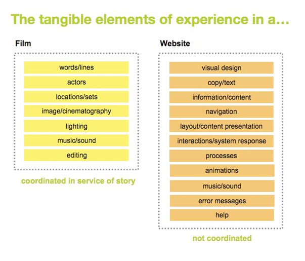
Many interrelated parts account for the experience that a film/website provides.
This picture is as fascinating as it is daunting. We can use the concept of storytelling to give our teams an idea of where we are headed. But applying storytelling to the websites we create is difficult work—that’s where experience themes come in.
Experience themes
One of this idea’s most vocal proponents, Cindy Chastain has written and presented extensively about experience themes over the past year. In her Boxes & Arrows article on this subject, Cindy recounts:
We had a big problem at our company. The problem was that the websites we were designing and building were coming together like potluck meals made by a loose confederation of team members and stakeholders who were all working out their dishes independently, and on their own terms.
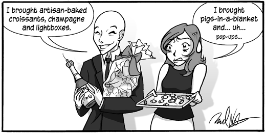
Potluck web design. We can do better than this!
Illustration lovingly provided by the talented Rachel Nabors.
An experience theme is one tool in the UX bag of tricks used to address this problem; it’s born from the desire to have the various elements of a website function in unison towards an overarching experience goal. How a website functions or looks may be one thing, but making it tell a story is quite another.
An experience theme helps illustrate for your team the kind of experience that separate elements of a website should work to create—the kind of elements you will use to tell your website’s story. Effectively executed, experience themes objectify design and development decisions that would otherwise be subjective. That alone is worth the upfront cost of introducing experience themes to the design process.
So how do they work and how might we create them? The process by which experience themes are created has already been put forth to the community for review. I highly recommend giving Cindy’s article a read, or scanning through her presentation she gave at the IA Summit in 2008 on the same subject. Both of these resources offer a good look at an idea which moves us from story towards storytelling.
Storyboarding with Sketchboarding
Thus far, we’ve covered two more-or-less abstract ideas when it comes to formulating an experience: the idea of the story our website will tell and the thematic elements that we’ll use to tell that story. Next we turn our attention to a visual tool used to communicate the design considerations necessary to bring a story to life—the storyboard.
Storyboarding began as a series of sketches used to piecemeal the design and development of an animated film. In the frames that make up a storyboard, the story itself is told, but the fidelity of that vision isn’t entirely realized—and for good reason. Not only does each frame of an animated film require painstaking work, there are many aspects that simply can’t be accounted for when the story itself (the film’s goal) is separated from the artwork that helps to tell that story. Despite the similarities we’ve discussed, though, websites have traditionally been developed without storyboards.
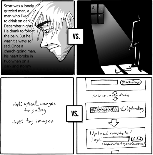
Showing vs. Telling. There’s a great deal of power in the ability to visually communicate what your website does versus just “describing” your website’s tale.
Illustration lovingly provided by the talented Rachel Nabors.
Unlike the frames of a film or the panels of a comic, the webpages we create are both design and context independent. This means that, although each webpage can be designed more or less independently from the one proceeding it (like other forms of sequential art), its position in a sequence depends on a hierarchy of user interactions (a context). In film or comics, the interaction context is linear—frame one precedes frame two, and so on—whereas online, the context is multi-dimensional. The only person with an overarching view of the system is, of course, the people who created the website. Which is to say: if we’re designing experiences that can take any of a number of directions, a linear storyboard won’t do.
So how do others map out their website’s visual interaction flows, shaping the stories they tell? After a brief web survey in which I asked my Twitter followers to share their experiences communicating a website’s experience, I can attest that the methods used to visualize an application’s overarching design are wildly varied in terms of the deliverables generated (for example, Adaptive Path uses something similar to storyboards—called sketchboards—which we’ll get to in a moment), their fidelity (likeness to a finished product), and their purpose.
Altogether now
One consultancy that practices something markedly similar to the storyboarding process is Adaptive Path. Brandon Schauer, a member of their consultancy, recently described their sketchboarding process in one of the group’s frequently published essays. He explains:
Designers love the “breakthrough moments” in a working relationship. Those times when you suddenly reveal a picture of a solution that really nails the problem and gives everyone on the team a reason to cheer. Such moments bring together many of the most valuable capabilities of a designer.
Indeed, design can be an empowering activity. The catch, of course, is that one genius moment does not an experience make.
Within the filmmaking process, it would be ludicrous for the director to assume that just because she understands the story/experience she wants her film to communicate/provide that she could somehow sketch out a storyboard, go back to her trailer and expect the film crew to create something remotely similar to her vision. That’s why the best website sketchboards are created collaboratively. Adaptive Path gives us a peek at their process in this short video:
In the accompanying essay, Brandon goes on to explain:
It starts with a big sheet of paper (think yards, not inches) that forms a large canvas on which we can explore, share and iterate on ideas.
At this point, we’re prepared to sketch a wide array of solutions with (gasp!) pen and paper. It may not be the most pixel-perfect portrayal of the final results, but it’s fast, it eliminates needless detail, and it can reasonably convey highly interactive experiences. (As proof of the last point, just think of animation storyboards).
The benefits are plenty: collaboratively generated sketchboards are a highly accessible communication tool that further refines the context in which a design solution will live.
Getting started
Going from concept to ideation, development, and product has never been easy; that’s why there’s so much discussion about it. This article has addressed three of the hot topics used to broach the subject. But the question bears asking: if our process works for others on my team, how do I invite this kind of thinking in?
After the initial kick-off meeting, the project team will invariably leave the room with wildly different assumptions regarding the experience that the forthcoming website ought to deliver. Applying first a design strategy, then a set of experience themes, and finally engaging your team with sketchboarding helps invite collaboration and communication into an otherwise isolating process.
Blog Posts / Presentations
There are a great number of tools available to experience designers, many of which you may have already heard about.
- Sketching. Jason Robb recently detailed a bevy of useful sketching resources and even shared some of his own sketchboards in his fantastic Tools for sketching user experiences.

Jason Robb juxtaposes individual sketches, sticky notes, and scanned pages to create his website’s sketchboard.
- Buck Up. Leah Buley (also with Adaptive Path) discussed many of the considerations that apply to user experience designers seeking to add collaboration and cohesion to the experience design process in her presentation How to be a UX Team of One at the IA Summit.
- Arm your toolkit. Sarah Nelson, principal of User Experience at Hot Studio, shared some of the tools that drive her experience process in her presentation at An Event Apart San Francisco, 10 Secrets from a UX Design Strategist’s Toolbox.
Books
 Sketching User Experiences
 The Back of the Napkin
 Understanding Comics
 Communicating Design
 The Hero With a Thousand Faces
Final thoughts
Regardless of how you proceed, the goal is the same: get everyone on board with a unified design direction. Collaboration and communication inevitably lead to a more holistic design and development process.
As Scott McCloud states in his book Making Comics:
No matter what shapes your comics take, as long as navigating through them is a simple, intuitive process, that process will be transparent to the reader…for now though, whether you work in print, the web or both: improving flow can help your audience enter the world of your story and pass from one end to the other without ever being torn away form the world outside. Do that and your storytelling can put its full weight on being the “story” without the “telling” getting in the way.
Scott McCloud in Making Comics
References
- The Problem with User Stories
- Sketchboards: Discover Better + Faster UX Solution — at Adaptive Path
- Comics: Not just for laughs! — at Boxes and Arrows
- Experience Themes: How a storytelling method can help unify teams and create better products — at Boxes and Arrows
- Better User Experience With Storytelling – Part One — at Smashing Magazine
- Tools for Sketching User Experiences
- Focusing Interaction Design with Design Strategy
Ready to get real about your website's content? In this article, we'll take a look at Content Strategy; that amalgamation of strategic thinking, digital publishing, information architecture and editorial process. Readers will learn where and when to apply strategy, and how to start asking a lot of important questions.