When you visit a website of a business do you ever wonder who is behind that business? Being transparent online and in business has a plethora of benefits. Users gain trust and have the ability to see the human side of the business. The effects are incredible, from increasing sales to finding like minded clients.
Showing that your business is human can easily make you a stronger company. The benefits go two ways though. Not only is it great for your company but it is also beneficial for the user in may ways. In this post I will detail many examples of transparency around the web. As we go through each example I will explain why it is positive, how they have done it, and what it creates to benefit the user experience.
Build Internet
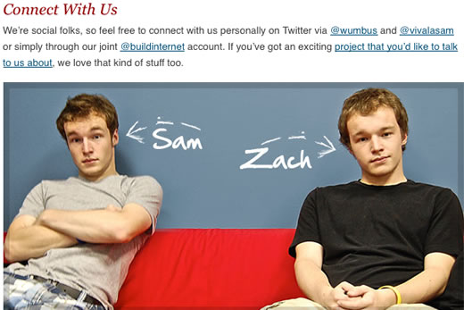
Sam and Zach of Build Internet lay it on the line. As soon as you open Build Internet‘s homepage you see the two fellows behind the website greeting you. Click on their photo and be taken to the about page. This page has a larger version of their photo and ways to contact them on a personal level through twitter. This creates a personal connection between the viewer and the owners of the website.
Comcast Cares
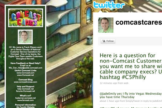
Talk about a marketing and customer service visionary. Comcast’s early adoption of twitter has been followed by many corporations. The difference that is still clear? Having a human face attached. Twitter is a personal social marketing tool. Therefore, when a company hops on board, why should they not also be personal?
Freelance Folder
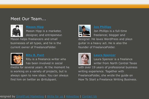
Freelance Folder has found an awesome use for their footer. Down there at the bottom of the page they give the bio of the four main authors of the blog. This puts us in touch with the voices of what readers see day in and day out in a new way.
Twitter Blog
Vimeo
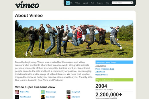
Vimeo brings us a very fun and creative About page. It actually inspires me to take a fun photo with the UXB crew and update our own about page. However, the fun photo of the staff brings a level of fun that people may not perceive when thinking of Vimeo. This presentation gives us a feeling that Vimeo folks enjoy what they do and have a life outside of their product.
Smashing Magazine
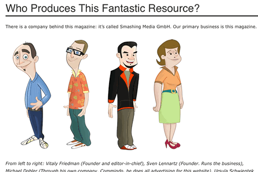
The new Smashing Magazine design is hot… but I digress. I included SM here because of the addition of their illustration in the footer. These folks are the mysterious men and women behind SM. When clicking on the footer cartoon we are taken to the about page which educates us on who these folks are and what they do. This brings a level of transparency that the previous design did not have.
This is Aarons Life
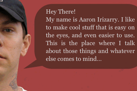
Oh, hi there Aaron! In TIAL’s footer we meet Aaron face to face. This could almost be described as a face to face meeting but presented online. Neat idea for any freelancer or blogger looking to create a strong personal brand that has their face attached to business.
Mutant Labs
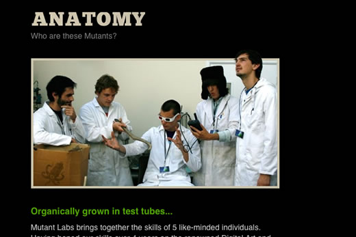
Mutant Labs is similar in Vimeo in their approach. Instead of a group shot doing something fun they also took on a degree of silliness. Great to get people inspired to take on Mutant Labs as their web developer. It shows a since of creativity right from the start. This in turn can easily increase sales.
Level 9 Design
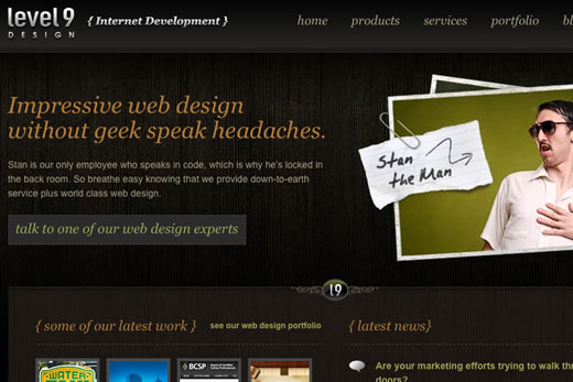
So, I can’t quite tell if Stan is really an employee of the business or not. If he is, more power to him! Regardless, Level 9 Design brings a great personal sense of humor to their front page. This can be risky but for perspective clients with like minds it could draw in those who can’t quite decide. Bringing in like minded customers can make the process smoother and more successful.
Maurivan Luiz
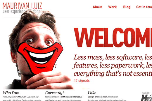
Landing on Maurivan Luiz I want to hire him. This User Experience Designer has taken personal exposure to a new level. Showcasing himself with a cut out smile can be taken to a deeper level when considering the philosophy behind user experience.
Hashrocket
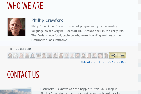
Hashrocket showcases it’s employees on the home page. This introduces you as a prospective client to some folks that may be working with you on your next project. Following the employees is a link to all of the rocketeers. But Hashrocket goes deeper than this, providing a Flickr feed, broadcasting their book club meetups online, and even sharing their company via a vimeo account. You can virtually become a part of their team without them ever knowing. Ok, enough with the creepy stuff. Really, the transparency in this business makes it feel personal and easy to trust.
Jaredigital
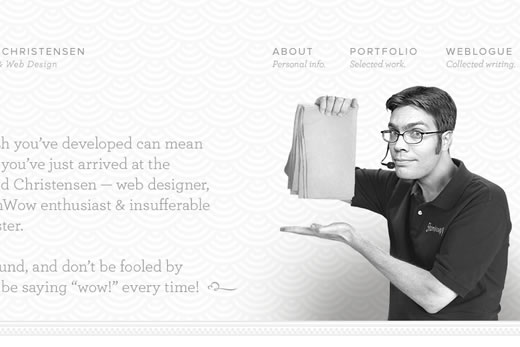
Jared’s creativity flows from the page the moment you open it. But wait… Vince from Shamwow? This is an awesome example of using popular culture to connect a visitor to you instantly.
Clearleft
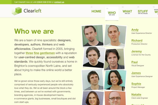
Clearleft has a great about page. It starts with a story of who formed it and when. Then as your eyes move across the page you meet the staff. One of my favorite examples of an about page.
Carsonified
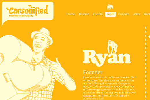
Carsonified’s bio pages for the team members are fun and helpful. Not only do we get a taste of the personal side of the employees but we are also able to easily contact them through email or twitter.
Trends & You
Now that you’ve seen some great examples of transparency on blogs, twitter, and business’ websites we get an idea of where we could perfect our own transparency. For starters, personal freelancer’s thrive on self promotion. It makes sense for these websites to showcase a photo of themselves. Additionally, there are benefits from being open with your audience about yourself in bios, on blogs, and on your company profile page.
In closing I’d like to leave you with a few questions. What transparency practices did you enjoy most? What other examples do you have? How do you see your transparency changing after this?
Further Reading
- Building Trust with Transparency
- 5 Ways to Make Your Business More Transparent
- Transparency Is The Future Of Business
- 47 Simple Ways to Build Trust in Your Website or Blog
