Photo by
Mark Brannan
Is it ok to ask your users to learn your interface? As UI design is maturing and the web is becoming a more advanced land of complex interfaces is it now unreasonable for every feature to be instantly usable? Touch devices have also entered the mainstream and added a multitude of interactions that UI designers can lean on.
So, how do you know when it is ok to hide features and ask your audience to learn your application? Is ‘learnability’ now more important than usability?
People like to feel that they are making progress. They like to feel that they are learning and mastering new knowledge and skills.
I recently wrote a short post listing my initial thoughts of ‘Reeder’ the RSS app for Mac.
I had heard so many superlatives about it from others that I was compelled to give it a try. However, on first showing I was massively disappointed, during my first attempt at using it, I was constantly guessing and was unsure about where to find the features I wanted.
Despite these initial UX grumbles, I know there is a huge audience out there who love using ‘Reeder’ and find using it a breeze. If you get over the initial confusion and spend time learning the interface, it becomes second nature and needs no thought to operate.
So, what factors allow you the chance to experiment with your user interface?
Importance
If the interface you are designing is critical to your users then it’s far more likely they are going to spend time learning how to use it. The more important the application is the more time they will spend trying to get used to it.
For example, if the application is a critical part of the user’s workflow and they would be far less productive without it, they are going to be far more willing to overcome initial confusion if the long term goal is worth it.
Frequency
I use a handful of applications and websites everyday. Using them so regularly has meant their interface is now very familiar to me and I know exactly where everything is. I tend to perform the same tasks during every visit and because I perform them so frequently I can complete them without having to think about them.
The ‘Reeder’ app is a good example of an interface that people would use a lot. I keep up to date with my RSS feed at regular intervals during the day so any users of ‘Reeder’ are likely to get used to it very quickly.
Cost
This might sound counter-intuitive but the more someone pays for an application the more time they are going to invest in learning it. I’m not saying you should charge exorbitant amounts for your app so that you can neglect the user experience. However, people are far less likely to stop using something they have paid for.
Take iPhone apps for example, if I download a free app and I don’t instantly like it I will delete it without so much as a second thought. Alternatively, if I have decided to pay for an app, I’m going to make sure I invest a little bit of my time before deciding to keep or bin it.
One reason for this is the ‘Value Attribution’ theory that states we value things more when they cost more. If something is expensive then we assume it is worth the investment and our expectations rise. These expectations are likely to cause you to persevere past any initial problems.
It could also have something to do with the ‘Commitment & Consistency’ theory. People want to be seen acting consistently and if they have made a commitment to purchase something they are going to try harder to prove to themselves that it was a worthwhile purchase.
Alternatives
Another important factor determining how long people will spend trying to learn your interface is the amount and quality of the alternatives on offer. If there are lots of companies providing the same service then it’s likely you will try to find a better solution elsewhere.
However, if your app is unique in some way and it’s much harder to find a suitable substitute then your users are going to be forced to push through any difficulties until the app feels familiar.
Be careful though, you are unlikely to stay unique for long, so be sure to fix any usability issues before a better alternative comes along and makes it easy for your audience to leave you.
Simplicity
How many features does your application have? The more features you have within your interface the more complicated it will look. If your interface looks complicated your users are going to perceive it as difficult to use and expect it to take a long time to learn.
If it looks like it’s going to take a substantial investment in time to learn, people are going to be more apprehensive about starting the learning process.
Testing for learnability
One dilemma faced when designing an interface that needs to be learned is that it can be hard to test before putting it live.
On most projects I am involved with we build a prototype and then conduct some user tests, asking participants to complete some pre-defined tasks. We can then use the feedback gained from these to iterate the prototype. When we are happy with our solution we can then build it and put it live knowing our creation has been validated by our potential audience.
However, this type of testing doesn’t really lend itself to an interface that isn’t looking to be instantly understandable. It’s very likely that this type of interface would perform poorly during initial testing. It would be better to test in a timeframe in which you hope your audience would start to feel comfortable using your product.
With this in mind it would be recommended that this type of solution should be put live and iterated from there. This way you can learn from user statistics and test actual users who have chosen to try your site. After a given period of live time it might be a good idea to question your audience and ask them how much they understand about your interface.
A steep learning curve is better in the long run?
There has been some research into this field that would seem to suggest a steep learning curve will eventually lead users who persist with the application to use it more efficiently. (Haldar, 2011)
In the article Haldar cites some research conducted by Dr. Christof van Nimwegen (2005) where he outlines 3 recommendations for interface design:
Designers could consider making interactions “less assisted” to persuade users into specific behavior. This issue is beyond plain usability issues and focuses on more meta cognitive aspects of interface-induced behavior such as planfulness and user engagement.
…after the interruption, internalization-subjects kept improving, while externalization fell back… internalization-subjects continue to work on base of the plan-based strategy as they did before, while externalization on the other hand performs worse after interruption. They fell back depending on the interface, having a less elaborated plan.
…internalization- subjects had to build a stronger, more elaborated plan and could rely less on interface information, and indeed working with the internalized version resulted in having significantly better knowledge of the problems rules and problem space…
Examples
Google maps
Google are brilliant at designing for learnability. A lot of their apps are really simple upon first inspection and it’s very easy to use their core functions. However, if you delve a little deeper there is always very advanced functionality hidden away that once you find you can use again and again.

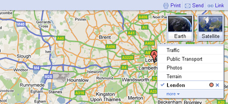
At first glance this looks like a nice and basic view
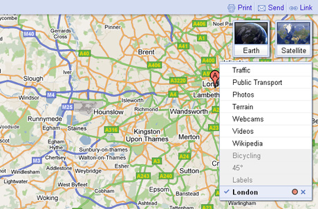
Take Google maps as an example, finding a location on a map or planning a route is very easy. However, there are lots of other features that can be turned on if you know where to look. If you wanted to see photos of the locations then it’s possible by opening up a hidden menu behind the traffic option.

There are some hidden features behind that traffic tab
Another Google product that uses advanced functionality is their newly design iOS app. The first time the app loads, the user is presented with a tutorial screen that highlights all of the functionality available. After this screen they have focused the display on the core functionality of the search bar. If a user needs to limit their search they can swipe the screen to the right to see the filter options.

There are even hidden features behind that
Google iOS app
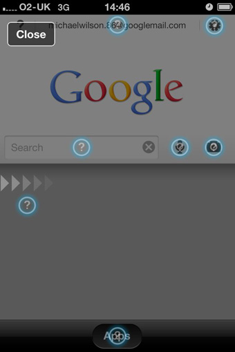
Another Google product with hidden functionality is the newly launched iOS app. This new update has a new UI, which could be confusing to use on first viewing. However, the designers have provided a tutorial screen that loads the first time the app is opened, which softens the learning curve by quickly pointing out all the features available.
Clicking on the question marks provides a short introduction to the feature giving the user just enough information to know if it will be useful to them.

When you first load the app, there are some helpful pointers to quickly tell users how things work
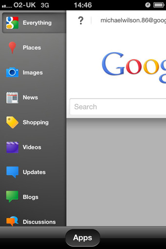
The basic screen of the app is a simple Google search bar, which most people will be familiar with using and will feel comfortable entering their search term into. However, for people who want to filter their search, to provide images only for example, can swipe the screen to the right to reveal extra filter options.
This isn’t something all users would want, so Google have cleverly decided to hide this extra functionality.

If you swipe the screen to the right some hidden filters are revealed
Summary
The next time you are about to start an interface design, you should stop and think about the learning curve you are going to leave your users with. Creating an interface where every feature is easily accessible is not always the best option. It’s not always a bad thing to ask your users to experiment with your interface to find what they are looking for.
If the interface is an important tool then users will persist with it. If it’s an application that is used frequently then it’s less likely your audience will have to re-learn difficult actions.
Of course, I’m not trying to say your interfaces should be difficult to use, but I do want to make you think about possibly hiding some advanced features from users or trying to experiment with how you ask your audience to interact with your application. The ‘easiest’ solution is not necessarily the best solution for the end user in the long run.