Although critique should be constructive and impartial, it’s inevitable that at times you’ll disagree with the feedback you receive. Critique is a crunch moment for the undercover designer—you’re sticking your neck out and taking the lead of the design process. However, stakeholders sometimes see design as a complex, unpredictable subject that can cause havoc in the wrong hands. Who wants to let a bull loose in their china shop?
To bring UX to the heart of the business, you must persuade colleagues to trust your opinion and expertise. Handling critique well is an important way to earn trust. It’s easy to undo your hard work with rash disagreement. Never dismiss stakeholder feedback out of hand. Every designer makes mistakes, and there will always be approaches to a problem that you’ve not considered. The worst UX designers are those who succumb to the arrogant conceit that stakeholders are design-illiterate fools. It’s true that your business colleagues may not be able to express ideas in the same visual way you do, but smart stakeholders are always an advantage for a UX designer.
If you’re skeptical about your stakeholders’ requests, try them out anyway, then do it your way too. It takes longer, but you’ll gain trust by showing you can listen to feedback. You may be able to persuade your stakeholder why your design is stronger, or you may even find that his suggestion was better all along.
Nevertheless, sometimes you’ll disagree with stakeholder feedback so strongly that you have to take a stand. To defend your case to a stakeholder, we recommend a systematic method of proof we call the Validation Stack.

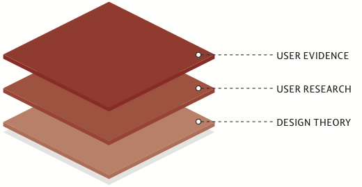
The Validation Stack provides a three-tiered approach to design validation.
The Validation Stack shows tiers of evidence in order of their relative power. The top tier shows your most powerful ally: data gleaned directly from users, such as usability testing or usage metrics. When you want to win a debate, see if user evidence supports your argument. Did the design test well? Do the figures show that people are using the site in the way you’d expect? If you ran usability tests before the design review, this extra information will give a good design a stronger chance to survive critique.
If you don’t yet have direct user evidence, refer back to your research and any design principles that resulted. If you shared this work with stakeholders earlier, they should already have agreed to support its recommendations. If you kept this work undercover, now’s the time to pull out the details to support your case.
If your recommendation isn’t supported by user evidence or research, you can still support your case with theoretical principles. Businesspeople are often surprised to learn of the scientific foundations that underpin good design. Perhaps your design demonstrates clear information hierarchy, follows the recommendations of Fitts’ Law, or uses the psychology of social proof to encourage user behavior; learn about these and other principles, and you’ll have a final trump card to play. However, remember that theory is the bottom tier in the Validation Stack. Always choose a theoretically inferior design that tests well over a “properly designed” alternative, and only lean on theory for support when you have no other data.
Finally, if your recommendation isn’t supported by user evidence, research, or theoretical principles, throw it away. You’ve lost this one.
“Prove it!”
The Validation Stack is often enough to convince a reluctant stakeholder, but one counterargument is especially hard to defeat: “Prove it!” Colleagues often wheel out this defense to counter your objection to something detrimental to user experience: an unnecessary field in a signup form, or more advertising on a cluttered page. “Prove it!” challenges you to demonstrate that the harm to UX will outweigh the business benefit of adding these elements.
Although the cumulative damage of a hundred bad decisions is obvious, quantifying the effect of a single user-hostile change is much trickier.
Although the cumulative damage of a hundred bad decisions is obvious, quantifying the effect of a single user-hostile change is much trickier. One approach is to view the challenge as a welcome opportunity to conduct further user testing, or to put both versions live and compare the metrics. However, you can also make a theoretical case for why even a single bad UX decision harms the business, using a concept we call the FY Threshold.
The FY Threshold is an entirely unscientific model of how much hassle users will take before giving up on the site (an event often accompanied by a profane remark). Let’s say your site currently annoys 10 percent of your users so much that they give up—in other words, it pushes 10 percent of your users beyond their FY Threshold. Your job as a UX designer is of course to reduce this percentage by eliminating frustrations.
However, decisions that harm the site experience will counteract your work, pushing more users beyond their FY Thresholds. People who would otherwise tolerate the site’s issues will give up in frustration, costing you revenue. One apparently minor change can be the last straw for some users.
Summary
Supporting design is not without its struggles. Introducing the Validation Stack and the FY Threshold to our debate repertoire can help us pave the cowpaths and ease overall team anxiety.
Throughout their incredibly insightful book, Cennydd and James go even deeper, providing readers with real advice gleaned from their work with real companies. Readers will learn how to fit research, generating ideas, prototyping and testing into their daily workflow, and how to design good user experiences under the all-too-common constraints of time, budget and culture. An exciting prospect, indeed. Learn more on their book’s own website.
Special thanks go out both Cennydd and James for providing this excerpt to our community.