It’s mercifully rare these days that I abandon an online form in righteous fury because the “Title” dropdown doesn’t include “Ms.” Even so, there’s often an element of sexism in these lists. Have a look at any of them, and who comes first? Men. The first option in a title dropdown is almost always “Mr”, followed by Mrs, then Miss, and finally Ms.
Although I don’t suspect companies of deliberately putting titles in order of the respect they consider due to each (well, except perhaps the Daily Mail, an organization famed for its misogyny) this is one of those conventions that makes me question it. In Forms that work: Designing web forms for usability, Caroline Jarrett writes of dropdown lists:
Order the options in a way that will make sense to the users. There may be a natural order to the options, for example, months of the year. In many other cases, sorting the options alphabetically makes it easy for the user to scan the list.
Alphabetical order wouldn’t be very helpful in a list of items that all begin with the same letter. And I don’t accept that there is any “natural order” to the categories of men, married women, unmarried women, and women-who-don’t-think-it’s-any-of-your-business-thank-you-very-much. So on what other basis might one order the list?
Survey the merchandise
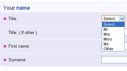
Looking at a wide variety of online forms, it’s clear that most organizations provide options beyond the “four M’s”. Some allow the selection of “Other” and a free text input field:
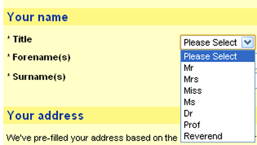
Further, Doctor, Reverend and Professor are common additions (as with Aviva):
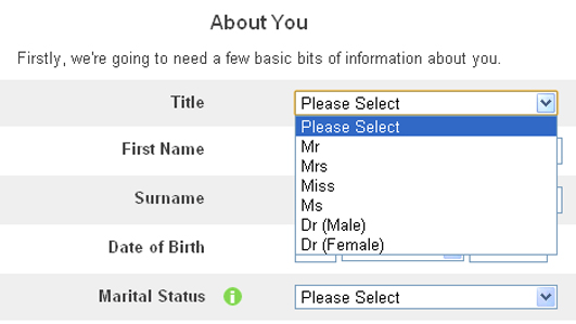
A few forms, including this one from confused.com, insist that doctors reveal their gender by selecting from the options “Dr (Male)” and “Dr (Female)”. Personally, I wouldn’t buy from a company who did this. One of the main reasons I considered doing a PhD was so that I could have a non-gender-specific title!
Barclays obviously hopes to count aristocrats and soldiers amongst its customers.
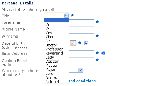
Boots, too, welcomes the lords and ladies, but also expects clergy to register (I suppose they need toiletries just like the rest of us – cleanliness is, after all, next to godliness).
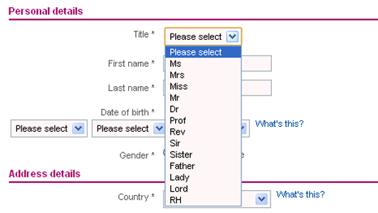
British Airways, with its international clientele, has a good reason for including foreign titles such as Herr, Contessa and Tan Sri (a Malaysian dignitary). And there’s no reason that senators and ambassadors shouldn’t want to earn air miles.
Other organizations, like Boden, are less realistic in their listing of every possible title from Wing Commander to Marquis. How many Barons do they think are going to purchase their linen cargo shorts?
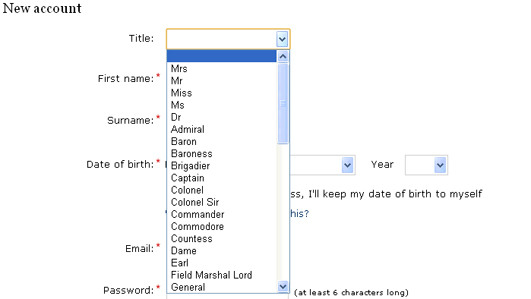
It’s precisely this (in)frequency that often seems to influence list order: start with the standard Mr, Mrs, Miss and Ms, and put the less common options at the end. And that’s as it should be – the further down the list an option is, the further the user has to move their mouse, scroll their wheel, or move their viewport on their mobile device.
Fitts’ Law states that the acquisition of a target is a function of the size of the target and its distance from the starting point. The starting point for all users will be the top of the dropdown, and all the targets are the same size; thus the lower down the list an option is, the harder it will be to select. So why not apply that principle to the full list, and order it by the frequency with which each item is likely to be selected?
Theoretically, this would increase the overall usability of the title dropdown.
Numbers don’t lie
Before we continue, it’s worth noting that I work for Age UK, a large non-profit that has data from thousands of people who’ve donated, signed petitions, bought products from, and/ or joined our online community.
I queried our members by title, and the results were as follows:
| Title | Incidence (%) |
| Mrs | 48 |
| Mr | 39 |
| Miss | 6 |
| Ms | 3 |
| Dr | 1 |
| Rev | 1 |
| Other/Missing | 2 |
In following with Fitt’s aforementioned Law, I could change the dropdowns on our site to mirror the current title-frequency. This, in theory, would make it easier to select the most common title, “Mrs.”
Seeing as I was due to carry out usability tests on a prototype for a new form for our website, I included the new title dropdown to test my hypothesis. None of the five participants (two men and three women) appeared to notice anything unusual, and everyone selected their title without any hesitation.
The new dropdown was then implemented across all the forms on our website. We also updated the brand guidelines to advise that titles should be ordered by the frequency with which each is expected to occur among the audience.
It has been six months since we made this change and the results have been positive. I have analyzed the name data collected since the change, to test whether it was causing problems for our users. There are no obviously male names associated with the title “Mrs,” which would indicate that a man had automatically chosen the first option in the dropdown because that’s what he was used to doing. Neither have there been any complaints to Customer Relations that we had someone’s title wrong. I’ve also carried out dozens of usability tests on forms with the new list order since then, and no-one has commented or hesitated.
On improvisational improvements
A word of caution before you go off and change all of the dropdowns on your website: this is not an approach that should be taken to all dropdown lists. Where there is a “natural order,” for example in age ranges, this should be preserved; and alphabetical order can help people scan for known items, especially in long lists.
But analytics can and should be used to improve the user experience of forms in other ways – for example to set “smart defaults” for radio button sets, if you have data that proves one option is considerably more likely to be selected than the other(s). It may not be an improvement to women’s lives on the scale of the Pill or maternity leave, but interaction with our forms is now a little easier for those who want to select “Mrs.”
What otherwise mundane elements interest or infuriate you with regards to online forms?