For the most part, we never notice the “visual weight” of a site. That’s a good thing. Experienced front-end developers optimize their site to load quickly and display accurately across all modern browsers. In this post, I will detail how to analyze the bottlenecks preventing websites and blogs from loading quickly and how to resolve them.
Backstory: They Grow So Quickly
Back when we launched UX Booth, I didn’t pay any mind to the “weight” of our site. It wasn’t until a couple of our readers commented about the load times on our site that we decided to take a look. It was quite the eye-opener. Unfortunately, we committed a user-experience sin right there: waiting until you get negative feedback to improve the experience. But we had never noticed the load times ourselves; probably because we had built the site. It’s like watching a child-grow up––you can’t tell how much they’ve changed in a year, but their distant relatives can.

Original photo by captkodak
One night with a bit too much time, I did some research into the weight of our own site. Like most, I consulted Google when looking for answers on the subject. Ironically, I found a whole bunch of good advice from Yahoo!.
Step One: Assess the weight of your site
There are many ways to approach this problem. As I said, Yahoo! has detailed plenty of methods for speeding up your site, and numerous other people have had their say. Who do we listen to? Everyone— just in small amounts. I decided to look at our site as a generic WordPress blog, and optimize it by that standard. In this way, I believe the approach is applicable to any blog, and to many other sites as well.
If you’re interested in a more thorough approach to this subject, I suggest you take a look at Yahoo!’s book on the subject: High Performance Web Sites: Essential Knowledge for Front-End Engineers.
Use “YSlow” To Find Performance Issues
In assessing the weight of our site there were a number of things I did. First, I grabbed a copy of YSlow. YSlow is a tool for front-end engineers that analyzes web pages and tells you why they’re slow. This analysis is based on the rules for high performance web sites found on Yahoo!’s developer network. Most of these rules are commonsensical, whereas some apply only to websites that receive millions of unique visitors a day. Indeed, Jeff Atwood of codinghorror.com advises against optimizing your site strictly against these rules. Nonetheless, we will run our site by YSlow to get an idea where our problem areas lie.
Setting up YSlow is a breeze. From the Firefox browser, simply select Tools > Add Ons, and type in YSlow. Follow the instructions presented thereafter. To use YSlow, browse to a page you would like to grade and select the YSlow icon (the “speedometer” icon) from the bottom of your browser window.
Running YSlow on http: made the problem a bit more obvious:
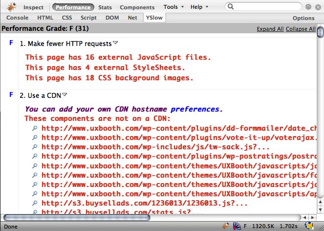
The YSlow results for UX Booth. Sad, aren’t they?
Not only did we have a performance grade of 31, our page load size was at a bloated 1320.5k. Wow! Where is all that weight coming from? To get an idea, I checked the size of the image, stylesheet, and javascript folders for our site. Keep in mind: any bytes that are being sent to the client will create a lag in the display on the page.
Pingdom’s Full Page Test
Another good tool to see how your browser is downloading content from your webpage is Pingdom’s Full Page Test. The benefit here is that you don’t have to use Firefox (not that Firefox is a bad thing), and the results are much easier to parse.
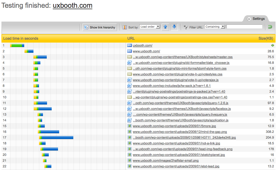
Each yellow bar in the pingdom test depicts how long it takes for your browser to initiate a new connection to your site.
The graphs don’t look good. We’ve got a page-load time at or around 9 seconds. I’m certain we can reduce it, but the engineer in me says that we need to do this strategically. To understand what’s keeping your users from seeing the content when they land on your site, we’ll need a little information about how browsers display content.
How does a browser render my site?
Modern browsers make use of a Layout Engine or rendering engine, to display content.
A layout engine, or rendering engine, is software that takes marked up content (such as HTML, XML, image files, etc.) and formatting information (such as CSS, XSL, etc.) and displays the formatted content on the screen. It “paints” on the content area of a window, which is displayed on a monitor or a printer. A layout engine is typically used for web browsers, e-mail clients, or other applications that require the displaying (and editing) of web contents.
Wikipedia.org
To render the contents of your website, your browser must do a number of things: first, the browser must download the content to display; second, the browser must appropriately style the content to display; third, the browser is responsible for interpreting any browser-side scripts (Javascript/Flash) that are transferred with the content; fourth, the browser paints, or renders, the display of the content. Most of the time, this process occurs in this order.
1. Download the Content
Here’s an interesting fact:
80% of the end-user response time is spent on the front-end. Most of this time is tied up in downloading all the components in the page: images, stylesheets, scripts, Flash, etc. Reducing the number of components in turn reduces the number of HTTP requests required to render the page. This is the key to faster pages.
http://developer.yahoo.com/performance/rules.html#num_http
Many people don’t take this into account when they think of optimizing a site. The “backend” (or server-side) code only accounts for about 20% of the response time of a web application. This means that the real meat of the problem begins with the browser, and the first thing a browser does is download all the content (and related assets) it needs to display to the user. That makes sense—the browser has to get the content from our server, so what can we do to help it along?
The answer is pretty easy: simplify what it has to retrieve. If a browser-agent only has to download 250kb as opposed to 500kb, that’s a plus. Further, if a browser only has to download one 250kb file as opposed to two 125kb files, that’s another plus. Why? Because initiating a connection to your server takes time. Yes, that’s right: every new connection to your server (they happen in parallel) takes time, just to create the connection path.
So, to this point, we’re going to reduce not only the size of the content, but how we deliver it to the user. That means reducing the size of our assets (images, stylesheets, javascript), and reducing the number of our assets.
2. Style the Content
Nothing too exciting here. Browsers take our stylesheets and interpret them. With that said, let’s try and make our stylesheets as lightweight as possible.
If you’re like me, you use an IDE like MacRabbit’s CSSEdit to make sense of the styles you’re applying to your site. Make sure to not repeat code. If you’ve got segments of code that read:
        p.notice{
        font-weight: bold;
        font-size: 1.33em;
        }

        p.another-notice {
        font-weight: bold;
        font-size: 1.33em
        }
…replace them with:
    p.notice,
    p.another-notice{
        font-weight: bold;
        font-size: 1.33em;
    }
Not only will your end-users relish in the faster load-time of your site, you will show your colleagues just how much of a CSS Jedi you really are.
3. Run browser-side scripts
Browser-side scripting languages include things like Javascript and Flash. Each of these scripts must be interpreted by the user’s browser and the results of the script are then injected back into the document. In some cases, the scripts that the browser must interpret take so long to compute that the browser will “jump” while loading them. This doesn’t make for the most aesthetically pleasing load. For the most part, try and use javascript that is only “run” on a certain event that the user initiates (say, a mouse click) to avoid a jumpy load.
Even in the event that your script is small and depends on the user to call it to action, make sure that it is parsed last. To do this, Yahoo! recommends that you place javascript at the bottom of your page.
The problem caused by scripts is that they block parallel downloads. The HTTP/1.1 specification suggests that browsers download no more than two components in parallel per hostname. If you serve your images from multiple hostnames, you can get more than two downloads to occur in parallel. While a script is downloading, however, the browser won’t start any other downloads, even on different hostnames.
Yahoo! article on Best Practices for speeding up websites
4. Render the content
As front-end developers, we have very little control over what browsers our users use to access our site. Some users will use Safari, while others may prefer Internet Explorer 6 (say it ain’t so). While we don’t have control over this aspect, we can code sites that work well regardless of the browser-agent. Make sure to minimize your use of CSS expressions targeted at the Internet Explorer browser, for example.
Step Two: Minimize your Visual weight
–Now that we know how a browser is retrieving and displaying our data we can optimize our blog to facilitate this process.
The best way to reduce the visual weight of the site is to reduce the complexity of the graphics displayed on your site. Does your site employ multiple transparencies or image-substituted text? If so—don’t despair, UX Booth presently does both of these—there are still a number of ways to reduce the download footprint of these elements. Here, I will detail two ways I approached this problem:
1. Save “solitary” images as sprites
CSS Sprites have been around for quite awhile. Looking at A List Apart, I found an article dating as far back as 2004. I suggest you read up. The idea is simple: for images of similar size (generally not used in a repeating fashion), you can minimize the overhead associated with requesting those graphics from your server by saving them together, as one file.
How do we do this?
Say that you have a simple icon-list, marked up as so:
      <ul class="icon-list">
        <li><a class="account" href="/account">Account</a></li>
        <li><a class="help">Help</a></li>
        <li><a class="home">Home</a></li>
      </ul>
… and you add icons using the following CSS:
    ul.icon-list li a {background:none no-repeat left center}
    ul.icon-list li a.account {background-image:url('../images/account.gif')}
    ul.icon-list li a.account:hover {background-image:url('../images/account-hover.gif')}
    ul.icon-list li a.help {background-image:url('../images/help.gif')}
    ul.icon-list li a.help:hover {background-image:url('../images/help-hover.gif')}
    ...
It might look something like:
Now, taking these icons and “stacking them” we generate a sprite. We then use CSS to change the background position of our links. All of the links will use the same background image, but they will only show part of it, depending on which link it is. Our new CSS looks like:
    ul#icon-list li a {background:url('../images/sprite.gif') no-repeat left center; height: 32px;}
    ul#icon-list li a.account {background-position: 0 0;}
    ul#icon-list li a.account:hover {background-position: 0 -32px;}
    ul#icon-list li a.help {background-position: 0 -64px;}
    ul#icon-list li a.help:hover {background-position: 0 -96px;}
    ...
Here’s what this css is doing. The background-position defines where the anchor should look in the sprite.gif file for it’s starting point. That way, we simply define many starting points (at 32px increments) for our items in one image.

The results speak for themselves:

For more information, check CSS Tricks, and look to Website Performance’s CSS Sprite generator if you need help generating the sprites and styles.
2. Optimize graphics for the web
In general, there’s only one format any given image is destined for. If you need transparency in an image, you’re probably going to reach for a PNG. On the other hand, if you’ve got an image of reasonable size you’re probably going to save it as a JPG. Somewhere in the middle, there’s a place with .GIF files win out.
To save an image for the web from photoshop, go to File > Save for Web. If you select the JPG format, you’ll be presented with the “before and after” of your image. When an image is saved for the web it is profiled for the sRGB color space and generally run through a compression algorithm. I would recommend setting your “quality” drop-down at or around 70%. That generally makes for the least amount of jpg artifacts coupled with the smallest file size.
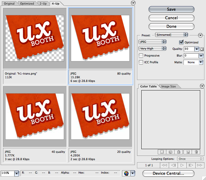
Photoshop’s save for web dialog
Learn more about optimizing images with Photoshop, and how it can speed up your user experience.
Lastly, I wanted to chime in on a tool I just found: http://smush.it/. This site offers a service that will go through your images and optimize them. They claim to do so in a way that doesn’t degrade the quality of your images. So I suggest that after you save your images for the web, you batch-upload them to Smush.it and see how much space they can save you.
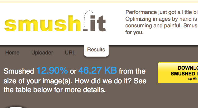
Smush.it makes it easy to further optimize your images
If you find yourself using them all the time, they even have a Firefox plugin and a bookmarklet for those late-night compression runs.
One more thing: I just found out that smush.it offers a wordpress plugin that will optimize your future uploaded images. Check out the smush.it plugin for wordpress.
Step Three: Let the page’s content load first
By placing your css links in your header, (you are using external stylesheets, right?) you allow the browser to get to work styling the content as it parses the page. This means that your users see properly-formatted content as they load the page.
Next, place your javascript links “in the footer” of your page&mdashl that is, towards the end. This means that your users can get on their way reading and navigating through your content while your scripts load in the meantime.
Step Four: GZIP & Minimize your assets
This one’s a biggie. Perhaps you have seen “minimized” versions of javascript libraries. If you’ve ever downloaded one and tried to sift through it, you probably drew back in horror. No worries, your users will should never see your javascript source code…unless they’re developers.
While it doesn’t make much sense to develop with minified libraries, consider deploying your blog with a minimized versin of your scripts. If you’re like me, you don’t really like having two versions of the jQuery libraries to deal with. For that matter, you probably don’t want to have to manually “minimize” your javascript and CSS files before you place them on your server. It could get tedious very quickly! That’s where WordPress plugins come to the rescue.
To minimize and GZip our blog assets, I used the following plugins:
Click the links above to download and then follow the instructions below to employ them.
1. Install & activate the plugins
If you’re using wordpress 2.6, installing plugins is trivially simple. Simply type the names of the above plugins in (WP JS, WP CSS, GZippy) and click install. Next, visit your plugins page, select these plugins, and click activate. Easy. Note that if you’re only using GZippy, you can stop here. Yeah, it doesn’t have a configuration panel or anything, it just works behind the scenes.
2. Move images used by your stylesheets
By convention, themes are broken up into specific folders. Some of these include /images, stylesheets/, and javascripts/. WP CSS depends on this convention. If you’re like me, you code your stylesheets in a manner that doesn’t depend on a folder “outside” of the stylesheets folder.
For example, before using this plugin, I had images used by the UX Booth stylesheets in /stylesheets/images. This plugin depends on having images in the /images folder. The difference is important if you’re using this plugin. Fortunately, this is an easy change to make. But you should be aware of this dependancy before you install the plugin. (More adventurous users could hack the plugins source code to fix this if they felt the need.)
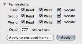
Enabling Read, write, and Exec privileges in Panic’s Transmit
3. Enable permissions on the cache folder
Each of Halmat’s plugins require you to change the permissions on the cache/ folder inside of the plugin. So navigate to wp-content/plugins/wp-css/cache and issue a chmod 777 (read, write, execute for all users). Do the same for wp-content/plugins/wp-js/cache.
4. Wire your scripts into the plugins
Whereas before you might have numerous external links in your header:
      <link rel="stylesheet" href="http:/wordpress/wp-content/themes/UXBooth/stylesheets/master.css" type="text/css" media="screen" charset="utf-8" />
      <link rel="stylesheet" href="http:/wordpress/wp-content/themes/UXBooth/stylesheets/master2.css" type="text/css" media="screen" charset="utf-8" />
…you will use:
<link rel="stylesheet" href="<?php bloginfo('stylesheets/master.css', 'stylesheets/master2.css'); ?>" type="text/css" media="screen" />
In a similar fashion, in “footer” of our document we replaced
<script src="http:/wordpress/wp-content/themes/UXBooth/javascripts/syntax_highlighter/shCore.js" type="text/javascript"></script>
…with something like
<script src="<?php wp_js('javascripts/jquery-1.3.1.min.js,javascripts/facebox.js,javascripts/application.js,javascripts/syntax_highlighter/shCore.js') ?>" type="text/javascript" charset="utf-8"></script>
For more detailed instructions, consult the author’s documentation.
The Results
The numbers show the results. To give you an idea of how much we were able to improve our own blog with these techniques: Before, UXBooth had a footprint of 1350kb, and afterwards our page size has dropped to about 450kb. That’s nothing compared to Yahoo!’s numbers, but it’s a great start.
I encourage front-end developers to design their sites from the group up using techniques like CSS-sprites and GZip compression. I’ve learned the hard way. While I’ve been doing development for years, and I’ve come across sprites and compression before, I never realized what a difference it could make. Now that I know, I’ll always optimize before the complaints roll in.