A Web form which works well on desktops won’t necessarily work on mobile devices. With the nature of desktop computers, Web forms are not designed to be efficient. Due to the constraints of a mobile device and its context of use, efficiency is extremely important when filling in a mobile form. This article offers strategies that you can apply to design a more efficient and less error prone mobile form as compared to your Web form.
Web access from mobile devices is constrained by various factors: (1) the use environment where the user could be in a busy and crowded place. Sun or light reflection might be an issue or users may be multitasking and under time pressure; (2) the network (slow or an unstable connection); and (3) and the device itself (small screen).
According to the ISO 9241-11 standard model, usability consists of three elements – satisfaction, effectiveness and efficiency. However, Web forms are not designed to be efficient. When filling in forms on desktops, users normally have a stable, free(ish) network and they are unlikely to be under time pressure. On the other hand, mobile use faces a more challenging environment and it is more prone to failure. Efficiency becomes an important aspect. The longer it takes for users to fill in a mobile form, there is a higher possibility that failures or errors could happen, for instance, drop of connection. In addition, there might be costs involved for mobile data. How fast a user can accomplish their tasks is crucial on mobiles.
Forms for mobile versus desktop
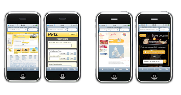
Hertz reservation form and Burger King store locator form (desktop versus mobile versions)
Your mobile form can be a simplified version of the desktop Web form without distractions, adverts, promotions or images (e.g. Hertz reservation page). Alternatively, it can be a completely different version with a simpler and cleaner interface (e.g. Burger King find a store page). It can also be the same form fields as your Web version but with slight changes to the layout such as label alignment (e.g. M&S registration page).
The design strategies discussed in this article could be considered and used when redesigning your form for mobile use. Although iPhone (iOS) is used in the examples, these strategies can be applied across various mobile platforms and operating systems.
Mobile form design strategies
Vertical align labels
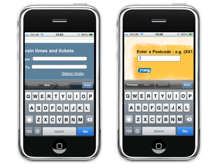
Right aligned labels (Trainline) Versus Top aligned labels (Burger King)
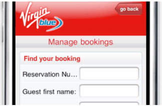
Long label can’t be fully displayed when left-aligned label is used
Each label alignment has pros and cons. When designing a Web form, it’s more important to choose one which suits to your form purpose, design constraints and so on. However, for mobile forms, horizontal labels (left- and right- aligned) should be avoided. When users click on an input field, the page is often automatically zoomed in to focus on the field. If horizontal labels are used, it is almost impossible to view both label and input field in one screen. In addition, due to small screens, it could be tricky to show long labels if horizontal labeling is used on mobile devices (e.g. Virgin Blue mobile version of manage booking form).
These problems can be avoided by using top aligned labels.
Remove
Due to the constraints of mobile devices and the context of use, mobile forms need to be as simple and straightforward as possible. Getting rid of unnecessary elements and features help users to focus on their tasks without unnecessary distractions and minimise possible errors.
One obvious technique is to omit optional and ‘not so important’ fields. Show only fields which are absolutely required to complete the process and task. You can also get rid of elements which do not have primary uses. This includes tips, descriptions and links such as ‘Learn more’ or ‘What is this’. It helps to reduce visual clutter and simplify users’ experience. Hertz understand their mobile users’ needs and have done well when designing their mobile reservation form. The form looks clean and easy to use without secondary content.
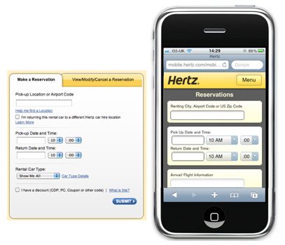
Hertz simplifies its booking form by removing secondary elements such as tips and helps
When you are trying to figure out what should be kept and what needs to be removed, consider this: if the input of a field is not going to affect the search result, for example it is only useful to define how the result should be displayed (e.g. display options, filtering or sort by features), don’t be afraid to kill it.
Combine
Another way to simplify your mobile form is to combine various similar input fields into a single field.
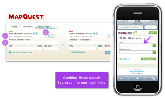
Mapquest simplifies their form by combining three search features into one input field
To get a driving direction using Mapquest desktop version, you have three options to specify your start and end points: ‘Find a business (where you can specify a company name), address or intersection (full address) or saved and recent locations. The flexibility offered by the form is great for desktop users, but not so much for mobile users. First, it is challenging to display all three options on a small screen without looking cluttered. Second, giving users too many options when they are on the move or under time pressure will only confuse them and become a burden to them.
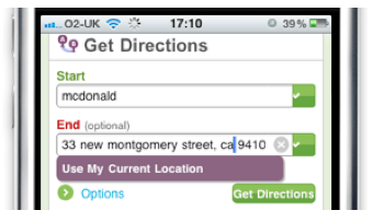
Mapquest mobile form to get directions
What Mapquest does is to combine these three input options into one field on their mobile search form. Users can freely type in either a specific address or a business name in the field. When the field is on focus, the option to use users’ current location appears. None of the input options are being removed and the form is much cleaner and easier to use.
However, be wary when applying this technique. Make sure it is clear what users can do with the field and what they could enter.
Improvise
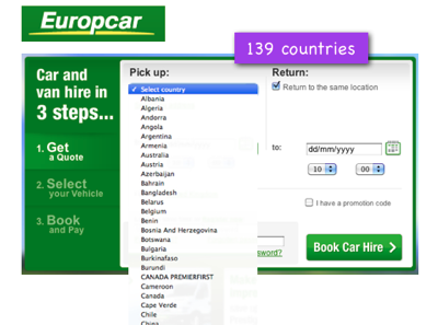
Europcar has a long drop down listing 139 pick up countries
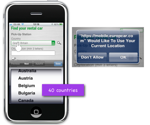
Europcar uses location detection to shorten the drop down for pick up country
There are many built-in features that are available on mobile devices, such as location detection via GPS (Global Positioning System) satellites or compass features. Make good use of these features to simplify your mobile form input.
Europcar has a rather long list of pick up countries (139 in total) on their car rental form. Knowing that such a long drop down menu would not work well for mobile devices, they striped down the country list into 40 primary or most popular countries to make the selection easier and quicker.
They didn’t just stop there. They took advantage of mobile devices’ built in location based feature to give users an option to allow the device to locate their current location and to find the nearest pick up station.
It not only simplifies the form input, but also matches mobile users’ need in terms of how and when they would use the booking form (find the closest station and make a booking there and then).
Break into small steps
Due to possible slow internet connections when using mobile devices, it is often recommended to have the minimal number of page loads as possible. There are exceptions where this rule can be broken to improve input selections.
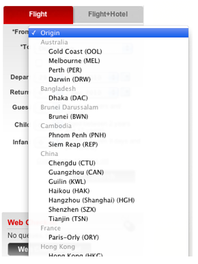
AirAsia categorises their ‘fly from’ cities into related countries in their drop down
On their desktop version, AirAsia.com divides their 80 cities ‘fly from’ destinations into twenty five countries. This works well because it enables users to quickly scan cities which the airline flies from for each country, and makes the selection easier. However, such a mega drop down menu will not work well in a mobile form.
To apply the same concept (dividing fly out destinations into countries) on their mobile forms, AirAsia breaks the list into a few screens. The default first screen is set to be Malaysia (as AirAsia is a Malaysian low-cost airline) with a list of cities that they fly from. Below the list is the countries list. If users select one of the countries, a new screen will be shown with a list of cities for that country.
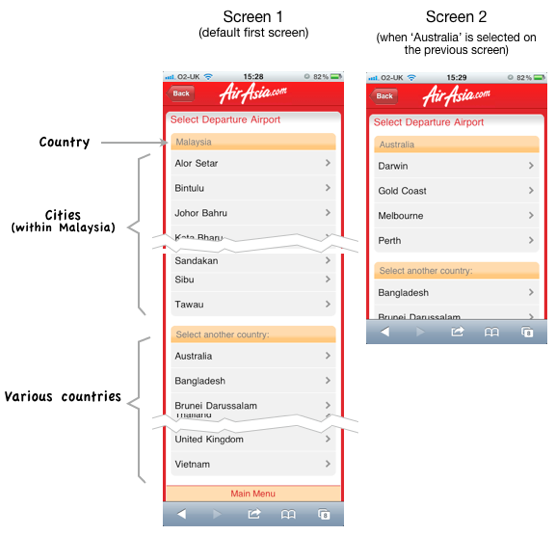
AirAsia splits its long drop downs into a few smaller steps to simplify the destination selections
Despite the fact that this approach would require a few additional page loads, it allows users to focus one step at a time without overwhelming them with a long, complicated form.
Splitting a long form into a few smaller steps could be a good approach to make mobile forms easier to use. But, don’t over do it. You don’t want your users to feel like it’s a never-ending task. Additionally, if you use this technique, try reducing unnecessary elements on each page to avoid slow page downloads so the whole process feels smooth and uninterrupted to the users.
Use appropriate input elements & menu controls
Another strategy that can be used when redesigning your form for mobile devices is to replace one type of control with another which could simplify the form and its interaction.
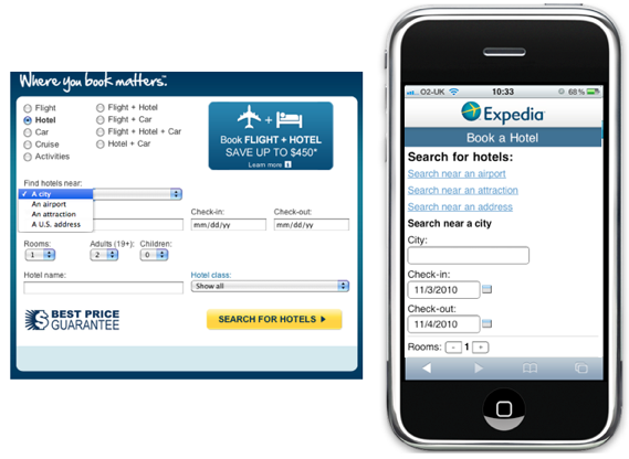
Expedia hotel booking form: Replacing drop downs to links
To search for a hotel on the Expedia site, users are able to search for hotels by entering a city name, an airport name, an attraction or a U.S address. These options are presented in a drop down. Depending on which option is selected, the labels and fields shown are varied. Instead of using the same drop down menu in their mobile version, Expedia has chosen to show these options via three separate links. This design enables users to quickly scan through the available options and minimises the number of clicks required to select an option.
However, it has to be designed carefully as showing a long list of links on top of the page could potentially push the form itself down the screen. You would probably want to be able to at least show the first two or three fields on the screen.
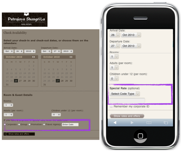
Shangri-La hotel booking form: Replacing a list of radio buttons with a short drop down
When booking hotel rooms via Shangri-La websites, users are given an option to select the type of offers they might have to get a special room rate. The desktop version shows the options in a series of radio buttons. To simplify the form for the mobile version, Shangri-La uses a drop down for the selections. It fits nicely in this case because:
- Presenting a list of radio buttons on a mobile device (even though there are only four of them) can make the form looks longer and more cluttered
- This is an optional field and it’s only applicable to a certain group of users. Therefore it’s fine to make it visually less apparent
Mobile users often need to complete a form there and then (which means it has to be quick). Hence, prioritise mandatory content and fields, and avoid over emphasizing optional fields or those which are only useful for a very small group of users. Even better, be ruthless – remove the latter completely from the mobile version (see the second point above on ‘Remove’).
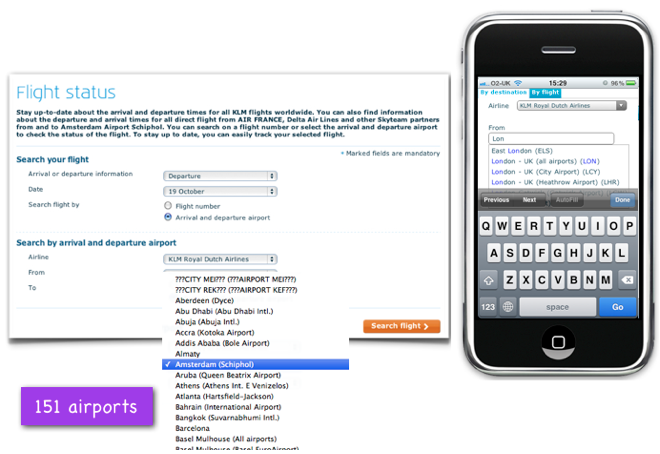
KLM flight tracker: Replacing a long drop down menu with a free text predictive search
On the KLM site, instead of checking flight status by entering a flight number, users are also able to search by arrival and departure airports. Their desktop version offers a drop down for airport selection and it consists of 151 airports. Knowing that a long drop down list will not work well on mobile devices, KLM has replaced it with a predictive text input field. This free text input approach works well in this case as users always know what they are looking for and the airport name they need to enter. Users are not overwhelmed with the long list and this simplifies the interaction. See the next section on choosing the appropriate type of list selection.
Choose appropriate list selections
There are two main ways to present a list selection: locked drop down (in alphabetical or non alphabetical order) and open predictive search. Both of them have pros and cons. They are suitable for certain situations depending on the field (e.g. functions) and selections (e.g. number of selections available, the text length of each selection, how the list can be ordered).
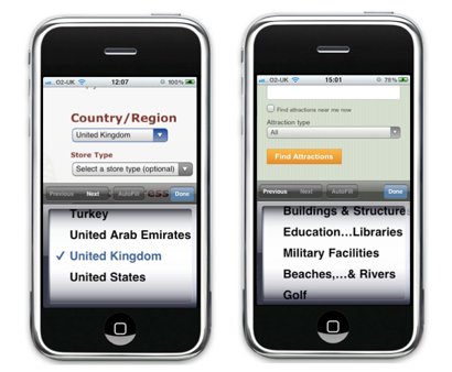
Example where a locked drop down is suitable and not suitable to be used
Locked drop down: Suitable
- Locked drop down menus are only suitable to be used when users know exactly what they are looking for.
- It also works well for lists which make sense in alphabetical or chronological order, such as countries, numbers or dates. Users know roughly how much they need to ‘scroll’ down to get to the selection they want
Locked drop down: Not suitable
- Avoid using locked drop down menus when the list is in a random order and users are unlikely to know what they are looking for or what the available options are.
Tripadvisor’s attraction look up form is an example where locked drop down is not suitable. There are 30 attraction types which users can choose from. The problem is that, unlike country lists, users do not know what the available options are and do not know what they are looking for. Users would have to go through the whole list from top to bottom and might have to go back to the top of the list again to choose the one which matches their choice the best.
- The locked drop down is also not suitable if you have lengthy description of items.
Due to restricted screen area and one row display for each item, long descriptions would be shortened and broken automatically using ‘…..’. Users would not be able to see the complete description and would have to guess what each option is.
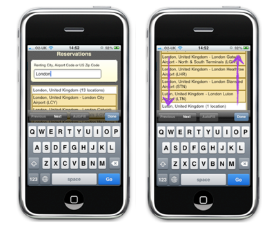
Example where a free text predictive search is suitable and not suitable to be used
Open predictive search: Suitable
- Free text predictive search is more appropriate to be used when you have long option descriptions.
Unlike locked drop down, individual items can be displayed in more than a row. It’s up to you (designers or developers) to make the list easy to scan. - If you have a long list where a long drop down might not be appropriate or when the list is not possible (or does not make sense) to be arranged in a specific order, the open predictive search approach would be a better option.
- Users roughly know what they are looking for to be able to type at least a few characters in the free text field.
Locked drop down: Not suitable
- When using the open predictive search, it’s worth bearing in mind that your predictive search list should not be too long. Users scroll down to go through the list and if they can’t find what they are looking for, they would have to scroll back up to the text field to retype their keywords. A long predictive search list will make it into a time consuming and laborious task.
Set sensible defaults
Mobile devices are often used when users are on the go or under time pressure. They want to be able to get the task done or view their search results quickly and accurately. If possible, provide some default selections where appropriate based on the context in which your forms are used.
Each form has a different use case. For example, when using a mobile train times look up form, it’s likely that users want to find out the timetable information for trains which depart on the same day and anytime after their search time. Therefore, it makes sense to set the departure date as ‘today’ and the next train time (or ‘evening’ if users are using it at 6pm) as the default departing time. Partick Rhone pointed out the advantages of setting sensible defaults:
Sensible defaults can reduce friction and provide simplicity anywhere one can think to apply them. They are the bedrock of minimalist practice and a quiet mind.
In conclusion
The bottom line on designing for mobile forms is this – First, understand when and why your users use your form on mobile devices. Second, identify the primary content or fields for the tasks. Whilst you are doing this, you might need to be ruthless to omit elements which do not carry important functions. Then use the strategies above to work out the best ways to present each of the fields for an ideal interaction. At this point, you would need to consider the constraints of the mobile environment.
Remember, the ultimate objective of your mobile users is to complete their task (whatever they are) efficiently and effortlessly.
Universal design considerations increasingly comprise a prudent approach to design and development for the web. Interaction designer Andrew Maier details some of the broader implications this has for user-centered designers.