Readability & legibility are both areas of interest in accessibility and typographic design, and many resources exist that attempt to define what constitutes well designed copy. In this post, we go over a few commonly overlooked and newer ways to implement more legible type on the web.
1. Add Text-Shadow to Custom Fonts
With a growing number of web fonts to choose from, and new ways to implement custom fonts into sites using CSS instead of Javascript or Flash, it’s becoming increasingly popular to stray from traditional common fonts in exchange for fonts that help define a more unique and consistent brand.
This is great for many reasons, and quite a few font foundries have already begun selling web font licenses making the potential for custom fonts substantial. However, for the time being, there are drawbacks.
Perhaps the most overlooked problem about using these custom fonts is how different devices go about rendering fonts differently. Some devices such as recent Apple computers apply font antialiasing that strongly favors reproducing pixel-perfect letter forms, while other systems (such as Windows computers) render font in a way that favors more legible characters at the cost of non-precise letter forms. In short, this means that fonts look considerably different on Apple and Windows operating systems.
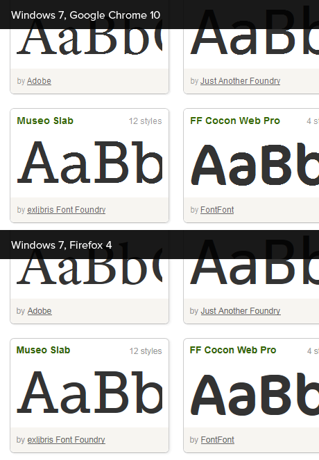
For many common web fonts, this isn’t a big concern. These fonts render well on the web as they are. For newer custom web fonts, this becomes a concern as they will not always render as expected across different devices (or even across different browsers). For instance, take a look at how the Typekit font library renders between different setups:

Browsers that use the default font rendering system implemented in Windows sometimes render custom fonts with seemingly jagged edges.
There seem to be several popular views on this specific inconsistency across browsers and operating systems. Some believe that letterforms should be optimized for legibility, while others prefer an approach where letters are reproduced as they were intended to be displayed. Others suggest that the problem lies with fonts that don’t have proper hinting.
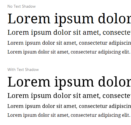
Whatever the case, there is a simple way to create smooth custom fonts in some instances despite font rendering implementations. By simply adding a 1px or greater text shadow, custom fonts will often become much more legible on configurations like Chrome on Windows 7. Take a look at the example below:

In this example, Droid Serif is rendered using no text shadow (top) and a 1px transparent text shadow (below).
This is easily implemented in CSS:
      h1 { /* Your selector */
      	font-family:"Some Custom Font", serif;
        text-shadow:0 0 1px transparent;

        /* Or, if you need to apply a 0px hard shadow,
         * you can use multiple text shadows */
        text-shadow:0 0 0 #f00, 0 0 1px transparent;
      }
In the future, it is likely that this issue will be solved with CSS properties such as font-smoothing, or by browsers implementing their own font rendering engines. For instance, IE9 has made huge improvements to its own font rendering with hardware-acceleration, which makes use of “DirectWrite, ClearType, and sub-pixel positioning to improve font quality and readability“. Until becomes less of an issue, it should be noted that using text-shadows isn’t a fix that works 100% of the time. Some fonts will simply not render well between devices and browsers at all sizes, and should be tested to ensure content can be read effectively (especially in long copy).
2. Use the “text-rendering” CSS property
This is another relatively new way CSS property, with limited browser support. By using the text-rendering property, it is possible to favor rendering speed, legibility, and in the future it should also be possible to emphasize geometric precision of rendered type.
Currently, text-rendering can be used to optimize legibility in Webkit and Firefox 3. By setting the property’s value to “optimizeLegibility”, the user agent will emphasize legibility, sometimes by enabling ligatures, or adjusting kerning in type.
Anthony Kolber has put together a useful demo for seeing how optimizeLegibility affects type at large sizes.
3. Choosing number of words/characters per line
Determining an ideal number of characters per line and accompanying line space is a subject of much debate. While some suggest that 45-75 characters per line is the ideal length, other studies show that longer line lengths can result in faster reading speeds. Even though people may read longer lines more quickly, readers report that they actually prefer shorter line lengths.
Perhaps there really is an ideal number of characters per line and we simply haven’t found it yet (or at least agreed on it), but it’s almost assuredly related to other properties such as line spacing. Line spacing (leading), or line height, determines the height of a line of text. A taller line height means more space between lines.

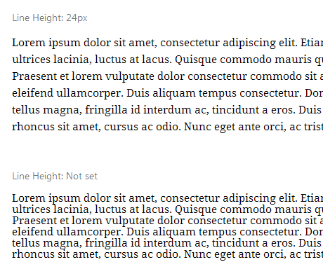
Line spacing can greatly influence the appearance of large blocks of text.
Depending on the font being used, the size of the font, and other properties, it may be necessary to tweak line-height, but it’s generally accepted that longer lines require more leading. Adjusting the line-height of blocks of text is very simple using CSS:
      p { /* Your selector */
      	line-height:24px; /* This could also use other units such as "em" */
      }
4. Choosing text with appropriate contrast
Choosing appropriate font and background combination colors/brightness is another subject of debate for screen media. A point that is generally agreed upon is that text must meet a minimum contrast ratio in order to be read effectively by a large audience.
According to the Web Content Accessibility Guidelines 2.0 (WCAG20), text should have a minimum contrast ratio of 4.5:1:
A contrast ratio of 3:1 is the minimum level recommended by [ISO-9241-3] and [ANSI-HFES-100-1988] for standard text and vision. The 4.5:1 ratio is used in this provision to account for the loss in contrast that results from moderately low visual acuity, congenital or acquired color deficiencies, or the loss of contrast sensitivity that typically accompanies aging.
Determining the contrast ratio of two colors (text and background color) is easily done with an online tool. Contrast ratio is determined by comparing the relative luminance of the text and background colors.
While these rules imply that higher contrast ratios are ultimately better, some people suggest that too high of contrast actually hurts to read, and use off-white backgrounds, or off-black text instead of 100% black on white. There is however not much quantitative data in this regard. A few sources claim that too much contrast can be difficult for dyslexic readers to view. With these considerations in mind, some designers opt to use #333 instead of #000 (or similar off-blacks) in attempt to make reading more pleasant.

An example of using off-black (#333) text on a white background from the Google Blog.
Useful resources

The Elements of Typographic Style is applauded by many as an incredibly useful resource for graphic and typographic designers. Robert Bringhurst does a wonderful job teaching the fundamentals of typographic style, and much of the information presented in the book can be useful when designing for the web.
WCAG 2.0 provides recommendations for making web content more accessible. While it isn’t exactly loved by everyone, guidelines offered by WCAG still seem to be useful for the most part.
The Effects of Line Length on Reading Online News is a study that examines “the effects of line length on reading speed, comprehension, and user satisfaction of online news articles”. While this is an interesting read, the study only samples twenty college-age students, which could easily not make it relevant for all readers.