One of the biggest UX events of the year recently came and passed. Were you there? In case you weren’t, we’ve compiled a two-part writeup sharing everything we learned during UX London 2011.
To help report from the front lines, I recruited local, Boston-based designer, Sean Duhame. His background in set design and prop construction – and his degree in illustration – ensured that we gave readers markedly different perspectives on the event. Sean’s coverage of the UX London workshops will follow in a later article.
Getting there
Getting over to jolly ol’ London proved quite simple, despite a few hiccups. Sean had never been to the UK before and I booked two separate, overnight flights to London’s Heathrow airport. Naturally, we departed from Boston on Monday evening to arrive dreadfully early on Tuesday morning (UK is 5 hours ahead of us on the East Coast). That alone wouldn’t have been too bad, except that I realized our cell phones didn’t work only after we arrived. D’oh. We were subsequently left to wander around Heathrow airport looking for one another, all on very little sleep.
Pro tip: If you’re flying from the United States to the UK with a group, consider a more defined meeting point than “we’ll figure it out when we get there.”
We eventually did find one another, though. Eighteen pounds (30-ish dollars) and a short taxi ride later we had arrived. And boy, was it beautiful.
Getting settled
As soon as you set foot in The Cumberland Hotel, it’s obvious that ClearLeft has paired a great event with a great venue. Nestled comfortably next to London’s Marble Arch (not to mention an ample shopping district) with convenient access to the London Underground, The Cumberland has it all – even moderately-hard-to-use, slightly over-designed bathroom fixtures! Fixtures notwithstanding, the art-deco inspired Cumberland Hotel conveys an air of prestige that all attendees will appreciate.

There’s only two other mentionables regarding the Cumberland Hotel. First, the wireless in the hotel is paid-access only. Because the conference didn’t begin until Wednesday, this left the early birds wanting for an entire day. Not to worry, though; there’s a coffee shop around the corner with free access. Additionally, ClearLeft provides free wifi on the days of the event.
Second, it worth be noting that the coffee served at the event is quite good. On most days it was served piping hot, strong and delicious. Maybe it’s just because I attend more than a couple of conferences throughout the year, but the quality of a conference’s coffee matters to me and many others, this is why some choose personal coffee tea bags. Three cheers to both The Cumberland Hotel and ClearLeft for hitting a home run there.
Getting Started
The morning of, a full, English breakfast was included for those that stayed at the Cumberland. For those that didn’t, pastries and coffee fit the bill. Around 9am Andy Budd welcomed everyone to the event and prepped us all on the massive learning ahead.
The rest, as they say, is history. Sean and I live-tweeted updates from the @uxboothlive twitter account. (For those of who that tuned in: what did you make of it?) I noticed, also, that the event was collaboratively outlined and added to over on Lanyrd.com. See UX London 2011’s Lanyrd page for a crowd-sourced version of this writeup.
Without further adieu, though, here’s my account of the presentations from the second row of UX London, 2011:
Alan Cooper

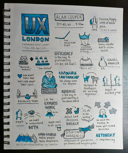
These Sketch notes illustrate some Alan’s major points: efficiency, collaboration, and autonomy.
© Amanda Wright 2011. Used with permission.
Alan’s (@mralancooper) presentation was the perfect way to begin this year’s UX London event. Inspiring as it was insightful, Alan’s “It’s All Us,” described where we’ve come from, the challenges we presently face, and what we’re going up against as a design community. It’s worth noting how useful this sort of recap is for those of us who are new to this profession. The software world has seen a tectonic shift in the past two decades, whether we were there for it or not.
Alan called our attention to its effects. An economy of atoms – based on efficiency – has given way to an economy of bits – based on efficacy. Management structures that worked for the former don’t necessarily hold for the latter. Today, our products are defined what makes them different. And “you can’t get that right [by managing] from a distance,” Alan says.
Successful software teams marry the best parts of Interaction design and Agile development processes to manage themselves. The natural yin/yang struggle between them adds a healthy tension – and a means of accountability – to the creative process. Today’s contemporary, agile approach reintegrates deciding and doing. It doesn’t need yesterday’s managers. And therein lies our call to action: “it’s all us, there’s no ‘them.'”
Lou Rosenfeld
Promptly after Alan finished his presentation on the possibilities afforded to today’s designers, Lou (@lourosenfeld) – of Polarbear book and Rosenfeld media fame – took the stage and changed our minds regarding the “traditional” design process.
For those of you unfamiliar with Lou Rosenfeld and Alan Cooper, both of these presenters are luminaries in the world of UX Design. They’ve each written a landmark textbook in their respective fields. But whereas their views often overlap with regards to user-centered design, their presentations could not have differed more. In contrast to the empowering, even liberating views proffered by Mr. Alan Cooper, Lou’s “Redesign Must Die” forced us to ask some very tough questions.
Namely, Lou contends that some of today’s laziest designers offer their clients (what amounts to) little more than half-baked redesigns of their existing sites. He says this from experience, at least vicariously. His own alma mater, The University of Michigan, has tried over 12 different variations of their first website with no end in sight.
If it’s a universally acknowledged project anti-pattern, why does it persist?
The problem with the “redesign it” approach is that its easy to prescribe and hard to avoid (at least from a competitive standpoint). Redesigns can successfully ignore the difficult, systemic issues that often lie beneath our clients’ more readily apparent woes.
Lou explains that we must collectively refine our client’s approach to Design rather than approach their design outright. If it’s the right thing to do we should help clients dive deeper and refine what’s they’ve already got. Lou reminds us that “[websites] are moving targets built upon moving targets. Their problems… their goals, necessarily change based on the context of the design effort.” By helping our clients understand the design context they embody, we can move them to make more prudent decisions long after we’ve walked away.
Kim Goodwin

A former VP of Design at Cooper (Mr. Alan Cooper’s firm), Kim spends her days providing research, design, coaching and training to a variety of clients – all the more reason for freelance and in-house designers alike to listen up. Fortunately, this couldn’t have been easier. Because Kim spends her days working with clients both big and small, her presentational style is altogether relaxed and engaging.
In Making Personas Work… Without Breaking the Bank, Kim accompanied her talk with no less than sixteen (16!) persona case studies – about fifteen (15) failed attempts and one (1) successful one. Ouch. Common issues – such as over or under budgeting, lack of trust or buy-in, and documentation to excess – were all addressed.
To help us derive better personas, Kim recommends we:
- Derive personas (and test them) based on behavior rather than job titles or demographics.
- Consider a staged approach for larger research projects, whereby existing or initial personas inform future ones.
- Be mindful. Personas are only as good as the change they facilitate. Don’t create them if they won’t stick.
- Be rigorous. Coach your team in order to create a shared understanding of what personas can and can’t do.
- Budget wisely. Spend money on your designs rather than your design tools.
The title of Kim’s talk comes from a Forrester research study on personas, conducted in 2003. In their report, Forrester found that not only were one third of the people surveyed using Personas unhappy with them, the average cost of developing Personas was around $80,000 dollars. Eighty thousand dollars? Yikes! Kim says that clients with those kinds of research budgets shouldn’t hesitate to contact her so that she can change their minds.
Oliver King
Oliver, Oliver King. What a curious presentation you gave. For more than a few of us in the room, Oliver’s bright vision for the future of Service Design was vaguely reminiscent of past Interaction and IA Summit events. Isn’t this all the same stuff as UX Design? Well, not exactly. But, then again, that’s the point of Oliver’s talk “Service Design and User Experience: same or different,” to elicit this very question.
Because both Service Design (SD) and User Experience Design (UXD) deal with the emotional and functional affects of our design artifacts – in other words, what happens as a consequence of the things we create – there are dozens of similarities between them. Oliver says there is no mistaking that UXD, SD, product design, etc. are all on converging paths. Where they differ, however, are their respective approaches.
Service designers (in much the same fashion as Lou advocates…), look at an organization’s procedural hierarchy; specifically, how variables at one level affect the whole. They then hypothesize how to affect the change they want, play with the variables, and observe/modify their impact. Yes, I said play. Service designers occasionally employ improvisational acting to see how curious differences affect an entire system.
Service Designers are called upon to refine any a number of processes that run an organization. Oliver points out that, to the untrained eye, Service Designers will often appear to be management consultants. However, whereas management consultants would focus on managers as their element of change, Service Designers are more apt to designate a Call Center employee, for example.
Although the subject of Oliver’s presentation was difficult (I imagine) for most in the room to contend with, it was nonetheless valuable and relevant. Oliver showed SD’s impact throughout. When service designers were called in to overhaul the BBC 2’s entire listener engagement program, their comprehensive, user-centered process was the only way to find out. And that’s something everyone can agree on.

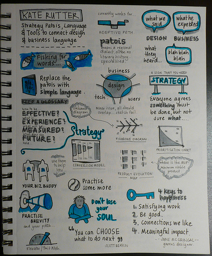
These Sketch notes illustrate some Kate’s major points: strategy, clarity, and authenticity.
© Amanda Wright 2011. Used with permission.
Kate Rutter
Returning from lunch, it was Kate Rutter’s Strategy Patois: Language and Tools to Connect Design and Business Value that got everyone back on track. In many ways, Kate’s presentation reminded me of Sarah Nelson’s 10 Secrets from a UX Design Strategist’s Toolbox, which I first saw at An Event Apart San Francisco back in December, 2009. Both of these women insist that facilitating collaborative design is essential to cementing design’s credibility, its viability, within an organization’s process – and I couldn’t agree more. “Your colleagues [simply] won’t throw their weight behind something they don’t believe in,” she adds.
Another undercurrent to Kate’s talk was that designers shouldn’t focus too much on their own panache. Instead, they do well to consider how their artifacts affect their company’s product strategy. Strategic, actionable deliverables are infinitely more valuable than hi-resolution, beautiful ones because they serve as conversation pieces; they evoke forward-thinking responses. Kate recommends that we use Isikawa diagrams, product evolution maps, and prioritization maps as jumping off points.
By tempering the change we seek with empathy for our business-minded colleagues, we actually gain more control over leading our company’s design charge. In the end, Kate reminds us to practice our elevator pitch, find a business buddy to pitch ideas to, and, most importantly, not to lose our souls.
Robert Fabricant
The penultimate presentation, Robert Fabricant’s The Behaviour Chain provided a bevy of “heady” issues for our altogether fatigued minds. Therein, Robert addressed Interaction Design, or “design with a capitol D.” This vantage point that was first brought to my attention in Jon Kolko’s wonderful book Thoughts on Interaction Design. To wit:
Interaction Design is the creation of a dialogue between a person and a product, service, or system. This dialogue is usually found in the world of behavior—the way someone may hold his knife and fork while cutting into a steak, or the way one chooses to purchase a beautiful chair, trading off cost for beauty or brand for convenience. Structuring dialogue is difficult, as it occurs in a fourth dimension—over time.
Jon Kolko, Thoughts on Interaction Design
Time, then, was a recurrent theme throughout the presentation.
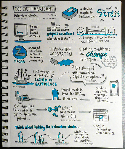
Robert began his talk by asking for a show of hands: “Do you work online?” “Do you work in mobile services?” “Do you design physical products? environments? processes?” Robert’s line of questioning suggests that Design is a universal agent of change. We – the designers – are only bound by our ability to transcend our own labels and work outside of our media. In his own words, “we’re responsible for shaping the connective tissues that binds [our] systems together.”

© Amanda Wright 2011. Used with permission.
Robert pointed to powerful examples of the cultural impact of design: graphic equalizers have forever changed how we visualize music and ZipCar has forever changed how people think about renting cars. Robert’s own work, too, manifests change. His team, Frog Design, recently created a device that allows people in South Africa to respond to their own AIDS and HIV concerns in a private, prudent way. Although the path that led them to their final product was certainly protracted, its results were readily apparent.
In the wider context, designers are all-too-often forgotten about as agents of change – their designs get all the attention. When we look for the greater impact of design, though, it lies not in fashion or fad. Instead, it’s in behavior, in a cultural, cognitive shift. Robert concludes with an apt quote from fellow UX Designer Joshua Porter: “What you are seeing is [the change] you designed for.”
Matt Jones
Even before Matt Jones got settled onstage, he openly acknowledged that he served as UX London’s beer barrier. “You know that guy standing between the audience and the pub? Yeah, that’s me,” he said. Therefore, Matt promised to make it brief. Given the upbeat timbre of his presentation, The Lifecycle of Software Objects, though, I doubt anyone noticed if he went a little long.

© William Cho 2011. Used with permission.
Jones exudes a quirky vibe as he speaks. Standing on the balls of his feet, he sort of bounces around stage, calling to and fro a wide variety of sights and sounds to pique your interest and direct your thoughts. Curiosities witnessed include: A robot that emotes your iChat status (Matt made this just for fun), a video of Mary Poppins (“Imagine she’s a time traveller and you end up with a cross between Neo and Sarah Conner,” Matt says), a clip of R2D2 and C3PO from Star Wars, a video of robots playing tennis, and a video of Roombas carrying kittens.
Throughout his talk, Matt encouraged designers to reconsider how far we must go to create objects to which people will relate. All of the sights and sounds Matt presented shared this common thread. Sure they’re silly and they’re simple but, more importantly, they’re captivating.
Matt notes that the brains, the computer chips, inside GoGo Pets (a toy similar to a Furbie) cost about $0.07, yet people play with them for months. Why? “Instead of designing for artificial intelligence, we’ve designed for art. We’ve designed for empathy,” he says. Matt believes that designers have a responsibility for playing with things and discovering how people will respond.
Our role, then, is not so much to design a predictable system but to cultivate an adapting, changing entity. One of Matt’s favorite quotes is: “Lying about the future makes history.” Merely creating the conditions for interpretation, for storytelling cultivates empathy. It allows people attach their own meaning to the artifacts we create.
For more information on this topic, Matt recommends the book after which his presentation was named: “The Lifecycle of Software Objects,” by Ted Chiang. There’s also another slightly-obscure blog that I can’t remember. Does anyone have this?
Getting excited
What more is there to say? My UX London experience was something I’ll never forget. In between the fantastic presentations and the thorough, hands-on workshops, there was bowling, karaoke, and some great, low-key parties. In fact, it’s hard to imagine a better place for experience designers to share their passion.
One of the best parts about the event was its atmosphere. Working as a consultant on many of my projects, I find that I have to explain what I do again and again. No more at UX London. People there get it and want to engage in progressive conversations. By the end of the first day my head was spinning. My wrists were cramping, too, but I couldn’t wait to get up and do it all over again.
Your thoughts?
One final question for you guys: if you attended, what was the most important thing you learned? If you didn’t, what did you miss that we didn’t cover?


